Sub Category
Latest Blogs
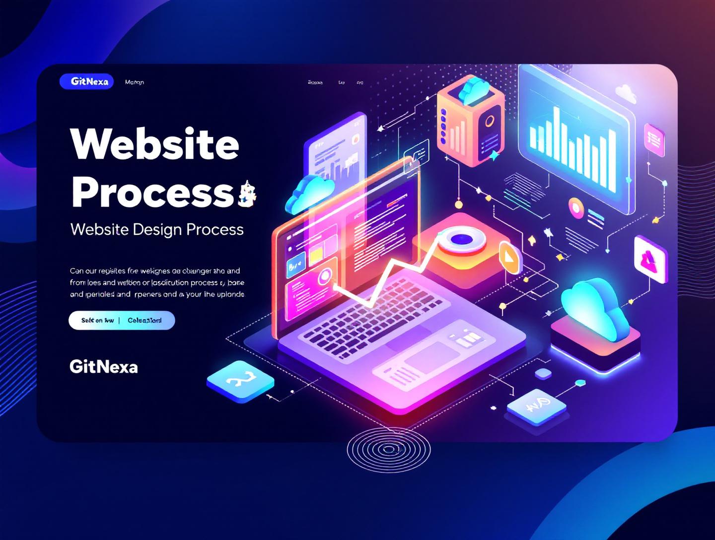
The Ultimate Website Design Process: A Complete 2026 Guide
Introduction
In 2024, Google reported that 53% of users abandon a website if it takes more than three seconds to load. That stat gets quoted often, but here’s the part most teams miss: performance issues usually trace back to poor decisions made early in the website design process, not just sloppy code. The same goes for usability problems, weak conversions, and costly redesigns that happen a year after launch.
The website design process is no longer about picking colors, designing a homepage, and pushing it live. It’s a structured, multidisciplinary workflow that blends UX research, visual design, frontend engineering, content strategy, accessibility, SEO, and performance optimization. When done right, it reduces risk, speeds up development, and produces sites that actually support business goals.
Yet many companies still treat web design as a linear checklist. Design first. Development later. SEO at the end. That approach might have worked in 2015. In 2026, it leads to bloated interfaces, frustrated users, and engineering teams stuck refactoring avoidable problems.
In this guide, we’ll break down the modern website design process step by step. You’ll learn what the process really involves, why it matters more than ever, how successful teams execute each phase, and where most projects go wrong. We’ll also share real-world workflows, practical examples, comparison tables, and future-facing trends that are shaping how websites are designed today.
Whether you’re a CTO planning a platform rebuild, a startup founder launching an MVP, or a designer trying to align better with engineering, this guide will give you a clear, battle-tested framework you can actually use.
What Is the Website Design Process?
At its core, the website design process is the structured sequence of research, planning, design, validation, and implementation steps used to create a functional, usable, and visually coherent website.
But that definition barely scratches the surface.
In modern teams, the website design process is a cross-functional system. It aligns business objectives, user needs, technical constraints, and brand identity into a single execution plan. It starts long before the first wireframe and continues well after the site goes live.
A Practical Definition
The website design process typically includes:
- Business and stakeholder discovery
- User research and audience segmentation
- Information architecture and content planning
- UX wireframing and interaction design
- Visual UI design and design systems
- Frontend and backend collaboration
- Accessibility, performance, and SEO considerations
- Testing, iteration, and post-launch optimization
Unlike older waterfall-style approaches, today’s process is iterative. Teams validate assumptions early, test often, and refine continuously.
Website Design vs Web Development
This distinction causes confusion, especially for non-technical stakeholders.
| Aspect | Website Design | Web Development |
|---|---|---|
| Focus | User experience, layout, interaction, visuals | Code, data, performance, integrations |
| Outputs | Wireframes, UI mockups, design systems | HTML, CSS, JS, APIs, databases |
| Tools | Figma, FigJam, Adobe XD | React, Next.js, Node.js, Laravel |
| Timeline | Early and ongoing | Starts early, extends post-launch |
In reality, the best projects blur this line. Designers understand technical constraints. Developers give feedback on feasibility early. That collaboration is a hallmark of a mature website design process.
Why the Website Design Process Matters in 2026
Websites in 2026 operate in a harsher environment than ever before. User expectations are higher, devices are more fragmented, and Google’s ranking systems are less forgiving.
User Expectations Have Shifted
According to a 2025 Statista survey, 72% of users say they judge a company’s credibility primarily based on its website design. Not branding. Not ads. The website.
Users expect:
- Sub-second interactions
- Clear navigation within three clicks
- Mobile-first layouts that don’t feel cramped
- Accessibility by default
A sloppy or outdated design instantly signals risk.
Google Rewards Process, Not Just Output
Google’s Core Web Vitals, updated again in late 2024, now heavily weight Interaction to Next Paint (INP). This metric is influenced by design decisions such as layout shifts, heavy animations, and poor component structure.
Designing without performance in mind directly impacts search visibility. MDN’s performance guidelines make this clear: layout stability and predictable interactions are design problems as much as engineering ones.
Faster Iteration Cycles
Companies shipping monthly or even weekly updates can’t afford fragile designs. A well-defined website design process creates reusable components, documented patterns, and shared understanding. That’s what enables speed without chaos.
If your site requires a full redesign every two years, the process is broken.
Phase 1: Discovery and Strategic Alignment
The biggest mistake teams make is opening Figma before they understand the problem.
Discovery sets the foundation for the entire website design process. Skip it, and every decision afterward becomes a guess.
Business Goals and Constraints
Start with clarity.
Questions That Matter
- What is the primary business goal of this website?
- Is success measured by leads, signups, sales, or engagement?
- What technical constraints already exist?
- Are there compliance or regulatory requirements?
A B2B SaaS marketing site has a radically different design process than an internal enterprise dashboard.
Stakeholder Interviews
Talk to sales, support, marketing, and engineering. Each group sees different failure points.
For example, on a recent fintech project, customer support revealed that users couldn’t find pricing details easily. That insight reshaped the entire navigation structure before design even began.
Competitive and Market Analysis
This isn’t about copying competitors. It’s about understanding norms and opportunities.
Create a simple comparison table:
| Competitor | Strength | Weakness | Opportunity |
|---|---|---|---|
| Company A | Clean UI | Poor mobile UX | Better responsive layouts |
| Company B | Strong content | Slow load time | Performance-led design |
This step informs positioning and helps avoid generic outcomes.
For a deeper look at aligning design with business goals, see our guide on product-driven web development.
Phase 2: User Research and Information Architecture
Designing without understanding users is like building a product for an imaginary customer.
User Research Methods That Actually Work
You don’t always need expensive studies.
Effective approaches include:
- 5–7 qualitative user interviews
- Reviewing support tickets and chat logs
- Heatmap analysis using Hotjar or Microsoft Clarity
- Google Analytics behavior flow reports
In 2025, Baymard Institute reported that 61% of usability issues stem from poor information architecture, not visual design. That’s a research failure.
Personas and Jobs-To-Be-Done
Avoid fluffy personas.
Instead, focus on:
- Context of use
- Primary motivation
- Key friction points
A job-to-be-done statement like: “I need to evaluate this service in under five minutes so I can justify it to my manager” directly informs layout and content hierarchy.
Structuring Information
Create a sitemap that reflects user priorities, not internal org charts.
Example structure:
Home
├── Solutions
│   ├── By Industry
│   └── By Use Case
├── Product
├── Pricing
├── Resources
└── Contact
This step saves weeks of redesign later.
For more on UX foundations, read our article on UX research for scalable products.
Phase 3: Wireframing and UX Design
Wireframes are where ideas become tangible.
Low-Fidelity First
Start with grayscale layouts. No colors. No branding. Just structure.
Why?
Because stakeholders argue less about aesthetics and more about usability.
Tools like Figma, Balsamiq, and Whimsical are commonly used here.
Core UX Principles
Clarity Beats Creativity
Users don’t visit your site to admire innovation. They want answers.
Progressive Disclosure
Don’t overwhelm. Reveal complexity only when needed.
Consistency
Navigation patterns, button styles, and spacing should feel predictable.
Validating Early
Before UI design:
- Run quick usability tests
- Observe task completion
- Note confusion points
Even five users can uncover 80% of major issues.
Phase 4: Visual Design and Design Systems
This is where most people think “design” begins. In reality, it’s halfway through the website design process.
Building a Visual Language
Define:
- Color palette with accessibility contrast ratios
- Typography scale
- Spacing system (4px or 8px grids)
- Iconography rules
Accessibility isn’t optional. WCAG 2.2 compliance affects both usability and legal risk.
Google’s accessibility documentation is a solid reference: https://developer.google.com/web/fundamentals/accessibility
Design Systems Over One-Off Screens
A design system includes:
- Reusable components
- States (hover, active, disabled)
- Usage guidelines
This enables faster development and consistent UX.
For teams scaling quickly, this step is non-negotiable. We’ve covered this in detail in design systems for growing teams.
Phase 5: Design-to-Development Handoff
This phase breaks projects when done poorly.
Collaborative Handoff
Designers and developers should review screens together.
Key details:
- Responsive behavior
- Animation intent
- Edge cases
Tools like Figma Dev Mode and Zeplin help, but conversation matters more.
Performance-Aware Design
Design choices affect:
- Bundle size
- Layout shifts
- Interaction latency
For example, replacing heavy carousels with static hero sections can reduce Largest Contentful Paint by over 30%.
Referencing MDN’s performance guides here is invaluable: https://developer.mozilla.org/en-US/docs/Web/Performance
Phase 6: Testing, Launch, and Iteration
Launch is not the finish line.
Pre-Launch Checklist
- Cross-browser testing
- Mobile and tablet checks
- Accessibility audits
- SEO validation
- Performance benchmarks
Post-Launch Optimization
Track:
- Conversion rates
- Bounce rates
- User flows
Iterate based on real data.
For ongoing optimization, see our post on conversion-focused UI design.
How GitNexa Approaches the Website Design Process
At GitNexa, we treat the website design process as a strategic system, not a visual exercise. Our teams combine UX researchers, UI designers, and engineers from day one. This eliminates silos and prevents costly rework later.
We start with deep discovery workshops to align business goals, user needs, and technical realities. From there, we move into research-backed UX design, followed by scalable UI systems that developers can actually implement without guesswork.
Our process integrates performance, accessibility, and SEO into design decisions early. That’s why our websites consistently meet Core Web Vitals benchmarks at launch, not months later.
Whether it’s a marketing site built with Next.js, a SaaS dashboard, or a complex enterprise platform, the same principles apply. Clear strategy. Validated design. Clean execution.
If you’re curious how this ties into broader engineering efforts, our full-stack web development guide provides more context.
Common Mistakes to Avoid
- Designing without user research
- Treating mobile as an afterthought
- Ignoring accessibility requirements
- Overloading pages with animations
- Skipping usability testing
- Poor design-to-dev communication
- Launching without analytics
Each of these mistakes adds cost and reduces impact.
Best Practices & Pro Tips
- Start with content, not layouts
- Design components, not pages
- Test early with real users
- Use performance budgets
- Document design decisions
- Involve developers from day one
Small habits make a big difference.
Future Trends & What to Expect
By 2027, expect:
- AI-assisted UX research synthesis
- Design systems generated from codebases
- Greater emphasis on inclusive design
- Tighter integration between design and DevOps
The website design process will continue to shift left, becoming more strategic and data-driven.
Frequently Asked Questions
What is the website design process?
It’s a structured workflow for planning, designing, and validating a website, covering research, UX, UI, and collaboration with development.
How long does the website design process take?
Typically 6–12 weeks depending on scope, complexity, and feedback cycles.
Is UX design part of the website design process?
Yes. UX is a foundational component that informs layout, navigation, and interactions.
Can design and development happen in parallel?
They should. Parallel workflows reduce rework and speed up delivery.
What tools are used in the website design process?
Common tools include Figma, FigJam, Hotjar, Google Analytics, and design system libraries.
How does SEO fit into website design?
SEO impacts content structure, accessibility, and performance, all of which are design decisions.
What’s the biggest mistake companies make?
Skipping research and rushing into visual design.
How often should a website be redesigned?
With a solid process, incremental updates can replace full redesigns every 3–5 years.
Conclusion
The website design process is no longer optional structure. It’s the difference between a site that looks good and one that actually performs. In 2026, successful websites are built through research, collaboration, and iteration, not guesswork.
By understanding each phase, aligning design with business goals, and avoiding common pitfalls, teams can create websites that scale, convert, and evolve over time.
Ready to improve your website design process? Talk to our team to discuss your project.
Comments
Loading comments...