Sub Category
Latest Blogs
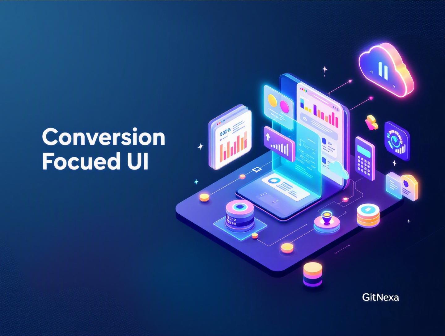
The Ultimate Guide to Conversion-Focused UI Design
Introduction
In 2025, the average website conversion rate across industries hovers between 2% and 4%, according to data from Statista and multiple CRO platforms. That means 96 out of 100 visitors leave without taking action. Not because the product is bad. Not because the price is wrong. But because the interface fails to guide them.
Conversion-focused UI design is the difference between a product people "use" and a product people "act on." It’s what turns traffic into revenue, signups into customers, and curiosity into commitment. And yet, many teams still treat UI as decoration rather than a strategic growth engine.
If you’re a CTO, founder, or product leader, this isn’t a design problem. It’s a business problem.
In this comprehensive guide, we’ll break down what conversion-focused UI design really means, why it matters more in 2026 than ever before, and how to implement it across web apps, SaaS platforms, eCommerce stores, and mobile products. You’ll get real-world examples, UX patterns, architecture considerations, A/B testing workflows, and actionable best practices your team can apply immediately.
Let’s start with the fundamentals.
What Is Conversion-Focused UI Design?
Conversion-focused UI design is the practice of designing user interfaces specifically to drive measurable user actions — such as purchases, signups, demo requests, downloads, or subscriptions — while maintaining usability and trust.
At its core, it blends:
- UI design (visual layout, typography, color, spacing)
- UX design (user journeys, information architecture, interaction flows)
- Behavioral psychology (cognitive bias, decision theory)
- Conversion rate optimization (CRO)
- Data analytics and experimentation
Unlike purely aesthetic design, conversion-focused UI design prioritizes outcomes over appearance.
UI vs UX vs CRO: Where It Fits
Here’s a quick breakdown:
| Discipline | Focus | Goal |
|---|---|---|
| UI Design | Visual interface elements | Usability and visual clarity |
| UX Design | User journey and interactions | User satisfaction and flow |
| CRO | Testing and optimization | Higher conversion rates |
| Conversion-Focused UI Design | UI built for action | Measurable business outcomes |
In other words, it’s UI with intent.
What Counts as a Conversion?
Depending on your product, conversions may include:
- SaaS free trial signups
- eCommerce purchases
- Demo bookings
- Newsletter subscriptions
- App installs
- Feature upgrades
- Lead form submissions
For a B2B SaaS platform, reducing friction in a signup flow from 7 steps to 3 could increase activation by 25%. For an eCommerce store, simplifying checkout can reduce cart abandonment (which averages 70% globally per Baymard Institute).
Conversion-focused UI design is about engineering these outcomes deliberately.
Why Conversion-Focused UI Design Matters in 2026
User expectations have changed dramatically.
1. Attention Spans Are Shrinking
Research from Microsoft (updated behavioral studies through 2024) suggests users form judgments about a website in under 50 milliseconds. That’s not enough time to read. It’s barely enough time to perceive structure.
If your interface doesn’t instantly communicate value, users bounce.
2. Acquisition Costs Are Rising
Paid acquisition costs have increased steadily across Google Ads and Meta platforms since 2022. Many SaaS companies now report CAC increases of 20–35% year-over-year.
When traffic is expensive, conversion rate optimization becomes your highest ROI growth lever.
Improving conversion rate from 2% to 3% is a 50% revenue lift without increasing traffic.
3. AI-Driven Personalization Is Raising the Bar
Companies using AI personalization (Amazon, Netflix, Shopify stores with AI recommendation engines) have trained users to expect contextual experiences.
Generic UI is now a liability.
4. Product-Led Growth Demands Better UI
In product-led growth models, your UI is your sales team.
If onboarding is confusing, you don’t lose a lead — you lose a customer silently.
That’s why modern teams combine UI/UX design strategy, analytics, and experimentation as part of their growth stack.
Now let’s break down the mechanics.
The Psychology Behind Conversion-Focused UI Design
If you want users to act, you need to understand how they decide.
Cognitive Load and Decision Fatigue
The human brain prefers simple decisions. Every additional field, button, or option increases friction.
Hick’s Law states:
Decision time increases with the number and complexity of choices.
Amazon’s one-click checkout is a classic example of minimizing cognitive load.
Visual Hierarchy and Attention Control
Eye-tracking studies show users scan in F-patterns or Z-patterns.
You can guide attention through:
- Size (larger elements draw focus)
- Color contrast (CTA buttons)
- Whitespace (reduces noise)
- Directional cues (arrows, imagery gaze direction)
Behavioral Triggers
Common persuasion principles used in UI:
- Social proof ("12,000+ companies use us")
- Scarcity ("Only 3 spots left")
- Urgency (countdown timers)
- Reciprocity (free trial)
- Commitment bias (multi-step forms)
But here’s the key: misuse destroys trust. Ethical design matters.
For example, dark patterns may increase short-term conversions but hurt retention and brand equity.
Core Principles of Conversion-Focused UI Design
Let’s move from theory to practical principles.
1. Clarity Over Cleverness
Dropbox’s homepage copy is a masterclass in clarity:
"Everything you need for work, all in one place."
No jargon. No clever metaphors.
Your primary CTA should answer:
- What will happen if I click this?
- Is it safe?
- What do I gain?
Instead of "Get Started," test:
- "Start Free 14-Day Trial"
- "Create My Free Account"
Specificity converts.
2. One Primary Action Per Screen
Each page should have a dominant goal.
Bad example:
- Buy Now
- Contact Sales
- Download Brochure
- Subscribe
Good example:
- Primary CTA: "Start Free Trial"
- Secondary CTA: "Watch Demo"
Clear hierarchy reduces hesitation.
3. Friction Reduction in Forms
Form optimization can increase conversions by 10–40% depending on industry.
Best practices:
- Remove unnecessary fields
- Use inline validation
- Enable autofill
- Break long forms into steps
- Show progress indicators
Example React input validation pattern:
const [email, setEmail] = useState('');
const [error, setError] = useState('');

const validateEmail = (value) => {
  const regex = /^[^\s@]+@[^\s@]+\.[^\s@]+$/;
  if (!regex.test(value)) {
    setError('Enter a valid email address');
  } else {
    setError('');
  }
};
Inline feedback reduces abandonment.
4. Speed Is a Conversion Feature
Google reports that when page load time increases from 1s to 3s, bounce probability increases by 32%.
Optimizing performance using techniques discussed in modern web performance optimization directly impacts conversions.
Key tactics:
- Lazy loading images
- Code splitting
- CDN usage
- Server-side rendering (Next.js)
Speed is not engineering vanity. It’s revenue protection.
Conversion-Focused UI for SaaS Applications
SaaS has unique conversion moments: onboarding, activation, upgrades.
Optimizing Onboarding
A common onboarding flow:
- Signup
- Email verification
- Profile setup
- Feature walkthrough
- First value moment
If users don’t reach the "aha moment" quickly, churn spikes.
Slack reduced onboarding friction by letting teams explore before full configuration.
Progressive Disclosure
Instead of overwhelming users with features, reveal them gradually.
For example:
- Basic dashboard first
- Advanced analytics after first usage
This aligns with product-led growth strategies explained in building scalable SaaS products.
Upgrade UI Patterns
Common high-converting patterns:
- Feature comparison tables
- Usage limit warnings ("You’ve used 90% of storage")
- In-context upgrade prompts
Example pricing comparison table:
| Feature | Free | Pro | Enterprise |
|---|---|---|---|
| Users | 1 | 10 | Unlimited |
| Analytics | Basic | Advanced | Custom |
| Support | Priority | Dedicated |
Clear differentiation drives upgrades.
Conversion-Focused UI for eCommerce
In eCommerce, small UI changes can increase revenue significantly.
Product Page Optimization
High-converting product pages include:
- High-quality images
- Trust badges
- Clear pricing
- Prominent CTA
- Delivery estimates
Amazon displays delivery dates near the CTA. That reduces uncertainty.
Checkout Flow Optimization
Baymard Institute reports average cart abandonment at nearly 70%.
Common friction points:
- Forced account creation
- Unexpected shipping costs
- Complex forms
Solution patterns:
- Guest checkout
- Address autofill
- One-page checkout
- Clear progress steps
Example checkout flow:
- Cart review
- Shipping info
- Payment
- Confirmation
No distractions. No cross-sell clutter.
For backend integration, robust APIs and payment handling discussed in secure payment gateway integration are critical.
Data-Driven UI Optimization and A/B Testing
Design without data is guesswork.
A/B Testing Framework
Basic experimentation cycle:
- Identify hypothesis ("Changing CTA color increases clicks")
- Design variation
- Split traffic (50/50)
- Run test until statistical significance
- Implement winner
Tools commonly used:
- Google Optimize (sunset, alternatives like Optimizely, VWO)
- Hotjar (heatmaps)
- Mixpanel
- Amplitude
Example Experiment
Original CTA: "Submit" Variation: "Get My Free Quote"
Result:
- Control: 2.3% conversion
- Variation: 3.1% conversion
- Lift: 34.7%
Small change. Big impact.
Integrating analytics pipelines using best practices from modern DevOps and CI/CD workflows ensures experiments deploy safely.
How GitNexa Approaches Conversion-Focused UI Design
At GitNexa, we treat conversion-focused UI design as a cross-functional initiative, not a design task.
Our process typically includes:
- Business goal alignment (KPIs, revenue targets)
- User research and behavior mapping
- UX wireframing
- High-fidelity UI design
- Frontend implementation (React, Next.js, Vue)
- Performance optimization
- A/B testing and iteration
We combine UI/UX expertise, scalable architecture, and analytics instrumentation to build products that don’t just look good — they convert consistently.
Whether it’s SaaS onboarding, eCommerce funnels, or enterprise dashboards, our team integrates insights from cloud-native architecture design and AI-powered personalization systems to maximize measurable impact.
Common Mistakes to Avoid
- Designing for stakeholders instead of users
- Adding too many CTAs per page
- Ignoring mobile optimization
- Using dark patterns that erode trust
- Skipping performance optimization
- Running A/B tests without statistical significance
- Failing to define a single primary KPI
Each of these reduces conversion efficiency and long-term growth.
Best Practices & Pro Tips
- Use action-oriented microcopy ("Start Saving Today")
- Add trust signals near CTAs
- Keep above-the-fold value clear
- Use contrasting colors strategically
- Optimize for thumb reach on mobile
- Personalize content based on user behavior
- Measure activation rate, not just signups
- Conduct usability testing quarterly
Future Trends & What to Expect (2026–2027)
- AI-driven real-time UI personalization
- Voice-assisted interfaces in commerce
- Predictive UX using behavioral data
- AR previews in eCommerce
- Privacy-first tracking models
- Emotion-aware interfaces via sentiment analysis
Companies that integrate AI and behavioral analytics early will outperform static UI competitors.
FAQ: Conversion-Focused UI Design
What is conversion-focused UI design?
It is the practice of designing user interfaces specifically to drive measurable user actions like purchases, signups, or demo requests.
How is it different from traditional UI design?
Traditional UI focuses on appearance and usability, while conversion-focused UI prioritizes measurable business outcomes.
Does conversion-focused design harm user experience?
Not when done ethically. In fact, reducing friction improves UX and conversions simultaneously.
What metrics should I track?
Conversion rate, bounce rate, time to first action, activation rate, and revenue per visitor.
How long should A/B tests run?
Until statistical significance is reached, typically 2–4 weeks depending on traffic volume.
Is mobile optimization necessary?
Yes. Over 60% of global web traffic comes from mobile devices as of 2025.
What tools help optimize UI conversions?
Optimizely, VWO, Hotjar, Mixpanel, Amplitude, and Google Analytics 4.
Can small UI changes really increase revenue?
Absolutely. Even a 0.5% improvement in conversion can significantly increase annual revenue at scale.
How do I reduce form abandonment?
Minimize fields, use autofill, add inline validation, and break long forms into steps.
Should I use urgency and scarcity?
Yes, but ethically. False scarcity damages trust and retention.
Conclusion
Conversion-focused UI design is not about flashy visuals. It’s about guiding users toward meaningful action with clarity, speed, and psychological insight. When executed properly, it aligns user needs with business goals, turning design into a measurable growth driver.
From SaaS onboarding to eCommerce checkout optimization, the principles remain consistent: reduce friction, highlight value, test continuously, and design with intent.
Ready to optimize your product for higher conversions? Talk to our team to discuss your project.
Comments
Loading comments...