Sub Category
Latest Blogs
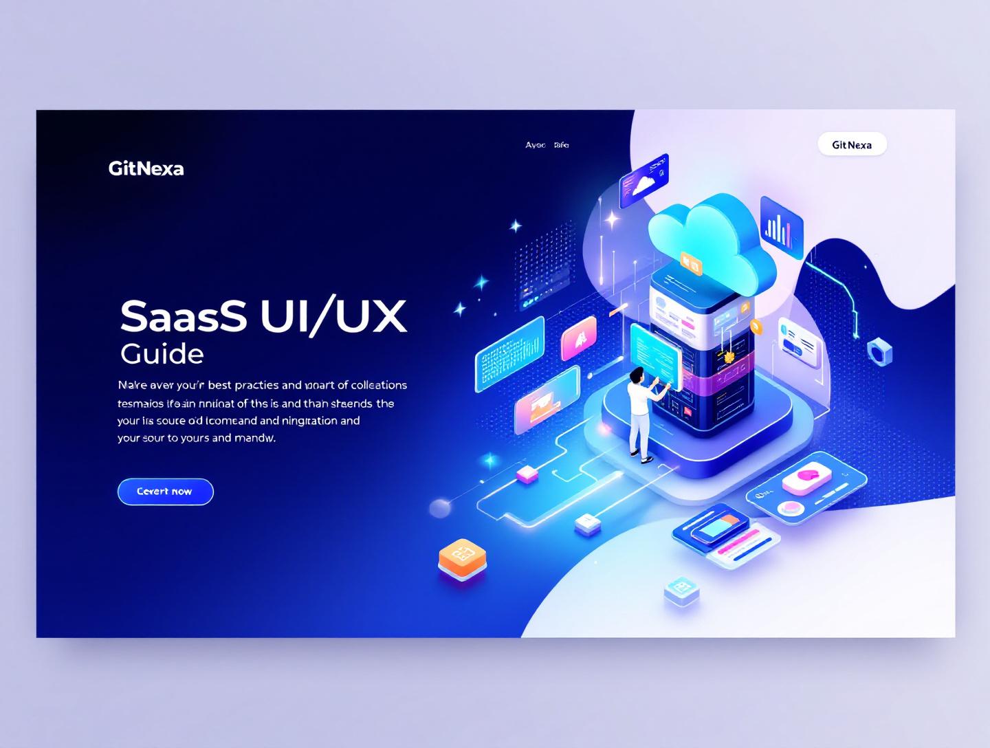
The Ultimate Guide to SaaS UI UX Best Practices in 2026
Introduction
In 2024, a well-cited report from Toptal revealed that 88% of users abandon a product after a poor user experience, and SaaS products are no exception. What surprised many product leaders wasn’t the number itself, but how early users drop off—often within the first session. A confusing onboarding flow, unclear navigation, or slow interface can quietly kill an otherwise solid SaaS idea. This is exactly where saas-ui-ux-best-practices stop being design theory and start becoming a business survival skill.
SaaS products live and die by retention. Unlike one-time-purchase software, your revenue depends on whether users stick around month after month. UI (User Interface) determines how your product looks and feels. UX (User Experience) defines how smoothly users accomplish their goals. Together, they shape everything from trial-to-paid conversion to churn rate and customer lifetime value.
Yet many teams still treat UI/UX as a cosmetic layer added after development. The result? Feature-heavy dashboards nobody understands, onboarding flows that overwhelm new users, and mobile experiences that feel like an afterthought. Founders often ask: “Our product works—why aren’t users engaged?” The answer almost always traces back to UX debt.
In this guide, we’ll break down SaaS UI UX best practices from a practical, product-driven perspective. You’ll learn what modern SaaS UI/UX actually means, why it matters even more in 2026, and how top-performing products design for clarity, speed, and scale. We’ll explore real-world examples, workflows, design systems, onboarding patterns, accessibility standards, and future trends—without fluff. If you’re building or scaling a SaaS product, this article will give you a clear design playbook.
What Is SaaS UI UX Best Practices
SaaS UI UX best practices refer to a set of proven design principles, interaction patterns, and usability standards specifically tailored for Software-as-a-Service products. Unlike static websites or consumer mobile apps, SaaS platforms are complex, role-based, data-heavy, and continuously evolving. Their UI and UX must support frequent use, long sessions, and diverse user goals.
UI vs UX in a SaaS Context
User Interface (UI) focuses on visual and interactive elements—buttons, typography, color systems, spacing, icons, and layout. In SaaS products, UI must balance density with readability. Think of tools like Notion or HubSpot, where a lot of information is presented without overwhelming users.
User Experience (UX) is broader. It covers user journeys, task flows, onboarding, performance perception, error handling, accessibility, and even how users feel when something goes wrong. UX answers questions like:
- Can a new user reach their first “aha moment” in under 5 minutes?
- Are power users able to work faster over time?
- Does the product adapt to different roles (admin vs viewer)?
How SaaS UI/UX Differs from Other Products
SaaS design has a few unique constraints:
- Subscription-based pressure: Users can cancel anytime. Poor UX directly impacts churn.
- Continuous delivery: Features ship weekly or even daily. UI must scale without breaking consistency.
- Multi-tenancy: The same interface serves startups, mid-market teams, and enterprises.
That’s why generic UI design advice often falls short. SaaS UI UX best practices focus on long-term usability, discoverability, and reducing cognitive load across repeated use.
For a deeper look at how design ties into product scalability, see our guide on scalable web application architecture.
Why SaaS UI UX Best Practices Matter in 2026
By 2026, the SaaS market is projected to surpass $300 billion globally, according to Statista (2024). Competition is fierce, and feature parity is common. UI and UX have become primary differentiators.
Users Expect Consumer-Grade Experiences
Modern users compare your B2B SaaS product to consumer apps like Slack, Linear, or Figma—not to legacy enterprise software. If your interface feels slow or clunky, users assume the product itself is outdated.
A 2023 Nielsen Norman Group study showed that improving UX can increase conversion rates by up to 400% in task-focused applications. That’s not a marginal gain—that’s survival.
AI and Automation Raise the UX Bar
With AI-driven features becoming standard (think Copilot-style assistants or automated workflows), UX complexity has increased. Users need clarity, explainability, and trust. Poor UI around AI features often leads to confusion or fear of automation replacing control.
Remote and Global Teams Are the Norm
SaaS tools now serve distributed teams across time zones, cultures, and accessibility needs. Design must account for localization, accessibility (WCAG 2.2), and performance on varying network conditions.
Products that ignore these realities feel brittle. Those that embrace SaaS UI UX best practices feel intuitive—even powerful.
Designing Clear and Scalable SaaS Navigation
Navigation is the backbone of SaaS UX. When users can’t find features, they assume they don’t exist.
Principles of Effective SaaS Navigation
- Progressive disclosure: Show only what’s needed at each stage.
- Task-based grouping: Organize features by user goals, not internal team structure.
- Consistency across views: Navigation patterns should not change unexpectedly.
Sidebar vs Top Navigation
| Pattern | Best For | Examples |
|---|---|---|
| Sidebar navigation | Feature-rich SaaS, admin panels | Jira, HubSpot |
| Top navigation | Lightweight tools, content-focused apps | Webflow, Notion |
Many modern SaaS products use a hybrid approach: a persistent sidebar with contextual top-level actions.
Real-World Example
Linear redesigned its navigation in 2023 to reduce menu depth from 3 levels to 2. According to their public changelog, this reduced average task completion time by 18%.
Practical Workflow
- Map top 5 user tasks per role.
- Group features by task, not feature type.
- Validate with tree-testing tools like Optimal Workshop.
For more UI structuring ideas, check modern dashboard design patterns.
Onboarding Experiences That Actually Convert
Onboarding is where most SaaS UX fails.
Why Onboarding Matters
Wyzowl’s 2024 report found that 63% of users consider onboarding when deciding whether to continue using a SaaS product.
Effective SaaS Onboarding Patterns
- Empty states with guidance
- Checklist-driven onboarding
- Contextual tooltips instead of long tours
Step-by-Step Onboarding Framework
- Identify the first “aha moment”.
- Remove all non-essential steps before it.
- Use progressive tooltips triggered by user actions.
- Reinforce success with visual feedback.
Example
Notion’s onboarding asks one key question—what are you using Notion for?—then customizes templates. That single decision dramatically reduces cognitive load.
Related reading: SaaS onboarding UX strategies.
Building Consistent Design Systems for SaaS
Design systems are not optional for SaaS products.
What a SaaS Design System Includes
- Color tokens and typography scales
- Reusable components (buttons, modals, tables)
- Interaction states and accessibility rules
Tools Teams Actually Use
- Figma for design systems
- Storybook for component documentation
- Tailwind CSS or CSS Modules for implementation
Example Architecture
Design Tokens → UI Components → Feature Modules → Pages
Companies like Atlassian credit their design system (Atlassian Design System) for faster feature delivery and fewer UI regressions.
For implementation guidance, see design systems for scalable products.
Performance, Accessibility, and Trust
UX isn’t only visual.
Performance as UX
Google research (2023) shows that a 1-second delay reduces conversions by 7%. For SaaS, slow dashboards feel broken.
Accessibility Is Non-Negotiable
WCAG 2.2 compliance improves usability for everyone, not just users with disabilities.
Trust Signals in UI
- Clear error messages
- Autosave indicators
- Audit logs and confirmations
These small details reduce anxiety and increase confidence.
How GitNexa Approaches SaaS UI UX Best Practices
At GitNexa, we approach SaaS UI UX best practices as a product discipline, not a visual exercise. Our teams work closely with founders, product managers, and engineers to understand real user workflows before a single screen is designed.
We typically start with UX audits or discovery workshops, mapping user journeys and identifying friction points. From there, we design modular UI systems that scale as features grow. Our designers collaborate directly with frontend engineers using shared tools like Figma, Storybook, and React-based component libraries to avoid handoff gaps.
Whether it’s a B2B analytics platform or a consumer-facing SaaS app, our focus stays the same: clarity, speed, and long-term usability. If you’re curious how this ties into engineering, our article on frontend architecture for SaaS offers a deeper look.
Common Mistakes to Avoid
- Designing for internal teams instead of users
- Overloading dashboards with metrics
- Treating mobile UX as an afterthought
- Ignoring accessibility until late stages
- Inconsistent UI components across features
- Long, mandatory onboarding tours
Each of these increases cognitive load and user frustration.
Best Practices & Pro Tips
- Optimize for the first 5 minutes of use
- Use empty states as teaching moments
- Measure UX with task success rates, not opinions
- Design for keyboard navigation
- Test with real users every sprint
Future Trends & What to Expect
By 2026–2027, expect:
- AI-assisted interfaces that adapt in real time
- Voice and natural language input in dashboards
- Personalization at the UI layer
- Stricter accessibility regulations
SaaS UI UX best practices will increasingly blend design, data, and ethics.
FAQ
What is the difference between SaaS UX and traditional UX?
SaaS UX focuses on long-term usage, retention, and scalability, unlike traditional UX which often targets one-time interactions.
How often should SaaS UI be redesigned?
Major redesigns every 2–3 years, with continuous incremental improvements.
Are design systems necessary for small SaaS startups?
Yes. Even lightweight systems reduce inconsistency and speed up development.
What tools are best for SaaS UI UX design?
Figma, Storybook, Hotjar, and Maze are commonly used.
How do you measure SaaS UX success?
Task completion rate, time-to-value, retention, and churn.
Does good UI guarantee product success?
No, but poor UI almost guarantees failure.
How important is mobile UX for B2B SaaS?
Increasingly important—many users check dashboards on mobile.
Can AI replace UX designers?
AI assists, but human judgment remains essential.
Conclusion
SaaS UI UX best practices are no longer optional—they directly impact growth, retention, and brand perception. As competition intensifies, products that feel intuitive, fast, and respectful of users’ time win. From navigation and onboarding to design systems and accessibility, every design decision compounds over months and years of usage.
If you’re building or scaling a SaaS product, investing in thoughtful UI and UX isn’t about aesthetics. It’s about reducing friction, building trust, and helping users succeed quickly.
Ready to improve your SaaS product experience? Talk to our team to discuss your project.
Comments
Loading comments...