Sub Category
Latest Blogs
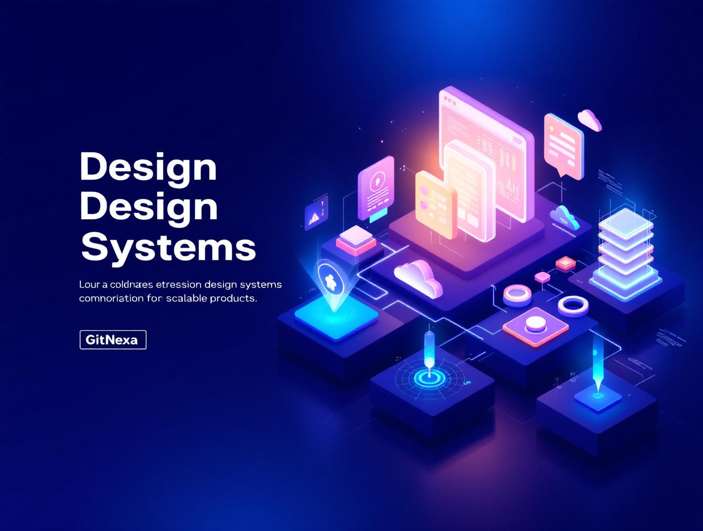
The Ultimate Guide to Design Systems for Scalable Products
Introduction
In 2024, a Nielsen Norman Group study found that teams using a mature design system shipped new features 34% faster than teams without one. That number tends to surprise founders and even seasoned product leaders. After all, design systems are often seen as a "nice-to-have" or something you invest in once your product feels big enough. The reality is the opposite. For any team building digital products that need to grow, design systems for scalable products are no longer optional.
The problem usually starts small. A few UI inconsistencies here. A duplicated button style there. Then the team grows, deadlines tighten, and suddenly every release introduces regressions. Designers spend more time policing styles than solving user problems. Developers reimplement the same components in slightly different ways. Product velocity slows, not because the team lacks talent, but because the foundation is shaky.
This is where design systems earn their keep. A well-implemented design system creates a shared language between design, development, and product. It reduces cognitive load, speeds up decision-making, and allows teams to scale without chaos. In the first 100 days of a fast-growing SaaS, that difference can decide whether you ship confidently or scramble constantly.
In this guide, we will break down what design systems really are, why they matter even more in 2026, and how successful companies use them to build scalable products. You will learn practical frameworks, see real-world examples, review component architectures, and walk away with steps you can apply to your own product. Whether you are a CTO, founder, designer, or engineering lead, this guide will help you build products that scale without losing coherence.
What Is Design Systems for Scalable Products?
At its core, a design system is a collection of reusable components, guided by clear standards, that can be assembled together to build digital products. But that definition barely scratches the surface.
A design system for scalable products goes beyond visual consistency. It includes:
- Design principles that guide decision-making
- A component library with documented behavior and usage
- Design tokens for colors, spacing, typography, and motion
- Accessibility standards and interaction guidelines
- Code implementations aligned with design assets
Think of it as the operating system for your product’s UI. Just as an OS manages hardware resources efficiently, a design system manages design and development resources so teams can build faster without breaking things.
For beginners, a design system answers basic questions like: Which button do I use here? What font size is correct? For experienced teams, it answers harder ones: How do we introduce a new pattern without breaking existing flows? How do we support multiple brands or themes from the same codebase?
Companies like Shopify (Polaris), Google (Material Design), and Atlassian have shown that design systems are not static style guides. They are living products that evolve with the organization. According to Google’s Material Design documentation, teams that adopt Material see measurable improvements in usability and development speed.
The key distinction is scalability. A static UI kit might work for a marketing site. A scalable design system supports multiple teams, products, and platforms over years of iteration.
Why Design Systems for Scalable Products Matter in 2026
The way products are built has changed dramatically. By 2026, most digital products will need to support multiple platforms, themes, and user contexts from day one.
Here are a few forces driving the urgency:
- Multi-platform expectations: Users expect consistent experiences across web, mobile, tablets, and even embedded devices.
- Remote and distributed teams: According to Statista, over 28% of tech workers were fully remote in 2024, increasing the need for shared systems.
- Faster release cycles: CI/CD pipelines and feature flags mean teams ship weekly or daily, not quarterly.
- Accessibility regulations: WCAG 2.2 enforcement is increasing globally, especially in the EU and US.
Without a design system, these pressures amplify friction. Each team makes local decisions that create global inconsistencies. Over time, the cost of change skyrockets.
Gartner predicted in 2023 that by 2026, organizations with strong design systems would reduce design and development rework by at least 30%. That saving directly impacts burn rate for startups and margin for enterprises.
Design systems also align closely with modern development practices like component-driven development, design tokens, and headless architectures. If your product roadmap includes growth, acquisitions, or platform expansion, a design system is one of the safest long-term investments you can make.
Core Components of Design Systems for Scalable Products
Design Principles and Foundations
Every strong design system starts with principles. These are not marketing slogans. They are practical filters for decision-making.
Examples from real teams:
- Shopify Polaris: "Clarity over cleverness"
- Atlassian: "Bold, optimistic, and practical"
Principles guide trade-offs. When two patterns compete, principles decide which one wins.
Foundations typically include:
- Color systems with semantic meaning
- Typography scales with clear hierarchy
- Spacing and layout rules
- Motion guidelines
These elements are usually implemented as design tokens.
{
  "color-primary": "#0052CC",
  "font-size-base": "16px",
  "spacing-sm": "8px"
}
Design tokens allow consistency across platforms and enable theming without rewriting components.
Component Libraries and Patterns
Components are the visible part of a design system. Buttons, inputs, modals, tables, and navigation patterns.
A scalable component library:
- Has a single source of truth
- Defines variants and states explicitly
- Includes accessibility requirements
Example using React:
<Button variant="primary" disabled>
  Save changes
</Button>
Companies like Airbnb maintain strict review processes for component changes to prevent fragmentation.
Documentation and Governance
Documentation is where most design systems fail. Not because teams do not document, but because documentation is outdated or unusable.
Effective documentation includes:
- When to use (and not use) a component
- Do and don’t examples
- Code and design references side by side
Tools like Storybook, Zeroheight, and Figma Dev Mode have become standard here.
Design Systems and Product Scalability in Real Teams
Case Study: SaaS Dashboard at Scale
A B2B SaaS company with 12 engineers and 3 designers approached GitNexa after hitting a wall. Feature delivery slowed as the product grew.
Problems observed:
- Five different button styles
- Inconsistent table behaviors
- Accessibility issues flagged by enterprise clients
The solution was not a redesign. It was a system.
Steps taken:
- Audit existing UI patterns
- Define core components
- Align design and code libraries
- Roll out incrementally
Within three months, release cycles shortened by 22%, and bug reports related to UI dropped significantly.
Startups vs Enterprises
| Aspect | Startup | Enterprise |
|---|---|---|
| Initial scope | Small | Large |
| Governance | Lightweight | Formal |
| Tooling | Figma + Storybook | Enterprise design platforms |
| Evolution | Rapid | Controlled |
Both need design systems. The difference is timing and governance, not necessity.
Implementation Workflow for Design Systems for Scalable Products
Step-by-Step Process
- UI Audit: Inventory existing components
- Define Principles: Agree on design values
- Create Tokens: Colors, typography, spacing
- Build Core Components: Start with high-usage elements
- Document Everything: Usage, code, accessibility
- Adopt Gradually: Refactor as you ship
This incremental approach avoids the "big bang" failure many teams experience.
Tooling Stack
Common stacks we see:
- Figma for design
- Storybook for components
- React, Vue, or Angular for implementation
- Style Dictionary for tokens
For accessibility guidance, refer to the official MDN accessibility docs.
How GitNexa Approaches Design Systems for Scalable Products
At GitNexa, we treat design systems as long-term infrastructure, not short-term deliverables. Our teams work closely across UI/UX, frontend engineering, and product strategy to ensure systems actually get adopted.
We typically start with a focused audit rather than a blank slate. Most products already have patterns hiding in plain sight. From there, we help clients define practical design principles and convert existing UI into reusable components.
Our experience building UI/UX design services, scalable web applications, and mobile apps informs how we structure systems that work across platforms.
We also emphasize governance. A design system without ownership quickly decays. GitNexa helps teams define contribution models, review processes, and documentation standards so systems evolve alongside the product.
The result is not just consistency, but confidence. Teams ship faster because they trust the system under their feet.
Common Mistakes to Avoid
- Treating the design system as a one-time project: Systems require ongoing maintenance.
- Overengineering too early: Start simple. Complexity can come later.
- Ignoring accessibility: Retrofitting accessibility is expensive.
- Poor documentation: If people cannot find answers, they will bypass the system.
- Lack of ownership: No owner means slow decay.
- Design-only systems: Code must be part of the system.
Best Practices & Pro Tips
- Start with the most reused components
- Align design tokens with code variables
- Use real product examples in documentation
- Review system changes like code changes
- Measure adoption and usage
- Budget time for system maintenance
Future Trends & What to Expect
Looking ahead to 2026–2027, design systems will become more automated and intelligent.
Trends to watch:
- AI-assisted component generation
- Cross-platform token standards
- Deeper integration with CI pipelines
- Personalization driven by design systems
According to Google’s design team, design tokens will become the backbone of multi-brand and white-label products.
FAQ: Design Systems for Scalable Products
What is the primary goal of a design system?
The primary goal is consistency at scale. It helps teams build faster while maintaining quality and usability.
When should a startup build a design system?
As soon as patterns start repeating. Usually earlier than founders expect.
Is a design system only for large teams?
No. Small teams benefit even more because it reduces decision fatigue.
How long does it take to build a design system?
An initial system can take 4–8 weeks, with ongoing iteration afterward.
Do design systems replace designers?
No. They free designers to focus on solving new problems.
How do design systems support accessibility?
They bake accessibility into components, reducing compliance risks.
Can design systems support multiple brands?
Yes, through theming and tokenization.
What tools are best for documentation?
Storybook, Zeroheight, and Figma are widely used.
Conclusion
Design systems for scalable products are not about visual polish. They are about building products that can grow without collapsing under their own weight. From faster development cycles to improved accessibility and happier teams, the benefits compound over time.
The most successful products treat design systems as shared infrastructure. They invest early, evolve intentionally, and govern thoughtfully. Whether you are scaling a startup or modernizing an enterprise platform, a strong design system will pay for itself many times over.
Ready to build a design system that actually scales? Talk to our team to discuss your project.
Comments
Loading comments...