Sub Category
Latest Blogs
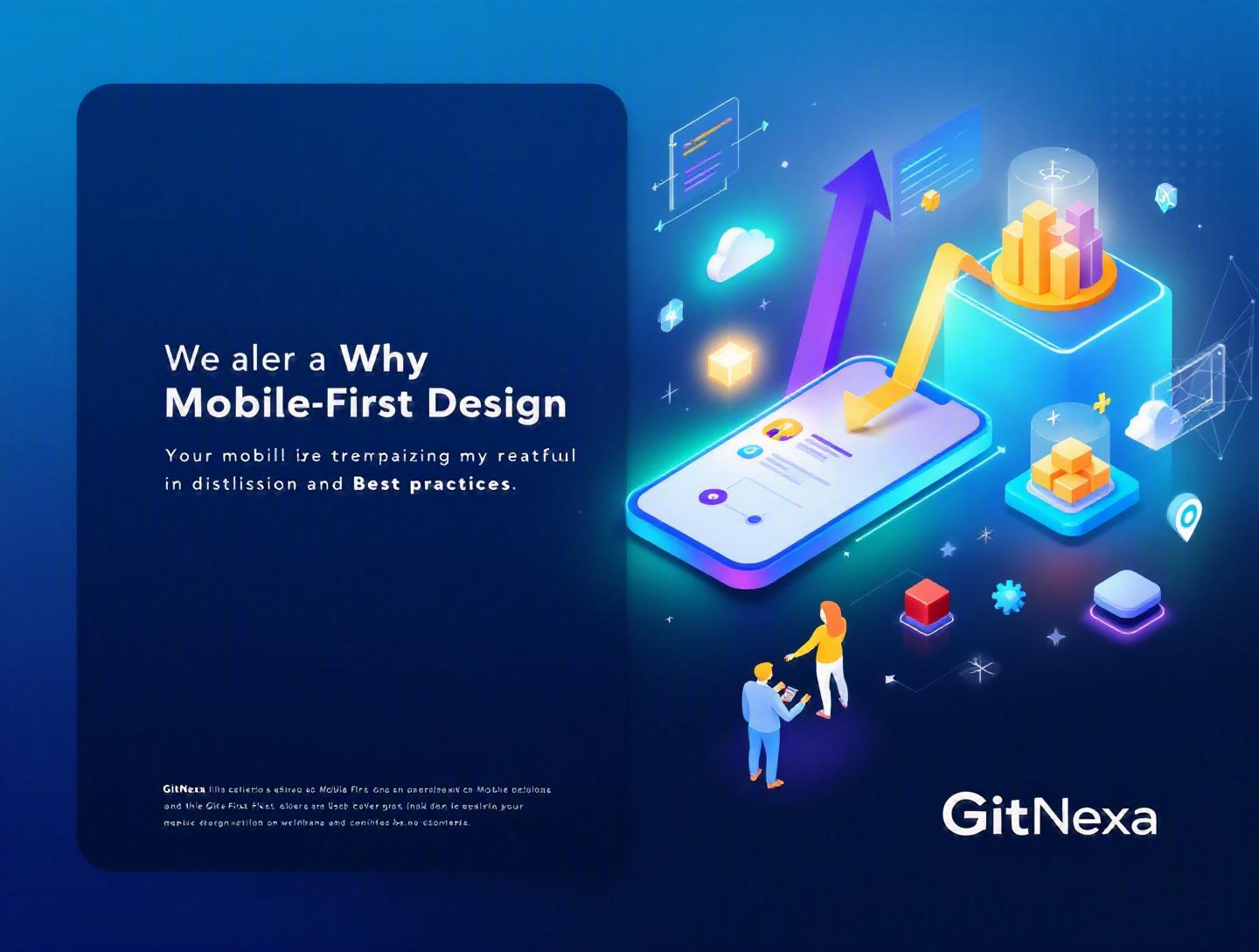
The Ultimate Guide to Mobile-First Design Best Practices
Introduction
In 2025, mobile devices accounted for over 59% of global website traffic, according to Statista. In some industries—food delivery, ride-sharing, social media—that number exceeds 80%. Yet many businesses still design for desktop first and "adapt" later. That approach is backward.
Mobile-first design is no longer a trend. It is the default expectation. If your product doesn’t perform flawlessly on a 6-inch screen with inconsistent network speeds, users won’t wait. They’ll leave.
Mobile-first design means designing for the smallest screen first, then progressively enhancing the experience for larger devices. It forces clarity. It forces prioritization. And in 2026, it directly impacts SEO rankings, conversion rates, and customer retention.
In this guide, we’ll break down what mobile-first design actually means, why it matters more than ever, and how to implement it correctly. You’ll see real-world examples, code snippets, performance considerations, UX strategies, and actionable best practices. If you’re a CTO, product manager, or founder planning your next digital product, this is your blueprint.
What Is Mobile-First Design?
Mobile-first design is a product design strategy where the user experience is created for mobile devices first, then expanded for tablets and desktops using progressive enhancement.
Instead of shrinking a desktop layout to fit a smaller screen, you start with constraints. Smaller screens. Limited bandwidth. Touch interactions. Reduced attention span.
Mobile-First vs Desktop-First
| Aspect | Mobile-First | Desktop-First |
|---|---|---|
| Starting Point | Small screens | Large screens |
| Design Philosophy | Progressive enhancement | Graceful degradation |
| Performance Focus | Critical | Often secondary |
| Content Prioritization | Essential only | Everything included |
Mobile-first design aligns closely with responsive web design principles outlined by Google’s developer guidelines (https://developers.google.com/search/docs). It also impacts Core Web Vitals—especially Largest Contentful Paint (LCP) and Interaction to Next Paint (INP).
Progressive Enhancement in Practice
You start with a simple HTML structure:
<meta name="viewport" content="width=device-width, initial-scale=1">
<link rel="stylesheet" href="styles.css">
Base CSS (mobile default):
body {
  font-family: system-ui, sans-serif;
}
.container {
  padding: 16px;
}
Enhancement for larger screens:
@media (min-width: 768px) {
  .container {
    max-width: 720px;
    margin: auto;
  }
}
Mobile-first CSS starts with no media query for mobile. Media queries add complexity only when needed.
Why Mobile-First Design Matters in 2026
Google switched to mobile-first indexing years ago. But in 2026, the stakes are higher.
1. Mobile-First Indexing Is the Standard
Google predominantly uses the mobile version of your content for ranking and indexing. If your mobile site has reduced content compared to desktop, your SEO suffers.
2. Performance Is a Revenue Driver
According to Google research, a 1-second delay in mobile load time can reduce conversions by up to 20%. Amazon famously reported that every 100ms of latency cost them 1% in sales.
3. Emerging Markets Are Mobile-Dominant
In India, Brazil, and much of Africa, mobile devices are the primary internet access point. Designing desktop-first excludes millions of users.
4. User Behavior Has Shifted
Shorter sessions. Faster decisions. Thumb-based navigation. Micro-interactions. Your interface must match how people actually use devices today.
Core Principles of Mobile-First Design
1. Content Prioritization
On mobile, space is limited. You must ask: what is essential?
A fintech dashboard example:
Mobile view:
- Account balance
- Recent transactions
- Primary CTA (Transfer)
Desktop enhancement:
- Spending charts
- Filters
- Export tools
This prioritization improves clarity across all devices.
2. Touch-Friendly Interactions
Apple’s Human Interface Guidelines recommend minimum tap targets of 44x44 pixels. Google suggests 48x48dp.
Common mistake: links placed too close together.
Better pattern:
button {
  padding: 14px 20px;
}
3. Performance Optimization
Mobile-first means performance-first.
Steps:
- Use responsive images (
srcset) - Compress with WebP/AVIF
- Lazy load non-critical assets
- Minify CSS/JS
- Use CDN (Cloudflare, Fastly)
Example:
<img src="image-400.jpg"
     srcset="image-800.jpg 2x"
     loading="lazy"
     alt="Product image">
4. Typography and Readability
Minimum 16px base font size. Line height: 1.5–1.7. Avoid long paragraphs.
Mobile-first typography improves accessibility and reduces bounce rates.
Responsive Architecture & Framework Choices
Choosing the right stack matters.
Popular Frameworks
| Framework | Use Case | Mobile Support |
|---|---|---|
| Tailwind CSS | Utility-first UI | Excellent |
| Bootstrap 5 | Rapid prototyping | Good |
| Next.js | SSR + SEO | Excellent |
| React Native | Cross-platform apps | Native |
For web apps, we often combine Next.js with Tailwind for performance and maintainability.
For native apps, React Native and Flutter dominate cross-platform development.
You can explore deeper architecture insights in our guide on modern web development architecture.
UX Patterns That Work on Mobile
1. Bottom Navigation
Used by Instagram, LinkedIn, and Airbnb.
Why it works:
- Thumb-accessible
- Clear hierarchy
- Reduces cognitive load
2. Progressive Disclosure
Reveal advanced options only when needed.
3. Single-Column Layouts
Multi-column layouts reduce readability on small screens.
4. Sticky CTAs
Especially effective in SaaS onboarding flows.
For more UI insights, see our breakdown on ui-ux-design-principles-for-conversion.
Performance Engineering for Mobile-First
Mobile networks fluctuate. Even 5G isn’t universal.
Key Metrics
- LCP under 2.5 seconds
- INP under 200ms
- CLS under 0.1
Measure using Lighthouse or WebPageTest.
Optimization Checklist
- Remove unused JavaScript
- Implement code splitting
- Use HTTP/3
- Optimize server response times
- Deploy edge caching
Cloud optimization strategies are covered in our post on cloud-cost-optimization-strategies.
How GitNexa Approaches Mobile-First Design
At GitNexa, mobile-first design is not an afterthought—it’s the foundation.
We begin every project with mobile wireframes before desktop layouts. Our UI/UX team conducts user journey mapping based on thumb zones and behavioral heatmaps. Then our developers implement responsive layouts using scalable component systems.
We prioritize performance from day one—image optimization pipelines, lazy loading strategies, and server-side rendering where necessary. Our DevOps team ensures CDN distribution and monitoring for Core Web Vitals.
Whether it’s a SaaS dashboard, eCommerce platform, or enterprise portal, our approach combines design clarity with technical precision.
Common Mistakes to Avoid
- Designing desktop first and trimming features later
- Hiding critical content on mobile
- Ignoring performance testing on real devices
- Using tiny tap targets
- Overloading mobile navigation
- Neglecting accessibility
- Not testing under slow network conditions
Best Practices & Pro Tips
- Start wireframing at 375px width.
- Use mobile analytics to prioritize features.
- Adopt component-based design systems.
- Optimize images before development.
- Test on physical devices, not just emulators.
- Monitor Core Web Vitals monthly.
- Use feature flags for progressive rollouts.
- Conduct usability testing every quarter.
Future Trends & What to Expect (2026–2027)
- AI-personalized mobile interfaces
- Voice-assisted navigation
- Foldable device optimization
- Edge rendering for ultra-fast performance
- Greater integration with wearable ecosystems
Gartner predicts that by 2027, over 70% of digital interactions will involve mobile or wearable devices.
FAQ
What is mobile-first design in simple terms?
It’s a design strategy where you create the mobile version of a product first, then enhance it for larger screens.
Is mobile-first better for SEO?
Yes. Google uses mobile-first indexing, meaning your mobile site determines rankings.
How is mobile-first different from responsive design?
Responsive design adapts layouts. Mobile-first is a strategy that starts with mobile constraints first.
What screen size should I design for first?
Typically 375px width (iPhone standard), then scale upward.
Does mobile-first mean ignoring desktop?
No. It means prioritizing mobile and enhancing for desktop.
Is mobile-first necessary for B2B platforms?
Yes. Decision-makers increasingly review dashboards and analytics on mobile.
How do I test mobile performance?
Use Lighthouse, WebPageTest, and real device testing.
What industries benefit most from mobile-first design?
eCommerce, fintech, healthcare, logistics, SaaS, and media platforms.
Conclusion
Mobile-first design forces clarity, speed, and user focus. It aligns with how people access the internet today and how search engines evaluate your product. When done correctly, it improves performance, boosts conversions, and simplifies scaling across devices.
The question is no longer whether you should adopt mobile-first design—it’s how quickly you can implement it correctly.
Ready to build a mobile-first digital product? Talk to our team to discuss your project.
Comments
Loading comments...