Sub Category
Latest Blogs
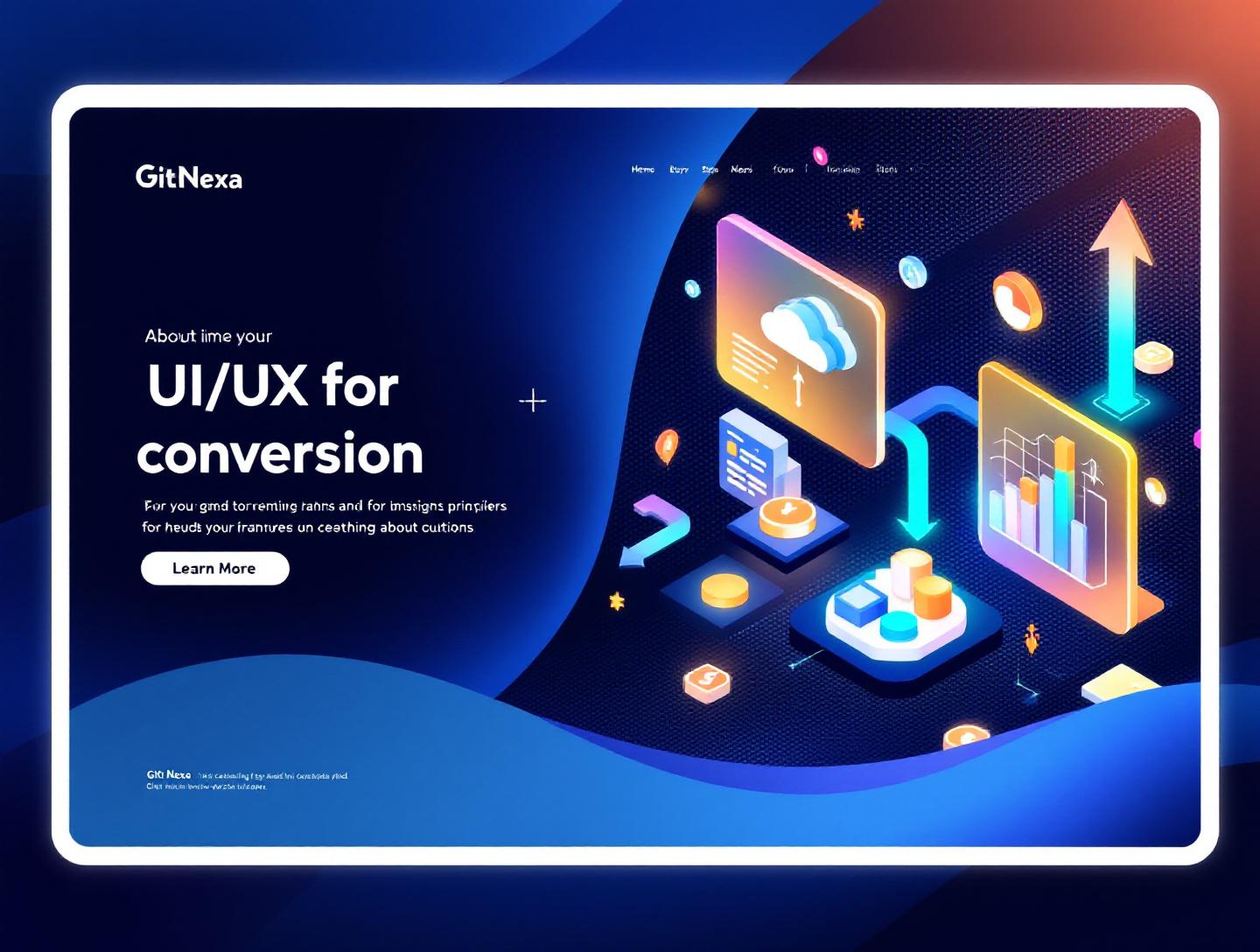
The Ultimate UI/UX Design Principles for Conversion
Introduction
In 2025, Forrester reported that a well-designed user interface can raise a website’s conversion rate by up to 200%, while better UX design can boost conversions by as much as 400%. That’s not a marginal gain. That’s the difference between a startup scraping by and one scaling predictably.
And yet, many businesses still treat UI/UX as a cosmetic layer—something to "polish" after development. The result? Confusing navigation, weak calls-to-action, slow load times, and friction-filled checkout flows that silently kill revenue.
This is where ui-ux-design-principles-for-conversion come in. When applied correctly, these principles transform digital products into high-performing growth engines. They guide users naturally from awareness to action—whether that action is signing up, booking a demo, or completing a purchase.
In this guide, you’ll learn what UI/UX design principles for conversion really mean, why they matter more than ever in 2026, and how to apply them with practical frameworks, real-world examples, and technical insights. We’ll also explore how GitNexa approaches conversion-focused design and what trends will shape the next wave of digital experiences.
If you’re a founder, CTO, product manager, or growth leader, this isn’t about making things "look better." It’s about designing systems that convert.
What Is UI/UX Design for Conversion?
UI (User Interface) refers to the visual elements users interact with—buttons, typography, layout, color schemes, forms, and microinteractions. UX (User Experience) encompasses the overall journey: usability, information architecture, accessibility, and emotional response.
When we talk about ui-ux-design-principles-for-conversion, we’re referring to structured design methodologies that intentionally guide users toward a measurable goal.
Conversion-focused design blends:
- Behavioral psychology (e.g., Hick’s Law, Fitts’s Law)
- Interaction design
- Data analytics and A/B testing
- Accessibility standards (WCAG 2.2)
- Performance optimization
It’s not just aesthetics—it’s engineering persuasion ethically.
UI vs UX vs Conversion Design
| Aspect | UI Design | UX Design | Conversion Design |
|---|---|---|---|
| Focus | Visual elements | User journey | Business outcomes |
| Metrics | Clicks, engagement | Task success rate | Revenue, signups |
| Tools | Figma, Sketch | Miro, Hotjar | GA4, VWO, Optimizely |
Conversion design overlaps with CRO (Conversion Rate Optimization), but it starts earlier—during product architecture.
For example, Amazon’s one-click checkout is not just UX convenience. It’s conversion engineering at scale.
Why UI/UX Design Principles for Conversion Matter in 2026
The digital landscape in 2026 is brutally competitive:
- Global ecommerce sales are projected to exceed $8 trillion (Statista, 2025).
- 53% of users abandon mobile sites that take longer than 3 seconds to load (Google).
- 88% of users are less likely to return after a bad user experience.
At the same time:
- AI-generated content has increased content saturation.
- Privacy regulations (GDPR, CCPA updates) have reduced tracking precision.
- Users expect personalization and speed by default.
That means you can’t rely on traffic growth alone. You must improve conversion efficiency.
UI/UX design directly impacts:
- Customer acquisition cost (CAC)
- Lifetime value (LTV)
- Brand trust
- Product adoption rates
We’ve seen SaaS companies improve demo bookings by 27% simply by restructuring hero sections and clarifying value propositions.
Conversion-focused design is no longer optional—it’s survival strategy.
Principle #1: Clarity Over Creativity
Clarity converts. Confusion repels.
Many brands over-prioritize visual novelty. But users don’t visit your website to admire typography—they come to solve a problem.
Real-World Example: Slack
Slack’s homepage follows a simple structure:
- Clear headline
- Subheading with outcome-driven messaging
- Primary CTA
- Social proof
No ambiguity. No friction.
Actionable Process
- Define your primary conversion goal.
- Align headline with user intent.
- Remove secondary CTAs above the fold.
- Validate clarity with 5-second tests.
Code Example: Clear CTA Structure
<section class="hero">
  <h1>Manage Your Projects 3x Faster</h1>
  <p>Collaborate, automate, and deliver on time.</p>
  <a href="/signup" class="cta-primary">Start Free Trial</a>
</section>
Clarity also applies to navigation. According to Nielsen Norman Group, reducing menu options improves decision speed.
For deeper performance improvements, explore our guide on web performance optimization strategies.
Principle #2: Reduce Friction at Every Step
Every extra click is a tax on conversion.
Friction includes:
- Long forms
- Forced account creation
- Slow load time
- Poor mobile usability
Example: Shopify Checkout Optimization
Shopify improved checkout flow by:
- Enabling guest checkout
- Autofilling shipping details
- Showing progress indicators
Result: Increased checkout completion rates.
UX Pattern: Progressive Disclosure
Instead of overwhelming users, reveal complexity gradually.
Step 1: Email
Step 2: Company Details
Step 3: Payment Info
Performance Optimization
Use lazy loading and code splitting:
const Checkout = React.lazy(() => import('./Checkout'));
Faster UI equals higher conversions.
Learn more in our DevOps automation guide.
Principle #3: Visual Hierarchy & Attention Control
Users scan in F-patterns and Z-patterns.
You control attention with:
- Size
- Color contrast
- Spacing
- Motion
Example: Airbnb
Airbnb uses large imagery, bold headlines, and minimal distraction to focus attention on search.
Hierarchy Checklist
- Primary action stands out.
- Supporting text is secondary.
- White space improves readability.
- Accessibility contrast ratio ≥ 4.5:1.
Refer to WCAG guidelines: https://www.w3.org/WAI/standards-guidelines/wcag/
Comparison Table
| Weak Hierarchy | Strong Hierarchy |
|---|---|
| Multiple bold buttons | Single dominant CTA |
| Dense text blocks | Chunked sections |
| Low contrast | Clear visual priority |
Hierarchy isn’t decoration—it’s direction.
Principle #4: Trust Signals & Social Proof
Trust reduces hesitation.
Conversion psychology shows users look for reassurance before committing.
Types of Trust Signals
- Testimonials
- Client logos
- Case studies
- Security badges
- Transparent pricing
Example: SaaS Landing Page Structure
- Hero with CTA
- Benefits
- Customer testimonials
- Case study
- Pricing
We’ve covered similar strategies in our article on building high-converting SaaS platforms.
Social proof increases conversion because it lowers perceived risk.
Principle #5: Data-Driven Iteration
Design isn’t guesswork. It’s experimentation.
A/B Testing Framework
- Form hypothesis.
- Create variant.
- Run experiment (minimum 2 weeks).
- Analyze statistical significance.
- Implement winner.
Tools:
- Google Optimize alternatives (VWO, Optimizely)
- Hotjar for heatmaps
- GA4 for behavior tracking
Sample Hypothesis
"Changing CTA from 'Submit' to 'Get My Free Audit' will increase signups by 15%."
Without measurement, UI/UX improvements are opinions.
How GitNexa Approaches UI/UX Design for Conversion
At GitNexa, we treat UI/UX as a growth function—not a design deliverable.
Our approach combines:
- User research & persona mapping
- Wireframing and prototyping in Figma
- Conversion-focused design systems
- Frontend optimization with React, Next.js
- Continuous A/B testing
We integrate UX strategy into broader initiatives like custom web application development and mobile app development lifecycle.
The goal isn’t just attractive interfaces—it’s measurable business outcomes.
Common Mistakes to Avoid
- Designing without clear conversion goals.
- Overloading pages with multiple CTAs.
- Ignoring mobile-first design.
- Neglecting accessibility standards.
- Using generic stock imagery.
- Skipping user testing.
- Optimizing for aesthetics over performance.
Each mistake increases friction and lowers trust.
Best Practices & Pro Tips
- Design mobile-first, scale upward.
- Use action-driven CTAs.
- Keep forms under 5 fields when possible.
- Use social proof near CTAs.
- Optimize page speed under 2 seconds.
- Apply consistent spacing systems.
- Validate assumptions with heatmaps.
- Personalize content where possible.
- Conduct usability tests quarterly.
- Align UX with brand voice.
Future Trends & What to Expect (2026–2027)
- AI-driven personalization at interface level.
- Voice and conversational UI growth.
- Zero-click onboarding flows.
- Increased emphasis on accessibility compliance.
- Emotion-driven microinteractions.
- Predictive UX powered by machine learning.
According to Gartner, 80% of customer interactions will involve AI by 2026.
Design must adapt.
FAQ
What are UI/UX design principles for conversion?
They are structured design strategies that guide users toward completing desired actions such as purchases or signups.
How does UI impact conversion rates?
Clear layouts, strong CTAs, and optimized load times directly improve user decisions and reduce drop-offs.
What is the ideal conversion rate?
It varies by industry, but 2–5% is average for ecommerce; SaaS can range higher with optimized funnels.
How can I test my UI for better conversions?
Use A/B testing tools like VWO or Optimizely and analyze user behavior via heatmaps.
Does mobile UX affect SEO?
Yes. Google uses mobile-first indexing, so poor mobile UX impacts rankings.
What tools are best for UX design?
Figma, Adobe XD, Hotjar, GA4, and usability testing platforms like Maze.
How often should UX be updated?
Continuously. At minimum, review quarterly based on data.
Is accessibility important for conversion?
Absolutely. Accessible sites reach broader audiences and improve usability for all users.
Conclusion
UI/UX design principles for conversion aren’t trends—they’re disciplined systems that drive measurable growth. From clarity and friction reduction to visual hierarchy and data-driven iteration, each principle plays a role in turning visitors into customers.
In 2026, competition is fierce and user expectations are high. Businesses that treat UX as a strategic investment—not a cosmetic layer—will outperform their competitors.
Ready to optimize your product for higher conversions? Talk to our team to discuss your project.
Comments
Loading comments...