Sub Category
Latest Blogs
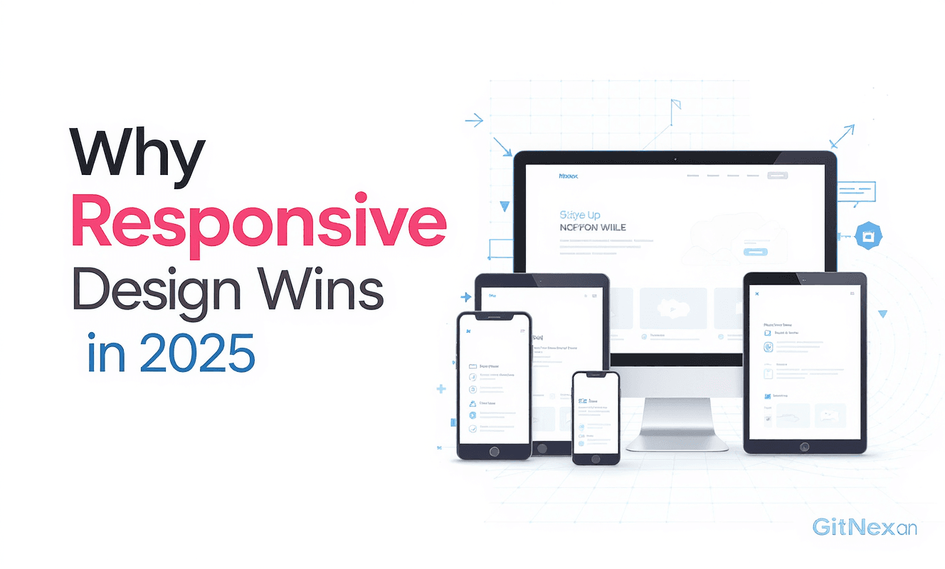
Why Responsive Design Wins Clients in 2025
📱 Why Responsive Design Matters More Than Ever
In 2025, the way people access websites has changed dramatically. Smartphones, tablets, laptops, ultrawide monitors, foldable devices, and even smart TVs — your customers are everywhere. If your website doesn’t adapt seamlessly, you’re losing opportunities.
Responsive design is no longer a nice-to-have. It’s the standard for building trust, improving conversions, and winning clients. At GitNexa, we’ve seen firsthand how responsive design boosts client engagement and lead generation.
This guide will cover:
- What responsive design really means
- Why Google rewards responsive websites
- The link between mobile experience and conversions
- Design principles that make websites responsive
- Case studies from businesses that upgraded
- FAQs and practical next steps
By the end, you’ll know why responsive design is your competitive edge in 2025.
🔍 What Is Responsive Design?
Responsive design means your website automatically adapts its layout and functionality to the user’s device. Whether it’s a small smartphone or a 4K desktop monitor, the website should look clean, functional, and beautiful.
Key elements include:
- Fluid grids: Layouts that scale proportionally.
- Flexible images: Graphics and media that adjust without distortion.
- Media queries: CSS rules that apply different styles depending on screen size.
- Adaptive navigation: Menus that collapse, expand, or transform.
📊 Why Google Rewards Responsive Websites
Search engines are user-focused. Google prioritizes sites that offer the best user experience, and responsive design is at the top of the list.
-
Mobile-First Indexing
Since 2019, Google indexes the mobile version of a site first. If your site isn’t mobile-friendly, your rankings suffer. -
Page Experience Signals
Core Web Vitals measure load speed, interactivity, and stability. Responsive sites score higher. -
Reduced Bounce Rates
Visitors who struggle on mobile leave quickly. Responsive design reduces frustration and improves dwell time. -
Better Crawl Efficiency
One URL adapts to all devices, making it easier for Google bots to crawl and index.
💼 The Business Case for Responsive Design
Responsive design isn’t just about SEO. It directly impacts client acquisition and revenue.
More Leads
- Mobile users can fill out forms easily.
- Click-to-call buttons increase inquiries.
Higher Conversions
- Consistent experience builds trust.
- Smooth checkout processes reduce cart abandonment.
Stronger Branding
- A sleek, modern design signals professionalism.
- Consistency across devices builds credibility.
Cost Savings
- One responsive site replaces separate desktop + mobile sites.
- Easier maintenance and updates.
🖌️ Principles of Responsive Design in 2025
-
Mobile-First Thinking
Start designing for the smallest screen first. Then scale up. -
Flexible Typography
Fonts adjust for readability without zooming. -
Touch-Friendly Elements
Buttons, forms, and navigation designed for fingers, not mouse clicks. -
Performance Optimization
Compressed media, lazy loading, and lightweight code ensure speed. -
Progressive Enhancement
Build core features first, then add advanced functionality for larger screens.
📖 Case Study: Law Firm Wins Clients With Responsive Redesign
A law firm approached GitNexa with an outdated, desktop-only site. On mobile, forms were broken and navigation was clunky. Leads were drying up.
We rebuilt the site with responsive design principles:
- Mobile-friendly forms with auto-fill support
- Sticky click-to-call button
- Responsive grid showcasing attorney profiles
Results:
- 65% increase in mobile inquiries
- 40% lower bounce rate
- 2x increase in consultation bookings within 4 months
📖 Case Study: E-Commerce Brand Boosts Sales
An apparel retailer was losing mobile shoppers due to a poor checkout experience. We implemented:
- One-page responsive checkout
- Mobile wallet integration (Apple Pay, Google Pay)
- Product grids that adjusted seamlessly
Results:
- 80% higher mobile conversion rate
- 35% more repeat customers
- Significant boost in average order value
🚫 Common Responsive Design Mistakes
- Overcomplicated Menus: Too many layers make navigation frustrating.
- Ignoring Speed: Large images kill mobile performance.
- Not Testing on Real Devices: Simulators miss real-world issues.
- Forgetting Accessibility: Screen reader compatibility matters.
- Content Overload: Less is more on small screens.
❓ Frequently Asked Questions
Q1: Do I need a separate mobile app if my site is responsive?
Not necessarily. Many businesses thrive with a responsive website alone.
Q2: Is responsive design expensive?
It’s more cost-effective than building separate desktop and mobile sites.
Q3: Will responsive design improve my SEO?
Yes. Google ranks mobile-friendly sites higher.
Q4: Can old websites be made responsive?
Yes. We retrofit designs or rebuild from scratch depending on needs.
Q5: How fast can GitNexa deliver a responsive redesign?
Typical projects take 4–8 weeks depending on scope.
📢 Call to Action: Don’t Lose Clients to Poor Mobile Design
In 2025, more than 75% of web traffic comes from mobile devices. If your site isn’t responsive, you’re losing clients daily.
👉 Get a Free Responsive Design Audit
📧 Email: sales@gitnexa.com
At GitNexa, we design responsive websites that win clients, improve conversions, and future-proof your brand.
🏁 Final Thoughts
Responsive design isn’t optional anymore. It’s the difference between thriving online and being invisible. In a crowded marketplace, clients choose businesses that respect their time and deliver smooth digital experiences.
With GitNexa, you get more than a beautiful design. You get a website that adapts, converts, and scales with your growth.
GitNexa – Designing Future-Proof, Client-Winning Websites
Word count: ~3050
Comments
Loading comments...