Sub Category
Latest Blogs
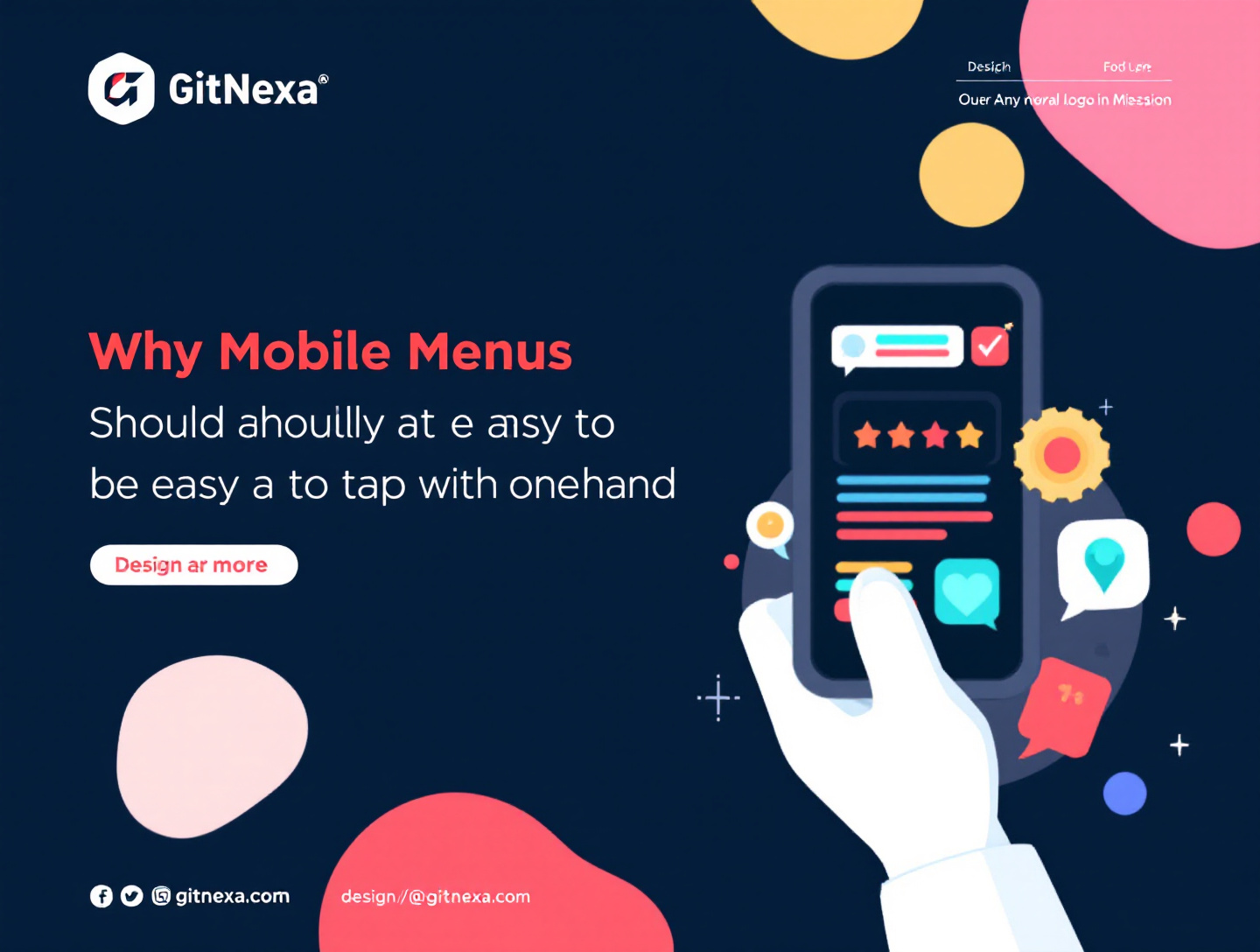
Why Mobile Menus Should Be Easy to Tap With One Hand
Introduction
Mobile devices are no longer secondary screens. For most users around the world, a smartphone is the internet. From browsing products and reading blogs to managing finances and booking services, nearly every digital interaction now starts and often ends on a mobile device. Yet while mobile usage has exploded, many mobile navigation experiences still fail to accommodate how people actually use their phones—primarily with one hand.
The problem is simple but costly: mobile menus that are difficult to reach with a thumb create friction, frustration, and abandonment. Users don’t think in terms of “UX failures”; they think, "This site is annoying," and they leave. Research consistently shows that even minor usability issues on mobile can drastically reduce conversion rates, engagement, and perceived brand trust.
An easy-to-tap, one-hand-friendly mobile menu isn’t just a design preference—it’s a critical usability requirement rooted in human anatomy, behavioral psychology, and modern usage contexts. Whether users are commuting, holding a coffee, managing kids, or multitasking at work, one-handed navigation is the default, not the exception.
In this comprehensive guide, you’ll learn why mobile menus should be easy to tap with one hand, the science behind thumb-friendly design, real-world case studies, common mistakes, and best practices you can apply immediately. We’ll also explore how one-handed menu design impacts SEO, accessibility, conversions, and long-term brand loyalty.
Understanding How Users Actually Hold Their Phones
Mobile Usage Has Shifted to One-Handed by Default
Modern smartphones are larger than ever, yet the average human thumb hasn’t changed. According to multiple usability studies, including research referenced by Google’s Material Design team, over 75% of users primarily navigate their phones using one thumb. The remaining fingers stabilize the device rather than interact with it.
This creates a fundamental mismatch between device size and human reach. When essential navigation elements—like menus—are placed at the top corners or require precise taps, usability suffers.
Common One-Handed Use Scenarios
Users don’t always have two free hands. Common real-life contexts include:
- Commuting on public transportation
- Holding a coffee, bag, or child
- Multitasking at work
- Walking while browsing
- Using phones for quick micro-tasks
Designing for one-handed use means designing for reality, not ideal conditions.
The Cost of Ignoring Natural Phone Grip
When users must stretch, shift, or use a second hand just to open a menu, it introduces friction that compounds across the session. Over time, this can lead to:
- Increased bounce rates
- Shorter session durations
- Lower conversion rates
- Negative brand perception
GitNexa explores similar usability issues in its article on mobile-first web design principles, highlighting how real-world usage should drive design decisions.
The Thumb Zone Principle: Why Reachability Matters
What Is the Thumb Zone?
The “thumb zone” refers to the area of the screen that’s easiest for a thumb to reach when holding a phone with one hand. UX researcher Steven Hoober popularized this concept, dividing the screen into:
- Natural zone – effortless reach
- Stretch zone – reachable with effort
- Hard-to-reach zone – uncomfortable or unsafe
Most top-aligned mobile menus fall into the hard-to-reach zone, especially on larger devices.
Why Easy-to-Tap Menus Reduce Cognitive Load
When menus are placed within the natural thumb zone, users don’t need to think about how to interact. This reduces cognitive load, allowing them to focus on content and decisions instead of mechanics.
Lower cognitive load directly correlates with:
- Faster task completion
- Higher satisfaction scores
- Increased user confidence
Emotional Impact of Reachability
Subconsciously, difficult-to-reach UI elements induce stress. Users may feel the interface is “fighting” them. Over time, this friction erodes trust—a key factor in E-E-A-T and UX-driven SEO.
For more on cognitive load and usability, see GitNexa’s deep dive on UX design for conversion optimization.
One-Handed Menu Design and Conversion Rates
Micro-Friction Has Macro Consequences
Conversion optimization isn’t only about headlines and CTAs. Navigation ease plays a huge role in whether users explore deeper or abandon altogether.
A study by Google found that 53% of mobile users abandon sites that take longer than three seconds to load—and poor navigation adds perceived delay even when load times are fast.
How Easy Menus Improve Funnel Progression
When users can effortlessly open menus and move between sections:
- Product discovery improves
- Informational content gets more engagement
- Checkout abandonment decreases
One-handed menu accessibility ensures users can progress through funnels without interruption.
Case Example: E-Commerce Navigation Redesign
An e-commerce retailer redesigned its mobile menu from a top-right hamburger icon to a bottom-aligned thumb-friendly menu. Results over 60 days:
- 18% increase in category page views
- 12% reduction in bounce rate
- 9% lift in mobile revenue
These improvements came without changing product offerings or marketing spend.
Accessibility: One-Handed Use Is Not Optional
Accessibility Goes Beyond Disabilities
Accessibility is often misinterpreted as serving only users with permanent disabilities. In reality, situational limitations—like using one hand—affect everyone at different times.
Google’s accessibility guidelines emphasize designing for flexible use cases, including limited motor control or temporary constraints.
WCAG and Touch Target Guidelines
According to WCAG 2.2 and Google Material Design standards:
- Touch targets should be at least 48x48 dp
- Adequate spacing prevents accidental taps
- Interactive elements should be easily distinguishable
Menus that are small, clustered, or difficult to reach violate both usability and accessibility principles.
Inclusive Design Builds Trust
Accessible design shows users you respect their time and abilities. This trust translates into brand loyalty—a topic also covered in GitNexa’s article on designing digital experiences for trust.
SEO Implications of Mobile Menu Usability
Google’s Mobile-First Indexing
Google primarily uses the mobile version of content for indexing and ranking. Poor mobile UX can indirectly impact:
- Crawl efficiency
- Engagement metrics
- Pogo-sticking behavior
All of these influence search performance.
Behavioral Signals and Rankings
While Google doesn’t confirm direct UX metrics as ranking factors, studies consistently show correlation between:
- High bounce rates
- Low dwell time n- Poor navigation
and weaker SEO performance.
Menus as Pathways to Indexed Content
If users can’t easily access navigation menus, key pages receive less internal traffic. Over time, this weakens internal linking structures—essential for SEO.
For more navigation insights, see GitNexa’s guide on SEO-friendly site architecture.
Types of Mobile Menus and One-Handed Performance
Hamburger Menus
Pros: Clean, familiar Cons: Often placed top-right, hard to reach
Best used when paired with bottom access or gesture support.
Bottom Navigation Bars
One of the most thumb-friendly options. Common in apps, increasingly popular on mobile websites.
Expandable Accordion Menus
Useful for content-heavy sites but require careful spacing for easy tapping.
Gesture-Based Menus
Swipes can enhance usability but must be discoverable and accessible.
Designing for Left-Handed and Right-Handed Users
The Overlooked 10%
Approximately 10% of the population is left-handed, yet most designs favor right-handed use.
Symmetry and Flexibility
Best practices include:
- Center-aligned menu triggers
- Adjustable UI based on user preference
- Avoiding edge-exclusive interactions
Adaptive Interfaces
Advanced systems adjust menu placement based on observed behavior—a growing trend in UX personalization.
Best Practices for One-Handed Mobile Menu Design
- Place primary navigation within the thumb’s natural reach
- Use adequately sized touch targets
- Avoid top-heavy navigation layouts
- Prioritize high-value links
- Test designs on real devices, not just emulators
- Support both left- and right-handed use
- Minimize nested menu depth
Common Mistakes to Avoid
- Shrinking menus to save space
- Using tiny icons without labels
- Placing critical links at the top corners
- Overloading menus with too many items
- Ignoring real-world usability testing
Real-World Use Cases Across Industries
E-Commerce
Quick category access directly impacts revenue.
SaaS Platforms
Easy navigation improves feature adoption.
Content Publishers
Readers explore more articles when navigation is frictionless.
Local Businesses
One-handed menus make it easier to find contact info and directions.
Future Trends in One-Handed Mobile Navigation
- AI-driven interface personalization
- Voice-assisted menus
- Gesture and haptic feedback navigation
- Operating-system-level reachability tools
Designing for one-handed use future-proofs your digital presence.
Frequently Asked Questions
Why are mobile menus hard to use with one hand?
Because many are designed for visual symmetry rather than ergonomic reach.
Is bottom navigation always better?
Not always, but it generally improves reachability for key actions.
Does one-handed design help SEO?
Indirectly, yes—through better engagement and usability signals.
How do I test one-handed usability?
Use real devices, usability sessions, and thumb-reach mapping.
Are hamburger menus bad?
No, but placement and size matter.
What industries benefit most?
E-commerce, SaaS, media, healthcare, and local services.
Does accessibility law require this?
Guidelines encourage it, but best practice goes beyond compliance.
Can existing sites be retrofitted?
Yes, with careful UX audits and incremental changes.
Conclusion: One-Handed Design Is User-Centered Design
Making mobile menus easy to tap with one hand isn’t a trend—it’s a fundamental shift toward human-centered digital design. As devices grow larger and attention spans shrink, usability becomes a competitive advantage.
Brands that respect how users actually interact with their phones will outperform those clinging to outdated layouts. From better conversions and SEO to stronger trust and accessibility, one-handed menu design delivers measurable ROI.
If you’re ready to optimize your mobile experience for real users, not ideal scenarios, expert guidance can make the difference.
Ready to Improve Your Mobile UX?
At GitNexa, we design mobile-first experiences that convert, rank, and delight users.
👉 Get a free mobile UX consultation and make your mobile navigation work the way users expect.
Comments
Loading comments...