Sub Category
Latest Blogs
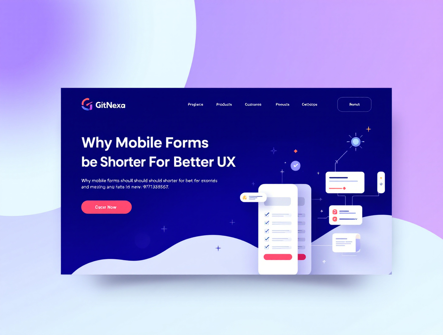
Why Mobile Forms Should Be Shorter for Better UX and Conversions
Introduction
Mobile devices have become the primary way people interact with the internet. From shopping and booking services to signing up for newsletters or requesting demos, users complete critical tasks on screens that fit in the palm of their hands. Yet, one of the biggest friction points in mobile user experience (UX) remains poorly designed forms. Long, complex mobile forms are one of the top reasons users abandon websites, apps, and digital services before converting.
Research consistently shows that attention spans on mobile are shorter, interactions are more contextual, and users are often multitasking. In this environment, forcing people to complete lengthy forms with multiple fields, unnecessary questions, or confusing layouts damages both usability and trust. Every additional field creates cognitive load, increases friction, and raises the likelihood that users will drop off before submitting.
This comprehensive guide explores why mobile forms should be shorter for better UX, higher conversion rates, and stronger brand perception. You will learn the psychology behind mobile behavior, understand the quantitative impact of form length, review real-world case studies, and discover actionable strategies to design short, high-performing mobile forms. Whether you are a marketer, UX designer, product manager, or business owner, this guide will help you turn mobile forms into conversion catalysts rather than obstacles.
The Rise of Mobile-First User Behavior
Mobile-first behavior is no longer a trend; it is the default. According to Google, more than 60% of global web traffic now comes from mobile devices. Users rely on their phones for quick interactions during commutes, meetings, or moments of downtime. This context shapes how forms should be designed.
Mobile users expect immediacy. They want results with minimal effort. When a form appears long or demanding, it contradicts the very reason users choose mobile devices in the first place: convenience. Shorter forms align with mobile usage patterns and meet users where they are.
Mobile Context vs Desktop Context
- Mobile users are often distracted or multitasking
- Sessions are shorter and more task-oriented
- Thumb-based input increases effort per field
- Screen real estate is limited
Unlike desktop users who may be seated and focused, mobile users operate in fragmented attention environments. This reality makes shorter mobile forms essential for maintaining engagement.
For more insights on mobile-first strategies, read GitNexa’s guide on mobile-first web design.
Understanding Cognitive Load on Mobile Devices
Cognitive load refers to the mental effort required to complete a task. On mobile devices, cognitive load increases faster because of smaller screens, touch-based input, and environmental distractions.
Each input field adds decision-making pressure. Users must read, understand, and decide how to respond. Long forms amplify this burden, leading to fatigue and errors.
Why Fewer Fields Matter
- Reduces thinking time
- Minimizes form abandonment
- Improves perceived ease of use
- Builds trust through simplicity
Nielsen Norman Group emphasizes that reducing cognitive load is fundamental to usability, especially on small screens. Short forms respect users’ mental bandwidth.
The Direct Link Between Form Length and Conversion Rates
Multiple industry studies confirm a strong negative correlation between form length and conversion rates. A well-cited study by HubSpot found that reducing form fields from 11 to 4 increased conversions by over 120%.
On mobile, the impact is even more dramatic. Long forms feel overwhelming before users even begin. This perception alone can trigger abandonment.
Psychological Commitment and Momentum
Short forms create momentum. When users see only a few fields, they feel completion is achievable. This sense of progress motivates action.
Conversely, long mobile forms break momentum before it starts.
Thumb-Friendly Design and Input Friction
Typing on mobile devices is inherently slower and more error-prone than typing on desktops. Small keyboards, auto-correct issues, and limited visibility all contribute to friction.
Shorter forms reduce the physical strain of typing and minimize the risk of errors. This is especially important for fields like passwords, addresses, or phone numbers.
Input Fatigue Is Real
- Repeated typing increases frustration
- Errors lead to rework
- Rework destroys trust
By shortening mobile forms, designers respect physical ergonomics and reduce user fatigue.
Trust, Privacy, and Perceived Data Sensitivity
Mobile users are more cautious about sharing personal information. Long forms often ask for details that feel unnecessary, triggering privacy concerns.
Short forms signal respect for user privacy. They communicate that the brand values users’ time and data.
Building Trust Through Minimalism
- Ask only essential questions
- Avoid sensitive fields unless necessary
- Clearly explain why data is needed
Google’s UX guidelines emphasize transparency and minimal data collection as trust-building factors.
Real-World Case Studies: Short Forms in Action
Case Study 1: SaaS Lead Generation
A B2B SaaS company reduced its mobile form fields from 9 to 5. The result was a 47% increase in mobile conversions and a 32% reduction in bounce rate.
Case Study 2: E-commerce Checkout
An online retailer simplified its mobile checkout form by removing optional address fields and introducing autofill. This led to a 28% increase in completed purchases.
Case Study 3: Service-Based Business
A local service provider shortened its mobile contact form to name, phone number, and service type. Leads increased by 62% within two months.
For more conversion optimization insights, see GitNexa’s conversion rate optimization guide.
Progressive Disclosure: Asking Less Upfront
Progressive disclosure is a UX strategy that reveals information gradually. Instead of showing all fields at once, mobile forms can ask a few key questions initially.
Benefits of Progressive Forms
- Lowers initial resistance
- Increases completion rates
- Feels conversational
This approach works particularly well for onboarding and surveys.
Shorter Forms Improve Accessibility
Accessibility is a key component of UX and SEO. Long forms create barriers for users with motor impairments, cognitive challenges, or visual limitations.
Short forms reduce navigation complexity and improve screen reader usability.
Learn more about inclusive UX in GitNexa’s accessibility best practices article.
SEO Benefits of Better Mobile UX
Google’s mobile-first indexing prioritizes mobile usability. Long, frustrating forms increase bounce rates and lower engagement signals.
Shorter forms contribute to:
- Lower bounce rates
- Higher dwell time
- Increased conversions
All of these signals support better search rankings.
Designing Short Mobile Forms: Best Practices
1. Define a Single Primary Goal
Every form should have one clear objective. Remove fields that do not directly support that goal.
2. Use Smart Defaults and Autofill
Leverage browser autofill, location data, and saved information.
3. Replace Fields with Toggles or Selectors
Dropdowns, radio buttons, and sliders reduce typing effort.
4. Break Multi-Step Processes
If more data is required, divide it into multiple short steps.
5. Optimize Error Handling
Use real-time validation to prevent frustration.
For UX design principles, explore GitNexa’s UX/UI design insights.
When Longer Forms Are Sometimes Necessary
Not all forms can be ultra-short. Financial, legal, or healthcare applications require detailed information.
Making Necessary Long Forms Mobile-Friendly
- Use step-based navigation
- Provide progress indicators
- Save user progress
Even when length is unavoidable, perceived effort can be reduced.
Common Mistakes to Avoid in Mobile Form Design
- Asking for unnecessary information
- Using desktop-style layouts on mobile
- Ignoring thumb reach zones
- Hiding error messages
- Overloading a single screen
Avoiding these mistakes dramatically improves usability and trust.
Measuring the Success of Short Mobile Forms
Key metrics to track include:
- Form completion rate
- Time to complete
- Drop-off points
- Error rates
Regular testing and optimization are essential for sustained performance.
Future Trends in Mobile Form UX
- Conversational AI forms
- Voice-enabled input
- Predictive data entry
- Biometric authentication
These trends further reduce effort and reinforce the importance of simplicity.
Frequently Asked Questions
Why are long mobile forms bad for UX?
They increase cognitive load, typing effort, and abandonment rates.
How many fields should a mobile form have?
Ideally between 3–5 fields for lead generation.
Do shorter forms reduce lead quality?
No. They often increase quality by removing friction.
Can progressive forms improve conversions?
Yes, significantly.
Is autofill safe to use?
Yes, when implemented securely.
Do shorter forms help SEO?
Indirectly, by improving engagement metrics.
What industries benefit most from short forms?
SaaS, e-commerce, real estate, and service businesses.
Should I remove optional fields?
Yes, unless they add clear value.
How often should forms be optimized?
Quarterly or after major traffic changes.
Conclusion: Less Is More in Mobile UX
Shorter mobile forms are not just a design preference; they are a strategic necessity. They reduce friction, build trust, and dramatically improve conversion rates. As mobile usage continues to dominate, businesses that respect users’ time and attention will win.
By focusing on simplicity, clarity, and purpose-driven design, brands can transform forms from barriers into seamless pathways to action.
Ready to Optimize Your Mobile Forms?
If you want expert help designing high-converting, mobile-first forms and user experiences, GitNexa is here to help.
👉 Request a Free Quote from GitNexa
Let’s turn your mobile traffic into measurable growth.
Comments
Loading comments...