Sub Category
Latest Blogs
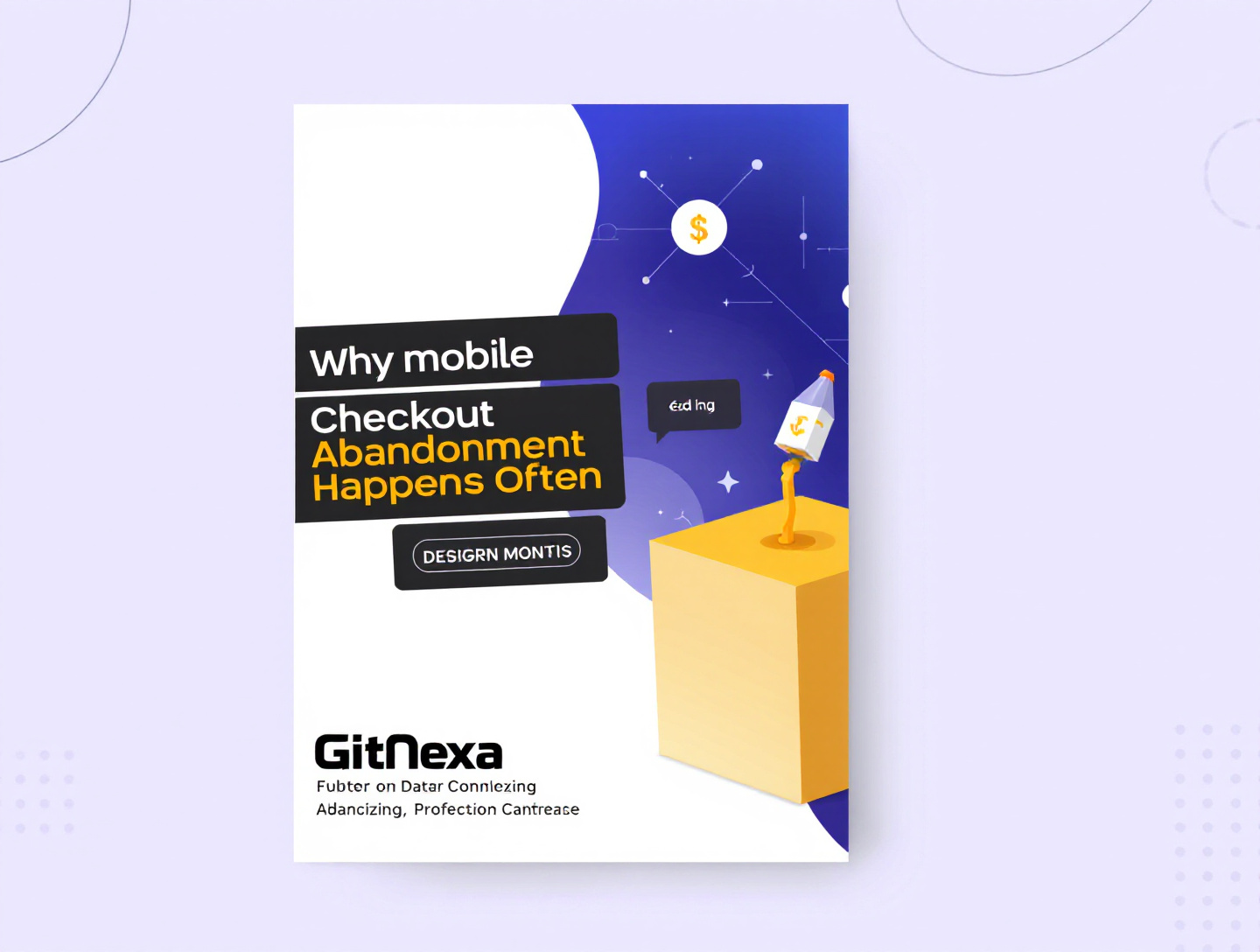
Why Mobile Checkout Abandonment Happens Often & How to Fix It
Introduction
Mobile commerce is no longer a trend—it’s the backbone of modern digital retail. With more than 60% of global eCommerce traffic coming from mobile devices, brands have invested heavily in mobile-first design, responsive layouts, and app-based experiences. Yet, despite all this progress, mobile checkout abandonment remains one of the most persistent revenue killers in eCommerce.
According to Baymard Institute, the average mobile checkout abandonment rate still hovers above 80%, significantly higher than desktop. That means for every 10 users who start a purchase on mobile, only 2 actually complete it. This gap represents billions in lost revenue globally—and for individual businesses, it can mean the difference between growth and stagnation.
So why does mobile checkout abandonment happen so often, even when users show strong purchase intent? The answer is complex. It spans usability challenges, psychological friction, technical limitations, performance issues, trust gaps, and poor optimization strategies that fail to account for how people actually behave on small screens.
In this comprehensive guide, we’ll break down every major reason mobile users abandon checkout, supported by real-world examples, behavioral insights, and industry data. You’ll also learn how top-performing brands reduce friction, what mistakes to avoid, and which best practices actually move the needle.
Whether you’re an eCommerce founder, product manager, marketer, or UX designer, this article will give you a complete, actionable understanding of why mobile checkout abandonment happens often—and how to fix it effectively.
Understanding Mobile Checkout Abandonment
Mobile checkout abandonment refers to situations where a user adds items to their cart on a smartphone or tablet, initiates checkout, but leaves before completing payment. This is not merely a UX problem—it’s a multi-layered business challenge tied to user psychology, device limitations, and operational decisions.
Why Mobile Behavior Is Different From Desktop
Mobile users behave differently than desktop users in several key ways:
- They are often multitasking or on the move
- They have shorter attention spans
- They rely on touch inputs rather than precision clicks
- They are more sensitive to loading delays
Unlike desktop users, mobile shoppers frequently start a purchase during micro-moments—standing in line, commuting, or scrolling during breaks. Any interruption, confusion, or delay can instantly derail the checkout flow.
The Cost of Ignoring Mobile Abandonment
High mobile abandonment doesn’t just hurt conversion rates. It also:
- Increases paid ad costs due to wasted traffic
- Skews analytics and funnel attribution
- Damages brand perception and trust
- Reduces customer lifetime value
Many businesses mistakenly accept mobile abandonment as “normal.” In reality, companies that actively optimize mobile checkout often see 20–40% conversion lifts within months.
For deeper insight into mobile-first behavior patterns, see GitNexa’s analysis on mobile-first ecommerce UX strategy.
Complex Checkout Forms and Data Entry Fatigue
One of the most common and preventable reasons why mobile checkout abandonment happens often is overly complex checkout forms.
Why Forms Fail on Mobile
On small screens, every field introduces friction. Long forms force users to:
- Switch between multiple keyboards (text, numeric, symbols)
- Zoom in and out to read labels
- Correct frequent typos caused by autocorrect
- Scroll excessively, losing context
While a 12-field form may feel manageable on desktop, it becomes exhausting on mobile.
Case Example: Fashion Retail Brand
A mid-sized fashion retailer reduced mobile abandonment by 28% simply by:
- Removing optional fields (company name, second address line)
- Enabling address autofill
- Breaking the form into two clear steps
This highlights an important truth: every unnecessary field has a measurable conversion cost.
Best Practices for Mobile Forms
- Use the minimum number of required fields
- Enable Google and Apple autofill
- Use numeric keyboards for phone and card inputs
- Clearly mark progress (Step 1 of 2)
Related reading: eCommerce UX mistakes that hurt conversions.
Slow Load Times and Performance Bottlenecks
Speed is not a feature on mobile—it’s a prerequisite.
Google research shows that 53% of users abandon a mobile site if it takes longer than 3 seconds to load. Checkout pages are often the slowest part of an eCommerce site due to scripts, payment gateways, and third-party integrations.
Why Speed Matters More on Mobile
Mobile connections fluctuate. Even on 5G, users move between networks, elevators, and low-signal environments. A delay of even one second can feel significant.
Common Performance Killers
- Heavy JavaScript from analytics tools
- Multiple payment SDKs loading simultaneously
- Unoptimized images in checkout summaries
- Poor caching strategies
Real-World Impact
An electronics brand optimized checkout performance and reduced page load time from 4.8s to 2.1s, resulting in:
- 17% higher mobile checkout completion
- 11% lower bounce rate
Learn more about performance optimization in website speed optimization for conversions.
External reference: Google Page Experience Guidelines (https://developers.google.com/search/docs/appearance/page-experience).
Unexpected Costs and Price Transparency Issues
Nothing kills purchase intent faster than a surprise fee.
Why Price Surprises Hurt Mobile More
On mobile, users skim. They may not read shipping policies or tax notes until checkout. When the total suddenly jumps, it triggers a psychological “loss aversion” response.
Baymard Institute reports that 48% of users abandon checkout due to extra costs—the top reason overall.
Mobile-Specific Challenges
- Shipping costs hidden below the fold
- Taxes calculated late in checkout
- Currency conversion confusion for global users
How Top Brands Reduce Shock
- Display estimated total cost early
- Offer shipping calculators in-cart
- Clearly label “no hidden fees” messaging
See also: pricing psychology in ecommerce.
Forced Account Creation and Sign-Up Barriers
Mobile users value speed. Forced account creation feels like a tax on their time.
Why Users Resist Accounts on Mobile
- Password creation is cumbersome
- Email verification interrupts flow
- Concerns about spam and privacy
According to Baymard, 26% of users abandon checkout when forced to create an account.
Better Alternatives
- Guest checkout with post-purchase account option
- Social login (Google, Apple, Facebook)
- Magic link or OTP-based login
Case Study: A subscription brand increased mobile conversions by 34% after enabling guest checkout.
Related: user authentication UX best practices.
Poor Mobile UX and Touch Interface Issues
Mobile UX failures don’t always look dramatic—but they compound quickly.
Common UX Pitfalls
- Buttons too small for thumbs
- CTAs placed too close together
- Sticky elements covering form fields
- Inconsistent visual hierarchy
Thumb Zone Optimization
Designers often forget the “thumb zone”—the natural arc where users can comfortably tap.
Best practice:
- Place primary CTAs within easy thumb reach
- Avoid top-heavy critical actions
Explore more: mobile UX design principles.
Payment Method Limitations
Limited payment options are a silent conversion killer.
Mobile Payment Expectations
Users expect:
- Apple Pay / Google Pay
- Buy Now Pay Later (BNPL)
- Local payment methods
When their preferred option is missing, they often abandon rather than adapt.
Case Example
An international DTC brand added Apple Pay and Klarna, reducing mobile abandonment by 22% in three months.
Reference: Stripe Mobile Payments Report.
Security and Trust Concerns on Small Screens
Trust signals often disappear on mobile due to limited screen real estate.
What Users Look For
- HTTPS and padlock icons
- Recognizable payment logos
- Clear return and refund policies
Mobile-Specific Trust Gaps
- Security badges hidden below the fold
- Dense legal text impossible to read
Solution: concise reassurance copy near the payment CTA.
Distractions and Context Switching
Mobile users are constantly interrupted.
Sources of Interruption
- Notifications
- Calls and messages
- App switching
Without save-state checkout design, users rarely return.
Recovery Strategies
- Persistent carts across devices
- Exit-intent SMS or email reminders
Technical Errors and Validation Failures
Even small errors feel bigger on mobile.
Common Issues
- Card validation errors without clear messaging
- Form resets after an error
Best practice: inline validation with clear, human language.
Best Practices to Reduce Mobile Checkout Abandonment
- Simplify checkout to 1–2 steps
- Optimize speed below 3 seconds
- Offer guest checkout
- Support mobile wallets
- Show full cost early
- Design for thumb zones
- Provide strong trust signals
- Save cart state automatically
Common Mistakes to Avoid
- Copying desktop checkout flows to mobile
- Hiding fees until the last step
- Overloading analytics scripts
- Ignoring accessibility standards
FAQs
Why is mobile checkout abandonment higher than desktop?
Mobile users face smaller screens, slower networks, and more distractions, making friction more impactful.
What is a good mobile checkout abandonment rate?
Below 70% is considered strong; top brands aim for under 65%.
Do mobile wallets really help conversions?
Yes, they reduce data entry and improve trust.
How much speed improvement matters?
Even a 1-second improvement can increase conversions by up to 20% (Google).
Is guest checkout essential?
For most industries, yes.
How do I track mobile abandonment accurately?
Use funnel-based analytics segmented by device.
Can design alone fix abandonment?
Design helps, but pricing, trust, and performance matter equally.
Should I build an app instead of mobile web?
Apps convert better, but mobile web optimization is still essential.
Conclusion: Turning Mobile Friction Into Revenue
Mobile checkout abandonment is not inevitable. It’s the result of decisions—design, technical, and strategic—that can be improved with the right data and mindset.
Brands that treat mobile as a primary revenue channel, not a secondary adaptation, consistently outperform competitors. By simplifying flows, respecting user context, and investing in performance and trust, businesses can unlock massive gains hiding in plain sight.
The future of commerce is mobile. The question is whether your checkout experience is ready.
Ready to Reduce Your Mobile Checkout Abandonment?
If you want a tailored audit and conversion-focused optimization strategy, GitNexa can help.
Turn abandoned carts into completed purchases—starting now.
Comments
Loading comments...