Sub Category
Latest Blogs
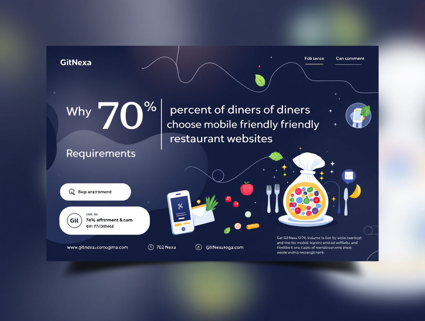
Why 70% of Diners Choose Mobile-Friendly Restaurant Websites in 2025
Introduction
In 2025, the restaurant discovery journey begins—and often ends—on a smartphone. Whether diners are searching for a nearby café while commuting, checking a menu from their couch, or booking a table minutes before arrival, mobile devices dominate how people interact with restaurants. Recent industry studies reveal a striking statistic: over 70% of diners now choose restaurants with mobile-friendly websites over those without. This shift is no longer a trend; it is the new baseline for competitiveness in the food and hospitality industry.
The problem many restaurant owners face is not a lack of passion or quality food, but outdated digital infrastructure. A website that looks fine on desktop but breaks on mobile screens frustrates users, increases bounce rates, and drives potential customers straight into the arms of competitors. In a world where attention spans are measured in seconds, mobile usability can be the difference between a booked table and a lost customer.
In this comprehensive guide, you’ll learn why 70% of diners choose mobile-friendly restaurant websites in 2025, the psychology behind mobile-first behavior, the business impact of mobile optimization, and actionable strategies to future-proof your restaurant’s online presence. Drawing from real-world examples, industry data, and best practices, this article is designed to help restaurateurs, marketers, and food entrepreneurs make informed decisions that directly impact revenue, brand trust, and customer loyalty.
The Mobile-First Dining Revolution
Why Mobile Devices Dominate Restaurant Searches
Mobile devices have become the primary gateway to the digital world. According to Google, more than 60% of all searches now come from mobile devices, with food-related queries among the most common “near me” searches. In 2025, diners expect instant answers—menus, hours, directions, and reviews—without pinching, zooming, or waiting for slow pages to load.
For restaurants, this means your website is often the first impression, not your storefront. A mobile-friendly design signals professionalism, attention to detail, and customer-centric thinking. Conversely, a broken or cluttered mobile site communicates neglect and lowers perceived quality before a diner ever steps inside.
From Desktop Browsing to On-the-Go Decisions
Unlike desktop browsing, mobile searches are intent-driven. Diners are hungry now, nearby, and ready to act. This is why mobile optimization directly influences conversions such as:
- Calling the restaurant
- Booking a table
- Ordering food online
- Navigating via Google Maps
Restaurants that adapt to this mobile-first reality consistently outperform those clinging to desktop-centric designs.
Understanding the 70% Statistic: What It Really Means
Behavioral Shifts in Diners
The statistic that 70% of diners prefer mobile-friendly restaurant websites is rooted in behavioral economics. Modern diners value convenience above all else. If your website loads slowly, displays poorly, or hides essential information, users experience cognitive friction and abandon the site.
Trust and Perceived Quality
Mobile-friendly websites build trust. Diners subconsciously associate usability with food quality and service reliability. A seamless mobile experience reassures users that the restaurant is modern, organized, and attentive to customer needs.
Competitive Differentiation
In saturated markets, mobile optimization is no longer a differentiator—it’s a requirement. However, restaurants that go beyond basic responsiveness and embrace mobile-first design gain a significant competitive edge.
Google’s Mobile-First Indexing and Its Impact
What Mobile-First Indexing Means for Restaurants
Google officially uses mobile-first indexing, meaning it primarily evaluates the mobile version of your website for search rankings. If your restaurant website isn’t optimized for mobile, your SEO suffers—regardless of how good your desktop version looks.
According to Google Search Central, mobile usability is a core ranking factor, especially for local queries. This directly affects visibility on Google Maps and local search results.
Local SEO and Mobile Search Visibility
Mobile-friendly websites improve:
- Page load speed
- User engagement
- Time on site
- Conversion rates
These signals feed back into Google’s algorithm, boosting your restaurant’s visibility when hungry diners search nearby.
For a deeper dive into SEO fundamentals, explore https://www.gitnexa.com/blogs/local-seo-strategies-for-small-businesses.
User Experience (UX): The Heart of Mobile Dining Decisions
What Diners Expect on Mobile in 2025
Mobile diners expect:
- Clean navigation
- Thumb-friendly buttons
- Readable fonts without zooming
- Quick access to menus and reservations
A mobile-friendly restaurant website prioritizes task completion over visual clutter.
The Cost of Poor Mobile UX
Poor UX increases bounce rates and reduces conversions. Studies show that 53% of mobile users abandon sites that take longer than three seconds to load. For restaurants, this often translates into lost orders during peak hours.
Speed Matters: Page Load Time and Its Direct Impact on Revenue
Why Speed Equals Sales
In 2025, speed is a revenue driver. Mobile users are often on limited networks, making lightweight, optimized pages essential. Even a one-second delay can reduce conversions by up to 20%.
Practical Speed Optimization Tips
- Compress images
- Minimize scripts
- Use modern frameworks
For more technical insights, read https://www.gitnexa.com/blogs/website-performance-optimization-guide.
Mobile-Friendly Menus: The Most Visited Page
Why PDFs Are Killing Conversions
Many restaurants still rely on PDF menus, which are notoriously unfriendly on mobile devices. Diners struggle to zoom, scroll, and read small text, leading to frustration.
Best Practices for Mobile Menus
- Use HTML-based menus
- Highlight popular items
- Optimize for readability
Online Ordering and Reservations: Mobile Conversion Powerhouses
The Rise of Mobile Ordering
Mobile ordering surged during the pandemic and remains dominant in 2025. Restaurants with seamless mobile ordering increase average order value and repeat customers.
Reservation Systems That Work on Mobile
Integrating mobile-friendly reservation tools reduces friction and increases bookings, especially during busy hours.
Learn more at https://www.gitnexa.com/blogs/restaurant-website-design-best-practices.
Case Study: How Mobile Optimization Increased Foot Traffic
Real-World Example
A mid-sized urban bistro redesigned its website with a mobile-first approach, reducing load time by 40% and increasing mobile reservations by 62% within three months.
Key Takeaways
- Simplicity drives conversions
- Speed influences trust
- Mobile UX affects in-store traffic
Mobile-Friendly Design and Brand Perception
Visual Consistency Across Devices
A cohesive mobile experience reinforces brand identity. Fonts, colors, and imagery should align seamlessly across screen sizes.
Emotional Impact on Diners
Mobile-friendly design creates positive emotional responses, increasing the likelihood of social sharing and repeat visits.
Accessibility and Inclusivity on Mobile
Designing for All Diners
Mobile-friendly websites also improve accessibility for users with disabilities. Features like readable fonts and clear navigation benefit everyone.
Legal and Ethical Considerations
Accessibility compliance reduces legal risk and expands your customer base.
Best Practices for Mobile-Friendly Restaurant Websites
- Adopt a mobile-first design philosophy
- Optimize page speed aggressively
- Use HTML menus instead of PDFs
- Simplify navigation
- Add click-to-call and map integration
- Test across multiple devices
- Monitor analytics and optimize continuously
Common Mistakes Restaurants Must Avoid
- Ignoring mobile testing
- Using outdated themes
- Overloading pages with images
- Hiding essential information
- Neglecting SEO fundamentals
Future Trends: What’s Next Beyond 2025
AI-Powered Personalization
Mobile websites will increasingly personalize recommendations based on user behavior.
Voice Search and Conversational UX
Voice-driven searches will further influence mobile design and content structure.
Frequently Asked Questions
1. Why is mobile-friendly design so important for restaurants?
Mobile is where diners search, decide, and convert in real time.
2. Does mobile optimization really affect SEO?
Yes, Google’s mobile-first indexing prioritizes mobile usability.
3. Are responsive and mobile-first design the same?
Responsive adapts; mobile-first prioritizes mobile from the start.
4. How fast should a restaurant website load on mobile?
Ideally under three seconds.
5. Should restaurants still have desktop websites?
Yes, but mobile should be the primary focus.
6. What tools help test mobile usability?
Google Mobile-Friendly Test and PageSpeed Insights.
7. Is mobile optimization expensive?
It’s an investment with measurable ROI.
8. How often should mobile sites be updated?
At least annually, with ongoing performance monitoring.
Conclusion: Mobile-Friendly Is No Longer Optional
The reality in 2025 is clear: 70% of diners choose mobile-friendly restaurant websites because convenience, speed, and usability drive decisions. Mobile optimization impacts everything from search visibility and brand perception to reservations and revenue. Restaurants that embrace mobile-first strategies position themselves for sustainable growth, while those that ignore it risk becoming invisible.
Ready to Upgrade Your Restaurant’s Mobile Experience?
If your restaurant website isn’t delivering a seamless mobile experience, now is the time to act. Partner with experts who understand both technology and hospitality.
👉 Get a free consultation today: https://www.gitnexa.com/free-quote
For more insights, explore our resources at:
- https://www.gitnexa.com/blogs/mobile-first-web-design-guide
- https://www.gitnexa.com/blogs/digital-marketing-for-restaurants
External References:
- Google Search Central – Mobile-First Indexing
- Think with Google – Food & Beverage Mobile Trends
- Nielsen Norman Group – Mobile UX Research
Comments
Loading comments...