Sub Category
Latest Blogs
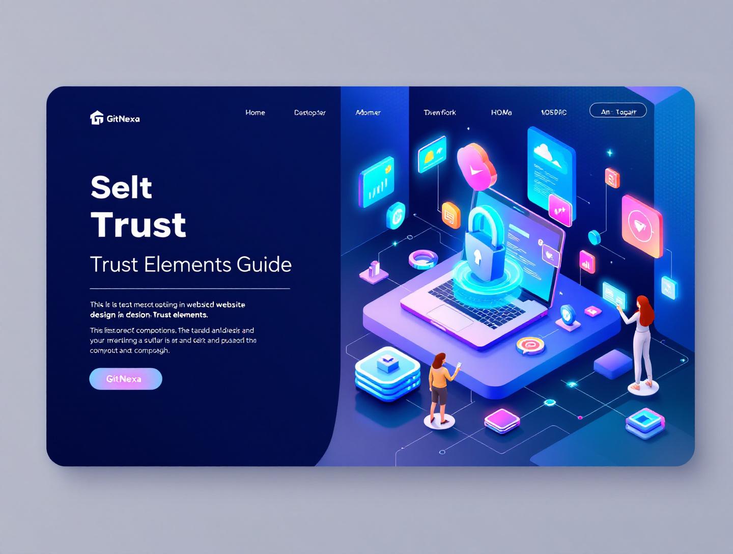
The Ultimate Guide to Website Design Trust Elements in 2026
Introduction
In 2024, a Stanford Web Credibility study revealed that 75% of users judge a company’s credibility based on website design alone. Not pricing. Not features. Design. That single data point should make any founder or CTO pause. If your website feels untrustworthy, visitors won’t stick around long enough to read your copy, explore your product, or talk to sales. This is where website design trust elements quietly decide whether your business earns confidence or skepticism.
Most teams know trust matters. Fewer understand how deeply it’s embedded in layout choices, microcopy, page speed, typography, accessibility, and even error handling. Trust isn’t a badge you slap on the footer. It’s a system — built from dozens of small, intentional decisions that work together.
This guide breaks down website design trust elements in a practical, developer- and decision-maker–friendly way. We’ll look at what they are, why they matter more than ever in 2026, and how real companies implement them effectively. You’ll see concrete examples, UX patterns, comparison tables, and step-by-step guidance you can apply to marketing sites, SaaS platforms, and enterprise portals alike.
By the end, you’ll know how to evaluate your current site, identify trust gaps, and design experiences that feel credible, secure, and human — without gimmicks or dark patterns.
What Is Website Design Trust Elements
Website design trust elements are visual, technical, and behavioral signals embedded into a site’s design that reassure users they are safe, understood, and dealing with a legitimate organization.
They go far beyond trust badges or testimonials. Trust elements include:
- Visual consistency and professional aesthetics
- Clear navigation and predictable interactions
- Transparent pricing and content structure
- Security indicators and data handling clarity
- Social proof presented in a believable way
- Performance, accessibility, and error recovery
Think of trust elements like body language in a conversation. You don’t consciously analyze every gesture, but you instantly sense whether someone feels credible or suspicious. Websites work the same way.
For beginners, trust elements answer simple questions:
- Is this company real?
- Is my data safe here?
- Will this product actually do what it claims?
For experienced users and buyers, they answer deeper ones:
- Does this team understand my problem?
- Are they hiding anything?
- Will this scale with my business?
A well-designed site communicates those answers without shouting. A poorly designed one raises doubts before a single CTA is clicked.
Why Website Design Trust Elements Matter in 2026
Trust has always mattered online, but the stakes are higher now.
In 2026, users are more skeptical, more informed, and quicker to abandon sites that feel off. According to Google’s 2025 UX research, 53% of mobile users leave a site that takes longer than 3 seconds to load, and performance is now subconsciously associated with professionalism and security.
At the same time:
- AI-generated scams have increased year over year, pushing users to look for authenticity signals
- Privacy regulations like GDPR, CPRA, and India’s DPDP Act have made data transparency non-negotiable
- B2B buying committees now research vendors independently before talking to sales
For SaaS and service companies, your website is often the first and last chance to establish credibility.
We’ve seen this firsthand at GitNexa. Clients come to us with solid products but low conversion rates. In many cases, the problem isn’t messaging — it’s missing or broken trust elements. Fixing layout hierarchy, improving page speed, clarifying data usage, and reworking testimonials often leads to measurable conversion lifts within weeks.
Trust isn’t a nice-to-have in 2026. It’s table stakes.
Visual Design Consistency as a Trust Signal
Why Consistency Builds Confidence
Inconsistent design creates cognitive friction. When fonts change randomly or spacing feels uneven, users subconsciously assume the same sloppiness exists behind the scenes.
Large companies like Stripe and Atlassian invest heavily in design systems for this reason. Their interfaces feel predictable, polished, and calm — which reinforces trust.
Key Elements to Standardize
Typography
- Limit to 2–3 font families
- Use a clear hierarchy (H1, H2, body, captions)
- Avoid decorative fonts for body text
Color Usage
- Define primary, secondary, and neutral palettes
- Use color consistently for actions and alerts
- Maintain contrast ratios per WCAG 2.2
Layout Patterns
- Reuse section structures across pages
- Align buttons and CTAs consistently
- Maintain spacing rhythm (8px or 4px grids)
Design System Example
Components:
- Button (Primary, Secondary, Disabled)
- Input (Default, Error, Success)
- Card (Content, Pricing, Testimonial)

Tokens:
- Colors
- Font sizes
- Spacing
A shared system reduces visual noise and strengthens trust over time.
Social Proof That Feels Real, Not Performative
The Problem With Generic Testimonials
"Great service! Highly recommended." No name. No context. No credibility.
Users have learned to ignore vague praise. In 2026, effective social proof is specific, verifiable, and relevant.
High-Trust Social Proof Formats
Client Logos With Context
Instead of a logo wall, add clarity:
- "Trusted by 200+ fintech teams"
- "Used by Series A–C SaaS companies"
Case Studies
A short case study beats ten testimonials.
Structure:
- Client background
- Problem
- Solution
- Measurable outcome
Reviews and Ratings
Embed real platforms where possible:
- Clutch
- G2
- Google Business
External validation carries more weight than self-hosted praise.
For more, see our deep dive on UX design for SaaS products.
Security, Privacy, and Transparency by Design
Visual Security Indicators
Trust starts with basics:
- HTTPS everywhere
- Visible security language near forms
- Clear error states, not silent failures
Privacy Clarity
Instead of hiding policies in footers, surface them contextually.
Example:
"We only use your email to respond. No spam." placed directly under a contact form reduces hesitation.
Common Technical Trust Elements
| Element | Trust Impact |
|---|---|
| SSL Certificate | High |
| CSP Headers | Medium |
| reCAPTCHA v3 | Medium |
| Clear Privacy Copy | High |
For technical implementation, MDN’s security headers guide is an excellent reference: https://developer.mozilla.org/en-US/docs/Web/HTTP/Headers
Performance, Accessibility, and Reliability
Speed as a Trust Factor
A fast site feels competent. A slow one feels risky.
Key metrics for 2026:
- LCP under 2.5s
- INP under 200ms
- CLS under 0.1
Google’s Core Web Vitals remain a trust proxy, not just an SEO metric.
Accessibility Signals Care
Accessible sites communicate respect and professionalism.
Trust-building accessibility practices:
- Keyboard navigation
- Alt text with meaning
- Visible focus states
- Plain language microcopy
Many enterprise buyers now include accessibility compliance in vendor evaluations.
Content Clarity and Honest Messaging
Avoiding Overpromising
Nothing erodes trust faster than inflated claims.
Replace:
"Best-in-class solution for everyone"
With:
"Designed for small to mid-sized e-commerce teams"
Specificity builds confidence.
Microcopy Matters
Button labels, helper text, and empty states all shape trust.
Good microcopy:
- Explains outcomes
- Reduces uncertainty
- Sounds human
We cover this in more detail in our guide on UI UX design principles.
How GitNexa Approaches Website Design Trust Elements
At GitNexa, we treat trust as an architectural concern, not a decorative layer. Our design and development teams collaborate early to ensure trust elements are baked into structure, performance, and content flow.
Our process typically includes:
- Trust audit of existing site
- User journey mapping with friction points
- Design system alignment
- Performance and accessibility benchmarks
- Content and microcopy refinement
We apply these principles across custom web development, SaaS platforms, and enterprise portals. The goal isn’t to make sites look flashy. It’s to make them feel dependable.
Common Mistakes to Avoid
- Overloading pages with trust badges
- Hiding pricing or key information
- Using stock photos of "fake teams"
- Inconsistent UI across pages
- Slow load times on critical pages
- Vague testimonials without context
- Ignoring accessibility requirements
Each of these chips away at credibility in subtle but measurable ways.
Best Practices & Pro Tips
- Audit trust elements quarterly
- Test copy clarity with real users
- Use real photos where possible
- Keep forms short and transparent
- Measure trust via conversion friction
- Treat performance as UX
- Design error states intentionally
Small improvements compound over time.
Future Trends & What to Expect
Looking ahead to 2026–2027:
- Verified company identities embedded in browsers
- AI-assisted personalization with transparency controls
- Accessibility as a legal baseline, not optional
- Fewer animations, more clarity
- Trust scores influenced by performance metrics
Design will continue shifting from persuasion to reassurance.
FAQ
What are website design trust elements?
They are visual, technical, and content signals that help users feel safe and confident using a website.
Why are trust elements important for conversions?
Because users won’t convert if they don’t believe the site or company is credible.
Do trust badges still work?
Only when relevant and supported by other signals like performance and clarity.
How does page speed affect trust?
Slow sites feel unreliable and unprofessional, increasing bounce rates.
Are testimonials enough to build trust?
No. They work best alongside design consistency and transparency.
How can small businesses build trust affordably?
Focus on clarity, speed, honest messaging, and real social proof.
Does accessibility really affect trust?
Yes. Inclusive design signals care and professionalism.
How often should trust elements be reviewed?
At least quarterly or after major product changes.
Conclusion
Website design trust elements are not decorative extras. They are foundational to how users perceive, evaluate, and decide whether to engage with your business. In 2026, trust is built through consistency, clarity, performance, accessibility, and honest communication — not hype.
The best websites don’t beg for trust. They earn it quietly, page by page, interaction by interaction. When design, content, and technology align, users feel it immediately.
If you’re serious about improving conversions, retention, and brand credibility, start by auditing your trust signals. Fix what feels uncertain. Clarify what feels vague. Speed up what feels slow.
Ready to strengthen trust across your website? Talk to our team to discuss your project.
Comments
Loading comments...