Sub Category
Latest Blogs
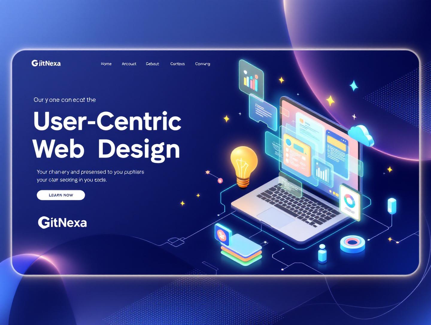
The Ultimate Guide to User-Centric Web Design in 2026
Introduction
In 2024, Google reported that 53% of mobile users abandon a site if it takes longer than three seconds to load. Now here’s the more uncomfortable stat: according to a 2025 Forrester study, nearly 70% of digital transformation projects fail to meet business expectations, and poor user experience is one of the top three reasons. That’s not a tooling problem. It’s a mindset problem.
User-centric web design isn’t a buzzword. It’s a disciplined way of building digital products around real human behavior, not internal assumptions or feature checklists. Yet many teams still design websites around stakeholder opinions, technical convenience, or what competitors are doing. The result? Sites that look fine in screenshots but quietly bleed conversions, retention, and trust.
If you’re a founder, CTO, or product lead, you’ve probably felt this tension. You invest in a redesign, ship on time, and still see bounce rates climb or funnels stall. The missing piece is rarely more animations or another A/B test. It’s a deeper commitment to user-centric web design—understanding users’ goals, constraints, and contexts, then designing systems that respect them.
In this guide, we’ll break down user-centric web design from first principles. You’ll learn what it really means, why it matters more in 2026 than ever before, and how modern teams apply it in practice. We’ll look at real-world examples, practical workflows, common mistakes, and future trends shaping the next generation of web experiences. If you’re serious about building websites people actually want to use, this is where you start.
What Is User-Centric Web Design
User-centric web design is an approach to designing websites where decisions are driven primarily by user needs, behaviors, and goals rather than internal preferences or technical convenience. The idea isn’t new—Don Norman popularized the concept of user-centered design in the late 1980s—but its application on the modern web has evolved significantly.
At its core, user-centric web design answers three questions before any visual polish happens:
- Who are the users?
- What are they trying to achieve?
- What gets in their way today?
This approach combines disciplines like UX research, interaction design, information architecture, accessibility, and performance engineering. It’s not limited to UI or aesthetics. Page speed, form validation, content clarity, and error handling all fall under the user’s experience.
A helpful way to think about it is this: traditional web design often asks, “How should this website look?” User-centric web design asks, “How should this website work for someone under time pressure, on a slow network, with imperfect information?”
User-Centric vs User-Friendly
These terms get used interchangeably, but they’re not the same. A user-friendly site might be easy to navigate once you understand it. A user-centric site reduces the need to understand it in the first place. It anticipates confusion and removes it.
For example, adding tooltips everywhere can make a product more user-friendly. Redesigning the workflow so tooltips aren’t needed is user-centric.
Core Principles Behind User-Centric Design
Empathy Over Assumptions
Design decisions start with research—interviews, usability testing, analytics—not gut feelings.
Clarity Over Cleverness
Clear language beats witty microcopy when users are trying to complete tasks.
Consistency Over Novelty
Predictable patterns reduce cognitive load, especially for complex applications.
Accessibility as a Baseline
Designing for edge cases (screen readers, keyboard navigation, color contrast) improves usability for everyone.
Why User-Centric Web Design Matters in 2026
The web of 2026 is not the web of even three years ago. User expectations have hardened, attention spans have shortened, and competition is one click away.
According to Statista, global e-commerce sales surpassed $6.3 trillion in 2024, with over 72% of transactions happening on mobile devices. At the same time, Google’s Core Web Vitals became a confirmed ranking factor, tying user experience directly to SEO performance.
But performance metrics are only part of the story.
Users Compare You to the Best, Not the Average
When someone uses your SaaS dashboard, they subconsciously compare it to Stripe, Notion, or Linear—even if you’re in a completely different industry. Those companies have trained users to expect instant feedback, sensible defaults, and minimal friction.
AI Has Raised the UX Bar
AI-driven personalization, from Netflix recommendations to Shopify product sorting, has normalized experiences that adapt to users in real time. Static, one-size-fits-all websites now feel dated.
Regulatory Pressure Is Increasing
Accessibility regulations like the European Accessibility Act (effective June 2025) and ongoing ADA-related lawsuits in the US mean ignoring user-centric design can become a legal risk, not just a UX flaw.
Retention Is Cheaper Than Acquisition
A 2024 Bain & Company report showed that increasing customer retention by 5% can boost profits by 25% to 95%. User-centric web design directly supports retention by reducing friction and frustration.
Understanding Your Users: Research That Actually Works
If user-centric design starts with empathy, research is how you operationalize it. The mistake many teams make is over-indexing on one method—usually analytics—while ignoring qualitative insights.
Quantitative Research: What Users Do
Tools like Google Analytics 4, Hotjar, and Mixpanel show where users drop off, which pages convert, and how long tasks take.
Example metrics that matter:
- Task completion rate
- Time to first meaningful action
- Funnel abandonment percentage
A fintech startup GitNexa worked with discovered through GA4 that 38% of users abandoned onboarding on step three. Analytics showed where; interviews explained why.
Qualitative Research: Why Users Do It
This is where interviews, usability testing, and session recordings come in.
Common Techniques
- One-on-one user interviews (30–45 minutes)
- Moderated usability tests with task scenarios
- Open-ended survey questions
A simple usability test script might look like:
Task: "You want to export last month’s reports as a CSV. Show me how you’d do that."
Follow-up: "What were you expecting to see next?"
Personas That Don’t Waste Time
Forget 10-page persona PDFs no one reads. Effective personas focus on:
- Primary goal
- Key frustrations
- Context of use (device, environment, time pressure)
Three well-defined personas are usually enough.
Information Architecture: Designing for How People Think
Even beautifully designed pages fail if users can’t find what they need. Information architecture (IA) is the unsung hero of user-centric web design.
Mental Models vs Org Charts
Users don’t care how your company is structured internally. They care about solving problems. A classic mistake is structuring navigation around departments instead of user goals.
Bad example:
- Solutions
- Services
- Products
Better example:
- Start a Project
- Improve Performance
- Scale Your Platform
Practical IA Techniques
Card Sorting
Users group content in ways that make sense to them. Tools like Optimal Workshop make this easy.
Tree Testing
Validate navigation labels before design begins.
Progressive Disclosure
Show only what’s needed at each step. Advanced options can wait.
Example Navigation Comparison
| Approach | Pros | Cons |
|---|---|---|
| Feature-based | Easy for internal teams | Confusing for new users |
| Task-based | Aligns with user goals | Requires research |
| Hybrid | Balanced | Needs careful labeling |
Interaction Design: Reducing Friction at Every Step
Interaction design is where user-centric thinking becomes tangible. Buttons, forms, feedback states—all of it matters.
Forms That Respect Users
Forms are the most common point of friction.
Best Practices
- Ask only for essential information
- Use inline validation
- Provide clear error messages
Example of helpful error copy:
“Password must be at least 12 characters and include one symbol.”
Not:
“Invalid input.”
Feedback and System Status
Users should never wonder if something worked.
Examples:
- Loading indicators for actions over 300ms
- Disabled buttons during submission
- Success messages with next steps
Microinteractions That Serve a Purpose
A subtle animation confirming an action can reduce uncertainty. Overdone animations, on the other hand, slow users down.
Accessibility as a First-Class Requirement
Accessibility is often treated as a checklist item. In user-centric web design, it’s foundational.
Why Accessibility Improves UX for Everyone
Captions help users in noisy environments. High contrast helps users in bright sunlight. Keyboard navigation helps power users.
Technical Basics You Can’t Ignore
- Semantic HTML (header, nav, main, footer)
- ARIA labels where necessary
- Color contrast ratio of at least 4.5:1
Reference: MDN Accessibility Guidelines
Testing Accessibility
Tools like Lighthouse, Axe, and manual screen reader testing (NVDA, VoiceOver) should be part of your workflow.
Performance and User-Centric Design
Performance is user experience. Period.
Real Numbers That Matter
Google data shows that as page load time goes from 1s to 3s, bounce probability increases by 32%.
Practical Performance Wins
- Optimize images (WebP, AVIF)
- Code-splitting with modern frameworks
- Reduce third-party scripts
Example architecture:
Client (Next.js)
  → CDN (Cloudflare)
    → API (Node.js)
      → Database (PostgreSQL)
How GitNexa Approaches User-Centric Web Design
At GitNexa, user-centric web design is not a phase—it’s a throughline across strategy, design, and engineering. We start every engagement with discovery workshops to align business goals with user needs. This includes stakeholder interviews, analytics reviews, and rapid user research.
Our design team works closely with developers from day one. That collaboration avoids the common handoff problems where beautiful designs fall apart during implementation. We rely on design systems built with tools like Figma, Storybook, and Tailwind CSS to maintain consistency and speed.
From a technical perspective, we prioritize performance, accessibility, and maintainability. Whether we’re building with React, Next.js, or custom CMS solutions, we make architectural decisions based on how users actually interact with the product.
If you’re curious about how this approach ties into broader digital strategy, explore our insights on custom web development and ui-ux-design-process.
Common Mistakes to Avoid
- Designing for stakeholders instead of users
- Skipping research due to tight timelines
- Treating accessibility as optional
- Overloading pages with features
- Ignoring performance until launch
- Relying solely on analytics without user feedback
Each of these mistakes compounds over time, making redesigns more expensive and risky.
Best Practices & Pro Tips
- Test early with low-fidelity prototypes
- Write copy before finalizing layouts
- Design for worst-case scenarios
- Use real data, not placeholders
- Revisit assumptions every quarter
Small habits make a big difference.
Future Trends & What to Expect
Looking ahead to 2026–2027, expect deeper personalization driven by privacy-conscious AI, more voice and multimodal interfaces, and stricter accessibility enforcement. Design systems will increasingly encode UX principles, not just visual styles.
We’ll also see more collaboration between UX and DevOps, as performance and reliability become core UX concerns.
Frequently Asked Questions
What is user-centric web design in simple terms?
It’s designing websites around user needs and behaviors instead of internal preferences.
Is user-centric design expensive?
Upfront research costs exist, but it reduces rework and increases ROI long term.
How does user-centric design affect SEO?
Better UX improves engagement metrics, which indirectly supports search rankings.
Do small businesses need user-centric design?
Yes. Smaller margins make usability mistakes more costly.
How often should user research be done?
Continuously, with lightweight testing every few months.
What tools support user-centric design?
Figma, Hotjar, GA4, Maze, and usability testing platforms.
Can developers lead user-centric design?
Absolutely, especially when paired with real user feedback.
How long does it take to implement?
It’s an ongoing practice, not a one-time project.
Conclusion
User-centric web design is not about trends or aesthetics. It’s about respect—for users’ time, attention, and goals. In a crowded digital world, the sites that win are the ones that feel obvious to use, even when the underlying systems are complex.
By grounding decisions in research, prioritizing clarity, and treating accessibility and performance as non-negotiable, teams can build products that last. The payoff shows up in higher conversions, stronger retention, and fewer painful redesigns.
Ready to build a website your users actually enjoy using? Talk to our team to discuss your project.
Comments
Loading comments...