Sub Category
Latest Blogs
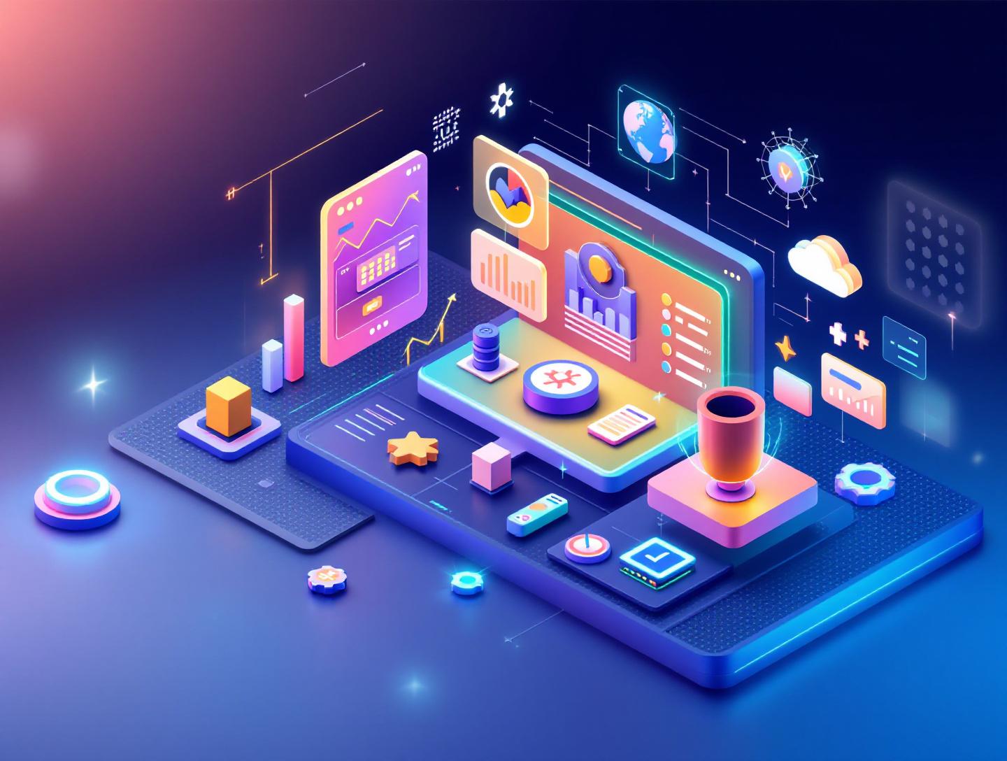
The Ultimate UI/UX Principles for High-Conversion Products
In 2025, Google reported that 53% of mobile users abandon a site that takes longer than three seconds to load. Meanwhile, Forrester Research found that a well-designed user interface can increase conversion rates by up to 200%, and better UX design can yield conversion improvements of up to 400%. Those numbers aren’t marketing fluff. They’re a wake-up call.
UI/UX principles for high-conversion products are no longer optional—they are revenue drivers. If your product looks decent but users hesitate to click, sign up, or complete checkout, you don’t have a traffic problem. You have a design problem.
In this guide, we’ll break down the UI/UX principles for high-conversion products that actually move metrics: clarity, hierarchy, trust, speed, personalization, and frictionless flows. You’ll see real examples, practical frameworks, and step-by-step processes you can apply whether you’re building a SaaS dashboard, eCommerce platform, or mobile app.
By the end, you’ll understand not just what makes a product beautiful—but what makes it convert.
What Is UI/UX for High-Conversion Products?
UI (User Interface) refers to the visual layer of a product—buttons, typography, spacing, color systems, layout grids. UX (User Experience) is broader. It covers usability, user journeys, information architecture, accessibility, and emotional response.
When we talk about UI/UX principles for high-conversion products, we’re talking about design decisions that directly influence measurable outcomes:
- Sign-ups
- Purchases
- Demo bookings
- Feature adoption
- Subscription upgrades
High-conversion design blends psychology, interaction design, and business strategy. It answers three questions clearly:
- What does this product do?
- Why should I trust it?
- What should I do next?
If users can’t answer those within seconds, conversion suffers.
At GitNexa, we often see startups over-invest in backend architecture but under-invest in interaction patterns and usability testing. The result? A powerful product that users abandon.
Why UI/UX Principles for High-Conversion Products Matter in 2026
Digital competition has intensified. According to Statista (2025), global eCommerce sales surpassed $6.3 trillion, and SaaS spending crossed $232 billion. Users now compare your product not just with direct competitors—but with the best digital experiences they’ve ever had.
Think about it. If Stripe can make payments feel effortless and Notion can make complex workflows feel intuitive, users expect that same clarity everywhere.
Several 2026 trends are reshaping expectations:
1. AI-Personalized Interfaces
Platforms like Shopify and HubSpot now adapt dashboards based on behavior. Static UI is fading.
2. Mobile-First Is the Default
Over 60% of global web traffic comes from mobile devices (StatCounter, 2025). Desktop-first thinking is outdated.
3. Accessibility as a Legal Requirement
WCAG 2.2 compliance is increasingly enforced. Poor accessibility isn’t just bad UX—it’s legal risk.
4. Shorter Attention Spans
Users decide whether to stay within 3–5 seconds. Clear hierarchy and microcopy matter more than ever.
In short, UI/UX principles for high-conversion products now sit at the intersection of psychology, performance, and personalization.
Principle #1: Clarity Over Creativity
Designers love cleverness. Users love clarity.
Dropbox’s homepage is a classic example. Minimal text. One clear value proposition. One primary CTA. No confusion.
Why Clarity Converts
When users face cognitive overload, they hesitate. According to Hick’s Law, decision time increases with the number of choices. More options = lower conversion.
Practical Framework: The 5-Second Test
Ask users:
- What does this product do?
- Who is it for?
- What action should you take?
If they struggle, simplify.
Example Layout Structure
[Headline]
[Subheadline explaining value]
[Primary CTA]
[Supporting visual]
[Social proof]
Comparison Table: Cluttered vs Clear UI
| Element | Cluttered UI | High-Conversion UI |
|---|---|---|
| CTAs | 4–5 competing buttons | 1 primary, 1 secondary |
| Messaging | Feature-heavy | Outcome-focused |
| Layout | Dense blocks | Generous whitespace |
| Navigation | 10+ menu items | 5–7 core links |
Clarity isn’t boring. It’s profitable.
For deeper layout optimization strategies, see our guide on modern web development best practices.
Principle #2: Visual Hierarchy That Guides Action
Users don’t read. They scan.
Eye-tracking studies from Nielsen Norman Group show F-pattern and Z-pattern scanning behaviors dominate web experiences.
Building Strong Hierarchy
- Use size to prioritize.
- Use contrast to highlight CTAs.
- Use spacing to group related content.
- Use typography scales (e.g., 8pt system).
Example CSS snippet for consistent hierarchy:
h1 { font-size: 2.5rem; font-weight: 700; }
h2 { font-size: 2rem; font-weight: 600; }
p  { font-size: 1rem; line-height: 1.6; }
.button-primary {
  background-color: #2563eb;
  color: white;
  padding: 12px 20px;
  border-radius: 8px;
}
Real-World Example: Airbnb
Airbnb’s search bar dominates the homepage. Everything else supports that action. That’s hierarchy aligned with business goals.
For SaaS dashboards, we recommend progressive disclosure—revealing advanced options only when needed.
Principle #3: Reduce Friction in User Flows
Every extra step costs conversions.
Baymard Institute (2025) reports that 18% of US online shoppers abandon carts due to overly long checkout processes.
Step-by-Step Optimization
- Map the entire user journey.
- Identify unnecessary fields.
- Enable autofill and social login.
- Add inline validation.
- Provide progress indicators.
Example: Optimized Signup Flow
Step 1: Email
Step 2: Password
Step 3: Plan Selection
Step 4: Payment
Instead of a 10-field form upfront.
Micro-UX Improvements
- Auto-detect location
- Default smart selections
- Error messages that explain fixes
See our related insights on building scalable SaaS platforms.
Principle #4: Trust Signals Drive Conversions
Users ask: “Can I trust this?”
Trust elements include:
- Testimonials
- Security badges
- Transparent pricing
- Case studies
- Clear privacy policies
Stripe’s documentation (https://stripe.com/docs) is a masterclass in transparency and clarity.
Placement Strategy
- Add testimonials near CTAs
- Show logos of known clients
- Display security badges during checkout
Trust reduces hesitation.
Principle #5: Speed Is Part of UX
According to Google’s Web Vitals research (https://web.dev/vitals/), conversion probability drops significantly as load time increases from 1 to 5 seconds.
Core Web Vitals to Monitor
- LCP (Largest Contentful Paint)
- CLS (Cumulative Layout Shift)
- INP (Interaction to Next Paint)
Optimization Tactics
- Use CDN (Cloudflare, Fastly)
- Implement lazy loading
- Optimize images (WebP/AVIF)
- Server-side rendering (Next.js)
Example lazy loading:
<img src="image.webp" loading="lazy" alt="Product screenshot" />
For performance architecture insights, read cloud-native app development.
Principle #6: Data-Driven Iteration
High-conversion design isn’t guesswork.
Tools to Use
- Google Analytics 4
- Hotjar heatmaps
- Mixpanel
- Optimizely A/B testing
A/B Testing Process
- Identify bottleneck page.
- Form hypothesis.
- Create variant.
- Run test (minimum 2 weeks).
- Analyze statistical significance.
Example: Changing CTA text from “Submit” to “Get My Free Demo” increased conversions by 22% in one B2B SaaS project we reviewed.
For experimentation workflows, explore DevOps automation strategies.
How GitNexa Approaches UI/UX Principles for High-Conversion Products
At GitNexa, we treat UI/UX as a conversion engine—not decoration.
Our process typically includes:
- Conversion-focused discovery workshops
- Competitor UX benchmarking
- Wireframing with measurable goals
- Interactive prototyping (Figma)
- Usability testing with real users
- Continuous A/B optimization post-launch
We align design decisions with KPIs—MRR growth, activation rate, checkout completion—not just visual aesthetics.
Our UI/UX team collaborates closely with frontend engineers and cloud architects to ensure performance, accessibility, and scalability from day one.
Common Mistakes to Avoid
- Designing for stakeholders, not users.
- Overloading homepage with features.
- Ignoring mobile optimization.
- Using vague CTAs (“Learn More”).
- Neglecting accessibility standards.
- Skipping usability testing.
- Treating launch as the finish line.
Each of these silently reduces conversions.
Best Practices & Pro Tips
- Use one primary CTA per page.
- Write benefit-driven headlines.
- Use social proof near decision points.
- Reduce form fields wherever possible.
- Maintain consistent design systems.
- Measure everything before redesigning.
- Optimize above-the-fold content first.
- Conduct quarterly UX audits.
Future Trends & What to Expect (2026–2027)
- AI-generated adaptive interfaces
- Voice-enabled UI patterns
- Predictive onboarding flows
- Hyper-personalized dashboards
- Emotion-aware design using sentiment analysis
Products that feel intelligent will convert better than static interfaces.
FAQ
What are UI/UX principles for high-conversion products?
They are design strategies focused on improving measurable outcomes like sign-ups, purchases, and engagement through clarity, usability, and trust.
How does UI affect conversion rates?
Clear layouts, strong hierarchy, and compelling CTAs guide users toward actions, increasing completion rates.
What is the difference between UI and UX?
UI covers visual elements; UX encompasses the overall experience, usability, and interaction flow.
How many CTAs should a landing page have?
Ideally one primary CTA and one secondary action to avoid decision fatigue.
Does page speed really impact conversions?
Yes. Google research shows conversion probability drops significantly after 3 seconds of load time.
What tools help optimize UX?
Google Analytics, Hotjar, Mixpanel, Figma, and A/B testing platforms like Optimizely.
How often should you test UX?
Continuously. At minimum, run quarterly usability tests and ongoing A/B experiments.
Is mobile-first still relevant in 2026?
Absolutely. Most traffic is mobile, and Google prioritizes mobile indexing.
How do you build trust in UI design?
Add testimonials, security badges, transparent pricing, and clear privacy messaging.
Can better UX reduce development costs?
Yes. Early usability testing prevents costly redesigns after launch.
Conclusion
High-conversion products aren’t accidents. They’re the result of deliberate UI/UX principles applied with discipline and tested with real users. Clarity beats cleverness. Speed beats decoration. Trust beats persuasion tricks.
If you want your product to convert more visitors into loyal customers, start by fixing friction, strengthening hierarchy, and measuring everything.
Ready to build a high-conversion product? Talk to our team to discuss your project.
Comments
Loading comments...