Sub Category
Latest Blogs
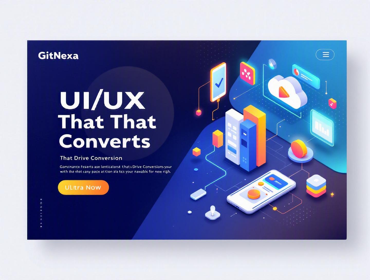
Ultimate UI/UX Principles That Drive Conversions
Introduction
In 2025, Forrester Research reported that a well-designed user interface can increase website conversion rates by up to 200%, while better UX design can yield conversion improvements of up to 400%. That’s not a minor uplift. That’s the difference between a struggling product and a scalable business.
Yet many companies still treat UI/UX principles that drive conversions as cosmetic enhancements—colors, fonts, and layouts layered on top of business logic. The result? Beautiful interfaces that don’t sell, sleek apps that don’t retain users, and landing pages that attract traffic but fail to convert.
UI/UX principles that drive conversions go far beyond aesthetics. They combine psychology, behavioral science, usability engineering, performance optimization, and data-driven experimentation. When done right, they guide users naturally from awareness to action—without friction, confusion, or doubt.
In this guide, you’ll learn:
- The core UI/UX principles that consistently increase conversion rates
- Why these principles matter more in 2026 than ever before
- Practical implementation tactics with real-world examples
- Common mistakes that quietly kill conversions
- How GitNexa approaches conversion-focused design
Whether you’re a CTO building a SaaS platform, a startup founder optimizing onboarding, or a product manager improving checkout flows, this is your blueprint.
What Is UI/UX and How Does It Drive Conversions?
Before we break down UI/UX principles that drive conversions, let’s define terms clearly.
What Is UI (User Interface)?
UI refers to the visual and interactive elements of a digital product—buttons, typography, forms, color systems, layouts, micro-interactions. It’s what users see and interact with.
A strong UI system ensures:
- Visual clarity
- Consistency across screens
- Accessibility compliance (WCAG 2.2)
- Responsive behavior across devices
What Is UX (User Experience)?
UX goes deeper. It covers the entire journey—from the first ad click to post-purchase support. UX includes:
- Information architecture
- User flows
- Interaction design
- Usability testing
- Performance and speed
- Emotional response
If UI is the steering wheel and dashboard, UX is the entire driving experience.
How UI/UX Principles Drive Conversions
Conversions happen when users:
- Understand what you offer
- Trust you
- See clear value
- Experience minimal friction
- Feel confident taking action
UI/UX principles that drive conversions systematically remove doubt and friction at each stage. They align business goals with human psychology.
For example:
- Amazon’s one-click checkout removes friction.
- Airbnb’s trust-building UI (reviews, host verification) reduces anxiety.
- Slack’s onboarding flow demonstrates value before asking for commitment.
Conversion-focused design is not accidental. It’s engineered.
Why UI/UX Principles That Drive Conversions Matter in 2026
Digital competition is brutal. According to Statista (2025), global e-commerce sales surpassed $6.3 trillion. Meanwhile, attention spans continue to shrink—Microsoft research shows average human attention spans dropped to 8 seconds.
Here’s what changed:
1. AI-Powered Personalization Is the Baseline
Users expect tailored experiences. Netflix, Spotify, and Amazon trained them. Generic interfaces now feel outdated.
2. Core Web Vitals Affect Revenue
Google’s Core Web Vitals (see https://web.dev/vitals/) directly influence search rankings. A 1-second delay in page load can reduce conversions by 7% (Akamai).
3. Multi-Device Journeys Are Standard
A user might:
- Discover your brand on mobile
- Compare on desktop
- Purchase on tablet
Your UI/UX must be consistent across devices.
4. Trust Is Fragile
Privacy regulations (GDPR, CCPA) and data breaches make users cautious. Transparent UX builds credibility.
5. SaaS Saturation
In B2B SaaS, switching costs are lower than ever. If your onboarding is confusing, users churn within minutes.
In 2026, UI/UX principles that drive conversions aren’t optional—they’re strategic differentiators.
Principle 1: Clarity Over Cleverness
Confused users don’t convert.
The Psychology Behind Clarity
Cognitive load theory explains that working memory is limited. If users must “figure out” your interface, they abandon it.
Real-World Example: Stripe
Stripe’s homepage headline: “Financial infrastructure for the internet.” Clear. Specific. Followed by direct CTAs.
Compare that with vague slogans like “Empowering digital transformation.” What does that even mean?
Tactical Implementation
1. Clear Value Proposition Above the Fold
Structure:
[Headline: Specific outcome]
[Subheadline: Who it’s for + benefit]
[Primary CTA]
[Secondary CTA]
2. Use Visual Hierarchy
- H1: Core promise
- H2: Supporting detail
- Body: Context
- CTA: High contrast color
3. Button Copy Matters
Bad: “Submit”
Better: “Start Free Trial”
Best: “Start My 14-Day Free Trial”
Clarity Checklist
| Element | Question to Ask |
|---|---|
| Headline | Is it specific and outcome-driven? |
| CTA | Does it describe the result? |
| Navigation | Can users predict what’s behind each link? |
| Forms | Are field labels explicit? |
At GitNexa, when working on custom web development projects, we often see conversion lifts of 15–30% simply by rewriting headlines and simplifying navigation.
Clarity converts.
Principle 2: Frictionless User Flows
Every extra step reduces conversion probability.
Understanding Friction
Friction includes:
- Too many form fields
- Forced account creation
- Slow loading times
- Complex checkout
Baymard Institute (2024) reports that 22% of users abandon carts due to overly long checkout processes.
Example: Amazon’s One-Click Model
Amazon minimized checkout to a single confirmation step for returning users. That’s friction reduction at scale.
Designing High-Converting Flows
Step 1: Map the Ideal Path
Create a user flow diagram:
Landing Page → Product Page → Cart → Checkout → Confirmation
Now eliminate unnecessary branches.
Step 2: Progressive Disclosure
Instead of overwhelming users, reveal information gradually.
Example:
- Step 1: Email
- Step 2: Shipping details
- Step 3: Payment
Step 3: Optimize Forms
Best practices:
- Autofill enabled
- Real-time validation
- Minimal required fields
Example form validation snippet (React):
if (!email.includes("@")) {
  setError("Please enter a valid email address");
}
Performance = UX
For performance optimization, combine UX with engineering. Our teams often integrate insights from DevOps CI/CD best practices to ensure fast deployment cycles for UX improvements.
Fast, simple flows convert better. Always.
Principle 3: Trust Signals and Social Proof
People buy when they feel safe.
Why Trust Drives Conversions
According to Nielsen (2024), 92% of consumers trust recommendations from other users over brand messaging.
Trust signals include:
- Reviews
- Testimonials
- Case studies
- Security badges
- Transparent pricing
Example: Shopify
Shopify’s product pages highlight:
- Merchant success stories
- Ratings
- Secure checkout badges
Types of Social Proof
| Type | Example | Best Use Case |
|---|---|---|
| User Reviews | Star ratings | E-commerce |
| Case Studies | ROI metrics | B2B SaaS |
| Logos | "Trusted by" section | Enterprise products |
| Data Points | "Used by 50,000+ teams" | SaaS |
Implementation Tips
- Place testimonials near CTAs.
- Include measurable results ("Increased revenue by 38% in 6 months").
- Add real photos and names.
When designing SaaS dashboards or enterprise portals, we integrate conversion-focused UX alongside scalable backends—often discussed in our cloud application architecture guide.
Trust reduces hesitation. Reduced hesitation increases conversions.
Principle 4: Strategic Visual Hierarchy and CTA Placement
Where users look determines what they click.
The F-Pattern and Z-Pattern
Eye-tracking studies by NNGroup show users scan web pages in F-patterns.
Design accordingly:
- Key message at top-left
- Important elements along scan lines
CTA Design Rules
- High color contrast
- Clear action verb
- Adequate white space
- Above-the-fold placement (when appropriate)
CTA A/B Testing Example
Original CTA: “Learn More”
Variant: “Get My Free Demo”
Result: 27% higher click-through rate.
Color Psychology
- Red: urgency
- Blue: trust
- Green: action
But context matters more than color stereotypes.
When implementing scalable design systems, our UI engineers align component libraries with frameworks like React, Next.js, or Vue—often covered in our frontend development best practices.
Strong hierarchy guides users naturally toward action.
Principle 5: Data-Driven Iteration and Testing
Great UI/UX is rarely perfect on version one.
A/B Testing Framework
- Identify drop-off point
- Form hypothesis
- Design variant
- Run controlled test
- Measure statistically significant results
Example tools:
- Google Optimize (sunset, alternatives include VWO, Optimizely)
- Hotjar
- Mixpanel
Sample Hypothesis
"Reducing form fields from 7 to 4 will increase demo requests by 20%."
Analytics Funnel Example
Landing Page: 10,000 visitors
Signup Click: 2,000
Form Completion: 800
Payment: 400
Where’s the bottleneck? Form completion.
Data should drive UI decisions—not opinions.
For AI-powered personalization, teams increasingly integrate insights from AI in product development.
Continuous iteration separates high-growth companies from stagnant ones.
How GitNexa Approaches UI/UX Principles That Drive Conversions
At GitNexa, we treat UI/UX as a revenue function—not decoration.
Our process includes:
-
Discovery & User Research
Stakeholder interviews, competitor analysis, persona development. -
Conversion Mapping
We define primary and secondary conversion goals before designing screens. -
Wireframing & Prototyping
Low-fidelity flows validated before visual polish. -
Design System Engineering
Component-based architecture for scalability. -
Performance & Dev Alignment
Close collaboration between designers and developers. -
Testing & Optimization
Post-launch A/B experiments.
We integrate UI/UX with backend scalability, DevOps automation, and cloud infrastructure—ensuring designs perform as beautifully as they look.
Common Mistakes to Avoid
- Designing for aesthetics over usability
- Ignoring mobile-first principles
- Overloading pages with CTAs
- Hiding pricing information
- Skipping usability testing
- Using generic stock imagery
- Failing to optimize page speed
Each of these silently reduces conversions.
Best Practices & Pro Tips
- Use action-oriented CTA copy.
- Limit primary navigation items to 5–7.
- Apply consistent spacing systems (8px grid).
- Show progress indicators in multi-step forms.
- Add micro-interactions for feedback.
- Ensure accessibility compliance (WCAG 2.2).
- Test on real devices—not just emulators.
- Continuously monitor heatmaps and session recordings.
Future Trends & What to Expect (2026–2027)
- AI-driven adaptive interfaces
- Voice and conversational UI
- Predictive personalization engines
- Emotion-aware UX using behavioral signals
- AR/VR commerce interfaces
Gartner predicts that by 2027, 25% of customer interactions will involve AI-driven UI layers.
Conversion design will become predictive—not reactive.
FAQ: UI/UX Principles That Drive Conversions
1. What are the most important UI/UX principles for conversions?
Clarity, reduced friction, trust signals, strong visual hierarchy, and continuous testing are foundational principles that directly impact conversion rates.
2. How does UX affect sales?
Better UX reduces confusion and hesitation, making users more likely to complete purchases or sign up for services.
3. What is a good conversion rate?
It varies by industry. E-commerce averages 2–4%, while high-performing SaaS landing pages may reach 10%+.
4. How can I improve website conversions quickly?
Simplify forms, improve CTA copy, add testimonials, and optimize page speed.
5. Is UI more important than UX?
They work together. UI influences perception; UX influences outcomes.
6. How often should I run A/B tests?
Continuously. Prioritize high-traffic pages and high-impact funnels.
7. Do colors really impact conversions?
Yes, but context matters more than color theory alone.
8. What tools help optimize UX?
Hotjar, Mixpanel, Figma, Optimizely, Lighthouse, and GA4 are widely used.
9. How does mobile UX impact conversions?
With over 60% of traffic coming from mobile devices (Statista 2025), poor mobile UX drastically reduces conversions.
10. Should startups invest in UX early?
Absolutely. Early UX investment prevents expensive redesigns later.
Conclusion
UI/UX principles that drive conversions combine psychology, engineering, and strategy. Clarity eliminates confusion. Frictionless flows remove barriers. Trust signals reduce hesitation. Strong hierarchy guides action. Data-driven testing refines everything.
In 2026, companies that treat UI/UX as a growth engine—not decoration—will outperform competitors consistently.
Ready to optimize your UI/UX for higher conversions? Talk to our team to discuss your project.
Comments
Loading comments...