Sub Category
Latest Blogs
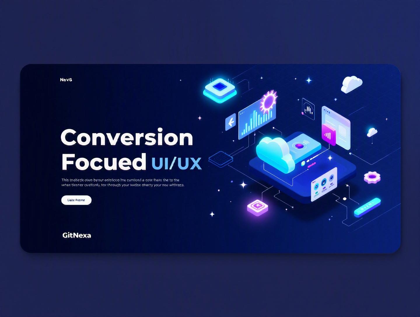
The Ultimate Guide to Conversion-Focused UI/UX Design
Introduction
In 2025, companies spent over $600 billion globally on digital advertising, yet the average website conversion rate still hovered between 2% and 3% according to data from Statista and industry benchmarks. That means 97 out of 100 visitors leave without taking action. The problem isn’t always traffic. More often, it’s the interface.
Conversion-focused UI/UX is the difference between a product that looks good and a product that performs. It’s not about trendy gradients or fancy micro-animations. It’s about guiding users—intentionally and ethically—toward meaningful actions: signing up, booking a demo, completing a purchase, or requesting a quote.
Too many teams separate design from business goals. Designers focus on aesthetics. Developers focus on performance. Marketing focuses on acquisition. But without conversion-focused UI/UX tying it all together, growth stalls.
In this comprehensive guide, you’ll learn what conversion-focused UI/UX really means, why it matters more than ever in 2026, and how to implement it across websites, SaaS products, and mobile apps. We’ll break down frameworks, psychology principles, UI patterns, A/B testing strategies, real-world examples, and common pitfalls. Whether you’re a CTO, founder, or product designer, this guide will help you build digital experiences that don’t just impress—they convert.
What Is Conversion-Focused UI/UX?
Conversion-focused UI/UX is a design approach that prioritizes measurable user actions aligned with business goals. These actions—called conversions—can include purchases, demo bookings, downloads, newsletter signups, or account registrations.
Traditional UI (User Interface) focuses on visual layout, typography, colors, and interactive components. UX (User Experience) considers usability, information architecture, user flows, and emotional engagement. Conversion-focused UI/UX adds a third layer: behavioral optimization.
In simple terms:
- UI answers: "Does it look good and function properly?"
- UX answers: "Is it intuitive and usable?"
- Conversion-focused UI/UX answers: "Does it drive the right action?"
Core Components of Conversion-Focused UI/UX
1. Goal-Driven Design
Every page must have a primary objective. A landing page should drive one action—not five.
2. Behavioral Psychology Integration
Principles like scarcity, social proof, reciprocity, and loss aversion influence decision-making.
3. Data-Backed Iteration
Heatmaps, session recordings, and A/B tests guide improvements.
Tools commonly used:
- Google Analytics 4
- Hotjar
- Mixpanel
- VWO
- Optimizely
You can explore more about optimizing performance in our guide to web application performance optimization.
Conversion-focused UI/UX isn’t manipulation. It’s clarity. It removes friction, reduces cognitive load, and makes the next step obvious.
Why Conversion-Focused UI/UX Matters in 2026
User expectations have changed dramatically.
According to Google research, 53% of mobile users abandon sites that take longer than 3 seconds to load (source: https://developers.google.com/web/fundamentals/performance/why-performance-matters). Meanwhile, Gartner predicts that by 2026, 60% of digital businesses will use AI-driven personalization engines.
Here’s why conversion-focused UI/UX is non-negotiable now:
1. Customer Acquisition Costs Are Rising
Paid ads cost more every year. If your conversion rate improves from 2% to 3%, that’s a 50% increase in revenue without increasing traffic.
2. AI Personalization Is Raising the Bar
Netflix, Amazon, and Spotify have trained users to expect tailored experiences.
3. Attention Spans Are Shorter
Users scan, not read. Eye-tracking studies show users form an impression in 50 milliseconds.
4. SaaS Competition Is Brutal
If onboarding feels confusing, users churn within minutes.
For SaaS teams, combining strong UX with scalable architecture is key. See our breakdown of SaaS product development strategies.
In 2026, design isn’t decoration. It’s revenue infrastructure.
The Psychology Behind High-Converting Interfaces
Conversion-focused UI/UX starts with human behavior.
Cognitive Load and Decision Fatigue
The human brain prefers simplicity. Hick’s Law states that decision time increases with the number of choices.
Example:
When Booking.com reduced unnecessary filters and clarified pricing, they improved booking completion rates significantly.
Social Proof in Action
Adding testimonials, usage numbers, and recognizable logos increases trust.
Example layout:
[Headline]
[Primary CTA]

★★★★★ 4.8/5 from 2,400+ customers
Trusted by: Slack | Shopify | HubSpot
Scarcity and Urgency
Limited-time offers and low-stock indicators drive faster decisions.
Loss Aversion
Users are more motivated to avoid losing something than gaining something new.
Example:
Instead of: "Start Free Trial" Use: "Don’t Miss Your 14-Day Free Trial"
Psychology isn’t about tricks. It’s about understanding friction and motivation.
Designing Conversion-Focused Landing Pages
Landing pages are where conversion-focused UI/UX shines.
Essential Structure of a High-Converting Page
- Clear headline
- Subheadline explaining value
- Hero image or product demo
- Primary CTA
- Social proof
- Benefits section
- Objection handling
- Secondary CTA
Example Comparison
| Element | Low-Converting Page | High-Converting Page |
|---|---|---|
| Headline | "Welcome to Our Site" | "Automate Payroll in 5 Minutes" |
| CTA | "Submit" | "Start Free Trial" |
| Social Proof | None | 3 testimonials + logos |
| Layout | Cluttered | Clear visual hierarchy |
CTA Button Optimization
Color contrast matters. Use WCAG accessibility standards (https://www.w3.org/WAI/standards-guidelines/wcag/).
Example button CSS:
.cta-button {
  background-color: #FF6B00;
  color: #FFFFFF;
  padding: 16px 24px;
  font-size: 18px;
  border-radius: 8px;
  font-weight: 600;
}
For deeper UI insights, check our guide on modern UI design principles.
Conversion-Focused UX for SaaS and Web Apps
Landing pages get attention. Product UX keeps users.
Optimizing Onboarding Flows
Slack’s onboarding success comes from:
- Immediate value demonstration
- Minimal setup steps
- Interactive tooltips
- Clear progress indicators
Example Onboarding Flow
Step 1: Create Account
Step 2: Invite Team
Step 3: Send First Message
Each step should reduce friction.
Reducing Form Friction
Best practices:
- Autofill support
- Inline validation
- Progress bars for multi-step forms
Example React validation snippet:
if (!email.includes("@")) {
  setError("Please enter a valid email address");
}
Pair strong UX with scalable backend systems. Learn more in our cloud-native application development guide.
Data-Driven Optimization: A/B Testing and Analytics
No interface is perfect on the first attempt.
Step-by-Step Conversion Optimization Process
- Define conversion goal
- Analyze current performance
- Identify friction points
- Form hypothesis
- Run A/B test
- Measure results
- Iterate
Example A/B Test
Variant A: "Start Free Trial" Variant B: "Start My Free Trial"
Result: Variant B improved click-through rate by 12%.
Tools:
- Google Optimize (sunset but replaced by GA experiments)
- VWO
- Optimizely
Analytics integration is easier with proper DevOps workflows. Explore our DevOps automation strategies.
Mobile-First Conversion-Focused UI/UX
Over 60% of global web traffic now comes from mobile devices.
Mobile Optimization Checklist
- Thumb-friendly buttons (minimum 44px height)
- Sticky CTAs
- Fast load times
- Simplified navigation
Example Sticky CTA Implementation
.sticky-cta {
  position: fixed;
  bottom: 0;
  width: 100%;
}
If you're building mobile products, our mobile app development guide explains scalable architectures.
How GitNexa Approaches Conversion-Focused UI/UX
At GitNexa, conversion-focused UI/UX isn’t an afterthought. It’s integrated from discovery to deployment.
Our approach includes:
- Business goal alignment workshops
- User persona research
- Wireframing and interactive prototyping
- Conversion hypothesis documentation
- A/B testing roadmap
- Performance monitoring
We collaborate across design, development, and DevOps teams to ensure experiences are fast, accessible, and measurable. Whether building SaaS dashboards, enterprise portals, or eCommerce platforms, we align every UI decision with ROI.
Common Mistakes to Avoid
- Designing without clear conversion goals
- Overloading pages with multiple CTAs
- Ignoring mobile optimization
- Using vague CTA text like "Click Here"
- Skipping usability testing
- Neglecting page speed optimization
- Failing to analyze user behavior data
Best Practices & Pro Tips
- Define one primary goal per page.
- Use action-oriented CTA copy.
- Show real customer testimonials with photos.
- Reduce form fields to essentials only.
- Use heatmaps to validate assumptions.
- Ensure accessibility compliance.
- Prioritize speed (Core Web Vitals).
- Personalize content where possible.
- Continuously test microcopy variations.
- Design for clarity before creativity.
Future Trends & What to Expect (2026–2027)
- AI-driven UI personalization
- Voice-enabled interfaces
- Predictive UX flows
- Zero-click onboarding
- Privacy-first design frameworks
- AR/VR commerce experiences
Companies integrating AI with UX will dominate conversion metrics.
FAQ: Conversion-Focused UI/UX
What is conversion-focused UI/UX design?
It’s a design strategy focused on driving measurable user actions aligned with business objectives.
How is conversion-focused UI/UX different from traditional design?
Traditional design emphasizes aesthetics and usability. Conversion-focused design adds measurable performance goals.
What is a good website conversion rate in 2026?
Average rates range from 2% to 5%, but optimized SaaS landing pages can exceed 10%.
Does better UX always increase conversions?
Not automatically. UX must align with clear business goals.
How long should A/B tests run?
Typically 2–4 weeks depending on traffic volume.
What tools help improve conversions?
Google Analytics, Hotjar, VWO, Optimizely.
Is mobile-first necessary?
Yes. Most traffic now comes from mobile devices.
How often should UX be updated?
Quarterly reviews are recommended.
Conclusion
Conversion-focused UI/UX bridges the gap between design and revenue. It aligns user psychology, interface clarity, and business objectives into a measurable growth engine.
Companies that treat design as strategy—not decoration—consistently outperform competitors in retention, acquisition efficiency, and customer satisfaction.
Ready to improve your product’s conversions with smarter UI/UX? Talk to our team to discuss your project.
Comments
Loading comments...