Sub Category
Latest Blogs
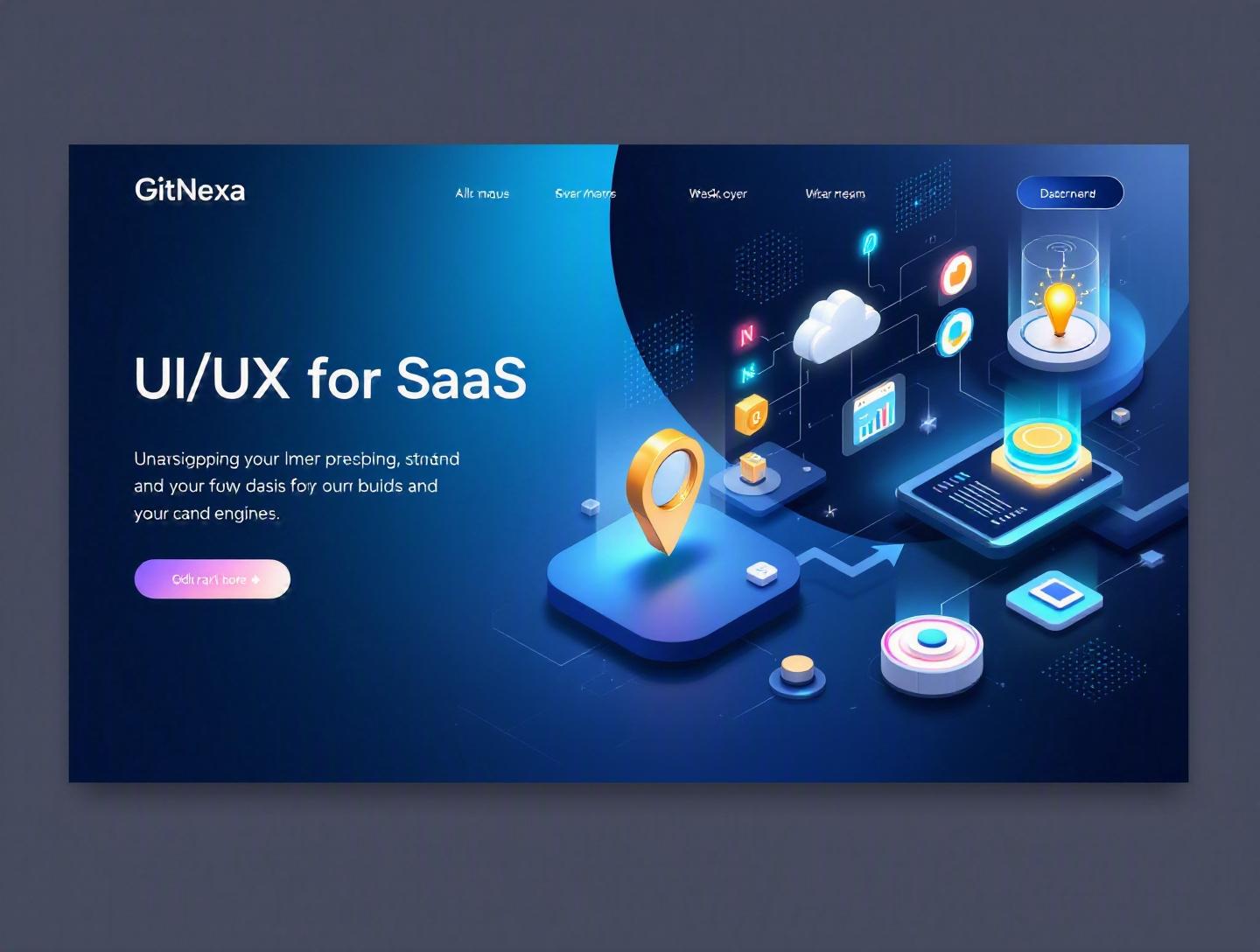
The Ultimate Guide to UI/UX Design for SaaS Platforms
In 2024, Forrester reported that every $1 invested in UX brings an average return of $100. Yet most SaaS companies still lose users in the first 7 days due to poor onboarding, confusing dashboards, and friction-heavy workflows. That’s not a marketing problem. It’s a UI/UX design problem.
UI/UX design for SaaS platforms is no longer about making screens look polished. It directly impacts activation rates, churn, expansion revenue, and even customer support costs. A confusing interface can double your churn. A well-designed onboarding flow can increase activation by 30–50%—a metric every founder and CTO cares about.
In this comprehensive guide, we’ll break down what UI/UX design for SaaS platforms actually means, why it matters in 2026, and how to design experiences that drive retention and revenue. You’ll learn practical frameworks, see real-world examples, review UI architecture patterns, and get actionable best practices you can implement immediately.
Whether you’re a startup founder building your MVP, a CTO scaling a multi-tenant platform, or a product team optimizing conversion funnels, this guide will help you design SaaS products users actually enjoy using.
What Is UI/UX Design for SaaS Platforms?
UI/UX design for SaaS platforms refers to the strategic creation of user interfaces (UI) and user experiences (UX) specifically tailored for subscription-based, cloud-delivered software products.
Let’s break that down.
UI vs UX in a SaaS Context
- UI (User Interface) focuses on the visual layer: layouts, buttons, typography, color systems, iconography, design systems, and interactive components.
- UX (User Experience) covers the broader journey: onboarding flows, task completion efficiency, information architecture, user feedback loops, and usability.
In SaaS, UI/UX design isn’t static. Unlike marketing websites, SaaS platforms are living systems. Users interact with them daily. They manage workflows, analyze data, collaborate with teams, and make business decisions inside them.
What Makes SaaS Design Different?
SaaS products have unique characteristics:
- Multi-tenant architecture — Different organizations share infrastructure but need isolated experiences.
- Role-based access control (RBAC) — Admins, managers, and users see different dashboards.
- Complex data visualization — Charts, filters, reporting engines.
- Continuous updates — Weekly releases without disrupting workflows.
- Subscription model — Retention is more important than acquisition.
Unlike eCommerce or content platforms, SaaS products must optimize for long-term engagement, not one-time conversion.
For deeper context on how SaaS architecture shapes product decisions, see our guide on cloud-native application development.
Why UI/UX Design for SaaS Platforms Matters in 2026
The SaaS market is projected to reach $317 billion globally in 2026, according to Statista (2024). Competition is fierce. Switching costs are lower than ever. And users expect consumer-grade experiences—even in enterprise software.
Here’s what’s changed.
1. AI Is Raising User Expectations
Tools like Notion AI, Microsoft Copilot, and ChatGPT integrations have changed what "intuitive" means. Users now expect predictive suggestions, smart defaults, and contextual assistance.
2. Product-Led Growth (PLG) Dominates
Companies like Slack, Figma, and Atlassian rely on self-serve onboarding. If users can’t understand your UI without a sales rep, you’re already behind.
3. Remote Work Is Permanent
According to Gartner (2024), 48% of knowledge workers remain hybrid or fully remote. That means SaaS tools must support distributed collaboration and async workflows.
4. Accessibility Is Now a Legal Requirement
The European Accessibility Act (2025 enforcement) requires digital products to meet accessibility standards. Following WCAG guidelines is no longer optional.
In 2026, great UI/UX isn’t a differentiator. It’s table stakes.
Designing Effective Onboarding Experiences
Your onboarding flow determines whether users stay or churn.
Wyzowl (2023) found that 63% of customers consider onboarding when deciding to subscribe long-term.
The Anatomy of High-Converting SaaS Onboarding
Let’s look at how companies like Slack and Asana approach onboarding.
1. Progressive Disclosure
Don’t show everything at once. Introduce features gradually.
2. Immediate Value Demonstration
Users should achieve one meaningful outcome within 5–10 minutes.
3. Contextual Tooltips
Use tooltips that appear based on behavior—not static tours.
Example implementation in React:
{showTooltip && (
  <Tooltip
    target="create-project-btn"
    message="Start by creating your first project"
    position="right"
  />
)}
Step-by-Step Onboarding Framework
- Define the “Aha!” moment.
- Map required steps to reach that moment.
- Remove optional features from early screens.
- Add contextual guidance.
- Measure activation metrics.
Activation metric examples:
- Slack: Sent first message
- Canva: Created first design
- HubSpot: Imported contacts
For UX testing strategies, explore our article on MVP development strategies.
Information Architecture & Navigation Patterns
Poor navigation is the silent churn driver.
Common SaaS Navigation Patterns
| Pattern | Best For | Example |
|---|---|---|
| Sidebar Navigation | Complex dashboards | Jira |
| Top Navigation | Simpler tools | Dropbox |
| Hybrid | Enterprise SaaS | Salesforce |
Designing Scalable Navigation
As your SaaS grows, navigation complexity increases.
Key principles:
- Limit primary nav items to 5–7.
- Use nested groups logically.
- Add global search (ElasticSearch, Algolia).
Example navigation JSON structure:
{
  "dashboard": {},
  "projects": {
    "all_projects": {},
    "archived": {}
  },
  "reports": {},
  "settings": {}
}
Role-Based Dashboards
Admins need analytics. Users need tasks. Mixing them creates confusion.
Implement conditional rendering:
if(user.role === 'admin') {
  renderAdminDashboard();
} else {
  renderUserDashboard();
}
For scalable frontend architecture patterns, read modern frontend development frameworks.
Data Visualization & Dashboard Design
Most SaaS platforms are data-heavy.
But charts don’t equal clarity.
Choosing the Right Chart Type
| Data Type | Recommended Chart |
|---|---|
| Trends over time | Line chart |
| Category comparison | Bar chart |
| Distribution | Histogram |
| Relationships | Scatter plot |
Use libraries like:
- Chart.js
- Recharts
- D3.js
UX Rules for Dashboards
- Prioritize key metrics above the fold.
- Allow filtering without page reload.
- Avoid more than 5–7 KPIs per screen.
- Use consistent color coding.
Bad dashboard: 20 widgets competing for attention. Good dashboard: 4 key metrics, drill-down capability.
We cover scalable analytics infrastructure in building scalable web applications.
Design Systems for SaaS Scalability
Without a design system, SaaS products become inconsistent fast.
What a SaaS Design System Includes
- Typography scale
- Color tokens
- Spacing system (4px or 8px grid)
- Reusable components
- Accessibility rules
Example token structure:
:root {
  --primary-500: #4F46E5;
  --spacing-md: 16px;
  --radius-sm: 6px;
}
Popular Tools
- Figma
- Storybook
- Material UI
- Tailwind CSS
Design systems reduce dev time by up to 34% (InVision 2023 Design Systems Report).
For DevOps alignment with design systems, see CI/CD pipeline best practices.
Accessibility & Inclusive SaaS Design
Accessibility expands market reach and reduces legal risk.
WCAG Checklist
- Contrast ratio 4.5:1
- Keyboard navigation support
- Screen reader compatibility
- Alt text for images
Test using:
- Lighthouse
- axe DevTools
Accessibility is especially critical for government and healthcare SaaS.
How GitNexa Approaches UI/UX Design for SaaS Platforms
At GitNexa, we approach UI/UX design for SaaS platforms as a growth strategy—not just a design exercise.
Our process includes:
- Product discovery workshops
- User journey mapping
- Wireframing & rapid prototyping
- Usability testing
- Design system creation
- Frontend-backend alignment
We combine expertise from our UI/UX design services, DevOps consulting, and AI integration solutions to ensure designs scale technically and commercially.
The result? SaaS platforms that convert, retain, and expand.
Common Mistakes to Avoid
- Designing for features instead of workflows.
- Ignoring onboarding metrics.
- Overloading dashboards.
- Skipping accessibility testing.
- Not building a design system early.
- Ignoring mobile responsiveness.
- Releasing major UI changes without user testing.
Best Practices & Pro Tips
- Define one primary action per screen.
- Use empty states strategically.
- Prioritize speed—keep load time under 2 seconds.
- Add inline validation in forms.
- Run usability tests quarterly.
- Use analytics tools like Mixpanel.
- Maintain consistent microcopy tone.
Future Trends & What to Expect (2026–2027)
- AI-driven UI personalization
- Voice-enabled SaaS workflows
- No-code customization layers
- Dark mode as default
- AR data visualization in enterprise
Expect SaaS UX to feel more adaptive and predictive.
FAQ
What makes SaaS UI/UX different from website design?
SaaS design focuses on long-term usability and workflow efficiency rather than one-time conversion.
How long does it take to design a SaaS platform?
An MVP UI/UX typically takes 6–10 weeks depending on complexity.
What tools are best for SaaS UI design?
Figma, Sketch, Adobe XD, and Storybook are widely used.
How do you measure SaaS UX success?
Track activation rate, churn, task completion time, and NPS.
Is mobile design necessary for B2B SaaS?
Yes. Many executives access dashboards on mobile.
What is a design system in SaaS?
A reusable component library ensuring consistency and scalability.
How often should SaaS UI be updated?
Continuously, but major redesigns should follow usability testing.
Does good UX reduce churn?
Yes. Improved usability directly correlates with retention.
Conclusion
UI/UX design for SaaS platforms determines whether users adopt, stay, and expand. From onboarding flows to dashboard clarity, every interaction influences business outcomes.
Companies that prioritize usability see higher retention, stronger product-led growth, and lower support costs.
Ready to design a SaaS platform users love? Talk to our team to discuss your project.
Comments
Loading comments...