Sub Category
Latest Blogs
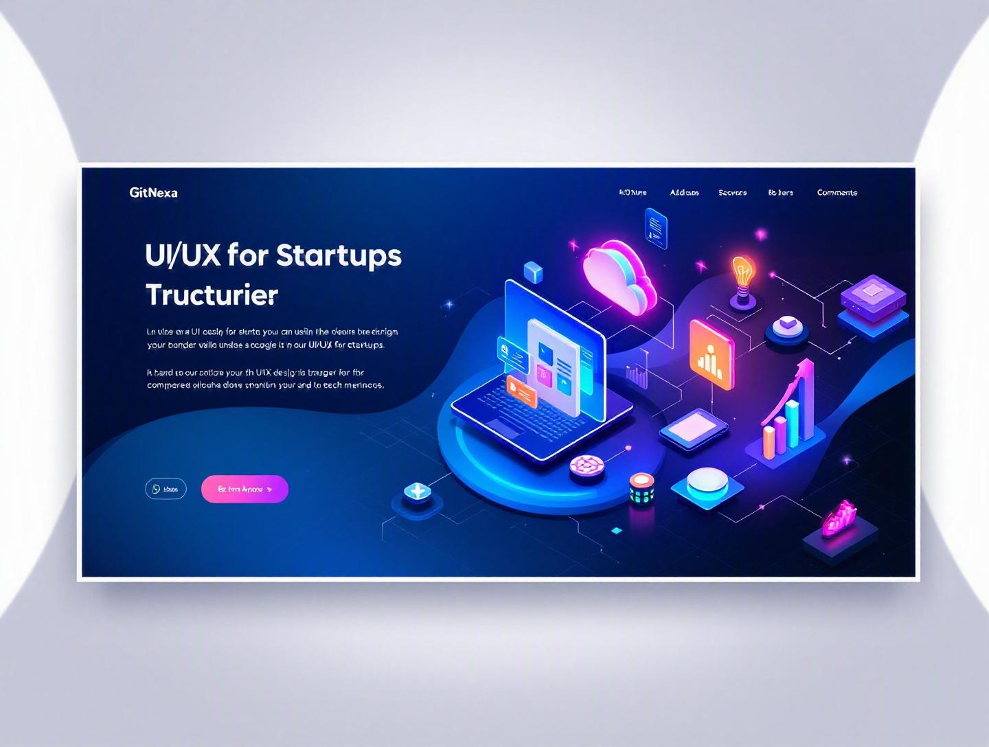
The Ultimate UI/UX Design Process for Startups
Introduction
In 2025, Forrester reported that every $1 invested in UX brings an average return of $100 — a staggering 9,900% ROI. Yet, most startups still treat design as decoration rather than strategy. Founders obsess over features, funding, and frameworks while overlooking the UI/UX design process for startups — the very system that determines whether users stay, convert, and recommend the product.
Here’s the uncomfortable truth: users form an opinion about your product in 50 milliseconds, according to Google research. That snap judgment isn’t about your backend architecture or your fundraising round. It’s about how your interface looks and feels.
The UI/UX design process for startups isn’t just about wireframes or color palettes. It’s a structured, iterative approach that aligns business goals with user needs. Done right, it reduces development waste, improves retention, and accelerates product-market fit. Done poorly, it burns runway.
In this guide, we’ll break down the complete UI/UX design workflow tailored specifically for startups. You’ll learn how to move from idea to interactive prototype, how to validate decisions with real users, how to collaborate with developers effectively, and how modern tools like Figma, Hotjar, and usability testing platforms fit into the picture. We’ll also cover common mistakes, future trends, and how GitNexa approaches product design for early-stage and scaling companies.
If you're a founder, CTO, or product manager trying to ship something people actually love, this is for you.
What Is the UI/UX Design Process for Startups?
The UI/UX design process for startups is a structured sequence of research, strategy, prototyping, testing, and iteration aimed at building user-centered digital products. It ensures your app or website solves real problems while aligning with business objectives.
Let’s break it down:
- UX (User Experience) focuses on usability, flow, accessibility, and how users interact with your product.
- UI (User Interface) focuses on visuals — typography, color systems, buttons, icons, layout, and motion design.
For startups, this process differs from enterprise design in three key ways:
- Speed matters more than perfection
- Validation is continuous
- Resources are limited
Unlike large corporations that can afford lengthy discovery cycles, startups must balance speed with strategic clarity. The goal isn’t to design a perfect product — it’s to design the right product.
Core Phases of the UI/UX Design Process
- Discovery & Research
- Definition & Strategy
- Information Architecture
- Wireframing & Prototyping
- Visual Design (UI)
- Usability Testing
- Developer Handoff & Iteration
Think of it like building a house. Research is your soil test. Wireframes are blueprints. UI is interior design. Testing is inspection. Skip one, and the structure cracks.
Why UI/UX Design Process for Startups Matters in 2026
In 2026, competition is brutal. According to Statista (2025), over 255 billion mobile apps were downloaded globally. SaaS markets are equally crowded. AI tools now allow competitors to replicate core features in weeks.
So what differentiates products? Experience.
1. AI Has Raised User Expectations
With AI-powered interfaces (ChatGPT, Notion AI, Google Gemini), users expect intuitive, adaptive experiences. Clunky onboarding feels outdated.
2. Accessibility Is No Longer Optional
WCAG 2.2 compliance is increasingly enforced. Lawsuits related to digital accessibility rose by 14% in 2024 (UsableNet report). A thoughtful UX process prevents legal risk.
Official accessibility guidelines: https://www.w3.org/WAI/standards-guidelines/wcag/
3. Investors Now Evaluate UX Maturity
Venture capital firms increasingly assess product usability before funding. A polished MVP signals execution capability.
4. Retention > Acquisition
Customer acquisition costs rose 60% over the past five years (ProfitWell). Poor UX increases churn. Strong UX reduces marketing dependency.
In short: great design is now a growth engine, not a cosmetic upgrade.
Phase 1: Research & Discovery
Skipping research is like writing code without requirements. Yet many startups do exactly that.
Step 1: Define Business Goals
Before interviewing users, clarify:
- What problem are we solving?
- Who pays for it?
- What metric defines success (CAC, LTV, retention)?
Example: A fintech startup building a budgeting app may define success as “Increase 30-day retention to 45%.” That goal shapes UX priorities.
Step 2: User Research Methods
Common methods for startups:
- Customer interviews (5–10 participants minimum)
- Surveys using Typeform or Google Forms
- Competitor analysis
- Review mining (App Store, G2, Reddit)
- Analytics from existing product
Example: When Dropbox launched, they used early user interviews to refine onboarding simplicity — leading to massive referral growth.
Step 3: Create User Personas
Document:
- Demographics
- Goals
- Pain points
- Devices used
- Technical literacy
Avoid fictional personas. Base them on real data.
Step 4: Competitive Analysis Table
| Competitor | Strength | Weakness | UX Opportunity |
|---|---|---|---|
| Notion | Flexible | Complex onboarding | Simplify setup |
| Trello | Simple UI | Limited automation | Smarter workflows |
| Asana | Powerful | Overwhelming UI | Minimal dashboards |
Research sets strategic direction. Without it, design becomes guesswork.
Phase 2: Information Architecture & User Flows
Information Architecture (IA) determines how content and features are structured.
Why IA Matters
Poor IA increases cognitive load. Users shouldn’t think — they should act.
Step-by-Step IA Creation
- List all features
- Group related features
- Define hierarchy
- Create sitemap
- Validate with card sorting
Example Sitemap
Home
 ├── Dashboard
 ├── Projects
 │    ├── Create
 │    └── Manage
 ├── Reports
 └── Settings
User Flow Example
Signup Flow:
- Landing Page
- Sign Up
- Email Verification
- Onboarding Questions
- Dashboard
Map flows visually in Figma or Miro.
For more on structured web architecture, see our guide on modern web application development.
Phase 3: Wireframing & Prototyping
Wireframes are low-fidelity layouts focusing on structure, not visuals.
Low-Fidelity vs High-Fidelity
| Type | Purpose | Tools |
|---|---|---|
| Low-Fidelity | Structure | Balsamiq, Paper |
| Mid-Fidelity | Layout clarity | Figma |
| High-Fidelity | Realistic UI | Figma, Adobe XD |
Why Startups Should Prototype Early
A clickable prototype prevents expensive dev rework.
Example: Airbnb tests interaction patterns extensively before deployment.
Rapid Prototyping Workflow
- Sketch core screens
- Convert to grayscale wireframes
- Connect flows
- Add microcopy
- Share for feedback
Sample HTML Structure (Landing Page Wireframe)
<header>
  <h1>Product Headline</h1>
  <button>Get Started</button>
</header>
<section>
  <h2>Features</h2>
</section>
<footer>
  <p>Contact Info</p>
</footer>
Keep it simple. Complexity comes later.
Phase 4: Visual UI Design & Design Systems
Now we add personality.
Core UI Components
- Typography scale
- Color system
- Grid system
- Buttons & forms
- Iconography
Design Systems for Startups
A design system ensures consistency and scalability.
Example stack:
- Figma for UI
- Storybook for components
- Tailwind CSS for implementation
Reference: https://developer.mozilla.org/
Component Example (React + Tailwind)
export default function Button({ children }) {
  return (
    <button className="bg-blue-600 text-white px-4 py-2 rounded-lg hover:bg-blue-700">
      {children}
    </button>
  );
}
For scaling UI across platforms, explore our insights on scalable frontend architecture.
Phase 5: Usability Testing & Iteration
Testing reveals truth.
Types of Usability Testing
- Moderated testing
- Unmoderated testing
- A/B testing
- Heatmaps (Hotjar)
- Session recordings
Testing Checklist
- Can users complete core task in under 2 minutes?
- Do they hesitate?
- Where do they drop off?
Metrics to Track
- Task success rate
- Time on task
- Net Promoter Score
- System Usability Scale (SUS)
Iterate quickly. Startups thrive on feedback loops.
For analytics integration, read our guide on data-driven product development.
Phase 6: Developer Handoff & Collaboration
Design without dev alignment fails.
Handoff Essentials
- Figma specs
- Component documentation
- Design tokens
- Accessibility notes
Agile Integration
- Sprint planning with designers
- UX reviews before release
- Continuous feedback loop
Pair designers with developers early.
Our article on agile software development lifecycle explores this collaboration deeper.
How GitNexa Approaches UI/UX Design Process for Startups
At GitNexa, we treat UI/UX as a product strategy discipline — not surface styling.
We begin with structured discovery workshops involving founders, developers, and stakeholders. We align KPIs with user outcomes. Our team combines UX researchers, UI designers, and frontend engineers, ensuring feasibility from day one.
We prototype rapidly in Figma, validate with real users, and integrate seamlessly with engineering workflows using tools like Jira and GitHub. For startups building SaaS, fintech, healthcare, or AI platforms, we focus heavily on onboarding optimization and retention design.
We also integrate accessibility standards and performance considerations early — not as afterthoughts. This reduces rework and speeds time to market.
If you're building an MVP or redesigning an existing product, our UI/UX services complement our expertise in custom web development and mobile app development.
Common Mistakes to Avoid
- Designing without user research
- Overloading MVP with features
- Ignoring accessibility
- Copying competitors blindly
- Skipping usability testing
- Lack of developer collaboration
- Treating branding and UX as separate silos
Each of these increases cost and reduces clarity.
Best Practices & Pro Tips
- Start with one core user journey.
- Prototype before coding.
- Use design systems early.
- Test with at least five users per iteration.
- Prioritize onboarding simplicity.
- Track UX metrics weekly.
- Document design decisions.
- Align UI with brand voice.
- Ensure WCAG compliance.
- Iterate continuously.
Future Trends & What to Expect (2026–2027)
- AI-personalized interfaces
- Voice-first UX patterns
- AR/VR micro-interactions
- Emotion-aware design
- Zero-UI environments
- Predictive onboarding
Startups that adapt quickly will win.
FAQ
What is the UI/UX design process for startups?
It’s a structured approach to designing digital products that align user needs with business goals, including research, prototyping, testing, and iteration.
How long does the UI/UX design process take?
For startups, 4–8 weeks for MVP design is common depending on complexity.
What tools are best for startup UI/UX design?
Figma, Miro, Hotjar, Maze, Adobe XD, and Storybook are widely used.
How much should startups invest in UI/UX?
Typically 10–20% of initial product budget.
Is UX more important than UI?
UX defines structure and usability; UI enhances visual engagement. Both matter.
Can founders handle UX themselves?
Early research, yes. Advanced design requires specialists.
How does UX impact retention?
Better onboarding and intuitive flows reduce churn.
What’s the difference between wireframes and prototypes?
Wireframes show structure; prototypes simulate interaction.
How often should usability testing happen?
Every major iteration.
What metrics measure UX success?
Retention rate, conversion rate, NPS, task completion rate.
Conclusion
The UI/UX design process for startups isn’t optional — it’s foundational. It clarifies your product vision, aligns your team, reduces costly rework, and creates experiences users trust.
Start with research. Build structured flows. Prototype fast. Test relentlessly. Collaborate closely with developers. Iterate without ego.
Design isn’t decoration. It’s strategy in action.
Ready to build a product users love? Talk to our team to discuss your project.
Comments
Loading comments...