Sub Category
Latest Blogs
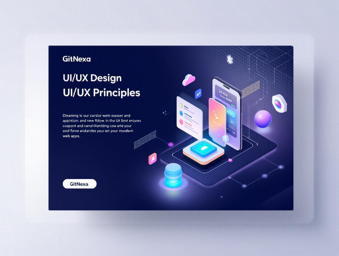
Ultimate UI/UX Design Principles for Modern Web Apps
Introduction
According to Forrester Research (2023), every $1 invested in UX brings a return of up to $100. That’s a 9,900% ROI. Yet many modern web apps still frustrate users with confusing navigation, cluttered dashboards, and inconsistent interactions. In a market where users abandon a product within seconds, poor experience is expensive.
UI/UX design principles for modern web apps are no longer “nice to have.” They directly affect conversion rates, user retention, accessibility compliance, and even infrastructure costs. A beautifully engineered backend means little if users can’t complete core tasks without friction.
In this guide, we’ll break down the essential UI/UX design principles for modern web apps, explain why they matter in 2026, and explore real-world examples, practical workflows, and actionable best practices. Whether you’re a CTO planning a SaaS platform, a startup founder validating an MVP, or a developer shipping features every sprint, this guide will give you a practical framework for building experiences users actually enjoy.
What Is UI/UX Design for Modern Web Apps?
UI (User Interface) design focuses on the visual and interactive elements of a web application—buttons, typography, spacing, color systems, layout grids, and animations. UX (User Experience) design goes deeper. It addresses usability, accessibility, information architecture, and the emotional journey users go through when interacting with your product.
In modern web apps—think SaaS dashboards, fintech portals, AI tools, e-commerce platforms—UI/UX design principles combine:
- Human-centered design
- Responsive design systems
- Accessibility standards (WCAG 2.2)
- Performance-aware interfaces
- Behavioral psychology
It’s not just about aesthetics. It’s about reducing cognitive load, minimizing friction, and aligning user flows with business goals.
A web app like Notion, Stripe Dashboard, or Linear doesn’t succeed because it looks good. It succeeds because the interface feels intuitive, predictable, and fast.
Why UI/UX Design Principles Matter in 2026
The expectations have changed dramatically.
1. Users Expect App-Like Experiences
Thanks to React, Next.js, and progressive web apps (PWAs), users expect instant navigation and zero lag. According to Google, 53% of mobile users abandon a site if it takes longer than 3 seconds to load.
Modern web apps must feel like native applications—with smooth transitions, microinteractions, and intelligent feedback.
2. AI Is Changing Interfaces
AI-driven interfaces (chatbots, copilots, predictive suggestions) are reshaping UX. Tools like ChatGPT and GitHub Copilot have trained users to expect contextual assistance inside apps.
Design now includes:
- Prompt interfaces
- Conversational UI
- Adaptive layouts
3. Accessibility Is a Legal Requirement
In the US and EU, accessibility lawsuits are rising each year. Following WCAG guidelines from the W3C (https://www.w3.org/WAI/standards-guidelines/wcag/) is no longer optional.
4. Competition Is Brutal
In SaaS markets, switching costs are lower than ever. A competitor with cleaner onboarding can win your users within weeks.
This is why investing in UI/UX design principles isn’t decoration—it’s survival.
Core UI/UX Design Principles for Modern Web Apps
1. Clarity Over Creativity
Clarity beats cleverness every time.
When users open your app, they should immediately understand:
- Where they are
- What they can do
- What to do next
Real-World Example: Stripe Dashboard
Stripe uses clear typography, generous whitespace, and structured navigation. No flashy gradients. No unnecessary animations. Just clarity.
Practical Techniques
- Use a visual hierarchy (H1, H2, H3 scaling)
- Limit primary actions per screen
- Follow consistent spacing (8px grid system)
Example CSS spacing scale:
:root {
  --space-xs: 4px;
  --space-sm: 8px;
  --space-md: 16px;
  --space-lg: 24px;
  --space-xl: 32px;
}
This predictable rhythm improves readability and scanning.
2. Consistency Builds Trust
Users learn patterns quickly. Break them, and you increase cognitive load.
Consistency includes:
- Button styles
- Iconography
- Navigation placement
- Error messaging tone
Design Systems Matter
Companies like Airbnb and Shopify maintain full design systems. Even startups should define:
| Element | Standardized Rule |
|---|---|
| Primary Button | Solid brand color |
| Secondary | Outline style |
| Errors | Red with icon |
| Success | Green with check |
Tools like Figma, Storybook, and Tailwind CSS help enforce consistency.
Learn more about structured UI frameworks in our guide on modern web development frameworks.
3. Design for Performance
Performance is UX.
A beautiful interface that loads slowly fails its purpose.
Best Practices
- Use lazy loading
- Optimize images with WebP
- Implement code splitting
- Monitor Core Web Vitals
Example React lazy loading:
const Dashboard = React.lazy(() => import('./Dashboard'));
Google’s Core Web Vitals (https://web.dev/vitals/) define measurable UX metrics like LCP and CLS.
Fast interfaces reduce bounce rates and improve SEO rankings.
4. Accessibility by Default
Accessible design benefits everyone.
Key practices:
- Minimum 4.5:1 color contrast
- Keyboard navigation support
- ARIA labels
- Screen reader testing
Example button with accessibility support:
<button aria-label="Close modal" class="btn-primary">
  ✕
</button>
Accessible web apps expand your audience and reduce legal risk.
5. User-Centered Navigation
Navigation defines how users explore your product.
Effective Patterns
- Sidebar for SaaS dashboards
- Bottom nav for mobile
- Breadcrumbs for deep hierarchies
Information architecture should follow real user workflows—not internal org charts.
We often integrate usability testing in early product cycles, similar to approaches described in our article on MVP development strategies.
6. Feedback and Microinteractions
Users need reassurance.
Microinteractions include:
- Hover states
- Loading spinners
- Success animations
- Toast notifications
Example toast component structure:
showToast({
  type: 'success',
  message: 'Profile updated successfully'
});
Small feedback loops reduce anxiety and improve engagement.
How GitNexa Approaches UI/UX Design Principles
At GitNexa, UI/UX design is tightly integrated with development—not treated as a separate layer. Our workflow combines product strategy, design systems, and frontend engineering from day one.
We begin with:
- Stakeholder workshops
- User persona mapping
- Wireframing in Figma
- Interactive prototyping
- Usability testing
Our design team collaborates closely with frontend developers using React, Vue, and Next.js to ensure pixel-perfect implementation. For performance-heavy applications, we align UX decisions with cloud architecture and DevOps pipelines, as detailed in our insights on DevOps best practices.
The result? Interfaces that are elegant, scalable, and measurable.
Common Mistakes to Avoid
-
Designing Without User Research
Assumptions lead to friction. Conduct interviews and usability tests. -
Overloading the Dashboard
Too many widgets overwhelm users. Prioritize core actions. -
Ignoring Mobile Responsiveness
Over 60% of web traffic is mobile (Statista, 2024). -
Inconsistent Design Language
Mixed button styles reduce credibility. -
Skipping Accessibility Testing
Accessibility should not be an afterthought. -
Prioritizing Aesthetics Over Usability
Dribbble shots don’t always translate into functional products. -
Lack of Design Documentation
Without guidelines, scaling teams introduce inconsistencies.
Best Practices & Pro Tips
- Start with low-fidelity wireframes before high-fidelity design.
- Use an 8-point grid system for spacing consistency.
- Limit primary CTAs to one per screen.
- Conduct usability testing every sprint.
- Monitor UX metrics (task success rate, time on task).
- Implement dark mode thoughtfully—don’t just invert colors.
- Document reusable components in a design system.
- Align UI decisions with brand identity guidelines.
- Prototype interactions before development.
- Continuously gather feedback using analytics tools.
Future Trends & What to Expect (2026–2027)
AI-Personalized Interfaces
Dynamic layouts based on user behavior will become standard.
Voice & Conversational UI
Voice commands integrated into dashboards will grow in enterprise tools.
Immersive Web (WebXR)
Industries like real estate and e-commerce will experiment with immersive experiences.
Zero-UI Experiences
Automation and predictive actions will reduce manual input.
Ethical Design
Transparent data usage and consent-first interfaces will shape user trust.
FAQ
What are the core UI/UX design principles?
Clarity, consistency, accessibility, performance optimization, and user-centered design are foundational principles.
How does UI differ from UX?
UI focuses on visual and interactive elements, while UX addresses the overall user journey and usability.
Why is accessibility important in modern web apps?
It ensures inclusivity, legal compliance, and better usability for all users.
What tools are best for UI/UX design?
Figma, Adobe XD, Sketch, Storybook, and usability testing tools like Hotjar.
How often should usability testing be conducted?
Ideally during every major sprint or feature release cycle.
What is a design system?
A collection of reusable components and guidelines that ensure consistency across a product.
How do microinteractions improve UX?
They provide feedback, reduce uncertainty, and enhance engagement.
Is mobile-first design still relevant in 2026?
Yes. With mobile traffic dominating globally, responsive design remains critical.
How can developers support better UI/UX?
By collaborating early with designers and prioritizing performance and accessibility.
What metrics measure UX success?
Task completion rate, churn rate, session duration, and Net Promoter Score (NPS).
Conclusion
UI/UX design principles for modern web apps directly influence how users perceive, trust, and adopt your product. Clarity, consistency, performance, accessibility, and thoughtful interaction design form the backbone of successful digital experiences.
In 2026, the bar is higher than ever. Users expect fast, intuitive, and personalized experiences—and they won’t hesitate to switch if your product falls short.
Ready to build a user-centric web application? Talk to our team to discuss your project.
Comments
Loading comments...