Sub Category
Latest Blogs
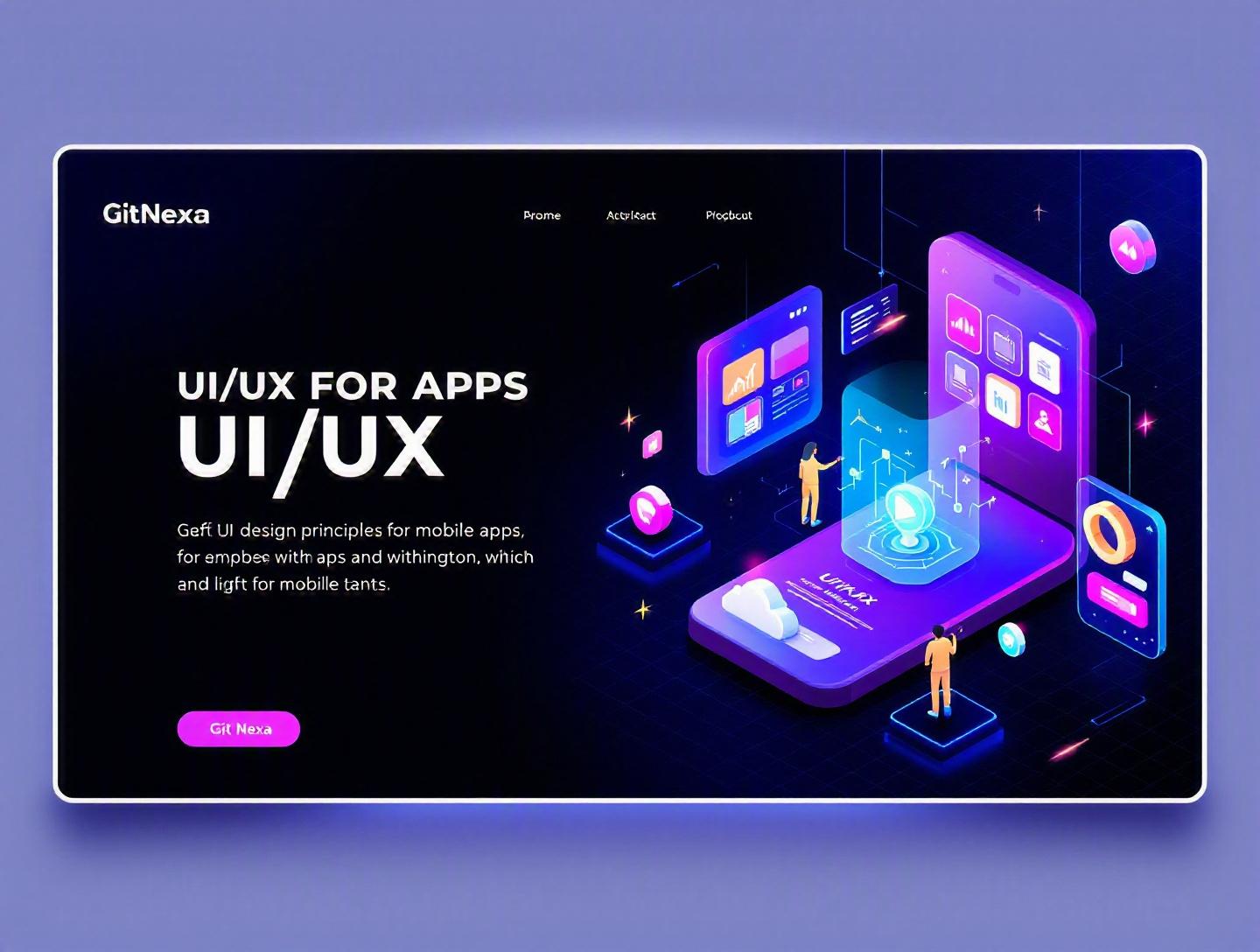
The Ultimate Guide to UI/UX Design Principles for Mobile Apps
Mobile users form an opinion about an app in less than 0.05 seconds. That’s not a design myth—that’s human perception speed, confirmed by usability research over the past decade. In 2024 alone, users downloaded over 257 billion mobile apps worldwide (Statista), yet the average 30-day retention rate across categories hovered below 6%. Most apps don’t fail because of bad ideas. They fail because of poor UI/UX design principles for mobile apps.
If you’re building a mobile product in 2026—whether you’re a CTO scaling a fintech startup or a founder validating your MVP—design is no longer a layer you “add later.” It’s a strategic asset that impacts acquisition, engagement, and revenue. A confusing onboarding flow, inconsistent navigation, or slow interface can quietly kill conversion rates.
This comprehensive guide breaks down UI/UX design principles for mobile apps in practical, developer-friendly terms. We’ll cover core foundations, mobile-specific constraints, real-world examples, measurable metrics, and emerging trends. You’ll learn how to design intuitive mobile interfaces, structure user journeys, optimize usability, and avoid costly mistakes.
Let’s start by clarifying what UI and UX really mean—and why the distinction matters.
What Is UI/UX Design Principles for Mobile Apps?
Before we dive into patterns and frameworks, we need a shared definition.
Understanding UI vs UX in Mobile Context
UI (User Interface) refers to the visual and interactive elements users engage with—buttons, typography, icons, color schemes, layout grids, animations.
UX (User Experience) focuses on how users feel when interacting with your app—ease of navigation, logical flows, speed, clarity, accessibility, and satisfaction.
In mobile app development, UI and UX are inseparable. A beautifully designed interface with confusing navigation still fails. A highly functional app with poor visual hierarchy also struggles.
Think of it this way:
- UI is the steering wheel, dashboard, and controls.
- UX is how smooth the drive feels.
Core Components of Mobile UI/UX
UI/UX design principles for mobile apps typically involve:
- User research & personas
- Information architecture (IA)
- Wireframing & prototyping
- Visual design systems
- Interaction design (IxD)
- Usability testing & iteration
For example, when designing a ride-sharing app:
- UX ensures booking a ride takes minimal steps.
- UI ensures the “Book Now” button is prominent and thumb-friendly.
Mobile-Specific Considerations
Mobile isn’t just “smaller web.” It introduces constraints:
- Limited screen space
- One-handed usage
- Variable network conditions
- Touch-based interaction
- Battery and performance sensitivity
This is why UI/UX design principles for mobile apps differ from desktop design patterns. You’re designing for thumbs, distractions, and short attention spans.
If you’re new to mobile architecture, our guide on mobile app development process explains how design integrates with engineering workflows.
Why UI/UX Design Principles for Mobile Apps Matters in 2026
Mobile usage continues to dominate digital behavior. As of 2025, over 60% of global web traffic comes from mobile devices (StatCounter). More importantly, consumer expectations are higher than ever.
Increased Competition Across Categories
In saturated markets—fintech, healthtech, e-commerce—users compare your app to the best in the industry, not your direct competitors.
A budgeting app isn’t just competing with other budgeting tools. It’s competing with the smooth interactions of Apple Pay and Google Pay.
App Store Algorithms Favor Engagement
Retention, session duration, and ratings influence visibility in both the App Store and Google Play. Poor UX leads to:
- Higher uninstall rates
- Negative reviews
- Lower lifetime value (LTV)
Accessibility Regulations Are Expanding
Governments worldwide are tightening digital accessibility standards. WCAG 2.2 compliance is increasingly expected. Designing with accessibility in mind isn’t optional—it reduces legal risk and expands your user base.
Reference: WCAG Guidelines – W3C
AI-Driven Personalization
Apps now adapt dynamically using AI. Static design systems are giving way to contextual interfaces that change based on behavior.
If you’re integrating AI-driven UX, check our breakdown on AI in mobile app development.
In short, UI/UX is no longer decoration. It directly impacts growth metrics.
Principle 1: User-Centered Design (UCD) First, Always
The foundation of UI/UX design principles for mobile apps is user-centered design.
Start with Research, Not Screens
Before Figma, before code—research.
Step-by-Step UCD Workflow
- Define target segments
- Conduct interviews (5–10 users minimum)
- Identify pain points
- Create personas
- Map user journeys
- Prototype and validate
Example: When Spotify redesigned its home screen in 2023, it analyzed listening behavior patterns before adjusting layout and recommendations.
Create Actionable Personas
A weak persona: “Tech-savvy millennial.” A strong persona: “28-year-old freelance designer who checks project updates between client calls and prefers quick interactions.”
Map Micro-Moments
Mobile users act in short bursts—while commuting, waiting, multitasking.
Your app should support:
- Quick login
- Fast loading
- Minimal typing
Usability Testing Framework
Use moderated or unmoderated testing tools:
- Maze
- Lookback
- UserTesting
Track metrics:
- Task completion rate
- Time on task
- Error frequency
Principle 2: Simplicity and Visual Hierarchy
Mobile screens demand ruthless prioritization.
The 3-Second Rule
Users should understand your screen purpose within 3 seconds.
If they hesitate, you’ve failed hierarchy.
Apply Visual Hierarchy Strategically
Use:
- Size
- Contrast
- Color
- Spacing
- Typography weight
Example Layout Hierarchy
[Headline - 24px Bold]
[Subtext - 16px Regular]
[Primary CTA - High Contrast Button]
[Secondary CTA - Outline]
Use the 8pt Grid System
Consistent spacing improves readability and scalability.
Many design systems (Material Design, iOS Human Interface Guidelines) follow 4pt or 8pt grids.
Reference: Material Design Guidelines
Comparison: Minimal vs Feature-Heavy Screens
| Element | Minimal Screen | Feature-Heavy Screen |
|---|---|---|
| Cognitive Load | Low | High |
| Conversion Rate | Higher | Lower |
| User Satisfaction | High | Moderate |
| Scalability | Easier | Complex |
Simplicity wins in most mobile contexts.
Principle 3: Intuitive Navigation Patterns
Navigation defines usability.
Popular Mobile Navigation Patterns
| Pattern | Best For | Example |
|---|---|---|
| Bottom Tab Bar | 3–5 Core Sections | |
| Hamburger Menu | Content-heavy apps | Medium |
| Gesture Navigation | Advanced interactions | Tinder |
| Hybrid | Complex ecosystems | Amazon |
Thumb-Friendly Zones
Research by Steven Hoober shows 75% of users interact with their thumbs. Design CTAs within natural thumb zones.
Breadcrumbs vs Deep Navigation
Avoid deep navigation trees. Rule of thumb: No more than 3 levels.
If your app feels like a maze, revisit your information architecture.
For scalable navigation architectures, read our article on scalable mobile app architecture.
Principle 4: Performance and Responsiveness
UX includes speed.
Google research shows a 1-second delay can reduce conversions by up to 20%.
Optimize Perceived Performance
- Use skeleton loaders
- Lazy load images
- Cache API responses
Example (React Native Lazy Loading)
const LazyImage = React.lazy(() => import('./ImageComponent'));
Reduce Cognitive Waiting
Instead of spinner loops, show progress states.
Performance Checklist
- Optimize assets
- Compress images (WebP/AVIF)
- Minimize network requests
- Use CDN
- Profile with Lighthouse
For backend performance strategies, see cloud optimization strategies.
Principle 5: Accessibility and Inclusive Design
Accessibility is a growth lever.
Key Mobile Accessibility Rules
- Minimum 44x44px touch targets
- 4.5:1 contrast ratio
- Screen reader compatibility
- Voice input support
Inclusive Design Beyond Disability
Consider:
- Older users
- Low-bandwidth users
- Non-native speakers
Apps like Microsoft Teams improved accessibility features and saw broader enterprise adoption.
How GitNexa Approaches UI/UX Design Principles for Mobile Apps
At GitNexa, UI/UX design isn’t an isolated design sprint—it’s integrated into product strategy.
Our process includes:
- Discovery workshops with stakeholders
- User research and competitor benchmarking
- Wireframes validated before visual design
- Component-based design systems
- Developer handoff with detailed documentation
- Continuous usability testing post-launch
We align designers and engineers early. That prevents friction between aesthetics and feasibility. Whether we’re building cross-platform apps in Flutter or native apps in Swift and Kotlin, design decisions are tested against real-world performance metrics.
Explore our work in custom mobile app development and UI/UX design services.
Common Mistakes to Avoid
- Designing for yourself, not users – Founders often assume behavior.
- Overloading first-time users – Too many onboarding screens reduce retention.
- Ignoring platform guidelines – Android and iOS expectations differ.
- Inconsistent design systems – Leads to user confusion.
- Skipping usability testing – Assumptions are expensive.
- Poor error messaging – “Something went wrong” isn’t helpful.
- Neglecting dark mode optimization – Increasingly expected.
Best Practices & Pro Tips
- Use progressive disclosure to reveal complexity gradually.
- Limit primary CTAs to one per screen.
- Use microinteractions for feedback.
- Conduct A/B tests for layout decisions.
- Design offline states intentionally.
- Maintain a scalable design system.
- Use analytics (Mixpanel, Firebase) to validate UX.
- Keep onboarding under 60 seconds.
Future Trends & What to Expect (2026–2027)
- AI-personalized interfaces
- Voice-first mobile navigation
- AR-integrated shopping experiences
- Biometric-first authentication
- Adaptive color systems
- Foldable device optimization
Mobile UI/UX will become more contextual and predictive.
FAQ: UI/UX Design Principles for Mobile Apps
1. What are the most important UI/UX design principles for mobile apps?
User-centered design, simplicity, intuitive navigation, performance optimization, and accessibility are foundational principles.
2. How is mobile UI/UX different from web design?
Mobile design prioritizes thumb interaction, limited screen space, and performance constraints.
3. How long does mobile UI/UX design take?
For an MVP, 4–8 weeks depending on complexity and research depth.
4. What tools are best for mobile UI/UX design?
Figma, Sketch, Adobe XD, Maze, and InVision are widely used.
5. Why is accessibility important in mobile apps?
It ensures usability for all users and reduces legal risks.
6. How do you measure UX success?
Track retention, task completion rate, churn, NPS, and conversion metrics.
7. Should startups invest in UX early?
Yes. Early UX reduces redesign costs later.
8. What is the role of microinteractions?
They provide feedback, guide users, and enhance engagement.
9. How often should UI be updated?
Major reviews annually; iterative improvements continuously.
10. Can AI improve mobile UX?
Yes. AI enables personalization and predictive interfaces.
Conclusion
UI/UX design principles for mobile apps determine whether users stay or leave. From user research to performance optimization, every design choice influences retention and revenue. In 2026, mobile apps must be intuitive, fast, inclusive, and adaptive.
Great design doesn’t happen by accident—it’s engineered through research, testing, and iteration.
Ready to build a mobile app users actually love? Talk to our team to discuss your project.
Comments
Loading comments...