Sub Category
Latest Blogs
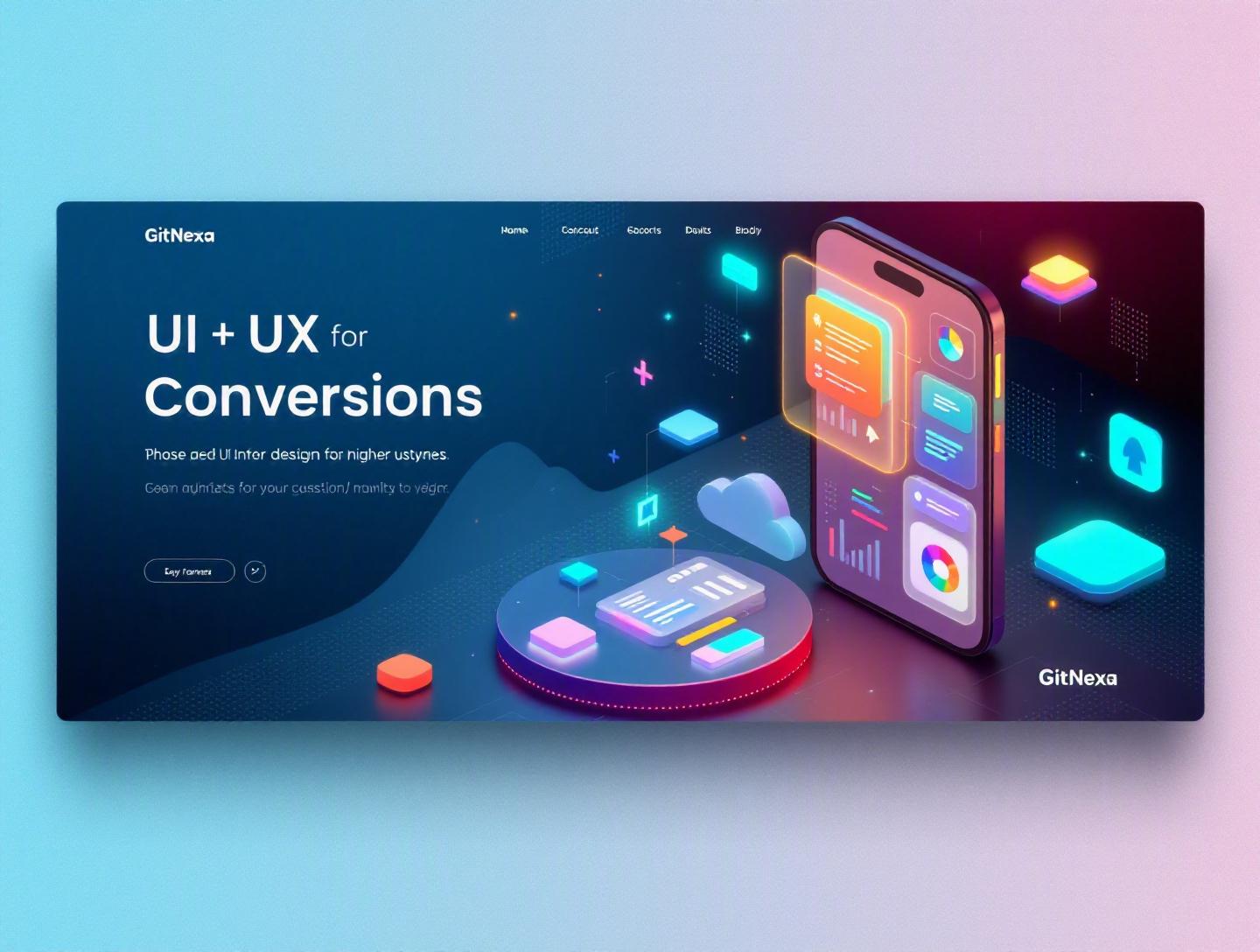
Ultimate UI UX Design Principles for Higher Conversions
Introduction
In 2025, Forrester reported that a well-designed user interface can raise a website’s conversion rate by up to 200%, while better UX design can boost conversions by 400%. Those numbers aren’t marketing fluff—they reflect a simple truth: design decisions directly impact revenue.
Yet many businesses still treat UI/UX as surface-level polish. They invest in traffic acquisition, paid ads, SEO, and performance marketing—but send users to interfaces that confuse, overwhelm, or frustrate them.
That’s where ui ux design principles for higher conversions come in. When applied correctly, these principles transform your website or app from a digital brochure into a conversion engine.
In this guide, you’ll learn:
- The psychology behind high-converting interfaces
- Practical UI and UX frameworks used by top SaaS and eCommerce brands
- Conversion-focused layout, navigation, and CTA strategies
- Common mistakes that quietly kill conversions
- How GitNexa approaches UI/UX to drive measurable results
Whether you're a CTO, founder, product manager, or growth marketer, this breakdown will help you connect design decisions to business outcomes.
What Is UI UX Design for Higher Conversions?
UI (User Interface) refers to the visual elements users interact with—buttons, typography, colors, forms, layouts. UX (User Experience) focuses on how users move through your product—their journey, emotions, friction points, and task completion flow.
When we talk about ui ux design principles for higher conversions, we’re talking about designing digital products that guide users toward specific actions:
- Signing up
- Booking a demo
- Making a purchase
- Subscribing to a service
- Requesting a quote
This isn’t manipulation. It’s clarity.
Conversion-focused UI/UX combines:
- Behavioral psychology
- Information architecture
- Interaction design
- Usability engineering
- Data-driven optimization
It ensures users don’t just visit—but act.
Why UI UX Design Principles for Higher Conversions Matter in 2026
The digital landscape in 2026 is more competitive than ever:
- Global eCommerce sales are projected to exceed $7 trillion (Statista, 2026).
- Google’s Core Web Vitals remain ranking factors, tying UX to SEO performance.
- Mobile traffic accounts for over 60% of global web traffic.
Attention spans are shrinking. Switching costs are near zero. If your interface creates friction, users leave.
Three major shifts define 2026:
1. AI-Powered Personalization
AI-driven UX adapts content in real time. Static interfaces feel outdated.
2. Micro-Interactions & Motion
Subtle feedback (hover states, loading animations) builds trust and reduces uncertainty.
3. Privacy & Trust Signals
Clear consent flows and transparent data policies increase user confidence.
In short, UI/UX is no longer aesthetic—it’s strategic.
Principle #1: Clarity Over Creativity
Creativity is valuable—but clarity converts.
Reduce Cognitive Load
Every extra decision increases friction. Hick’s Law states that decision time increases with the number of choices.
Example: Amazon limits homepage CTAs. The dominant action? “Add to Cart.”
Clear Visual Hierarchy
Use:
- Large headings
- Contrast for primary CTAs
- White space to isolate actions
Example layout hierarchy:
H1: Clear Value Proposition
Subheading: Supporting benefit
Primary CTA button
Social proof
Feature highlights
One Primary Goal Per Page
Landing pages that focus on one conversion goal outperform multi-goal pages.
| Page Type | Conversion Rate (Avg) |
|---|---|
| Single CTA | 5–12% |
| Multiple CTAs | 1–4% |
Principle #2: Frictionless User Flows
UX is about removing obstacles.
Map the User Journey
- Entry point
- Exploration
- Decision trigger
- Conversion action
- Confirmation
Use tools like Figma, Miro, or Whimsical to visualize flows.
Optimize Forms
Baymard Institute found checkout abandonment averages 70%.
Best practices:
- Reduce fields
- Enable autofill
- Use inline validation
Example:
<input type="email" required placeholder="Enter your email">
Progressive Disclosure
Don’t show everything at once. Reveal details only when needed.
Principle #3: Trust-Driven Design
Users don’t convert if they don’t trust you.
Social Proof
Add:
- Testimonials
- Case studies
- Client logos
- Star ratings
Example: Shopify prominently displays merchant success stories.
Security Signals
Display:
- SSL badges
- Secure payment icons
- Privacy guarantees
Consistency
Design systems prevent visual inconsistency.
Components:
- Typography scale
- Color palette
- Button styles
- Spacing grid
Consistency reduces cognitive strain and builds familiarity.
Principle #4: Data-Driven Iteration
High-converting UI/UX isn’t guesswork.
A/B Testing
Test:
- CTA color
- Headline copy
- Layout variations
Example tools:
- Google Optimize (archived but foundational)
- Optimizely
- VWO
Heatmaps & Session Recordings
Use Hotjar or Microsoft Clarity to identify:
- Dead clicks
- Scroll depth
- Drop-off zones
Analytics Integration
Tie UX changes to KPIs:
- Conversion rate
- Bounce rate
- Time on page
Principle #5: Mobile-First & Performance-Centric Design
Mobile UX is not optional.
Responsive Design
Use CSS media queries:
@media (max-width: 768px) {
  .container { padding: 16px; }
}
Core Web Vitals
Optimize:
- LCP (Largest Contentful Paint)
- CLS (Cumulative Layout Shift)
- INP (Interaction to Next Paint)
Reference: https://web.dev/vitals/
Faster pages convert better. Even a 1-second delay can reduce conversions by 7%.
How GitNexa Approaches UI UX Design Principles for Higher Conversions
At GitNexa, we treat UI/UX as a growth function—not decoration.
Our process:
- Conversion audit
- User journey mapping
- Wireframing in Figma
- Interactive prototyping
- A/B testing roadmap
- Performance optimization
We align UI/UX with development workflows in React, Next.js, and Flutter. Our work connects seamlessly with broader services like custom web development, mobile app development strategy, and cloud-native architecture.
The goal isn’t prettier screens. It’s measurable growth.
Common Mistakes to Avoid
- Designing without user research
- Overloading pages with animations
- Ignoring mobile usability
- Hiding CTAs below the fold
- Using vague microcopy
- Skipping usability testing
- Prioritizing trends over clarity
Best Practices & Pro Tips
- Use action-oriented CTA text (“Start Free Trial” > “Submit”)
- Keep forms under 5 fields when possible
- Use contrast ratios that meet WCAG 2.1
- Add micro-interactions for feedback
- Show pricing transparently
- Run usability tests before launch
- Document a design system
Future Trends & What to Expect (2026–2027)
- AI-personalized UI components
- Voice-assisted navigation
- Zero-UI predictive experiences
- Accessibility-first design mandates
- Biometric-based authentication flows
Interfaces will become more adaptive—and less cluttered.
FAQ
What are UI UX design principles for higher conversions?
They are design strategies focused on guiding users toward completing desired actions like purchases or sign-ups.
How does UI impact conversion rates?
Clear layouts, strong CTAs, and visual hierarchy reduce friction and increase user confidence.
Does UX affect SEO?
Yes. Google’s Core Web Vitals incorporate user experience signals into rankings.
How many CTAs should a landing page have?
Ideally one primary CTA supported by secondary contextual links.
Is mobile-first design necessary in 2026?
Absolutely. Most traffic comes from mobile devices globally.
What tools help improve UX?
Figma, Hotjar, Clarity, Optimizely, and GA4 are commonly used.
How often should you run A/B tests?
Continuously—especially on high-traffic pages.
What’s the difference between UI and UX?
UI focuses on visual elements; UX focuses on overall experience and flow.
Conclusion
Strong UI/UX isn’t decoration—it’s conversion strategy. By prioritizing clarity, reducing friction, building trust, and iterating based on data, you turn design into a revenue driver.
The companies winning in 2026 aren’t just attracting traffic. They’re guiding users with precision.
Ready to improve your product’s conversions through smarter design? Talk to our team to discuss your project.
Comments
Loading comments...