Sub Category
Latest Blogs
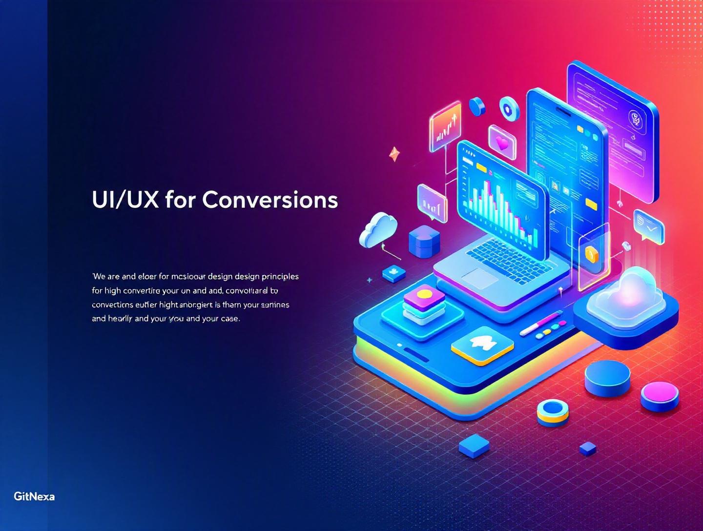
Ultimate UI/UX Design Principles for High-Converting Apps
Introduction
In 2025, Google reported that 53% of mobile users abandon a site or app that takes longer than three seconds to load. Meanwhile, Forrester Research found that a well-designed user interface can raise a website’s conversion rate by up to 200%, and better UX design can yield conversion improvements of up to 400%. Those numbers aren’t marginal gains. They’re the difference between a product that survives and one that scales.
UI/UX design principles for high-converting apps are no longer just a "nice-to-have" layer of polish. They sit at the core of product strategy. Whether you’re building a fintech dashboard, an eCommerce marketplace, or a SaaS productivity tool, the way users move through your interface determines whether they sign up, subscribe, purchase, or leave.
Yet many teams still treat UI as decoration and UX as a checklist. They launch feature-heavy apps with cluttered navigation, unclear CTAs, and inconsistent feedback loops—then wonder why churn is high and activation rates are low.
In this comprehensive guide, we’ll break down the essential UI/UX design principles that directly impact conversion rates. You’ll learn the psychology behind high-performing interfaces, see real-world examples, review actionable frameworks, and explore how modern tools and workflows support measurable growth. If you’re a CTO, founder, or product leader looking to increase activation, retention, and revenue, this is your blueprint.
What Is UI/UX Design and What Makes It High-Converting?
Before we talk about conversion optimization, we need to clarify terms.
UI (User Interface) refers to the visual and interactive elements users see and interact with—buttons, typography, color systems, layout grids, animations, and component libraries.
UX (User Experience) covers the entire journey: usability, information architecture, task flow, emotional response, and how efficiently a user accomplishes a goal.
When we talk about high-converting apps, we mean digital products designed to:
- Increase sign-ups and onboarding completion
- Boost purchases or subscriptions
- Improve feature adoption
- Reduce churn
- Drive repeat engagement
High-converting UI/UX design principles combine:
- Behavioral psychology (Fogg Behavior Model, Hick’s Law)
- Usability heuristics (Nielsen Norman Group)
- Performance engineering (Core Web Vitals)
- Data-driven iteration (A/B testing, heatmaps)
Think of it this way: UI is how your product looks. UX is how it works. Conversion is what it achieves.
And in 2026, you can’t separate them.
Why UI/UX Design Principles Matter in 2026
The stakes are higher than ever.
According to Statista (2025), global mobile app revenues surpassed $613 billion, with over 255 billion app downloads annually. Competition is fierce. Users install, test, and uninstall within minutes.
At the same time:
- AI-powered personalization is now expected.
- Accessibility compliance (WCAG 2.2) is legally enforced in many regions.
- Attention spans are shrinking.
- Dark patterns are increasingly penalized by regulators.
Google’s Core Web Vitals update continues to impact rankings. Metrics like LCP (Largest Contentful Paint), CLS (Cumulative Layout Shift), and INP (Interaction to Next Paint) influence both SEO and user satisfaction. You can review official guidance at https://web.dev/vitals/.
In B2B SaaS, product-led growth has changed the equation. Buyers expect to self-serve. If onboarding is confusing, they won’t book a demo—they’ll switch to a competitor.
In consumer apps, micro-moments dominate. Users expect instant feedback, intuitive gestures, and frictionless checkout (think Apple Pay or Google Pay).
So what does this mean for product teams?
It means UI/UX design principles are directly tied to revenue metrics:
- Activation rate n- Customer acquisition cost (CAC)
- Lifetime value (LTV)
- Monthly recurring revenue (MRR)
Design decisions are business decisions.
Principle 1: Clarity Over Creativity
Creativity wins awards. Clarity wins conversions.
Reduce Cognitive Load
Hick’s Law states that the time it takes to make a decision increases with the number and complexity of choices. More buttons ≠ more engagement.
Consider Amazon’s checkout flow. It’s not flashy. It’s streamlined. Every screen answers one question: “Are you ready to complete your purchase?”
Contrast that with early-stage SaaS dashboards that present 12 features at once. Users freeze.
To reduce cognitive load:
- Limit primary actions per screen (1–2 max).
- Use progressive disclosure.
- Apply visual hierarchy (size, contrast, spacing).
Example component structure in React:
<Button variant="primary" size="lg">
  Start Free Trial
</Button>
Notice the clarity in CTA language. No ambiguity.
Strong Visual Hierarchy
Use:
- 8pt spacing systems
- Clear H1–H4 typography scale
- Color contrast ratios (WCAG 2.2 AA minimum 4.5:1)
Comparison table:
| Weak Hierarchy | Strong Hierarchy |
|---|---|
| Same font size everywhere | Clear typographic scale |
| Multiple CTA colors | Single primary accent |
| Dense layout | Generous whitespace |
Whitespace is not wasted space. It’s decision space.
Principle 2: Frictionless Onboarding
Your onboarding flow determines whether users activate or churn.
Design for Time-to-Value (TTV)
Slack’s onboarding asks one thing: “What’s your team working on?” Within minutes, users see channels and collaboration in action.
Key onboarding steps:
- Capture minimal required data.
- Show immediate value.
- Guide next action with tooltips.
- Track completion metrics.
Use product analytics tools like Mixpanel or Amplitude to measure:
- Onboarding completion rate
- Feature adoption rate
- Drop-off points
Remove Form Friction
Shorten forms. Use autofill APIs. Offer OAuth login (Google, GitHub).
Form example:
<input type="email" required autocomplete="email" />
Small improvements compound. Expedia once increased profit by $12 million annually after removing a single redundant field from its booking form.
If you’re building complex SaaS onboarding, our guide on building scalable web applications explores backend alignment with UX flows.
Principle 3: Consistency Builds Trust
Users trust what feels predictable.
Design Systems and Component Libraries
Companies like Airbnb and Shopify rely on structured design systems.
A basic design system includes:
- Typography scale
- Color tokens
- Button states
- Form components
- Iconography
Token example:
{
  "colorPrimary": "#2563EB",
  "spacingMd": "16px"
}
Consistency improves:
- Development speed
- Brand recall
- Usability
Explore our insights on creating scalable design systems.
Micro-Interactions Matter
Hover states, loading spinners, and success animations reduce uncertainty.
Bad UX: Button click with no feedback. Good UX: Button transitions to loading state instantly.
Microcopy also impacts trust. “Submit” is generic. “Create My Account” is clear.
Principle 4: Performance Is Part of UX
Speed directly affects conversions.
According to Google (2024), a 0.1-second improvement in mobile site speed can increase conversion rates by 8% in retail.
Optimize Frontend Performance
Use:
- Code splitting
- Lazy loading
- Image compression (WebP)
- CDN delivery
Example dynamic import:
const Dashboard = React.lazy(() => import('./Dashboard'));
Measure with Lighthouse and PageSpeed Insights.
If infrastructure bottlenecks exist, review cloud migration strategies for scalable deployment.
Core Web Vitals and Conversion
| Metric | Target |
|---|---|
| LCP | <2.5s |
| CLS | <0.1 |
| INP | <200ms |
Performance isn’t just technical debt—it’s conversion optimization.
Principle 5: Data-Driven Iteration
Great UI/UX design principles rely on testing, not assumptions.
A/B Testing Framework
Step-by-step:
- Define hypothesis.
- Identify conversion metric.
- Build variant.
- Run experiment (minimum 2 weeks).
- Analyze statistical significance.
Example hypothesis:
“Changing CTA from ‘Sign Up’ to ‘Start Free Trial’ will increase conversions by 10%.”
Use tools like Google Optimize alternatives, VWO, or Optimizely.
Heatmaps and Session Recordings
Hotjar and FullStory reveal:
- Scroll depth
- Rage clicks
- Dead zones
These insights often reveal surprises. Users may ignore your hero section entirely.
For AI-enhanced personalization, see AI in product development.
Principle 6: Accessibility and Inclusive Design
Accessibility increases reach—and conversions.
According to WHO (2024), over 1.3 billion people live with significant disabilities.
WCAG 2.2 Compliance
Ensure:
- Keyboard navigation
- Alt text for images
- Focus indicators
- Screen reader compatibility
Example:
<button aria-label="Close modal">×</button>
Accessible apps outperform because they’re easier for everyone to use.
Inclusive UX
Consider:
- Cultural localization
- Gender-neutral language
- Flexible font sizes
Design for edge cases, and you improve the median experience.
How GitNexa Approaches UI/UX Design Principles
At GitNexa, we treat UI/UX design principles as a growth engine—not a cosmetic layer.
Our process typically includes:
- Stakeholder workshops to align business KPIs with user goals.
- UX research (personas, journey mapping, usability testing).
- Wireframing and rapid prototyping in Figma.
- Design system creation.
- Frontend engineering using React, Next.js, or Flutter.
- Continuous optimization via analytics and A/B testing.
We integrate UX with DevOps pipelines to ensure performance and scalability. Learn more about our DevOps best practices.
The result? Apps that don’t just look polished—but convert.
Common Mistakes to Avoid
- Designing without user research.
- Overloading dashboards with features.
- Ignoring mobile-first principles.
- Using vague CTA copy.
- Neglecting accessibility.
- Skipping usability testing before launch.
- Prioritizing aesthetics over performance.
Each of these silently erodes conversion rates.
Best Practices & Pro Tips
- Use one primary CTA per screen.
- Apply consistent spacing systems (8pt grid).
- Measure time-to-first-value.
- Optimize for thumb reach on mobile.
- Use real user testing, not internal feedback.
- Align UX metrics with revenue KPIs.
- Document your design system early.
- Continuously iterate post-launch.
Future Trends & What to Expect (2026–2027)
- AI-generated UI personalization.
- Voice and gesture-based interfaces.
- Spatial computing UX for AR/VR.
- Zero-UI interactions.
- Increased regulation against manipulative UX.
Design will increasingly merge with behavioral analytics and AI decision engines.
FAQ
What are UI/UX design principles?
They are foundational guidelines that shape how users interact with digital products, ensuring usability, accessibility, and goal completion.
How does UI/UX affect conversion rates?
Clear navigation, strong CTAs, and reduced friction directly increase sign-ups, purchases, and retention.
What tools are best for UI/UX design?
Figma, Adobe XD, Sketch, Hotjar, Mixpanel, and Lighthouse are widely used in 2026.
How long does it take to design a high-converting app?
Typically 6–16 weeks depending on complexity and research depth.
What is the difference between UI and UX?
UI focuses on visuals and interaction elements, while UX covers the overall user journey and usability.
Why is accessibility important in app design?
It increases reach, improves usability, and ensures legal compliance.
What metrics measure UX success?
Conversion rate, activation rate, churn rate, NPS, and time-to-value.
Can small UX changes improve revenue?
Yes. Even micro-optimizations in forms or CTAs can significantly impact revenue.
Conclusion
UI/UX design principles for high-converting apps combine psychology, performance, clarity, and data-driven iteration. When done right, they reduce friction, build trust, and guide users toward meaningful action.
Design is not decoration. It’s strategy.
If your app isn’t converting the way it should, the answer likely isn’t more features—it’s better experience design.
Ready to build a high-converting app? Talk to our team to discuss your project.
Comments
Loading comments...