Sub Category
Latest Blogs
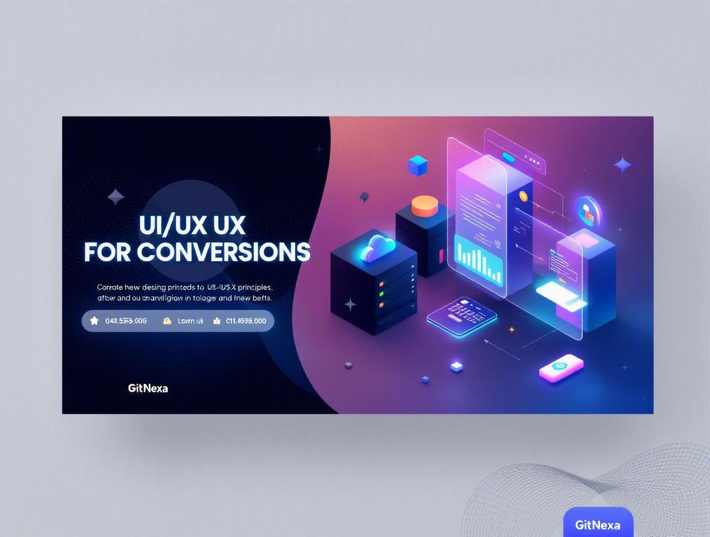
Ultimate UI UX Design Principles for High Conversions
Introduction
A one-second delay in page load time can reduce conversions by 7%, according to Akamai’s widely cited performance research. Google’s own data shows that when page load time increases from one to three seconds, the probability of bounce increases by 32% (Think with Google, 2023). Those numbers aren’t small fluctuations. They’re revenue leaks.
This is where ui-ux-design-principles for high conversions stop being “design theory” and start becoming business strategy. Every button placement, color contrast decision, onboarding flow, and microinteraction either moves a user closer to conversion—or pushes them away.
Most companies obsess over traffic. They pour budget into SEO, paid ads, and social campaigns. But if your product experience confuses users, overwhelms them, or slows them down, you’re paying for visitors who never convert. Strong UI (User Interface) and UX (User Experience) design principles bridge that gap between traffic and revenue.
In this guide, we’ll break down the essential UI UX design principles that directly impact conversions. You’ll learn how cognitive psychology shapes behavior, how visual hierarchy influences decisions, how performance optimization affects retention, and how companies like Airbnb, Stripe, and Amazon structure experiences to maximize results. We’ll also share practical frameworks, code-level considerations, common pitfalls, and how GitNexa approaches conversion-focused design for startups and enterprises alike.
If your goal is higher sign-ups, increased purchases, better engagement, or stronger customer retention, this isn’t about aesthetics. It’s about designing systems that convert.
What Is UI UX Design Principles for High Conversions?
UI UX design principles for high conversions refer to structured design guidelines that optimize digital interfaces—websites, mobile apps, SaaS platforms—to guide users toward specific actions.
Let’s separate the two briefly:
UI (User Interface)
The visual layer: typography, color schemes, buttons, spacing, icons, layout grids, animation. UI influences perception, clarity, and aesthetic appeal.
UX (User Experience)
The journey layer: navigation flow, information architecture, task completion paths, usability, accessibility, performance, feedback loops.
When we talk about high conversions, we’re discussing measurable outcomes such as:
- Product purchases
- SaaS trial signups
- Newsletter subscriptions
- App installs
- Demo requests
- Checkout completion
High-converting UI/UX design aligns three core elements:
- User intent (What problem are they trying to solve?)
- Business goal (What action do you want them to take?)
- Friction reduction (What obstacles stand in the way?)
Think of conversion design like airport navigation. The best airports guide thousands of passengers daily with minimal confusion. Clear signs, logical flow, and well-placed services reduce cognitive load. The same logic applies to digital products.
Conversion-focused design isn’t about aggressive CTAs or flashing buttons. It’s about clarity, trust, speed, accessibility, and psychological alignment.
For deeper insight into interface foundations, explore our guide on modern UI UX design best practices.
Why UI UX Design Principles Matter in 2026
The digital landscape in 2026 is more competitive—and more impatient—than ever.
According to Statista (2025), global e-commerce sales surpassed $6.3 trillion. Meanwhile, Gartner reports that 89% of companies compete primarily on customer experience. Not price. Not features. Experience.
Here’s what’s changed recently:
1. AI-Powered Personalization Is Expected
Users now expect dynamic content, personalized recommendations, and contextual flows. Netflix and Amazon set the benchmark years ago. SaaS and fintech products are catching up.
2. Mobile-First Is No Longer Optional
As of 2025, over 58% of global web traffic comes from mobile devices (Statista). Poor responsive UX directly translates to revenue loss.
3. Accessibility Is a Legal and Business Priority
WCAG 2.2 compliance isn’t just ethical—it reduces legal risk and expands reach. Microsoft estimates over 1 billion people globally live with some form of disability.
4. Attention Spans Are Shorter
TikTok, short-form video, and micro-content have trained users to scan rapidly. Your design must communicate value within seconds.
5. Performance Impacts SEO
Google’s Core Web Vitals remain ranking factors. Poor UX now affects both conversions and discoverability.
If your UI feels outdated, cluttered, or slow, users won’t complain. They’ll leave.
Principle 1: Clarity Over Cleverness
If users have to think too hard, they won’t convert.
The Cognitive Load Factor
Cognitive load theory suggests people can process limited information at once. Overloaded interfaces cause friction.
Compare:
| Confusing UI | Clear UI |
|---|---|
| Multiple CTAs competing | Single primary CTA |
| Vague headlines | Specific value proposition |
| Dense paragraphs | Scannable sections |
Airbnb’s homepage is a masterclass. Clear search bar. Minimal distractions. Focused action.
How to Implement Clarity
- Use one primary CTA per screen.
- Apply consistent typography hierarchy.
- Use white space strategically.
- Avoid jargon-heavy copy.
Example HTML CTA Structure
<section class="hero">
  <h1>Build Scalable Apps Faster</h1>
  <p>Launch your MVP in 8 weeks with our expert team.</p>
  <button class="primary-cta">Get a Free Quote</button>
</section>
Notice the simplicity. One goal. One direction.
Principle 2: Visual Hierarchy Drives Decisions
Users don’t read. They scan.
Eye-tracking studies by the Nielsen Norman Group show users follow F-pattern and Z-pattern scanning behaviors.
Key Hierarchy Techniques
- Size (larger = more important)
- Color contrast
- Positioning
- Spacing
- Motion cues
Stripe uses generous spacing and bold typography to highlight primary actions.
Conversion-Oriented Layout Structure
- Headline (value promise)
- Subheading (supporting detail)
- Social proof
- Primary CTA
- Secondary CTA (optional)
CSS Example for Emphasis
.primary-cta {
  background-color: #0052FF;
  color: #ffffff;
  padding: 16px 32px;
  font-weight: 600;
  border-radius: 8px;
}
Subtle design decisions like padding and contrast can increase click-through rates significantly.
Principle 3: Frictionless User Flows
Every extra step reduces conversions.
Baymard Institute reports that average cart abandonment rates remain around 70% (2024). A major cause? Complicated checkout processes.
Streamlining the Funnel
Example checkout improvement:
Before:
- Account creation required
- 12 form fields
- No progress indicator
After:
- Guest checkout
- Autofill enabled
- 6 essential fields
- Progress bar
Step-by-Step Optimization Process
- Map the entire user journey.
- Identify drop-off points using analytics.
- Remove unnecessary fields.
- Implement autofill and validation.
- Add trust indicators.
We cover backend performance considerations in our article on scalable web application architecture.
Principle 4: Trust Signals Increase Conversions
Trust is the invisible conversion driver.
Users ask subconsciously:
- Is this secure?
- Is this credible?
- Will this solve my problem?
High-Impact Trust Elements
- SSL certificates
- Customer testimonials
- Case studies
- Security badges
- Transparent pricing
- Real product photos
Dropbox increased conversions by adding customer logos and testimonials above the fold.
Structured Social Proof Block
<section class="testimonials">
  <blockquote>
    "GitNexa reduced our churn by 22% after redesigning our UX."
  </blockquote>
  <cite>CTO, FinTech Startup</cite>
</section>
Authenticity beats generic praise every time.
Principle 5: Performance Is Part of UX
Speed equals revenue.
Google’s Core Web Vitals focus on:
- LCP (Largest Contentful Paint)
- FID (First Input Delay)
- CLS (Cumulative Layout Shift)
Performance Optimization Checklist
- Lazy load images.
- Use CDN.
- Compress assets.
- Optimize fonts.
- Reduce JavaScript bundle size.
For DevOps-level optimization strategies, see DevOps best practices for scalable apps.
Principle 6: Data-Driven Iteration
Design is never finished.
High-converting teams rely on:
- A/B testing (Optimizely, VWO)
- Heatmaps (Hotjar)
- Session recordings
- Funnel analysis
A/B Testing Example
Test variable: CTA color
| Variant | Conversion Rate |
|---|---|
| Blue | 4.2% |
| Orange | 5.1% |
Small visual changes can produce measurable gains.
How GitNexa Approaches UI UX Design Principles
At GitNexa, conversion-focused design starts with discovery. We analyze business goals, user personas, and analytics before sketching wireframes.
Our approach includes:
- User research and behavioral analysis
- Wireframing and rapid prototyping (Figma)
- Usability testing with real users
- Accessibility audits
- Performance-first frontend development
We align UI/UX with scalable engineering, integrating insights from our work in custom web application development and mobile app development strategies.
The result? Products that look sharp and convert consistently.
Common Mistakes to Avoid
- Designing for stakeholders, not users.
- Ignoring mobile responsiveness.
- Overusing animations.
- Cluttered navigation menus.
- Weak contrast and accessibility issues.
- Long, mandatory signup forms.
- No clear primary CTA.
Each of these reduces clarity and increases friction.
Best Practices & Pro Tips
- Use 8px spacing systems for consistency.
- Keep forms under 7 fields when possible.
- Add microcopy near CTAs to reduce anxiety.
- Test with real users, not just internal teams.
- Use progressive disclosure for complex flows.
- Design mobile-first, scale upward.
- Maintain visual consistency across platforms.
- Optimize above-the-fold content first.
Future Trends & What to Expect (2026-2027)
- AI-personalized UI layouts.
- Voice-integrated interfaces.
- Gesture-based navigation in AR/VR.
- Hyper-accessible design standards.
- Predictive UX using behavioral analytics.
Companies that combine AI with ethical UX will dominate.
FAQ
What are UI UX design principles?
They are guidelines that improve usability, clarity, accessibility, and conversion performance in digital products.
How does UI affect conversion rates?
Clear layouts, strong contrast, and focused CTAs guide users toward actions, increasing click-through and completion rates.
What is the difference between UI and UX?
UI refers to visual interface elements; UX refers to the overall user journey and experience.
How can I measure UX performance?
Use metrics like bounce rate, task completion rate, time on page, and conversion rate.
Are UI UX principles different for mobile apps?
The core principles remain, but gesture interactions, smaller screens, and mobile performance add constraints.
How many CTAs should a page have?
Ideally one primary CTA and one secondary option.
Does page speed impact conversions?
Yes. Even one-second delays significantly reduce conversion rates.
What tools help improve UI UX?
Figma, Adobe XD, Hotjar, Google Analytics, Lighthouse.
Is accessibility part of UX?
Absolutely. Inclusive design expands your audience and reduces legal risk.
How often should UI UX be updated?
Continuously. Regular testing and iteration are key to sustained performance.
Conclusion
High-converting products don’t happen by accident. They’re built on clear UI UX design principles that reduce friction, guide attention, build trust, and prioritize speed. When you align user psychology with business goals, conversion rates improve naturally.
Whether you’re launching a SaaS platform, scaling an e-commerce store, or modernizing an enterprise application, thoughtful design decisions compound over time.
Ready to improve your product’s conversions? Talk to our team to discuss your project.
Comments
Loading comments...