Sub Category
Latest Blogs
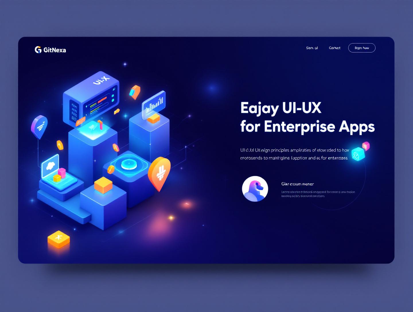
Ultimate UI UX Design Principles for Enterprise Apps
Introduction
Enterprise software failure is expensive. According to Gartner (2023), nearly 50% of large-scale digital transformation initiatives fall short of their expected outcomes, and poor user adoption is one of the top three reasons. The software works. The features are powerful. The architecture is sound. But employees don’t use it the way it was intended.
That’s where ui-ux-design-principles-for-enterprise-apps become mission-critical. In enterprise environments, design is not about pretty interfaces. It’s about reducing cognitive load for a procurement officer processing 400 invoices a day, helping a warehouse supervisor make decisions in seconds, or enabling executives to extract insights from complex dashboards without calling IT.
Enterprise apps are fundamentally different from consumer products. They serve multiple roles, integrate with legacy systems, enforce compliance rules, and operate under strict performance constraints. Designing them requires structure, discipline, and a deep understanding of workflows.
In this comprehensive guide, you’ll learn the essential UI/UX design principles for enterprise applications in 2026, including usability frameworks, accessibility standards, scalable design systems, performance optimization techniques, and real-world implementation patterns. We’ll cover common mistakes, best practices, future trends, and how GitNexa approaches enterprise design projects that drive measurable business results.
If you’re a CTO, product manager, or founder building internal tools, SaaS platforms, ERP systems, or complex dashboards, this guide will give you a practical roadmap.
What Is UI-UX-Design-Principles-for-Enterprise-Apps?
UI/UX design principles for enterprise apps refer to a structured set of guidelines and methodologies used to design complex business software that prioritizes usability, efficiency, scalability, and compliance across large organizations.
Unlike consumer apps (think Instagram or Spotify), enterprise applications:
- Serve multiple user roles with different permissions
- Handle complex workflows and data-heavy interfaces
- Integrate with legacy systems (ERP, CRM, HRIS)
- Require audit trails, compliance, and security constraints
- Must scale across thousands—or millions—of users
UI (User Interface) focuses on layout, typography, spacing, color systems, component libraries, and interaction states.
UX (User Experience) addresses workflows, user journeys, task efficiency, error prevention, accessibility, and satisfaction.
In enterprise environments, the goal is not delight alone—it’s productivity, clarity, and reliability.
A well-designed enterprise system should:
- Reduce task completion time
- Minimize errors
- Lower training costs
- Improve adoption rates
- Support long-term scalability
For example, a financial reconciliation dashboard may not need playful animations. It needs fast filtering, accurate data visualization, bulk actions, keyboard shortcuts, and clear audit trails.
This is why enterprise UI/UX design principles intersect heavily with product strategy, system architecture, and DevOps practices. At GitNexa, we often combine UI/UX planning with early technical discovery workshops similar to our approach in modern web application development.
Why UI-UX-Design-Principles-for-Enterprise-Apps Matters in 2026
The enterprise software landscape in 2026 looks very different from five years ago.
1. AI-Driven Workflows Are Everywhere
According to Statista (2024), global AI software revenue surpassed $300 billion. Enterprise apps now embed predictive analytics, automation engines, and generative AI copilots. Poor UI design around AI leads to mistrust.
Users need:
- Transparent decision explanations
- Confidence scores
- Manual override options
- Clear audit logs
Design now plays a role in AI governance.
2. Remote and Hybrid Work Is Permanent
Enterprise tools must function across distributed teams. That means:
- Role-based dashboards
- Real-time collaboration
- Mobile-first admin panels
- Cloud-native architectures
Design must account for inconsistent internet speeds, different devices, and varying accessibility needs.
3. SaaS Competition Is Fierce
Internal tools are increasingly replaced by SaaS products with superior UX. Employees compare your internal HR system to Notion or Linear. If your app feels outdated, adoption drops.
4. Accessibility and Compliance Are Mandatory
WCAG 2.2 standards (W3C) are now widely enforced across industries. Enterprise apps must meet accessibility standards or face legal and reputational risks.
5. Cost of Poor UX Is Measurable
Forrester Research estimates that every $1 invested in UX yields up to $100 in return (2023). In enterprise contexts, ROI shows up as:
- Faster onboarding
- Fewer support tickets
- Higher data accuracy
- Improved operational efficiency
In short: enterprise UX is no longer a design afterthought. It’s a strategic business asset.
Principle #1: Design Around Workflows, Not Screens
Enterprise apps are workflow engines. If you design screen-by-screen without mapping tasks, you create friction.
Start With Task Mapping
Before sketching UI, map:
- User roles (Admin, Manager, Analyst, Operator)
- Primary tasks per role
- Decision points
- Data inputs and outputs
- Dependencies
Example: In a supply chain platform:
- Procurement Manager → Approve vendor orders
- Warehouse Staff → Update stock
- Finance Team → Reconcile invoices
Each role needs different dashboards and permissions.
Use Journey-Based Wireframes
Instead of static mockups, create flow diagrams:
flowchart LR
A[Login] --> B[Role Detection]
B --> C[Dashboard]
C --> D[Task List]
D --> E[Action Modal]
E --> F[Confirmation + Audit Log]
This ensures logical transitions and error handling.
Minimize Cognitive Load
Enterprise users often multitask. Follow these UX heuristics:
- Show only necessary data
- Group related actions
- Use progressive disclosure
- Reduce modal overload
Consider SAP’s Fiori design system. It emphasizes role-based tiles rather than overloaded dashboards.
Measure Task Efficiency
Track metrics like:
- Time to complete task
- Click count
- Error rate
- Support ticket frequency
Tie UX to analytics dashboards—something we implement alongside DevOps monitoring pipelines.
Principle #2: Build Scalable Design Systems
Enterprise apps evolve. Without a design system, UI becomes inconsistent.
What Is a Design System?
A centralized library of:
- UI components
- Typography scales
- Color tokens
- Accessibility rules
- Interaction states
Popular frameworks:
- Material UI (MUI)
- Ant Design
- Salesforce Lightning
- IBM Carbon
Example Component Structure (React)
<Button
  variant="primary"
  size="large"
  disabled={isLoading}
>
  Submit Order
</Button>
Instead of custom-styling every button, you enforce consistency.
Design Token Example
{
  "color-primary": "#0052CC",
  "spacing-md": "16px",
  "border-radius-sm": "4px"
}
Tokens ensure brand alignment across web and mobile.
Benefits
| Without Design System | With Design System |
|---|---|
| Inconsistent UI | Unified visual language |
| Slow development | Faster component reuse |
| Accessibility gaps | Standardized compliance |
| Design debt | Long-term scalability |
For multi-platform products, we align design systems with architecture choices discussed in our cloud-native application guide.
Principle #3: Prioritize Accessibility and Compliance
Accessibility is not optional in enterprise software.
WCAG Standards
Follow WCAG 2.2 guidelines:
- Minimum 4.5:1 contrast ratio
- Keyboard navigability
- Screen reader compatibility
- ARIA roles
Official documentation: https://www.w3.org/WAI/standards-guidelines/wcag/
Accessible Form Example
<label for="email">Email Address</label>
<input id="email" type="email" aria-required="true" />
Compliance in Regulated Industries
- HIPAA (Healthcare)
- GDPR (EU Data Privacy)
- SOX (Finance)
UX must incorporate:
- Audit logs
- Consent tracking
- Clear error states
- Data masking
In fintech dashboards, for example, masked account numbers build trust.
Principle #4: Performance-First UX
Enterprise users won’t tolerate slow dashboards.
Google research shows that a 1-second delay can reduce conversions by 20% (Think with Google, 2023). In enterprise tools, delay affects productivity.
Optimization Techniques
- Lazy loading tables
- Virtualized lists (React Window)
- Caching APIs
- Server-side pagination
Example: Virtualized Table
import { FixedSizeList as List } from 'react-window';
This prevents DOM overload.
UX + Performance Checklist
- Skeleton loaders instead of spinners
- Optimistic UI updates
- Background sync
- Offline support (Service Workers)
We integrate these practices in high-traffic dashboards and AI-driven apps described in our enterprise AI integration guide.
Principle #5: Data Visualization with Clarity
Enterprise apps are data-heavy.
Avoid Dashboard Clutter
Instead of 12 charts on one page:
- Use tabs
- Add drill-down views
- Enable filtering
Choose the Right Chart
| Use Case | Chart Type |
|---|---|
| Trends over time | Line chart |
| Category comparison | Bar chart |
| Distribution | Histogram |
| Proportions | Pie (sparingly) |
Use libraries like:
- D3.js
- Recharts
- Chart.js
Executive Dashboard Example
- KPI summary cards
- Revenue trend graph
- Regional breakdown map
- Export to CSV
Clarity beats decoration every time.
How GitNexa Approaches UI-UX-Design-Principles-for-Enterprise-Apps
At GitNexa, we treat UI/UX as a core engineering discipline, not a surface layer.
Our process typically includes:
- Stakeholder workshops
- Role-based journey mapping
- Low-fidelity prototyping
- Usability testing with real users
- Design system setup
- Performance benchmarking
We collaborate closely with our cloud, DevOps, and AI teams to ensure the UI aligns with system architecture. Whether we’re building enterprise dashboards, internal SaaS tools, or complex workflow automation platforms, our focus remains consistent: measurable productivity gains.
You can explore related insights in our UI/UX strategy playbook.
Common Mistakes to Avoid
- Designing for executives only, ignoring frontline users
- Overloading dashboards with excessive KPIs
- Ignoring accessibility until late-stage QA
- Inconsistent component usage
- Overusing modals and pop-ups
- Poor error messaging
- Skipping usability testing
Each of these increases long-term maintenance costs.
Best Practices & Pro Tips
- Conduct task-based usability tests quarterly
- Standardize spacing and typography scales
- Document UX decisions
- Use feature flags for gradual rollout
- Implement keyboard shortcuts for power users
- Provide contextual help and tooltips
- Track UX metrics in analytics dashboards
Future Trends & What to Expect (2026-2027)
- AI copilots embedded in dashboards
- Voice-enabled enterprise commands
- Hyper-personalized role-based UI
- Increased adoption of micro-frontends
- Dark mode as standard
- Predictive UX recommendations
Enterprise apps will increasingly blend automation with human decision-making.
FAQ
What are UI/UX design principles for enterprise apps?
They are structured guidelines that ensure enterprise software is usable, scalable, accessible, and aligned with business workflows.
How is enterprise UX different from consumer UX?
Enterprise UX focuses on efficiency, compliance, and complex workflows rather than entertainment or engagement.
Why is accessibility critical in enterprise apps?
It ensures inclusivity, legal compliance, and broader adoption across diverse workforces.
How do design systems improve enterprise apps?
They ensure consistency, reduce development time, and maintain scalability.
What tools are best for enterprise UI development?
React with MUI, Angular with Ant Design, and Vue with Vuetify are widely used.
How can UX improve ROI?
By reducing training costs, minimizing errors, and increasing productivity.
What metrics measure enterprise UX success?
Task completion time, error rates, adoption rates, and support ticket volume.
Should enterprise apps support dark mode?
Yes. It improves accessibility and user comfort.
Conclusion
Enterprise software succeeds when users adopt it confidently and efficiently. The right UI/UX design principles reduce friction, improve performance, ensure compliance, and drive measurable ROI. From workflow mapping and design systems to accessibility and performance optimization, every decision matters.
Ready to improve your enterprise application experience? Talk to our team to discuss your project.
Comments
Loading comments...