Sub Category
Latest Blogs
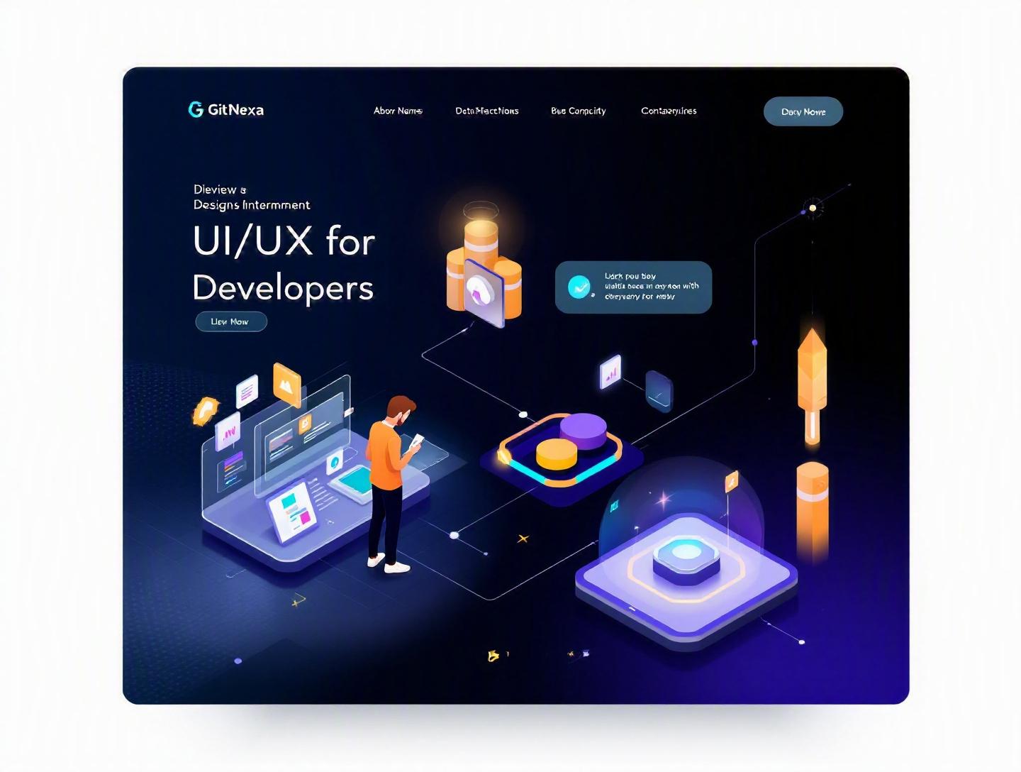
The Ultimate UI/UX Design Principles for Developers
Introduction
In 2025, Forrester reported that a well-designed user interface can increase conversion rates by up to 200%, while a better user experience can boost conversions by 400%. Yet most development teams still treat UI/UX as a "final layer"—something added after the logic works.
That approach is expensive.
When developers ignore UI/UX design principles, the result is predictable: high bounce rates, confused users, endless revision cycles, and frustrated stakeholders. Clean code alone doesn’t guarantee product success. Performance matters. Architecture matters. But if users struggle to navigate, understand, or trust your interface, none of it pays off.
This guide breaks down essential UI/UX design principles for developers who want to build products people actually enjoy using. We’ll cover usability fundamentals, accessibility standards, visual hierarchy, interaction design, performance considerations, design systems, and modern UX workflows. You’ll see real examples, practical techniques, and implementation details you can apply immediately—whether you’re building SaaS dashboards, mobile apps, or enterprise platforms.
If you're a developer, CTO, or founder looking to bridge the gap between engineering and design, this is your playbook.
What Is UI/UX Design Principles for Developers?
UI (User Interface) refers to the visual and interactive elements of a product—buttons, typography, layout, colors, icons, and micro-interactions. UX (User Experience) goes deeper. It’s the overall experience users have when interacting with your product—ease of use, efficiency, clarity, emotional response, and accessibility.
When we talk about UI/UX design principles for developers, we’re not discussing aesthetics alone. We’re talking about structured decision-making frameworks that guide how interfaces behave and feel.
These principles include:
- Usability heuristics (Jakob Nielsen’s 10 principles)
- Accessibility standards (WCAG 2.2)
- Cognitive load management
- Visual hierarchy and layout systems
- Consistency and design systems
- Performance-driven UX
Developers interact with these principles through:
- Frontend architecture (React, Vue, Angular)
- CSS frameworks (Tailwind, Bootstrap)
- State management (Redux, Zustand)
- Design tokens and component libraries
- API response patterns
In short: UI/UX design principles translate user psychology into implementation decisions.
Why UI/UX Design Principles Matter in 2026
User expectations have shifted dramatically.
According to Google’s UX research, users form design opinions in 50 milliseconds. Meanwhile, Statista (2025) reports that mobile devices account for over 58% of global web traffic. Add AI-driven personalization and cross-device experiences, and the bar is higher than ever.
In 2026, UI/UX matters because:
- AI-generated interfaces are increasing competition. Tools like Figma AI and Vercel’s AI SDK reduce development time—but they also raise design standards.
- Accessibility is becoming legally enforced. The European Accessibility Act (2025) expanded compliance requirements for digital services.
- Performance expectations are stricter. Google Core Web Vitals directly impact SEO and revenue.
- Design systems dominate enterprise development. Companies like Shopify and IBM rely on centralized component systems for scalability.
If you’re building products without considering UX metrics—task success rate, time-on-task, error rate—you’re flying blind.
And that’s costly.
Core Principle #1: Usability and Cognitive Simplicity
Usability isn’t about minimalism. It’s about reducing cognitive load.
Understanding Cognitive Load
Humans can hold roughly 4–7 items in working memory. Overwhelm them with too many options, and they freeze. This is known as Hick’s Law.
Hick’s Law Formula:
T = b log2 (n + 1)
Where:
- T = time to make decision
- n = number of choices
The more choices, the longer the decision time.
Real-World Example: Airbnb
Airbnb simplifies search results with progressive filtering instead of overwhelming dropdowns. Filters appear contextually, not all at once.
Developer Implementation Tips
- Break complex forms into multi-step flows.
- Use progressive disclosure.
- Provide inline validation instead of after-submit errors.
Example (React inline validation):
const [email, setEmail] = useState("");
const [error, setError] = useState(null);

const validateEmail = (value) => {
  const regex = /^[^\s@]+@[^\s@]+\.[^\s@]+$/;
  if (!regex.test(value)) {
    setError("Enter a valid email address");
  } else {
    setError(null);
  }
};
Comparison: Poor vs Good Usability
| Poor UX | Good UX |
|---|---|
| 15-field single form | 3-step guided form |
| Generic error messages | Contextual inline hints |
| No loading states | Skeleton loaders |
| Dense text blocks | Chunked content |
For deeper frontend structuring, see our guide on modern frontend architecture patterns.
Core Principle #2: Visual Hierarchy and Layout Systems
Visual hierarchy directs attention.
The 60-30-10 Color Rule
- 60% primary color
- 30% secondary
- 10% accent
Typography Scale
Use consistent scales like 1.25 or 1.333 ratio.
Example using Tailwind CSS:
<h1 class="text-4xl font-bold">Dashboard</h1>
<h2 class="text-2xl font-semibold">Analytics Overview</h2>
<p class="text-base">Summary metrics...</p>
Grid Systems
CSS Grid example:
.container {
  display: grid;
  grid-template-columns: repeat(12, 1fr);
  gap: 16px;
}
Real Example: Stripe
Stripe’s documentation uses spacing, contrast, and structured layout to guide developers effortlessly.
You can study their system at https://stripe.com/docs.
Core Principle #3: Accessibility as a First-Class Feature
Accessibility is not optional in 2026.
WCAG 2.2 standards (https://www.w3.org/WAI/standards-guidelines/wcag/) define guidelines around:
- Perceivable
- Operable
- Understandable
- Robust
ARIA Example
<button aria-label="Close modal">×</button>
Color Contrast
Minimum ratio: 4.5:1 for normal text.
Use tools like Lighthouse or axe DevTools.
Accessibility improves:
- SEO
- Usability
- Legal protection
- Brand trust
Learn more in our complete accessibility checklist.
Core Principle #4: Feedback, Microinteractions & State Design
Users need confirmation that the system heard them.
Types of Feedback
- Visual (spinners, animations)
- Audio
- Haptic (mobile)
- Status messaging
Example loading state in React:
{loading ? <Spinner /> : <Dashboard />}
Microinteractions
Think of LinkedIn’s subtle hover animations or Notion’s smooth transitions.
These small cues increase perceived performance.
For mobile-specific interaction patterns, read our mobile app UX patterns guide.
Core Principle #5: Performance-Driven UX
According to Google, 53% of mobile users abandon sites that take longer than 3 seconds to load.
Performance is UX.
Core Web Vitals
- LCP (Largest Contentful Paint)
- CLS (Cumulative Layout Shift)
- INP (Interaction to Next Paint)
Optimization Example
const LazyComponent = React.lazy(() => import('./HeavyComponent'));
Combine with:
- Code splitting
- Image compression (WebP)
- CDN caching
For scalable deployments, explore our cloud-native application guide.
Core Principle #6: Design Systems and Consistency
Design systems reduce chaos.
Companies like IBM (Carbon Design System) and Google (Material Design) publish reusable component guidelines.
Why Developers Should Care
- Faster onboarding
- Consistent UI
- Fewer regressions
- Predictable UX
Basic Design Token Example
{
  "primaryColor": "#2563eb",
  "spacingSmall": "8px",
  "borderRadius": "6px"
}
These tokens sync design and development.
We discuss implementation pipelines in our design-to-code workflow guide.
How GitNexa Approaches UI/UX Design Principles
At GitNexa, UI/UX design principles are embedded into engineering workflows—not added later.
We begin with UX discovery workshops, define user journeys, and align KPIs before writing code. Our designers collaborate directly with frontend developers using shared Figma libraries and component-driven architecture (Storybook + React).
Accessibility audits, Lighthouse benchmarks, and usability testing are integrated into CI pipelines. We also leverage DevOps automation, detailed in our DevOps implementation guide, to ensure UI updates deploy safely.
The result? Products that scale technically and resonate emotionally.
Common Mistakes to Avoid
- Designing only for desktop.
- Ignoring accessibility until late stages.
- Overusing animations.
- Inconsistent spacing and typography.
- Skipping user testing.
- Poor error messaging.
- Treating performance as backend-only.
Best Practices & Pro Tips
- Design mobile-first.
- Use consistent spacing scale (8px system).
- Write human error messages.
- Measure UX metrics, not just traffic.
- Build reusable components.
- Test with real users early.
- Document UI decisions.
- Audit accessibility quarterly.
Future Trends & What to Expect (2026–2027)
- AI-personalized interfaces.
- Voice-first UI patterns.
- AR-integrated UX for retail.
- Emotion-aware design via biometrics.
- Zero-UI experiences (ambient computing).
Developers who understand human-centered design will lead these shifts.
FAQ: UI/UX Design Principles for Developers
What are the most important UI/UX principles for developers?
Usability, accessibility, visual hierarchy, feedback, consistency, and performance are foundational principles.
Do developers need to learn UX design?
Yes. Even basic UX knowledge improves product quality and collaboration with designers.
How does UI/UX impact SEO?
Better UX improves dwell time, reduces bounce rate, and supports Core Web Vitals—all ranking factors.
What tools help implement UI/UX principles?
Figma, Storybook, Lighthouse, Tailwind CSS, React Aria, and Hotjar.
Is accessibility legally required?
In many regions, yes. Laws like the ADA and European Accessibility Act require compliance.
How do design systems help developers?
They ensure consistency, speed up development, and reduce design debt.
What’s the difference between UI and UX?
UI focuses on interface elements; UX covers the overall user journey and satisfaction.
How can small teams improve UX quickly?
Run usability tests, simplify flows, improve loading performance, and refine typography.
Conclusion
Great products aren’t defined by features alone—they’re defined by experiences. Mastering UI/UX design principles for developers means understanding psychology, accessibility, performance, and visual systems as deeply as you understand APIs and databases.
When developers think like designers, products become intuitive, fast, and genuinely enjoyable to use.
Ready to improve your product’s UI/UX? Talk to our team to discuss your project.
Comments
Loading comments...