Sub Category
Latest Blogs
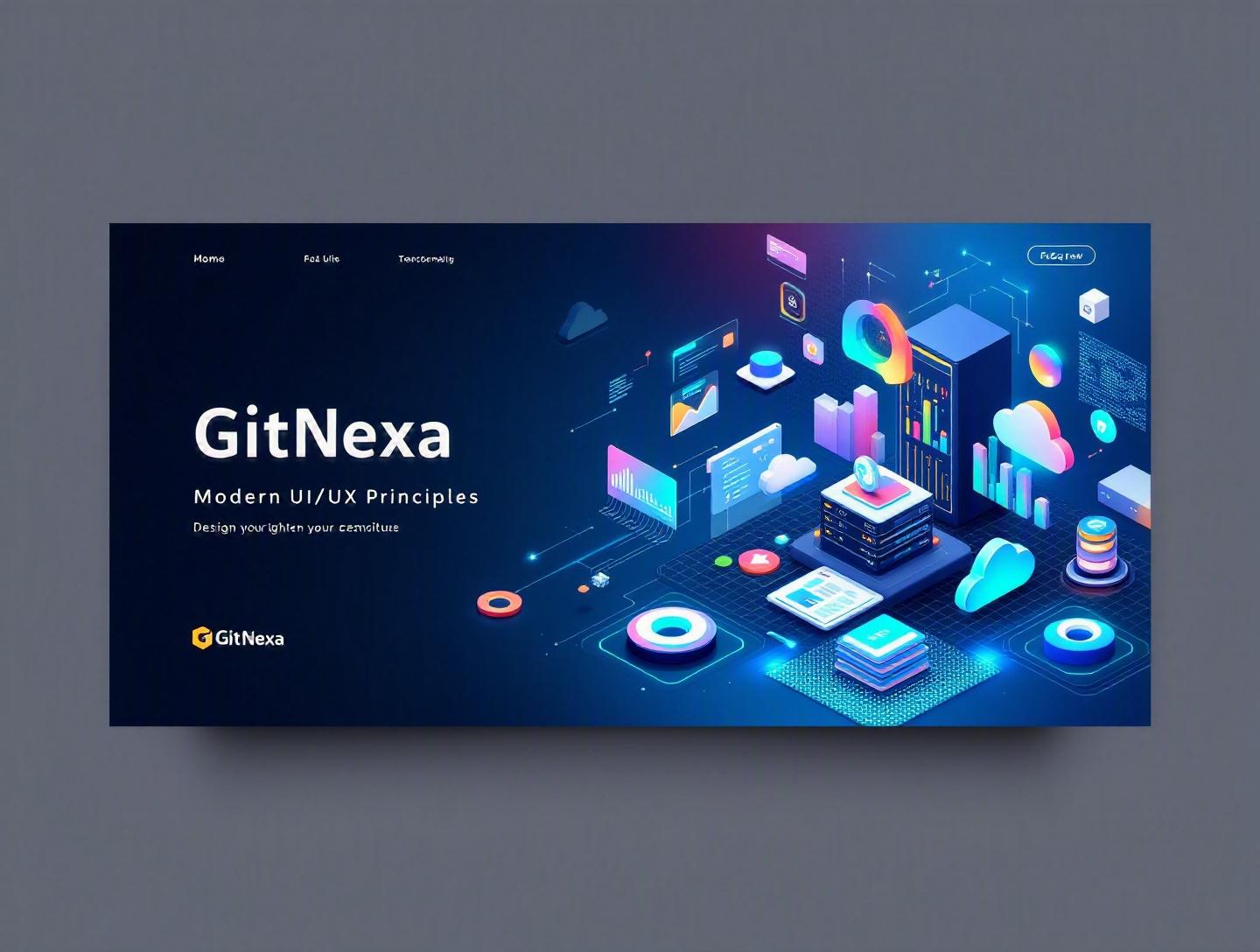
The Ultimate Guide to Modern UI/UX Design Principles
Introduction
A well-designed user interface can increase conversion rates by up to 200%, and a better UX design can boost conversions by 400%, according to research cited by Forrester. Yet in 2026, many digital products still frustrate users with cluttered layouts, confusing navigation, and inconsistent interactions. The gap between what users expect and what many products deliver has never been wider.
Modern UI/UX design principles are no longer just about making things look attractive. They directly impact revenue, retention, accessibility, and brand trust. Whether you're building a SaaS dashboard, an eCommerce platform, or a mobile banking app, the way users experience your product determines whether they stay—or leave.
In this comprehensive guide, we’ll break down modern UI/UX design principles in depth. You’ll learn what they are, why they matter in 2026, and how leading companies apply them. We’ll explore usability heuristics, accessibility standards, interaction design patterns, responsive systems, and data-driven optimization. You’ll also see practical workflows, real-world examples, and actionable best practices tailored for developers, CTOs, and product leaders.
If you’re serious about building digital products that users genuinely enjoy using, this guide will give you both the strategic foundation and the tactical tools to do it right.
What Is Modern UI/UX Design?
Modern UI/UX design refers to the strategic and systematic approach to creating digital interfaces that are intuitive, accessible, visually coherent, and aligned with user needs and business goals.
Let’s break that down.
UI vs UX: Understanding the Difference
- UI (User Interface) focuses on visual and interactive elements—buttons, typography, color schemes, spacing, icons, and animations.
- UX (User Experience) focuses on the overall journey—how users move through flows, accomplish tasks, and feel about the interaction.
Think of UI as the steering wheel and dashboard of a car, and UX as the entire driving experience. You can have a beautiful dashboard, but if the car handles poorly, no one enjoys the ride.
Core Components of Modern UI/UX Design
Modern UI/UX design principles typically include:
- User-centered design (UCD)
- Accessibility and inclusivity
- Responsive and adaptive design
- Performance optimization
- Data-driven iteration
- Design systems and consistency
- Microinteractions and feedback loops
Unlike early 2010s design trends that prioritized aesthetics (remember skeuomorphism?), today’s approach balances beauty with usability, speed, and inclusivity.
Evolution of UI/UX Over the Past Decade
- 2015–2018: Mobile-first design became mandatory.
- 2019–2022: Design systems (e.g., Material Design, Atlassian Design System) matured.
- 2023–2025: AI-assisted UX, personalization, and voice interfaces expanded rapidly.
- 2026: Accessibility, performance, and ethical design are now board-level priorities.
According to Statista (2025), over 60% of global web traffic comes from mobile devices. That alone reshaped how we approach layout, interaction patterns, and performance budgets.
Modern UI/UX design principles are not trends. They’re strategic frameworks for building products that scale.
Why Modern UI/UX Design Principles Matter in 2026
If you’re still treating UI/UX as a final design layer added after development, you’re already behind.
1. User Expectations Are Higher Than Ever
Users compare your product to the best digital experiences they’ve had—not just your direct competitors. If Spotify, Notion, or Apple sets a usability benchmark, your SaaS platform is measured against it.
Google’s Core Web Vitals, updated in 2024, directly impact search rankings. Performance, interactivity, and visual stability are now SEO factors. UI/UX isn’t just design—it affects discoverability.
Learn more about performance-driven development in our guide on web performance optimization strategies.
2. Accessibility Is a Legal and Ethical Imperative
WCAG 2.2 standards (W3C, 2023) require better keyboard navigation, focus visibility, and touch target sizes. Non-compliance can lead to lawsuits, especially in the US and EU.
Accessible design expands your audience. Over 1 billion people globally live with some form of disability (World Health Organization, 2024). Ignoring accessibility is ignoring a massive user base.
3. AI and Personalization Demand Better UX Architecture
As AI-powered features become common—recommendation engines, chatbots, predictive analytics—the UX must explain what’s happening. Transparency and clarity are essential.
Our deep dive on AI-powered product development explores how UX and machine learning intersect.
4. Retention Is More Valuable Than Acquisition
Customer acquisition costs (CAC) have increased across industries. A smooth onboarding flow and intuitive interface reduce churn and increase lifetime value (LTV).
In short: modern UI/UX design principles directly affect revenue, legal compliance, and brand reputation.
Principle 1: User-Centered Design (UCD)
User-centered design is the backbone of modern UI/UX.
What Is User-Centered Design?
UCD is a framework where user needs, behaviors, and pain points drive design decisions at every stage.
The UCD Process (Step-by-Step)
- User Research
- Interviews
- Surveys
- Usability tests
- Analytics review
- Persona Development
Create data-backed user personas. - User Journey Mapping
Visualize touchpoints and friction areas. - Wireframing & Prototyping
Low-fidelity → high-fidelity designs. - Testing & Iteration
A/B testing, usability sessions, heatmaps.
Real-World Example: Airbnb
Airbnb famously invested in user research during its early growth stage. By analyzing user photos and booking flows, they identified trust issues. Redesigning listing pages and improving image quality significantly increased bookings.
Tools for UCD
| Stage | Tools |
|---|---|
| Research | Typeform, Hotjar, Google Analytics |
| Wireframing | Figma, Sketch |
| Prototyping | Figma, Adobe XD |
| Testing | Maze, UserTesting |
For teams building complex web apps, pairing UCD with scalable engineering practices—like those discussed in our custom web application development guide—ensures design decisions translate smoothly into production.
Principle 2: Consistency Through Design Systems
Consistency reduces cognitive load. Users shouldn’t relearn your interface on every page.
What Is a Design System?
A design system is a collection of reusable components, guidelines, tokens, and documentation that standardizes UI elements.
Examples:
- Google Material Design
- IBM Carbon
- Shopify Polaris
Benefits of Design Systems
- Faster development cycles
- Improved collaboration between designers and developers
- Fewer UI inconsistencies
- Easier scaling across products
Basic Component Structure Example (React)
// Button.jsx
export default function Button({ label, variant = "primary" }) {
  return (
    <button className={`btn btn-${variant}`}>
      {label}
    </button>
  );
}
With design tokens:
:root {
  --color-primary: #4F46E5;
  --radius-md: 8px;
}

.btn-primary {
  background-color: var(--color-primary);
  border-radius: var(--radius-md);
}
Design Systems vs Style Guides
| Feature | Style Guide | Design System |
|---|---|---|
| Colors & Typography | ✅ | ✅ |
| Reusable Components | ❌ | ✅ |
| Code Integration | ❌ | ✅ |
| Governance Model | ❌ | ✅ |
A mature design system bridges design and development. For scaling teams, this integration often aligns closely with structured DevOps implementation strategies.
Principle 3: Accessibility & Inclusive Design
Accessibility isn’t optional.
Key Accessibility Standards
- WCAG 2.2 (W3C)
- ADA Compliance (US)
- EN 301 549 (EU)
Official guidelines: https://www.w3.org/WAI/standards-guidelines/wcag/
Core Accessibility Practices
- Maintain contrast ratio of at least 4.5:1
- Provide alt text for images
- Ensure keyboard navigability
- Use semantic HTML
Example:
<button aria-label="Close modal">
  <svg aria-hidden="true">...</svg>
</button>
Real-World Case: Microsoft
Microsoft’s inclusive design toolkit reshaped its product ecosystem. Features like high-contrast mode and screen reader support expanded usability for millions.
Accessibility also improves SEO and usability for all users—not just those with disabilities.
Principle 4: Performance-First Design
Users expect pages to load in under 2 seconds. According to Google, bounce rates increase by 32% when load time increases from 1 to 3 seconds.
Core Web Vitals (2026 Focus)
- LCP (Largest Contentful Paint)
- INP (Interaction to Next Paint)
- CLS (Cumulative Layout Shift)
Performance Best Practices
- Optimize images (WebP, AVIF)
- Use lazy loading
- Minify JS and CSS
- Implement CDN caching
- Avoid render-blocking scripts
Example Lazy Loading:
<img src="image.webp" loading="lazy" alt="Product screenshot">
Performance intersects with cloud infrastructure decisions. Our article on cloud-native application architecture explains backend considerations that impact frontend UX.
Principle 5: Meaningful Microinteractions
Microinteractions guide users subtly.
Examples:
- Button hover effects
- Form validation feedback
- Progress indicators
- Swipe animations
Why Microinteractions Matter
They:
- Reduce uncertainty
- Provide feedback
- Increase perceived speed
- Add personality to products
Consider Slack’s subtle loading animations. They don’t just inform—they reinforce brand identity.
Designing Effective Microinteractions
- Identify trigger
- Define rules
- Provide feedback
- Design loops and modes
Even small changes—like real-time form validation—can dramatically reduce abandonment rates.
Principle 6: Data-Driven UX Optimization
Modern UI/UX isn’t guesswork.
A/B Testing Framework
- Define hypothesis
- Create variant
- Split traffic
- Measure conversion
- Iterate
Example:
| Variant | Conversion Rate |
|---|---|
| Original | 3.2% |
| Variant A | 4.1% |
Tools
- Google Optimize alternatives (post-2023 sunset)
- Optimizely
- VWO
- Mixpanel
Data-driven UX often integrates with analytics pipelines and backend systems, similar to those discussed in our enterprise software development best practices.
How GitNexa Approaches Modern UI/UX Design Principles
At GitNexa, we treat modern UI/UX design principles as a cross-functional discipline—not a design afterthought.
Our approach combines:
- Discovery workshops with stakeholders
- User research and persona validation
- Scalable design systems built in Figma
- Frontend frameworks like React and Next.js
- Accessibility audits aligned with WCAG 2.2
- Continuous usability testing post-launch
We integrate design with engineering from day one. That alignment reduces rework and accelerates time-to-market. Our UI/UX process closely connects with our broader services in mobile app development lifecycle and cloud deployment strategies.
The result? Digital products that are visually refined, technically sound, and built for growth.
Common Mistakes to Avoid
- Designing Without Real User Research
Assumptions lead to misaligned products. - Overloading Interfaces
More features ≠ better UX. - Ignoring Accessibility
This can lead to legal risk and lost users. - Inconsistent UI Patterns
Breaks trust and increases cognitive load. - Neglecting Mobile Optimization
Mobile-first is mandatory in 2026. - Focusing Only on Aesthetics
Visual polish cannot fix poor usability. - Skipping Post-Launch Testing
UX improvement is ongoing, not one-time.
Best Practices & Pro Tips
- Start with user problems, not features.
- Use 8px spacing systems for layout consistency.
- Limit primary actions per screen.
- Document design decisions in shared repositories.
- Run usability tests every sprint.
- Prioritize accessibility from day one.
- Monitor Core Web Vitals monthly.
- Create reusable components before scaling.
- Validate major UI changes with A/B testing.
- Align UX metrics with business KPIs.
Future Trends & What to Expect (2026–2027)
The next evolution of modern UI/UX design principles will likely focus on:
1. AI-Augmented Interfaces
Adaptive layouts based on user behavior.
2. Voice and Multimodal Experiences
More conversational interfaces integrated into apps.
3. Ethical and Transparent Design
Clear AI explanations and privacy-first UX.
4. Immersive UI (AR/VR)
Spatial interfaces beyond flat screens.
5. Hyper-Personalization
Real-time content and layout adjustments driven by data.
Design will become more contextual, predictive, and human-aware.
FAQ: Modern UI/UX Design Principles
1. What are modern UI/UX design principles?
They are best practices and frameworks that guide the creation of intuitive, accessible, and performance-optimized digital interfaces aligned with user needs.
2. Why are modern UI/UX design principles important?
They directly affect user satisfaction, retention, SEO rankings, accessibility compliance, and conversion rates.
3. What is the difference between UI and UX?
UI focuses on visual elements and interactions; UX focuses on the overall user journey and experience.
4. How does accessibility fit into UI/UX?
Accessibility ensures digital products are usable by people with disabilities and improves overall usability and compliance.
5. What tools are best for UI/UX design in 2026?
Figma, Adobe XD, Sketch, Maze, Hotjar, and analytics platforms like Mixpanel.
6. How do design systems improve UX?
They ensure consistency, scalability, and faster development cycles across teams.
7. What are Core Web Vitals?
Metrics defined by Google that measure performance, interactivity, and visual stability.
8. How often should UX testing be done?
Ideally every sprint or major release cycle.
9. Can small businesses apply modern UI/UX principles?
Absolutely. Even basic improvements in navigation and accessibility can significantly boost engagement.
10. How long does it take to implement a design system?
Depending on complexity, 4–12 weeks for initial rollout.
Conclusion
Modern UI/UX design principles are no longer optional—they’re foundational to building successful digital products in 2026. From user-centered research and accessibility to performance optimization and data-driven iteration, every decision shapes how users perceive and interact with your brand.
The companies that win are the ones that treat design as strategy, not decoration. They test, iterate, and refine continuously.
Ready to elevate your digital experience with modern UI/UX design principles? Talk to our team to discuss your project.
Comments
Loading comments...