Sub Category
Latest Blogs
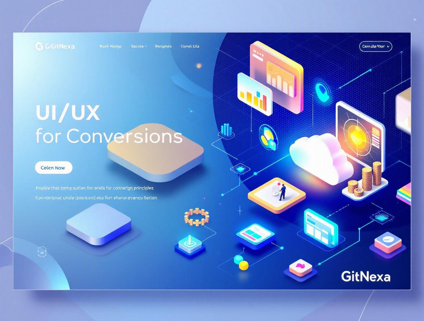
Ultimate UI/UX Design Principles for Higher Conversions
Introduction
In 2024, Forrester Research reported that a well-designed user interface can increase conversion rates by up to 200%, while better UX design can boost conversions by as much as 400%. Yet most companies still obsess over traffic instead of experience. They pour money into ads, SEO, and social campaigns, only to watch potential customers bounce within seconds.
That’s where UI/UX design principles for higher conversions come in. Design is no longer about aesthetics alone. It’s about psychology, behavioral economics, performance optimization, and data-driven iteration. Every button, headline, form field, and micro-interaction either moves users closer to action—or pushes them away.
If you’re a CTO, founder, product manager, or growth lead, this guide will help you connect design decisions directly to revenue. We’ll explore what UI/UX design principles for higher conversions actually mean, why they matter more than ever in 2026, and how to implement them across web and mobile products. Expect real-world examples, practical frameworks, UX heuristics, conversion rate optimization (CRO) tactics, and technical implementation insights.
By the end, you won’t just understand design theory. You’ll know how to turn interfaces into conversion engines.
What Is UI/UX Design Principles for Higher Conversions?
UI (User Interface) design focuses on the visual and interactive elements users engage with—buttons, layouts, typography, color systems, icons, and components. UX (User Experience) design goes deeper. It defines how users feel and move through your product—from first impression to final action.
When we talk about UI/UX design principles for higher conversions, we mean applying design psychology, usability standards, and interaction patterns intentionally to drive measurable business outcomes—sign-ups, purchases, bookings, demo requests, or subscriptions.
It’s not about making something “look modern.” It’s about:
- Reducing cognitive load
- Increasing clarity and trust
- Removing friction from decision-making
- Guiding users toward a primary action
- Testing and optimizing continuously
For beginners, think of it this way: UI is how it looks; UX is how it works; conversion-focused design is why it works.
For experienced teams, this discipline blends:
- Nielsen’s usability heuristics
- Fitts’s Law and Hick’s Law
- Information architecture
- A/B testing frameworks
- Accessibility standards (WCAG 2.2)
- Performance optimization
Modern product teams integrate UI/UX strategy directly into development workflows—often alongside DevOps and analytics pipelines. If your design decisions aren’t tied to metrics, they’re just decoration.
Why UI/UX Design Principles for Higher Conversions Matter in 2026
The digital landscape in 2026 looks very different from even five years ago.
1. Users Expect Instant Experiences
Google research shows that 53% of mobile users abandon a site that takes longer than 3 seconds to load. Core Web Vitals are now deeply embedded in SEO rankings and user expectations. Speed and perceived performance are part of UX.
2. Attention Spans Are Shrinking
Microsoft’s widely cited study suggests average human attention spans dropped to around 8 seconds. Whether the exact number holds or not, behavior data supports it: users skim, scroll fast, and decide quickly.
3. AI-Powered Personalization Is Becoming Standard
Companies like Amazon and Netflix set the bar for predictive UX. Users now expect personalization, adaptive layouts, and intelligent suggestions.
4. Privacy Regulations Are Tighter
With GDPR, CCPA, and new global data policies, dark patterns are under scrutiny. Conversion tactics must be ethical and transparent.
5. Competition Is Global
Your SaaS product isn’t competing with local vendors anymore. It’s competing with global, well-funded startups that obsess over UX.
If your interface causes friction, users won’t complain. They’ll leave.
Clarity Over Cleverness: The Foundation of Conversion-Focused UI/UX
Designers love creativity. Users love clarity.
The fastest way to increase conversions is to remove ambiguity.
Clear Value Proposition Above the Fold
Dropbox’s homepage is a classic example. One simple headline, a subheading, and a primary CTA. No jargon.
Bad example:
"Empowering next-gen synergy through scalable ecosystems"
Good example:
"Store and share files securely in the cloud."
Apply Hick’s Law to Reduce Decision Fatigue
Hick’s Law states that the time it takes to make a decision increases with the number of choices.
Instead of showing 12 pricing plans, show 3.
| Too Many Options | Optimized Options |
|---|---|
| 12 Plans | 3 Tiered Plans |
| 8 CTAs | 1 Primary + 1 Secondary |
| 20 Menu Items | 5 Core Items + Dropdown |
Step-by-Step Clarity Framework
- Identify the primary goal (purchase, sign-up, demo).
- Remove every element that does not support that goal.
- Make the CTA visually dominant.
- Use plain language.
- Test comprehension with 5-second user tests.
Implementation Example (React CTA Component)
<button className="cta-primary">
  Start Free Trial
</button>
With CSS:
.cta-primary {
  background-color: #2563eb;
  color: white;
  padding: 14px 28px;
  font-size: 16px;
  border-radius: 8px;
}
Consistency in button styling improves recognition and trust.
For deeper frontend optimization strategies, explore our guide on modern frontend development best practices.
Visual Hierarchy and Cognitive Psychology
Users don’t read. They scan.
Eye-tracking studies by Nielsen Norman Group show users typically follow F-pattern or Z-pattern scanning behaviors.
Establish a Clear Visual Hierarchy
Use:
- Size (larger = more important)
- Contrast (color emphasis)
- Spacing (whitespace improves comprehension by up to 20%)
- Typography scale
Example typography scale:
- H1: 36px
- H2: 28px
- H3: 22px
- Body: 16px
Fitts’s Law in Button Design
The time to acquire a target depends on size and distance.
Make important buttons:
- Large
- Easily reachable (especially on mobile)
- Positioned near decision-making points
Mobile-First Conversion Design
With over 60% of web traffic coming from mobile devices (Statista, 2024), mobile UX determines conversion rates.
Checklist:
- Thumb-friendly navigation
- Sticky CTAs
- Autofill-enabled forms
- Minimal input fields
For mobile-specific strategy, see our article on mobile app UI/UX design strategy.
Trust, Credibility, and Social Proof
People don’t convert when they’re uncertain.
Trust Signals That Increase Conversions
- SSL certificates
- Real testimonials (with names and photos)
- Case studies
- Press mentions
- Verified reviews
Basecamp increased sign-ups by simplifying their homepage and emphasizing testimonials.
Social Proof Types
| Type | Example |
|---|---|
| Expert Proof | "Recommended by Gartner" |
| User Numbers | "Trusted by 25,000+ teams" |
| Reviews | 4.8/5 on G2 |
| Case Studies | SaaS startup increased MRR by 40% |
Microcopy for Confidence
Instead of:
Submit
Use:
Get My Free Audit
Add reassurance:
No spam. Cancel anytime.
Even small microcopy changes can reduce friction significantly.
For enterprise credibility strategies, read building scalable SaaS platforms.
Reducing Friction in Forms and Checkout Flows
Long forms kill conversions.
Baymard Institute reports that the average checkout contains 11.3 form fields, while only 8 are necessary.
Optimize Forms Using These Steps
- Remove non-essential fields.
- Use progressive disclosure.
- Enable autofill.
- Show real-time validation.
- Add progress indicators.
Example HTML validation:
<input type="email" required />
Multi-Step vs Single-Step Forms
| Type | When to Use |
|---|---|
| Single-Step | Short lead forms |
| Multi-Step | Complex onboarding |
Payment UX Improvements
- Guest checkout option
- Multiple payment methods (Stripe, PayPal, Apple Pay)
- Transparent pricing
- No surprise fees
Stripe’s clean payment UI is a masterclass in reducing friction.
Data-Driven UI/UX: A/B Testing and Continuous Optimization
Design decisions should be backed by data.
A/B Testing Workflow
- Identify a conversion bottleneck.
- Form a hypothesis.
- Create variation (B version).
- Run test using tools like Optimizely or Google Optimize.
- Measure statistically significant results.
Example Hypothesis
Changing CTA from:
Request Info
To:
Get Free Demo
May increase demo bookings by 15%.
Metrics to Track
- Conversion rate
- Bounce rate
- Average session duration
- Scroll depth
- Heatmaps (Hotjar)
For technical infrastructure, see DevOps for scalable applications.
How GitNexa Approaches UI/UX Design Principles for Higher Conversions
At GitNexa, we treat UI/UX as a revenue function—not a design phase.
Our process includes:
- Conversion-focused discovery workshops
- User journey mapping
- Wireframing and rapid prototyping (Figma)
- Usability testing
- Frontend performance optimization
- Continuous CRO experiments
We collaborate closely with development teams across web, mobile, cloud, and AI initiatives to ensure design intent translates into measurable business impact. Our work in custom web application development and AI-powered product design integrates user psychology with scalable engineering.
Common Mistakes to Avoid
- Designing for aesthetics over clarity
- Ignoring mobile optimization
- Overloading pages with CTAs
- Using dark patterns that harm trust
- Skipping usability testing
- Failing to optimize load speed
- Not aligning design with analytics
Best Practices & Pro Tips
- Use one primary CTA per page.
- Keep navigation simple.
- Apply consistent design systems.
- Optimize images for performance.
- Use color psychology intentionally.
- Test headlines regularly.
- Ensure WCAG accessibility compliance.
- Personalize where appropriate.
- Show progress indicators in multi-step flows.
- Review heatmaps monthly.
Future Trends & What to Expect (2026–2027)
- AI-generated adaptive interfaces
- Voice-enabled navigation
- AR shopping experiences
- Hyper-personalized landing pages
- Predictive UI patterns
- Privacy-first UX models
Design will become increasingly data-driven and personalized, yet ethical transparency will matter more than ever.
FAQ
1. What are UI/UX design principles for higher conversions?
They are strategic design guidelines focused on increasing user actions such as sign-ups and purchases through usability, psychology, and optimization.
2. How does UX impact conversion rates?
Good UX reduces friction and builds trust, directly improving the likelihood that users complete desired actions.
3. What is the difference between UI and UX?
UI concerns visual and interactive elements, while UX focuses on overall user journey and experience.
4. How can I measure UI/UX effectiveness?
Track conversion rates, bounce rates, session duration, and conduct usability testing.
5. Does mobile UX affect SEO?
Yes. Google uses mobile-first indexing and Core Web Vitals as ranking factors.
6. How often should I run A/B tests?
Continuously. Prioritize high-traffic, high-impact pages.
7. What tools help improve UX?
Figma, Hotjar, Google Analytics 4, Optimizely, Lighthouse.
8. Are dark patterns effective for conversions?
Short term, maybe. Long term, they damage brand trust and retention.
9. What role does psychology play in UI/UX?
Principles like scarcity, social proof, and cognitive bias influence decisions.
10. Can small UI changes really increase revenue?
Yes. Even minor CTA or layout adjustments can lead to measurable gains.
Conclusion
UI/UX design principles for higher conversions combine psychology, clarity, performance, and data-driven iteration. When done right, they turn passive visitors into engaged customers.
Every pixel, interaction, and microcopy choice should support one goal: helping users act with confidence and ease.
Ready to optimize your product for higher conversions? Talk to our team to discuss your project.
Comments
Loading comments...