Sub Category
Latest Blogs
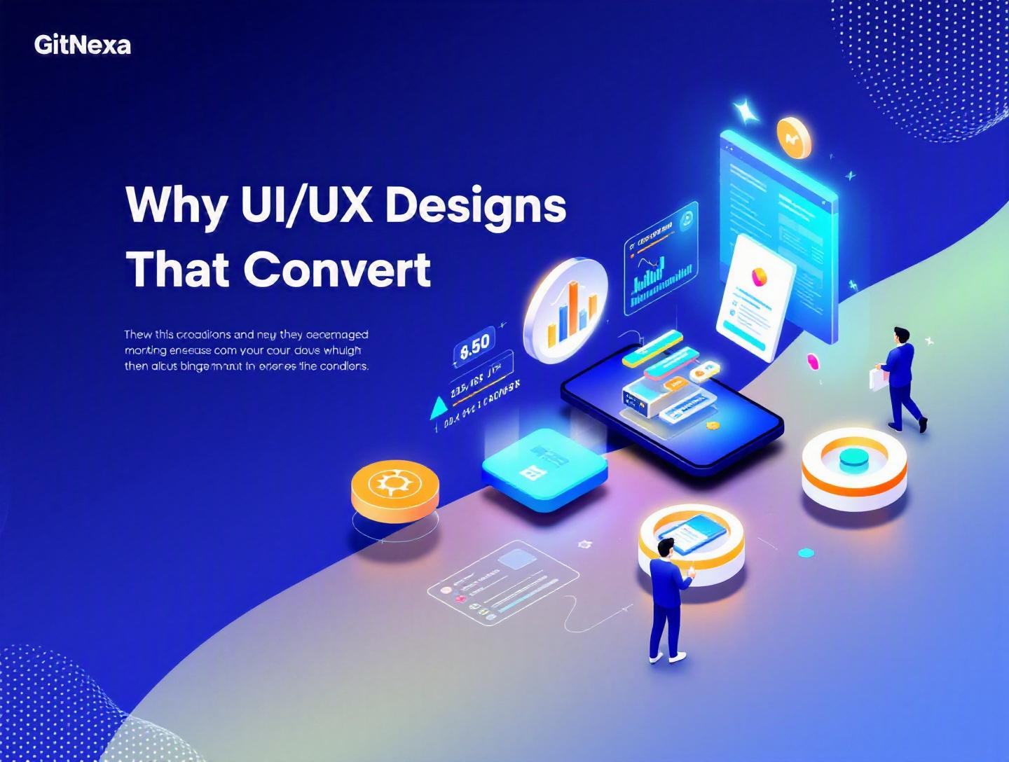
Ultimate Guide to UI/UX Design That Increase Conversions
Introduction
In 2025, Forrester reported that a well-designed user interface could raise a website’s conversion rate by up to 200%, while better UX design can boost it by 400%. Yet most businesses still treat UI/UX design that increase conversions as an afterthought—something to “polish” after development is done.
That’s a costly mistake.
If your product attracts traffic but struggles to convert, the problem usually isn’t your marketing budget. It’s friction. Confusing navigation. Slow load times. Forms that feel like tax returns. Messaging that doesn’t match user intent.
UI/UX design that increase conversions is about removing that friction systematically. It’s about guiding users from curiosity to commitment with clarity, trust, and speed.
In this guide, we’ll break down:
- What UI/UX design really means (beyond pretty screens)
- Why conversion-focused design matters more than ever in 2026
- Practical frameworks, workflows, and tools used by high-growth companies
- Real examples and actionable steps you can implement immediately
- Common mistakes that quietly kill conversions
- Future trends shaping product design in 2026 and beyond
Whether you’re a CTO refining a SaaS dashboard, a founder optimizing a landing page, or a product manager improving onboarding flows, this guide will give you a clear roadmap.
Let’s start with the fundamentals.
What Is UI/UX Design That Increase Conversions?
UI (User Interface) refers to the visual elements users interact with—buttons, typography, color systems, layouts, and micro-interactions. UX (User Experience) is broader. It includes usability, information architecture, interaction design, accessibility, and emotional response.
UI/UX design that increase conversions goes a step further: it aligns every interface decision with a measurable business goal.
That goal could be:
- Completing a purchase
- Submitting a lead form
- Booking a demo
- Installing a mobile app
- Upgrading to a paid plan
Conversion-focused UX blends psychology, data analysis, and design systems. It answers three core questions:
- Can users understand what to do in under 5 seconds?
- Can they complete it with minimal friction?
- Do they trust the experience enough to proceed?
UI vs UX vs Conversion Design
| Aspect | UI Design | UX Design | Conversion-Focused Design |
|---|---|---|---|
| Focus | Visual elements | User journey | Business outcomes |
| Tools | Figma, Sketch | Figma, Miro, FigJam | Figma + GA4 + Hotjar |
| Metrics | Visual consistency | Task success rate | Conversion rate, CAC |
| Outcome | Attractive interface | Usable product | Revenue growth |
A beautiful interface that confuses users fails. A usable interface that doesn’t persuade also fails. Conversion-driven design balances clarity, usability, and persuasive psychology.
Why UI/UX Design That Increase Conversions Matters in 2026
The digital market is saturated. According to Statista (2025), there are over 1.13 billion websites online. Users compare products instantly. They leave just as fast.
Google’s Core Web Vitals continue to influence search rankings. According to Google’s own documentation (https://developers.google.com/search/docs/appearance/page-experience), page experience signals impact SEO performance. That means UX now affects discoverability.
Key 2026 Trends Driving Conversion-Focused Design
1. AI-Powered Personalization
Platforms like Shopify and HubSpot use AI-driven product recommendations to increase conversions by 10–30%.
2. Mobile-First Dominance
Over 58% of global web traffic in 2025 comes from mobile devices (Statista). Poor mobile UX is no longer forgivable.
3. Shorter Attention Spans
The average user spends less than 8 seconds deciding whether to stay on a page. First impressions determine bounce rate.
4. Data-Driven Product Teams
Modern product teams rely on GA4, Mixpanel, Hotjar, and Amplitude to identify drop-off points. Design is no longer subjective—it’s measurable.
If your UI/UX doesn’t actively drive conversions, competitors will outperform you—even with a weaker product.
Deep Dive #1: Conversion-Centered User Research
Before changing colors or layouts, understand your users.
Step-by-Step Research Framework
- Define Conversion Goal (e.g., increase demo bookings by 20%)
- Analyze Behavioral Data (GA4 funnel reports)
- Run Heatmaps & Session Recordings (Hotjar, Microsoft Clarity)
- Conduct 5–10 User Interviews
- Identify Friction Points
Real Example: B2B SaaS Dashboard
A fintech SaaS company noticed users abandoned onboarding at step 3. Session recordings revealed confusion about API key generation.
Solution:
- Added inline tooltips
- Simplified copy
- Embedded short Loom tutorial
Result: 27% increase in onboarding completion.
Tools That Matter
- GA4 for conversion funnels
- Hotjar for heatmaps
- Maze for usability testing
- Notion or Confluence for documentation
We often explore this structured discovery approach in projects involving custom web application development.
Research reduces guesswork. It turns design into strategy.
Deep Dive #2: Information Architecture & User Flows
If users can’t find what they need, they won’t convert.
Designing High-Converting User Flows
Here’s a simplified flow for a SaaS free trial:
Landing Page → Sign-Up Form → Email Verification → Onboarding → First Value Action
Each step must answer one question clearly.
Example: Slack’s Onboarding Flow
Slack guides users to invite teammates within minutes. That "aha" moment increases activation rates significantly.
Navigation Best Practices
- Limit primary nav items to 5–7
- Use clear CTA hierarchy
- Avoid dropdown overload
Comparison: Complex vs Streamlined Flow
| Factor | Complex Flow | Streamlined Flow |
|---|---|---|
| Steps | 8+ | 4–5 |
| Fields per form | 10+ | 4–6 |
| Bounce Rate | High | Lower |
| Conversion Rate | Low | Higher |
This aligns closely with principles discussed in our UI/UX design process guide.
Information architecture shapes user decisions subtly but powerfully.
Deep Dive #3: Visual Hierarchy & Psychological Triggers
Design influences emotion. Emotion drives decisions.
Core Psychological Principles
1. Hick’s Law
More choices = slower decisions.
2. Fitts’s Law
Larger buttons near thumb zones increase clicks.
3. Social Proof
Testimonials increase trust.
Example: E-commerce Optimization
An apparel store moved its CTA button above the fold and changed it from gray to high-contrast orange.
Result: 18% increase in add-to-cart rate.
Sample CTA Markup
<button class="cta-primary">Start Free Trial</button>
.cta-primary {
  background-color: #FF6B00;
  color: white;
  padding: 14px 24px;
  border-radius: 8px;
  font-weight: 600;
}
Color contrast should meet WCAG 2.1 standards (https://www.w3.org/WAI/standards-guidelines/wcag/).
Psychology-backed design is not manipulation. It’s clarity and emphasis.
Deep Dive #4: Speed, Performance & Technical UX
Design isn’t just visual—it’s technical.
According to Google research, increasing page load time from 1 to 3 seconds raises bounce probability by 32%.
Performance Optimization Checklist
- Implement lazy loading
- Use WebP images
- Optimize CSS & JS bundles
- Enable CDN (Cloudflare, AWS CloudFront)
- Use server-side rendering (Next.js)
Example Architecture
Client → CDN → Load Balancer → App Server → Database
Performance improvements often go hand-in-hand with cloud infrastructure optimization.
Fast products convert better. Always.
Deep Dive #5: A/B Testing & Continuous Optimization
High-converting companies test everything.
A/B Testing Workflow
- Identify drop-off point
- Create hypothesis
- Design variant
- Run test (Google Optimize alternative like VWO)
- Measure statistically significant results
Example Hypothesis
"Reducing form fields from 8 to 4 will increase demo requests by 15%."
Result: 22% improvement over 30 days.
Use tools like:
- VWO
- Optimizely
- Convert.com
Combine testing with insights from DevOps-driven deployment cycles to ship iterations faster.
Optimization is ongoing. Never "finished."
How GitNexa Approaches UI/UX Design That Increase Conversions
At GitNexa, we don’t start with mockups. We start with metrics.
Our approach includes:
- Conversion goal mapping
- Behavioral data analysis
- Wireframe prototyping in Figma
- Interactive testing
- Performance engineering
- Continuous iteration
We integrate UI/UX with development from day one—whether it’s mobile app development, SaaS platforms, or enterprise dashboards.
Design and engineering collaborate closely. That alignment prevents rework and accelerates measurable growth.
Common Mistakes to Avoid
- Designing for stakeholders instead of users
- Overloading pages with CTAs
- Ignoring mobile responsiveness
- Using low-contrast text
- Long, complicated forms
- Skipping usability testing
- Not tracking conversion metrics
Each mistake creates friction. Friction kills conversions.
Best Practices & Pro Tips
- Define one primary goal per page
- Use progressive disclosure
- Add trust signals near CTAs
- Reduce cognitive load
- Optimize above-the-fold content
- Personalize based on user segment
- Keep copy concise and benefit-driven
- Test small changes consistently
Small adjustments compound into major gains.
Future Trends & What to Expect (2026–2027)
- AI-driven adaptive interfaces
- Voice and gesture UX growth
- Predictive UX using behavioral data
- Hyper-personalized onboarding
- No-code experimentation tools
- Privacy-first UX frameworks
Design will become more intelligent and more data-driven.
FAQ
1. What is UI/UX design that increase conversions?
It’s a design approach focused on guiding users toward specific business goals like purchases or sign-ups.
2. How does UX affect conversion rate?
Better UX reduces friction and confusion, making it easier for users to complete actions.
3. How long does conversion optimization take?
Initial improvements can show results in 4–8 weeks, but optimization is ongoing.
4. Is UI more important than UX?
No. Both must work together for effective conversion optimization.
5. What tools are best for UX testing?
Hotjar, Maze, GA4, and VWO are widely used.
6. Can small businesses benefit from UI/UX optimization?
Yes. Even minor improvements can significantly increase ROI.
7. What’s a good website conversion rate?
It varies by industry, but 2–5% is average for many sectors.
8. Does page speed impact conversions?
Yes. Faster pages consistently convert better.
9. How often should I run A/B tests?
Continuously, prioritizing high-traffic pages first.
10. Should developers be involved in UX decisions?
Absolutely. Technical feasibility and performance impact conversions.
Conclusion
UI/UX design that increase conversions is not about decoration. It’s about clarity, psychology, performance, and data.
When you combine research, structured user flows, persuasive visual hierarchy, technical optimization, and continuous testing, conversions rise naturally.
The difference between average products and high-growth platforms often lies in experience design.
Ready to improve your product’s conversion rate? Talk to our team to discuss your project.
Comments
Loading comments...