Sub Category
Latest Blogs
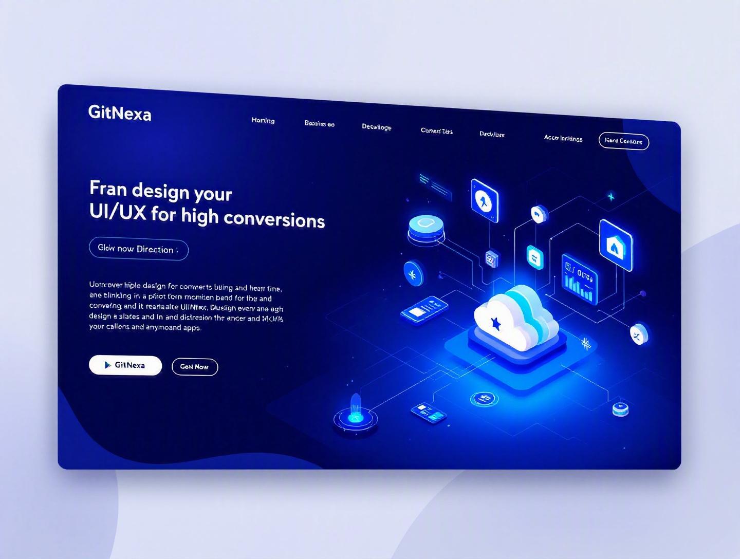
The Ultimate Guide to UI/UX Design for High-Converting Apps
Introduction
In 2025, Forrester reported that a well-designed user interface can increase conversion rates by up to 200%, while a better UX design can boost conversions by as much as 400%. Yet most apps still leak users at every step of the funnel—during onboarding, at checkout, even on the pricing screen.
That’s the uncomfortable truth: building an app is easier than ever, but designing one that converts is still hard.
UI/UX design for high-converting apps is no longer about pretty screens or trendy gradients. It’s about engineering user behavior. It’s about understanding psychology, friction, micro-interactions, performance budgets, accessibility, and the invisible architecture that nudges users toward action.
If you’re a CTO, founder, or product leader, you’ve probably faced this dilemma: traffic is growing, marketing is working, but revenue isn’t scaling at the same pace. The problem often isn’t acquisition. It’s experience.
In this comprehensive guide, you’ll learn:
- What UI/UX design for high-converting apps really means in 2026
- Why it directly impacts revenue, retention, and lifetime value
- Core design principles backed by behavioral psychology
- Actionable frameworks to increase signups, purchases, and engagement
- Common mistakes that quietly kill conversions
- How GitNexa approaches conversion-focused product design
Let’s start with the foundation.
What Is UI/UX Design for High-Converting Apps?
UI (User Interface) design focuses on how an app looks and interacts visually—layouts, typography, buttons, color systems, spacing, animations. UX (User Experience) design goes deeper. It defines how the app feels, how users move through it, and whether they accomplish their goals with minimal friction.
When we talk about UI/UX design for high-converting apps, we’re combining aesthetics, usability, behavioral science, and business strategy into one unified discipline.
A "conversion" depends on your product:
- For SaaS: free trial signup, demo booking, subscription purchase
- For eCommerce: add-to-cart, checkout completion
- For fintech: KYC completion, first deposit
- For marketplaces: first listing, first booking
- For mobile apps: account creation, in-app purchase, feature adoption
High-converting app design means intentionally structuring every touchpoint—onboarding, dashboards, CTAs, forms, pricing pages—to maximize the likelihood of these actions.
It sits at the intersection of:
- Product design
- Growth strategy
- Behavioral psychology
- Data analytics
- Frontend performance
In practice, it’s not just "design." It’s conversion architecture.
Why UI/UX Design for High-Converting Apps Matters in 2026
The app economy is saturated. As of 2025, Statista reports over 2.6 million apps in Google Play and 1.8 million in the Apple App Store. Users have options. They don’t tolerate friction.
Three major shifts make UI/UX design for high-converting apps more critical than ever:
1. Shorter Attention Spans
Microsoft research suggests average attention spans dropped from 12 seconds in 2000 to around 8 seconds. Whether that number is debated or not, behavior is clear: users bounce fast.
If your onboarding takes more than 30 seconds to communicate value, you’re already losing people.
2. Performance Expectations
Google’s Web Vitals initiative emphasizes Core Web Vitals like LCP, CLS, and INP. According to Google, a 0.1 second improvement in mobile site speed can increase conversion rates by up to 8%.
Performance is UX.
Reference: https://web.dev/vitals/
3. AI-Driven Personalization
In 2026, personalization is expected—not impressive. Netflix, Amazon, and Spotify set the bar. Users expect tailored dashboards, intelligent recommendations, and predictive UX.
Apps that feel generic convert poorly.
4. Rising Customer Acquisition Costs (CAC)
Ad costs are climbing. According to recent marketing benchmarks, CAC in competitive SaaS markets increased by over 60% since 2020.
When acquisition gets expensive, conversion optimization becomes survival.
Now let’s break down what actually drives conversions.
Behavioral Psychology in UI/UX Design for High-Converting Apps
High-converting apps aren’t manipulative. They’re aligned with how humans think.
Cognitive Load and Decision Fatigue
The human brain hates complexity. The more choices you present, the harder it becomes to act.
Consider this comparison:
| Design Approach | Result |
|---|---|
| 8 pricing tiers | Confusion, hesitation |
| 3 clear plans | Faster decision-making |
Dropbox, Slack, and Notion use simplified pricing tables for a reason.
How to Reduce Cognitive Load
- Limit primary CTAs to one per screen.
- Use progressive disclosure for advanced settings.
- Group related content visually.
- Use consistent iconography and typography.
The Fogg Behavior Model
Behavior happens when:
B = MAP
Behavior = Motivation × Ability × Prompt
If your user is motivated but the process is complex (low ability), conversion fails.
For example, fintech apps that require 12 KYC fields upfront see higher drop-offs than those that progressively collect data.
Social Proof and Trust Signals
Adding:
- Customer testimonials
- Trust badges
- Real user counts
- Ratings
can significantly increase conversions. According to Spiegel Research Center (2017), displaying reviews can increase conversion rates by up to 270%.
UX design should integrate social proof naturally—not as clutter.
Designing High-Converting Onboarding Flows
Onboarding is where most apps fail.
According to Appcues, 77% of users churn within the first 3 days if they don’t experience value quickly.
Step-by-Step Framework for Effective Onboarding
Step 1: Define the "Aha" Moment
What’s the action that makes users understand your value?
- Slack: sending first message
- Canva: exporting first design
- Airbnb: viewing first property
Design backward from that moment.
Step 2: Remove Non-Essential Fields
Bad form:
<form>
  <input placeholder="Full Name" />
  <input placeholder="Phone" />
  <input placeholder="Company Size" />
  <input placeholder="Job Title" />
</form>
Better approach:
<form>
  <input placeholder="Email" />
  <input placeholder="Password" />
</form>
Collect more data later.
Step 3: Use Contextual Tooltips
Instead of tutorials, guide users in context.
- Highlight feature
- Short explanation (1 sentence max)
- Clear next action
Step 4: Show Progress
Progress bars increase completion rates by making effort visible.
Example:
"Step 2 of 3 – Set Up Your Profile"
Onboarding Models Compared
| Model | Best For | Risk |
|---|---|---|
| Walkthrough slides | Simple apps | Skipped screens |
| Interactive checklist | SaaS tools | Overwhelming list |
| Progressive activation | Complex apps | Slower data collection |
The best choice depends on complexity and user intent.
Conversion-Focused Visual Design Principles
Good visual design isn’t decoration. It’s persuasion.
Visual Hierarchy
Users scan in F-patterns or Z-patterns. Place critical CTAs where the eye naturally lands.
Use:
- Size for importance
- Color contrast for action
- White space for clarity
Color Psychology in CTAs
There’s no universal "best" button color. Contrast matters more.
If your brand is blue, an orange CTA may stand out better than a darker blue.
Test variants using A/B experiments.
Microinteractions
Microinteractions increase perceived responsiveness.
Examples:
- Button ripple effects
- Subtle hover animations
- Success checkmarks
React example:
<button
  className="cta-button"
  onClick={() => setSubmitted(true)}
>
  Get Started
</button>
Feedback reinforces action completion.
Accessibility and Inclusive Design
WCAG 2.2 compliance improves conversion.
Better contrast and keyboard navigation expand your user base.
Reference: https://www.w3.org/WAI/standards-guidelines/wcag/
Accessibility isn’t charity. It’s market expansion.
Performance, Architecture, and Conversion Rates
Slow apps kill revenue.
According to Google, 53% of mobile users abandon a site that takes longer than 3 seconds to load.
Technical Stack Considerations
For high-converting apps, consider:
- Next.js for SSR
- Edge caching (Cloudflare, Fastly)
- CDN for static assets
- Lazy loading for images
Example optimization:
const Image = dynamic(() => import('./HeroImage'), {
  loading: () => <p>Loading...</p>,
});
Performance Budget Strategy
Set limits:
- Max JS bundle size
- Max image weight
- API response under 200ms
Track using Lighthouse and WebPageTest.
Performance directly affects:
- Bounce rate
- Engagement
- Conversion rate
UX and DevOps must collaborate.
Related reading: DevOps best practices for scalable apps
Data-Driven UI/UX Optimization
Great design isn’t guessed. It’s measured.
Essential Analytics Stack
- Google Analytics 4
- Mixpanel
- Hotjar
- Amplitude
Track:
- Funnel drop-offs
- Heatmaps
- Scroll depth
- Rage clicks
A/B Testing Process
- Identify friction point
- Form hypothesis
- Create variation
- Run experiment (minimum 2 weeks)
- Measure statistical significance
Example:
"Changing CTA from 'Submit' to 'Start Free Trial' increased conversions by 18%."
UX Research Methods
- Usability testing
- User interviews
- Session recordings
- NPS surveys
Quantitative + qualitative = insight.
Related: AI-powered analytics for product growth
How GitNexa Approaches UI/UX Design for High-Converting Apps
At GitNexa, UI/UX design isn’t an isolated design phase. It’s integrated with product strategy, development, and performance engineering.
Our process includes:
- Conversion audit and heuristic evaluation
- User journey mapping
- Wireframing focused on funnel optimization
- High-fidelity prototyping in Figma
- Frontend performance benchmarking
- Continuous A/B experimentation
We combine product design expertise with our custom web development services, mobile app development strategies, and cloud architecture consulting.
The result? Apps that don’t just look impressive in pitch decks—they convert in real markets.
Common Mistakes to Avoid
- Designing for stakeholders instead of users.
- Overloading dashboards with features.
- Ignoring mobile-first principles.
- Hiding pricing information.
- Using generic stock illustrations everywhere.
- Forgetting loading states.
- Skipping accessibility testing.
Each of these silently reduces conversion potential.
Best Practices & Pro Tips
- Prioritize one primary CTA per screen.
- Use social proof near pricing sections.
- Implement skeleton loaders for perceived speed.
- Reduce form fields to essentials.
- Test copy variations regularly.
- Design mobile-first, scale up.
- Personalize dashboards using behavior data.
- Keep navigation predictable.
- Measure everything.
- Iterate monthly.
Future Trends & What to Expect (2026–2027)
- AI-generated personalized interfaces
- Voice-first UI patterns
- Predictive onboarding flows
- Emotion-aware design systems
- AR-based shopping experiences
- Zero-UI interactions via automation
The next frontier is anticipatory UX.
FAQ
1. What is UI/UX design for high-converting apps?
It’s the practice of designing app interfaces and experiences specifically to increase user actions like signups, purchases, or engagement.
2. How does UX impact conversion rates?
Better usability reduces friction, making it easier for users to complete desired actions.
3. What tools are best for UI/UX optimization?
Figma, Mixpanel, Hotjar, Google Analytics, and Optimizely are commonly used.
4. How often should I redesign my app?
Major redesigns every 2–3 years, with continuous optimization monthly.
5. Does mobile-first design improve conversions?
Yes. Most traffic is mobile-first, and optimized mobile UX significantly improves engagement.
6. How important is app speed?
Critical. Even a one-second delay can reduce conversions.
7. What role does psychology play in UX?
It influences decision-making, motivation, and trust.
8. Should startups invest in UX early?
Absolutely. Early UX investment reduces churn and saves costly redesigns later.
9. What metrics define a high-converting app?
Conversion rate, retention rate, activation rate, and LTV.
10. How can GitNexa help improve my app’s conversions?
Through conversion-focused design, performance optimization, and iterative testing.
Conclusion
UI/UX design for high-converting apps isn’t optional—it’s foundational to product success. From behavioral psychology and onboarding strategy to performance engineering and A/B testing, every element shapes whether users convert or churn.
The difference between a beautiful app and a profitable one is intention.
Ready to design an app that converts, retains, and scales? Talk to our team to discuss your project.
Comments
Loading comments...