Sub Category
Latest Blogs
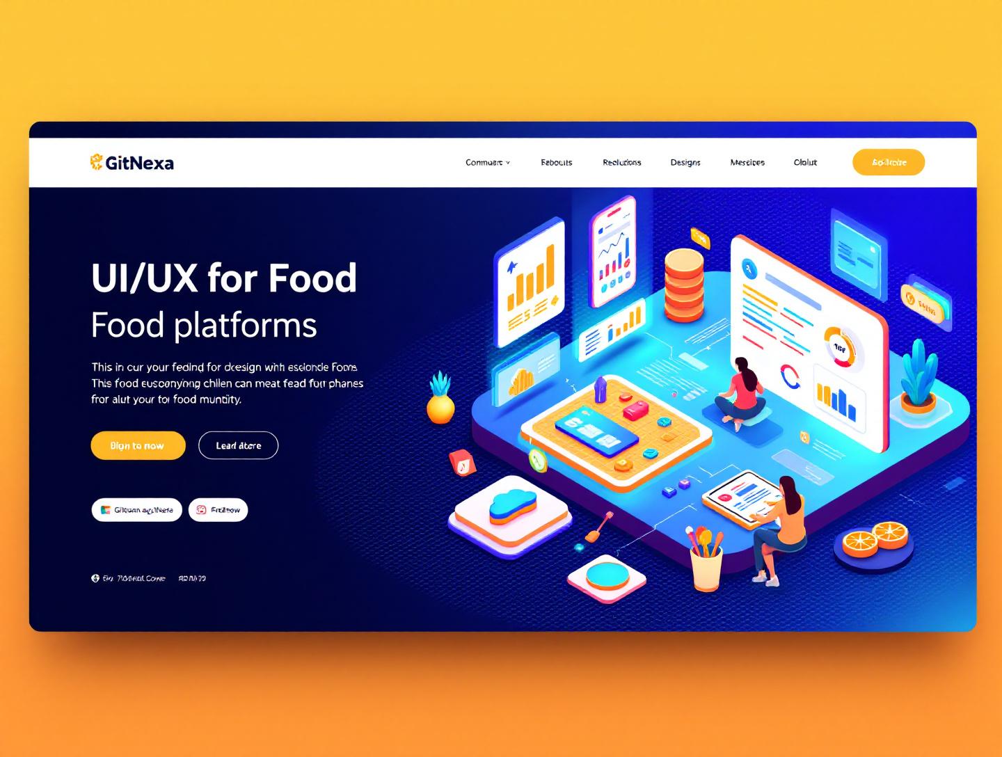
The Ultimate Guide to UI/UX Design for Food Platforms
Introduction
In 2025, the global online food delivery market crossed $1.20 trillion in gross merchandise value, according to Statista. That number isn’t just a reflection of changing eating habits—it’s proof that digital food experiences have become as important as the food itself. If your app takes 10 seconds too long to load a menu or makes checkout confusing, users won’t complain. They’ll switch.
This is where UI/UX design for food platforms becomes a serious competitive advantage. Whether you're building a food delivery app, restaurant ordering system, meal subscription service, cloud kitchen platform, or grocery marketplace, your interface directly impacts conversion rates, cart value, and customer retention.
Food platforms are uniquely challenging. You’re dealing with time-sensitive decisions, emotional triggers (hunger), visual persuasion (food imagery), logistics (delivery tracking), and operational constraints (inventory, kitchen load). A clunky experience doesn’t just frustrate users—it costs revenue every hour.
In this guide, we’ll break down what UI/UX design for food platforms actually involves, why it matters more in 2026 than ever before, and how to design high-performing systems that scale. We’ll explore real-world examples, UX patterns, architecture considerations, conversion strategies, and emerging trends like AI-driven personalization and voice ordering.
If you’re a founder, CTO, product manager, or designer working on a food tech product, this guide will give you practical frameworks—not generic advice.
What Is UI/UX Design for Food Platforms?
At its core, UI/UX design for food platforms is the process of crafting intuitive, visually engaging, and conversion-focused digital experiences for food-related applications.
That includes:
- Food delivery apps (like Uber Eats, DoorDash)
- Restaurant ordering systems (web and mobile)
- Cloud kitchen dashboards
- Meal prep and subscription platforms
- Grocery marketplaces
- Catering and bulk ordering portals
But it’s not just about making things look good.
UX in Food Platforms
UX (User Experience) focuses on:
- Reducing friction in browsing and ordering
- Designing fast decision-making flows
- Optimizing checkout conversion
- Improving order tracking clarity
- Building trust with ratings, reviews, and transparency
For example, the average user decides what to order in under 90 seconds. Your information architecture must support rapid scanning.
UI in Food Platforms
UI (User Interface) focuses on:
- Visual hierarchy (highlighting bestsellers, combos)
- Typography for readability
- High-quality food imagery
- Color psychology (reds and oranges increase appetite)
- Button placement and touch targets
Google’s Material Design guidelines emphasize minimum touch targets of 48x48dp for mobile interfaces. On food apps, ignoring this creates frustrating ordering experiences.
How It Differs from Other Digital Products
Food platforms differ from SaaS or fintech apps in key ways:
| Aspect | Food Platforms | SaaS Platforms |
|---|---|---|
| Decision Speed | Very fast | Considered |
| Emotional Trigger | Hunger, cravings | Logic, productivity |
| Visual Dependency | Extremely high | Moderate |
| Peak Usage | Lunch/Dinner spikes | Work hours |
| Abandonment Rate | High under friction | Moderate |
That emotional urgency changes everything about how you design.
Why UI/UX Design for Food Platforms Matters in 2026
The food tech industry in 2026 is not what it was in 2020.
1. Mobile-First Is Now App-First
Over 72% of online food orders globally now happen via mobile apps (Statista, 2025). If your UX feels like a responsive website stretched into an app shell, users notice.
Native-like interactions, micro-animations, and instant feedback are baseline expectations.
2. AI-Driven Personalization Is Standard
Platforms like Uber Eats now personalize home screens based on:
- Time of day
- Weather
- Previous orders
- Dietary preferences
- Location-based cuisine popularity
Users expect relevant recommendations within seconds.
3. Rising Customer Acquisition Costs
In competitive cities, CAC for food delivery apps can exceed $25–$40 per user. If your UX fails to retain them after first order, you lose money.
Retention-driven UX (reorder shortcuts, subscription nudges, loyalty dashboards) is critical.
4. Dark Kitchens & Multi-Brand Platforms
Cloud kitchens often operate 5–10 brands from a single backend. That requires:
- Smart menu filtering
- Cross-brand cart logic
- Inventory-based availability updates
5. Accessibility & Inclusivity Standards
WCAG 2.2 compliance is no longer optional. Food platforms must support:
- Screen readers
- High contrast modes
- Keyboard navigation
- Dietary filtering clarity
If you’re building at scale, accessibility is a growth strategy—not just compliance.
Core UX Principles for High-Converting Food Platforms
Let’s get tactical.
1. Minimize Cognitive Load
When users are hungry, they don’t want to think.
Strategies:
- Limit top-level categories to 6–8
- Use clear filters (Veg, Non-Veg, Gluten-Free, Under 30 min)
- Highlight "Popular" and "Chef’s Special"
2. Optimize Menu Architecture
Bad menu structures kill conversions.
Effective pattern:
- Cuisine Selection
- Restaurant Listing
- Menu Categories
- Item Detail with Add-ons
- Cart Summary
- Checkout
Use progressive disclosure—don’t show every modifier upfront.
3. Visual Hierarchy for Food Items
Prioritize:
- Image (primary focus)
- Name (bold)
- Rating + prep time
- Price
- Add button
Example UI component structure:
<div class="menu-item">
  <img src="pizza.jpg" alt="Margherita Pizza" />
  <h3>Margherita Pizza</h3>
  <p>4.6 ⭐ • 25 mins</p>
  <span>$12.99</span>
  <button>Add</button>
</div>
4. Cart & Checkout Optimization
Keep checkout under 3 steps.
- Address
- Payment
- Confirm
Show:
- Delivery time estimate
- Fees breakdown
- Promo code field
Amazon reduced friction by enabling 1-click checkout. Food apps should aim for the same simplicity.
5. Real-Time Feedback
Use micro-interactions:
- Button animations
- Cart counter updates
- Haptic feedback
These signals increase user confidence.
Designing for Performance & Scalability
Food platforms face traffic spikes at lunch (12–2 PM) and dinner (7–10 PM).
Architecture Considerations
A scalable stack often includes:
- Frontend: React / Next.js / Flutter
- Backend: Node.js / Django
- Database: PostgreSQL + Redis caching
- CDN: Cloudflare or AWS CloudFront
Architecture pattern:
Client App → API Gateway → Microservices (Orders, Menu, Payments) → Database
Performance Benchmarks
- First Contentful Paint: < 2.5s
- Time to Interactive: < 3s
- API response: < 300ms
Google’s Core Web Vitals (https://web.dev/vitals/) directly affect SEO and discoverability.
Image Optimization
Food images are heavy. Use:
- WebP format
- Lazy loading
- Responsive image sizes
Example in React:
<img
  src="/images/burger.webp"
  loading="lazy"
  alt="Cheeseburger"
/>
Personalization & AI in Food UX
AI is changing how users discover food.
Recommendation Engines
Models use:
- Collaborative filtering
- Order history
- Location heatmaps
Netflix-style "Because you ordered…" works extremely well in food apps.
Dynamic Pricing & Bundles
Offer combos during low-demand hours.
Smart Search
Natural language search:
"Healthy lunch under $15"
Integrate Elasticsearch or Algolia for advanced filtering.
For deeper AI integrations, explore how we build intelligent systems in our AI-powered product development.
Designing for Trust & Transparency
Trust drives repeat orders.
Essential Trust Signals
- Verified reviews
- Hygiene badges
- Real photos
- Transparent fees
Order Tracking UX
Use step indicators:
- Confirmed
- Preparing
- Out for Delivery
- Delivered
Live maps reduce support queries by up to 20% (industry estimates).
How GitNexa Approaches UI/UX Design for Food Platforms
At GitNexa, we approach UI/UX design for food platforms as a product-growth discipline, not just a design exercise.
Our process includes:
- User research (heatmaps, session recordings, interviews)
- Information architecture mapping
- Wireframing and rapid prototyping (Figma)
- Usability testing (real target users)
- Conversion optimization experiments
We integrate UX with scalable engineering—often combining our mobile app development expertise, cloud architecture strategies, and DevOps automation practices.
The result? Platforms that load fast, convert better, and scale during peak traffic without breaking.
Common Mistakes to Avoid
- Overloading menus with too many categories
- Hiding delivery fees until checkout
- Ignoring accessibility guidelines
- Slow-loading images
- Too many checkout steps
- Weak search functionality
- No reorder shortcut for returning users
Each of these directly impacts conversion and retention.
Best Practices & Pro Tips
- Show delivery time before menu browsing
- Use high-resolution but compressed images
- Highlight bestsellers visually
- Enable one-tap reorder
- Use push notifications strategically
- Offer guest checkout
- Display ratings prominently
- A/B test button colors and placements
- Provide dietary filters
- Keep cart visible at all times
Future Trends & What to Expect (2026–2027)
- Voice ordering integration (Google Assistant, Alexa)
- AR food previews
- AI meal planning subscriptions
- Hyper-personalized nutrition-based recommendations
- Drone delivery tracking interfaces
- Sustainable sourcing transparency dashboards
The next wave will combine logistics intelligence with deeply personalized UX.
FAQ: UI/UX Design for Food Platforms
1. What makes UI/UX design for food platforms different from eCommerce?
Food decisions are emotional and time-sensitive. Visual presentation and speed matter more than detailed specifications.
2. How many steps should a food checkout have?
Ideally three or fewer: address, payment, confirm.
3. What is the ideal loading time for food apps?
Under 3 seconds total interactive load time.
4. Should food platforms use dark mode?
Yes, especially for night-time ordering, but ensure contrast compliance.
5. How important are food images?
Critical. Platforms with professional imagery see significantly higher conversions.
6. What technologies are best for building food platforms?
React, Flutter, Node.js, PostgreSQL, Redis, and cloud hosting like AWS.
7. How do you reduce cart abandonment?
Show transparent fees, minimize steps, enable guest checkout.
8. Is personalization necessary?
In 2026, yes. Users expect relevant recommendations instantly.
9. How can small restaurants compete with large aggregators?
By focusing on niche branding, loyalty UX, and direct ordering platforms.
10. How often should food apps update their UX?
Continuously—test monthly, iterate quarterly.
Conclusion
The difference between a thriving food platform and one that struggles often comes down to user experience. Fast load times, intuitive menus, persuasive visuals, transparent pricing, and smart personalization all work together to drive higher conversions and stronger retention.
UI/UX design for food platforms is no longer optional polish—it’s the core growth engine behind modern food tech products. As competition intensifies in 2026, platforms that prioritize usability, scalability, and trust will win.
Ready to build or improve your food platform? Talk to our team to discuss your project.
Comments
Loading comments...