Sub Category
Latest Blogs
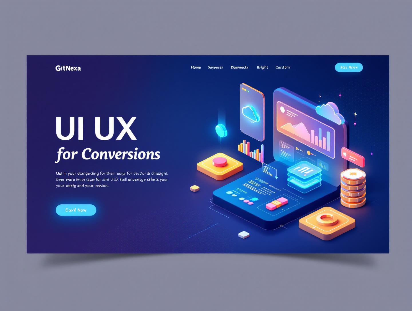
The Ultimate Guide to UI UX Design for Conversions
Introduction
In 2024, a Google study found that 61% of users leave a website if they cannot find what they are looking for within five seconds. That single statistic explains why UI UX design for conversions has become a boardroom topic, not just a design discussion. You can pour money into ads, SEO, and partnerships, but if your interface confuses users or creates friction, conversions quietly bleed out.
The problem most teams face is not a lack of features or technology. It is misalignment. Design decisions are often made for aesthetics, internal opinions, or trend-chasing rather than measurable business outcomes. Buttons look good but do not get clicked. Forms feel clean but never get completed. Users arrive with intent and leave with frustration.
This is where UI UX design for conversions changes the conversation. Conversion-focused design treats every screen, interaction, and micro-decision as part of a funnel. It blends behavioral psychology, usability principles, data, and visual clarity to guide users toward meaningful actions, whether that is signing up, purchasing, booking a demo, or requesting a quote.
In this guide, you will learn what UI UX design for conversions actually means, why it matters more in 2026 than ever before, and how leading companies design interfaces that turn traffic into revenue. We will break down real-world examples, practical workflows, design patterns, and mistakes we see repeatedly in SaaS, eCommerce, and enterprise products. You will also see how GitNexa approaches conversion-focused UI UX design and what future trends will shape how users interact with digital products.
If you are a founder trying to improve sign-ups, a CTO balancing usability with scalability, or a product manager responsible for growth metrics, this guide will give you a clear, practical framework.
What Is UI UX Design for Conversions
UI UX design for conversions is the practice of designing user interfaces and experiences with a primary goal: increasing the percentage of users who complete a desired action. That action might be a purchase, account creation, newsletter sign-up, app install, or lead form submission.
UI, or user interface, focuses on visual and interactive elements such as layout, typography, color, buttons, and spacing. UX, or user experience, covers the broader journey: how users move through a product, how intuitive it feels, and how efficiently they reach their goal. When combined for conversion optimization, these disciplines become tightly connected to metrics like conversion rate, bounce rate, task completion time, and customer lifetime value.
Unlike traditional design approaches that prioritize aesthetics or brand expression alone, conversion-focused UI UX design starts with user intent and business goals. Every design choice is evaluated against questions like: Does this reduce cognitive load? Does this build trust? Does this clarify the next step?
For example, Amazon’s one-click checkout is not visually exciting, but it is a masterclass in conversion-driven UX. By reducing steps and decisions, Amazon reportedly increased revenue by an estimated $300 million annually after introducing streamlined checkout flows. The interface serves a single purpose: getting users to complete purchases quickly and confidently.
In practice, UI UX design for conversions blends usability heuristics, behavioral psychology, analytics, and continuous testing. It is not a one-time redesign. It is an ongoing process of observation, iteration, and improvement.
Why UI UX Design for Conversions Matters in 2026
UI UX design for conversions is more critical in 2026 because user expectations and competitive pressure have never been higher. According to Statista, there were over 1.13 billion websites online in 2025, but fewer than 18% were considered active. Users compare your product not only to competitors but to the best experiences they have ever had.
Rising Customer Acquisition Costs
Customer acquisition costs continue to rise across industries. A 2024 report by ProfitWell showed CAC increased by more than 60% over the previous five years for SaaS companies. When traffic is expensive, wasting it through poor UX becomes a direct financial loss. Improving conversion rates by even 1% can offset rising ad costs without increasing spend.
Mobile-First and Multi-Device Journeys
More than 59% of global web traffic came from mobile devices in 2025, according to Statista. Users often start on mobile, continue on desktop, and convert later. Inconsistent UI UX across devices breaks trust and momentum. Conversion-focused design ensures continuity and clarity at every touchpoint.
AI, Automation, and Short Attention Spans
AI-powered tools have reduced user patience. People expect instant feedback, personalization, and relevance. If your interface feels slow, confusing, or generic, users leave. UI UX design for conversions integrates personalization, smart defaults, and predictive flows without overwhelming users.
Trust and Privacy Expectations
With regulations like GDPR and evolving data privacy standards, users are more cautious. Clear messaging, transparent consent flows, and ethical design patterns directly affect conversion rates. Dark patterns may work temporarily but damage long-term trust and retention.
Core Principles of UI UX Design for Conversions
Clarity Over Creativity
The first principle of UI UX design for conversions is clarity. Users should never wonder what a page is about or what to do next. Creative visuals are valuable, but not at the cost of comprehension.
Real-world example: Dropbox’s homepage redesign focused on a single headline, short supporting text, and one primary call-to-action. By removing competing elements, Dropbox improved sign-up conversions significantly without adding new features.
Key tactics include:
- One primary goal per page
- Clear visual hierarchy using size, contrast, and spacing
- Descriptive CTA text such as "Get your free report" instead of "Submit"
Reducing Cognitive Load
Cognitive load refers to the mental effort required to use an interface. High cognitive load kills conversions. Forms with too many fields, complex navigation, and unclear labels force users to think too much.
A practical technique is progressive disclosure. Show only what users need at each step. For example, multi-step checkout flows often convert better than long single-page forms because they feel manageable.
<form>
  <label>Email</label>
  <input type="email" required />
  <button>Continue</button>
</form>
This simple first step reduces friction and builds momentum.
Visual Hierarchy and Attention Control
UI UX design for conversions relies heavily on directing attention. Designers use contrast, color, whitespace, and motion to guide users naturally.
A comparison table illustrates this well:
| Element | Low Conversion Impact | High Conversion Impact |
|---|---|---|
| CTA Color | Same as background | High contrast accent |
| Headline | Vague message | Benefit-driven |
| Layout | Dense content | Clear sections |
Companies like Airbnb use subtle animations and spacing to highlight primary actions without overwhelming users.
UX Research and Data-Driven Design Decisions
Qualitative Research Methods
User interviews, usability testing, and session recordings reveal why users behave the way they do. Tools like Hotjar and FullStory provide heatmaps and session replays that expose friction points.
For example, an eCommerce client noticed users hovering over shipping costs but abandoning carts. UX research revealed hidden fees displayed too late in the flow.
Quantitative Metrics That Matter
Conversion-focused UI UX design relies on metrics such as:
- Conversion rate
- Drop-off rate per step
- Time on task
- Error rate
Google Analytics 4 and Mixpanel are commonly used to track these metrics and correlate design changes with outcomes.
A/B Testing and Iteration
A/B testing validates design assumptions. Booking.com famously runs thousands of experiments simultaneously. Even small changes like button copy or image placement can lead to measurable improvements.
if (variant === 'B') {
  cta.textContent = 'Start Free Trial';
}
UI Patterns That Drive Higher Conversions
Effective Call-to-Action Design
CTAs should stand out visually and communicate value. Avoid generic labels. Use action-oriented language tied to user benefit.
Example: Slack uses "Try for free" instead of "Sign up," reducing perceived risk.
Form Optimization Patterns
Shorter forms convert better, but context matters. For B2B lead generation, five to seven fields often outperform longer forms when paired with clear value propositions.
Best practices include:
- Inline validation
- Clear error messages
- Autofill support
Trust Signals and Social Proof
Logos, testimonials, reviews, and security badges reduce anxiety. According to Nielsen Norman Group, trust indicators significantly improve conversion rates, especially for first-time visitors.
Accessibility and Inclusive Design for Conversions
Accessibility is not just compliance; it is conversion optimization. The World Health Organization estimates that over 1.3 billion people live with some form of disability.
WCAG Guidelines in Practice
Following WCAG 2.2 improves usability for everyone. High contrast text, keyboard navigation, and readable fonts reduce friction.
Inclusive Copy and Design Choices
Avoid jargon and ambiguous language. Simple, inclusive copy increases comprehension and confidence, directly impacting conversions.
How GitNexa Approaches UI UX Design for Conversions
At GitNexa, UI UX design for conversions starts with understanding business goals and user intent before opening design tools. Our teams collaborate closely with product managers, developers, and stakeholders to align metrics with user needs.
We begin with UX audits and user research to identify friction points. From there, we create wireframes and interactive prototypes tested with real users. Design decisions are validated through data, not assumptions.
GitNexa integrates UI UX design with full-cycle development, ensuring designs translate accurately into code. Our teams work across web, mobile, and cloud platforms, supported by services outlined in our UI UX design services, web development, and mobile app development practices.
By combining design thinking, analytics, and engineering discipline, we help clients improve conversion rates without sacrificing performance or scalability.
Common Mistakes to Avoid
- Designing for aesthetics alone without measuring impact
- Overloading pages with multiple CTAs
- Ignoring mobile usability issues
- Hiding critical information until late in the funnel
- Using dark patterns that erode trust
- Skipping usability testing due to time pressure
Each of these mistakes creates friction that quietly reduces conversions over time.
Best Practices & Pro Tips
- Define one primary goal per screen
- Use benefit-driven headlines
- Test changes with real users before scaling
- Design mobile-first, then enhance for desktop
- Track micro-conversions, not just final actions
- Revisit UX quarterly as user behavior evolves
Future Trends & What to Expect
Between 2026 and 2027, UI UX design for conversions will increasingly rely on AI-driven personalization, voice and gesture interfaces, and real-time behavioral adaptation. Gartner predicts that by 2027, 40% of digital experiences will be personalized in real time using AI.
Designers will need to balance automation with transparency, ensuring users understand and trust adaptive interfaces. Accessibility and ethical design will also become stronger differentiators.
Frequently Asked Questions
What is UI UX design for conversions?
It is the practice of designing interfaces and experiences that increase the likelihood of users completing desired actions.
How does UI UX affect conversion rates?
Clear layouts, intuitive navigation, and reduced friction make it easier for users to act, directly improving conversion metrics.
Is UI UX design only for eCommerce?
No. SaaS, fintech, healthcare, and enterprise platforms all benefit from conversion-focused UX.
How long does it take to see results?
Minor improvements can show results within weeks, while larger redesigns may take several months.
What tools are used for conversion-focused UX?
Common tools include Figma, Hotjar, Google Analytics, Mixpanel, and Optimizely.
Does accessibility really impact conversions?
Yes. Accessible design improves usability for all users and expands your potential audience.
Can developers influence UX conversions?
Absolutely. Performance, error handling, and implementation quality directly affect user experience.
How often should UX be reviewed?
Quarterly reviews are ideal, with continuous monitoring of key metrics.
Conclusion
UI UX design for conversions is not about tricks or shortcuts. It is about respecting user intent, reducing friction, and aligning design decisions with measurable outcomes. As competition increases and user expectations rise, conversion-focused design becomes a core business capability, not an optional enhancement.
By focusing on clarity, data-driven decisions, accessibility, and continuous testing, teams can turn existing traffic into meaningful growth. Whether you are refining a landing page or redesigning a complex product, the principles outlined in this guide provide a practical foundation.
Ready to improve your UI UX design for conversions? Talk to our team to discuss your project.
Comments
Loading comments...