Sub Category
Latest Blogs
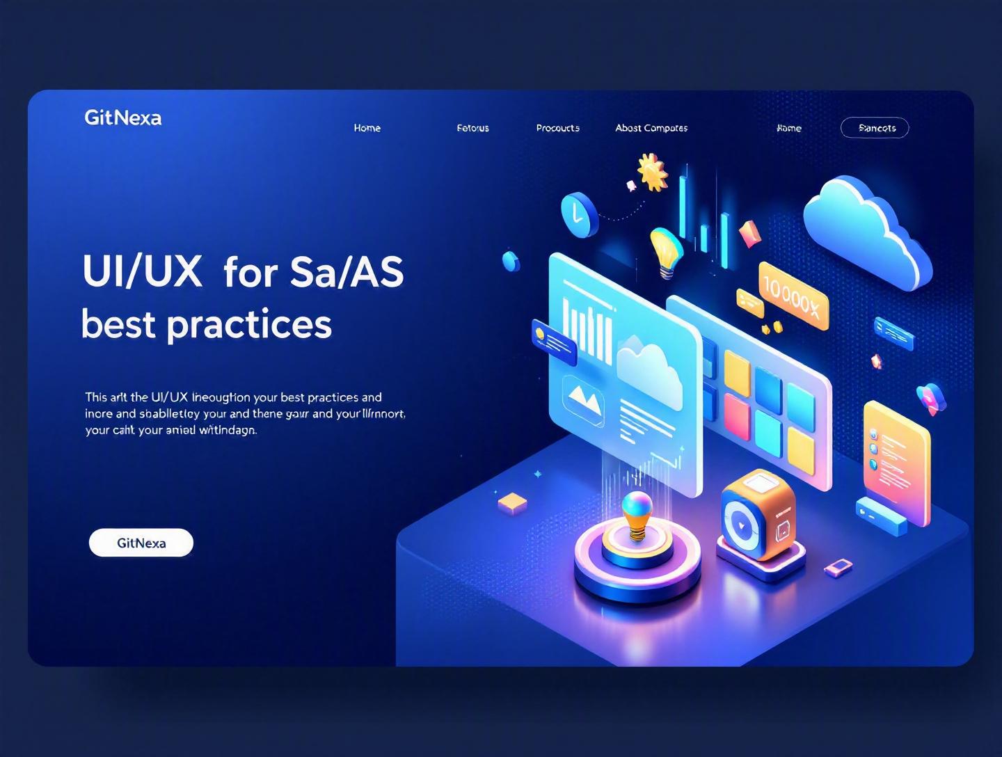
Ultimate UI/UX Design Best Practices for SaaS Growth
Introduction
In 2025, Forrester reported that a well-designed user interface can increase conversion rates by up to 200%, while better UX design can boost those numbers by as much as 400%. Yet, most SaaS products still struggle with onboarding friction, feature bloat, and inconsistent user journeys. The result? High churn, low adoption, and support teams drowning in tickets.
UI/UX design best practices for SaaS are no longer a "nice to have." They directly affect customer acquisition cost (CAC), lifetime value (LTV), expansion revenue, and even valuation multiples. In a subscription-driven world, users don’t tolerate confusion. They cancel.
If you’re a founder, CTO, product manager, or lead designer, this guide will walk you through what actually works in modern SaaS interface design. We’ll cover usability principles, onboarding psychology, data-heavy dashboard design, accessibility standards, design systems, and the metrics that matter. You’ll see real-world examples, comparison tables, actionable checklists, and workflow frameworks you can apply immediately.
Let’s start with the fundamentals.
What Is UI/UX Design for SaaS?
UI/UX design for SaaS refers to the strategic planning and execution of user interfaces (UI) and user experiences (UX) specifically tailored for subscription-based software products delivered over the cloud.
UI vs UX in the SaaS Context
- UI (User Interface) focuses on visual elements: typography, buttons, layout grids, spacing, color systems, icons, and interactive states.
- UX (User Experience) covers the entire journey: onboarding flows, feature discovery, error handling, performance perception, and task completion efficiency.
Unlike one-time software purchases, SaaS products depend on long-term engagement. That changes the design equation.
SaaS-Specific Characteristics
- Continuous updates and feature releases
- Tiered pricing models
- Role-based access (admin, manager, user)
- Data-heavy dashboards
- Integrations with third-party tools
For example, designing a landing page for an eCommerce brand is fundamentally different from designing an analytics dashboard like Mixpanel or a project management tool like Asana.
SaaS UX must balance:
- Simplicity vs feature depth
- Personalization vs consistency
- Scalability vs performance
At GitNexa, we often see startups confuse UI aesthetics with UX effectiveness. A beautiful interface that slows task completion is still a bad experience.
Why UI/UX Design Best Practices for SaaS Matter in 2026
The SaaS market is projected to exceed $300 billion globally by 2026, according to Statista (https://www.statista.com). Competition is fierce, and switching costs are lower than ever.
Here’s what changed:
1. AI-Driven Expectations
Users now expect intelligent recommendations, auto-complete, predictive analytics, and contextual help. Tools like Notion AI and HubSpot’s AI assistant set new standards.
2. Product-Led Growth (PLG)
Freemium and self-serve onboarding dominate B2B SaaS. That means your UI/UX replaces traditional sales demos. If your interface doesn’t communicate value within the first 5 minutes, users drop off.
3. Accessibility & Compliance
WCAG 2.2 compliance and ADA regulations are stricter. Ignoring accessibility can lead to lawsuits and lost enterprise deals. Refer to W3C guidelines: https://www.w3.org/WAI/standards-guidelines/wcag/
4. Multi-Device Workflows
Remote and hybrid work demand responsive design across desktops, tablets, and mobile apps.
If you’re scaling infrastructure, don’t ignore the frontend layer. We discuss this synergy in our guide on cloud-native application architecture.
In 2026, UI/UX is not decoration. It’s growth infrastructure.
Designing Frictionless SaaS Onboarding Experiences
Onboarding determines whether users reach their “aha moment.” Slack does this brilliantly—new teams send messages within minutes.
The 5-Step SaaS Onboarding Framework
- Clarify the Core Outcome – What problem gets solved first?
- Minimize Required Fields – Ask only essential data.
- Use Progressive Disclosure – Reveal features gradually.
- Show Immediate Value – Demo data or templates.
- Provide Contextual Guidance – Tooltips, checklists, walkthroughs.
Example: Linear vs Traditional Setup
| Factor | Traditional SaaS | Linear Approach |
|---|---|---|
| Signup fields | 10+ | 3-4 |
| Time to first action | 15-20 min | <5 min |
| Tutorial length | 10 slides | Contextual tips |
| Aha moment | Delayed | Immediate |
UX Pattern: Empty States Done Right
Instead of a blank dashboard, show:
- Sample data
- "Create your first project" CTA
- 2-3 suggested actions
Example React snippet for conditional onboarding:
if (!user.hasProjects) {
  return <EmptyState message="Create your first project" />;
}
return <Dashboard data={projects} />;
Empty states are prime real estate. Treat them as activation engines.
For deeper onboarding architecture, see our article on building scalable web applications.
Designing Data-Heavy Dashboards Without Overload
SaaS products often revolve around analytics, reports, or performance tracking.
The mistake? Cramming everything above the fold.
Principles for Effective Dashboard UX
1. Prioritize Signal Over Noise
Ask: What decisions should users make here?
Stripe’s dashboard prioritizes revenue, payouts, and failed payments—nothing more.
2. Use Visual Hierarchy
- Large typography for primary metrics
- Color contrast for alerts
- Consistent spacing (8px grid system)
3. Modular Layout Systems
Use grid-based structures:
.dashboard {
  display: grid;
  grid-template-columns: repeat(12, 1fr);
  gap: 16px;
}
4. Drill-Down Navigation
High-level metrics → detailed views → exportable reports.
Chart Selection Guide
| Data Type | Recommended Chart |
|---|---|
| Trend over time | Line chart |
| Category comparison | Bar chart |
| Distribution | Histogram |
| Proportion | Donut (limited use) |
Use libraries like Recharts, D3.js, or Chart.js. Always test performance impact.
If performance degrades, your UX suffers. Our breakdown on frontend performance optimization explains how to manage bundle size.
Building Consistent Design Systems for SaaS Scale
As SaaS products grow, inconsistency creeps in. Different teams ship slightly different buttons, spacing rules, and modal patterns.
That’s how design debt accumulates.
What Is a SaaS Design System?
A centralized library of:
- Components
- Tokens (color, typography, spacing)
- Interaction rules
- Accessibility standards
Companies like Shopify (Polaris) and Atlassian (Atlassian Design System) treat design systems as products.
Core Layers of a Design System
1. Design Tokens
{
  "primaryColor": "#4F46E5",
  "borderRadius": "8px",
  "fontFamily": "Inter, sans-serif"
}
2. Atomic Components
- Buttons
- Inputs
- Dropdowns
- Modals
3. Complex Patterns
- Data tables
- Filters
- Multi-step forms
Benefits
- Faster development cycles
- Reduced QA bugs
- Consistent brand perception
- Easier onboarding for new developers
Learn more in our deep dive on design systems for scalable products.
Accessibility and Inclusive SaaS Design
Ignoring accessibility limits your market. According to WHO (2023), over 1.3 billion people live with some form of disability.
Key WCAG 2.2 Guidelines
- Minimum 4.5:1 contrast ratio
- Keyboard navigation support
- Alt text for images
- Focus indicators
Accessibility Checklist
- Test with screen readers (NVDA, VoiceOver)
- Ensure form labels are explicit
- Avoid color-only indicators
- Provide error suggestions
Bad example:
"Error occurred"
Good example:
"Password must contain at least 8 characters, including one number."
Accessibility improves usability for everyone—not just disabled users.
How GitNexa Approaches UI/UX Design Best Practices for SaaS
At GitNexa, we approach UI/UX design for SaaS as a growth lever, not a cosmetic phase.
Our process typically includes:
- Product Discovery Workshops – Stakeholder interviews and user persona mapping
- UX Research & Competitor Analysis – Heuristic evaluations and usability audits
- Wireframing & Prototyping – Figma-based interactive flows
- Design System Creation – Token-driven component libraries
- Developer Handoff & QA – Close collaboration with engineering teams
We integrate UI/UX with broader technical architecture, whether it’s a DevOps transformation strategy or AI-powered SaaS development.
Our goal is simple: reduce friction, increase activation, and design products users actually enjoy using.
Common Mistakes to Avoid in SaaS UI/UX
- Feature Overload at Launch – Trying to impress users with everything at once.
- Ignoring User Research – Designing based on assumptions.
- Inconsistent Navigation – Moving primary actions across screens.
- Slow Load Times – Heavy images, unoptimized scripts.
- Poor Mobile Responsiveness – Treating mobile as an afterthought.
- Weak Error Handling – Generic error messages.
- Skipping Accessibility Testing – Risking compliance and inclusivity.
Best Practices & Pro Tips
- Design around one primary user persona first.
- Track activation rate and time-to-value.
- Use micro-interactions for feedback.
- Keep navigation depth under three levels.
- Conduct usability testing every release cycle.
- Maintain a living design system.
- Optimize for perceived performance.
- Write UX copy that sounds human.
Future Trends & What to Expect (2026–2027)
1. AI-Personalized Interfaces
UI elements adapting based on usage patterns.
2. Voice and Multimodal Inputs
Integration with AI assistants.
3. Zero-UI Automation
Background workflows replacing manual dashboards.
4. AR Data Visualization
Especially in enterprise SaaS.
5. Hyper-Personalized Onboarding
Dynamic flows powered by behavioral analytics.
SaaS UX will become predictive, adaptive, and context-aware.
FAQ: UI/UX Design Best Practices for SaaS
1. What makes SaaS UI/UX different from regular web design?
SaaS design focuses on long-term engagement, recurring revenue, and feature scalability rather than one-time conversions.
2. How do you measure SaaS UX success?
Track activation rate, churn rate, task completion time, and NPS.
3. What tools are best for SaaS UI design?
Figma, Sketch, Adobe XD, and Storybook for component documentation.
4. How often should SaaS UX be updated?
Continuously—iterate based on user feedback and analytics.
5. Is dark mode necessary for SaaS products?
Not mandatory, but increasingly expected in data-heavy tools.
6. How do you reduce churn through design?
Improve onboarding, clarify value, and reduce friction in workflows.
7. What role does AI play in SaaS UX?
AI powers personalization, automation, and intelligent recommendations.
8. Should startups invest in a design system early?
Yes. Even a lightweight system prevents future inconsistencies.
9. How important is accessibility in B2B SaaS?
Critical for compliance, enterprise deals, and inclusivity.
10. What’s the biggest UI mistake SaaS companies make?
Designing for themselves instead of real users.
Conclusion
UI/UX design best practices for SaaS directly influence activation, retention, and long-term revenue. From frictionless onboarding to scalable design systems and accessible interfaces, every design decision compounds over time.
The companies that win in 2026 aren’t just feature-rich—they’re effortless to use.
Ready to elevate your SaaS product experience? Talk to our team to discuss your project.
Comments
Loading comments...