Sub Category
Latest Blogs
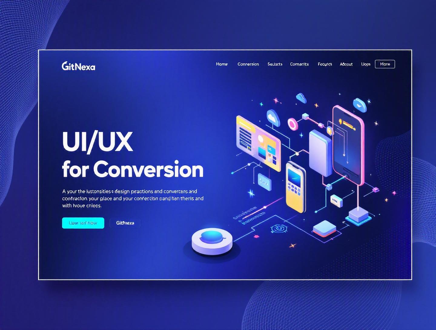
The Ultimate Guide to UI/UX Design Best Practices for Conversion
Introduction
A one-second delay in page load time can reduce conversions by up to 7%, according to data from Akamai. Even more striking: Forrester Research found that a well-designed user interface can raise a website’s conversion rate by up to 200%, while better UX design can yield conversion rates up to 400%. Those numbers aren’t marketing fluff. They represent millions in revenue gained—or lost—based purely on design decisions.
That’s why ui-ux-design-best-practices-for-conversion are no longer optional. They are strategic business tools. Whether you’re running a SaaS platform, an ecommerce store, or a B2B services website, your user interface (UI) and user experience (UX) directly impact customer acquisition, retention, and lifetime value.
Yet many companies still treat UI/UX as surface-level aesthetics. They obsess over color palettes and animations while ignoring friction in checkout flows, onboarding journeys, or mobile responsiveness. The result? High bounce rates, abandoned carts, and underperforming funnels.
In this comprehensive guide, we’ll break down proven UI/UX design best practices for conversion. You’ll learn how to reduce cognitive load, design persuasive CTAs, optimize forms, improve mobile usability, and implement data-driven testing frameworks. We’ll also explore emerging trends shaping 2026 and beyond.
If you’re a developer, founder, product manager, or CTO, this guide will help you connect design decisions directly to measurable business outcomes.
What Is UI/UX Design Best Practices for Conversion?
UI (User Interface) refers to the visual elements users interact with—buttons, typography, layout, color schemes, forms, and interactive components. UX (User Experience) encompasses the overall journey: how intuitive, efficient, and enjoyable the interaction feels from entry to conversion.
When we talk about ui-ux-design-best-practices-for-conversion, we mean design principles and implementation strategies that intentionally guide users toward a specific action—signing up, purchasing, booking a demo, or subscribing.
Conversion-focused design blends psychology, usability engineering, behavioral economics, and performance optimization.
Core Components of Conversion-Centric UX
1. Clarity
Users should instantly understand:
- What your product does
- Who it’s for
- What action to take next
2. Reduced Friction
Every extra step, field, or decision reduces conversion probability.
3. Trust Signals
Security badges, testimonials, reviews, and clear policies increase perceived safety.
4. Persuasive Microcopy
Button text like “Get My Free Trial” outperforms generic “Submit.”
UI vs UX: Quick Comparison
| UI | UX |
|---|---|
| Visual presentation | Overall user journey |
| Colors, fonts, spacing | Flow, usability, logic |
| Aesthetic appeal | Efficiency and satisfaction |
| Interaction components | Behavioral psychology |
Great UI attracts. Great UX converts.
Why UI/UX Design Best Practices for Conversion Matters in 2026
Digital competition has intensified. According to Statista (2025), global ecommerce sales surpassed $6.3 trillion. SaaS spending continues to grow at double-digit rates annually. Users have choices—and little patience.
Here’s what changed:
1. Mobile Dominance
Over 58% of global web traffic now comes from mobile devices (Statista, 2025). Poor mobile UX directly impacts revenue.
2. AI-Driven Expectations
Users now expect personalization similar to Amazon and Netflix. Static interfaces feel outdated.
3. Performance Standards
Google’s Core Web Vitals (see https://web.dev/vitals/) impact rankings and conversions. UX and SEO are tightly connected.
4. Attention Scarcity
The average attention span for digital content continues to shrink. Simplicity wins.
Companies investing in conversion-centered design see measurable ROI. A McKinsey study (2023) found companies that prioritize design outperform industry peers by 32% in revenue growth.
UI/UX isn’t decoration. It’s revenue infrastructure.
Designing High-Converting User Journeys
Conversion starts with mapping the entire user journey.
Step 1: Define the Primary Conversion Goal
Examples:
- SaaS: Free trial signup
- Ecommerce: Completed purchase
- B2B: Booked consultation
- Mobile app: First meaningful action
Step 2: Map the Funnel
Landing Page → Feature Page → Pricing → Checkout → Confirmation
Each transition must remove doubt and friction.
Step 3: Identify Drop-Off Points
Use tools like:
- Google Analytics 4
- Hotjar
- Mixpanel
- FullStory
Heatmaps and session recordings reveal friction areas.
Example: Dropbox Simplified Onboarding
Dropbox reduced onboarding steps and added visual progress indicators. Result: increased completion rates significantly.
Journey Optimization Framework
- Define intent
- Align messaging
- Reduce clicks
- Add trust elements
- Test continuously
Related read: User-centered design principles
Conversion-Optimized Landing Page Design
Landing pages are conversion machines—if designed correctly.
Essential Elements
1. Clear Value Proposition
Above-the-fold messaging must answer:
- What is it?
- Why should I care?
- What do I do next?
2. Strong CTA Design
High-performing CTAs:
- Use action verbs
- Create urgency
- Stand out visually
Example comparison:
| Weak CTA | Strong CTA |
|---|---|
| Submit | Start My Free Trial |
| Learn More | See Pricing Plans |
3. Social Proof
- Case studies
- Reviews
- Client logos
- Testimonials
4. Visual Hierarchy
Use:
- F-pattern layout
- Z-pattern scanning
- Clear typography scale
CSS Example:
.cta-button {
  background-color: #ff6b35;
  padding: 14px 28px;
  font-size: 18px;
  border-radius: 6px;
  transition: transform 0.2s ease;
}

.cta-button:hover {
  transform: scale(1.05);
}
Related read: High-converting landing page development
Reducing Friction in Forms and Checkout Flows
Baymard Institute (2024) reports average cart abandonment rates near 70%. A major cause? Complex checkout processes.
Best Practices
1. Minimize Fields
Only ask what’s necessary.
2. Use Inline Validation
Show errors instantly instead of after submission.
if (!email.includes("@")) {
  showError("Please enter a valid email address");
}
3. Enable Autofill
Use proper input types:
<input type="email" autocomplete="email" />
4. Offer Guest Checkout
Forcing account creation kills conversions.
One-Page vs Multi-Step Checkout
| One-Page | Multi-Step |
|---|---|
| Faster perception | Clear progress indicators |
| Best for simple products | Better for complex purchases |
Related read: Ecommerce UX optimization strategies
Mobile-First and Responsive Design for Conversion
Google uses mobile-first indexing. Your mobile experience defines performance.
Mobile UX Best Practices
- Thumb-friendly navigation
- Sticky CTA buttons
- Simplified menus
- Fast loading times
Media Query Example:
@media (max-width: 768px) {
  .container {
    padding: 16px;
  }
}
Performance Optimization Tips
- Lazy loading images
- Compress assets
- Use CDN
- Optimize Core Web Vitals
Related read: Progressive web app development guide
Data-Driven A/B Testing and Continuous Optimization
Design without testing is guesswork.
A/B Testing Process
- Define hypothesis
- Create variation
- Split traffic
- Measure results
- Implement winner
Example Hypothesis:
"Changing CTA color from blue to orange will increase click-through rate by 10%."
Metrics to Track
- Conversion rate
- Bounce rate
- Time on page
- Scroll depth
Use tools like:
- Google Optimize (historical reference)
- Optimizely
- VWO
Related read: Conversion rate optimization strategies
How GitNexa Approaches UI/UX Design Best Practices for Conversion
At GitNexa, we approach UI/UX as a measurable growth lever—not just design deliverables.
Our process:
- Discovery workshops with stakeholders
- User persona development
- Wireframing and prototyping (Figma, Adobe XD)
- Usability testing
- Performance optimization
- Continuous CRO testing
We integrate UX with development workflows using React, Next.js, Flutter, and modern backend stacks. Our DevOps teams ensure deployment pipelines don’t compromise performance or accessibility.
Whether building SaaS dashboards, ecommerce platforms, or enterprise portals, we align every pixel with conversion goals.
Common Mistakes to Avoid
- Overloading pages with information
- Ignoring mobile responsiveness
- Weak CTA copy
- Slow load times
- Too many form fields
- Lack of trust signals
- Designing without user testing
Best Practices & Pro Tips
- Use contrasting CTA colors
- Show progress indicators in forms
- Prioritize above-the-fold clarity
- Implement micro-interactions
- Use whitespace generously
- Optimize for accessibility (WCAG 2.1)
- Test headline variations regularly
- Personalize content when possible
Future Trends & What to Expect (2026–2027)
- AI-driven personalization interfaces
- Voice UI integration
- Predictive UX flows
- AR-based ecommerce experiences
- Biometric authentication
- Hyper-fast edge computing
Expect UX to become increasingly adaptive and context-aware.
FAQ
1. What is the difference between UI and UX?
UI focuses on visual elements, while UX encompasses the overall experience and usability.
2. How does UI/UX impact conversion rates?
Better usability reduces friction and improves user confidence, increasing completed actions.
3. What tools are best for UX design?
Figma, Adobe XD, Sketch, InVision, and Axure are widely used.
4. How many form fields are ideal?
As few as possible—typically 3–5 for lead generation.
5. Is mobile-first design necessary in 2026?
Yes. Most traffic comes from mobile devices.
6. How often should A/B testing be done?
Continuously. Optimization never stops.
7. What are Core Web Vitals?
Google metrics measuring performance, interactivity, and visual stability.
8. Can good UX replace marketing?
No—but it amplifies marketing ROI.
9. How long does UX optimization take?
Initial improvements can show results in weeks; continuous iteration is ongoing.
10. Should startups invest early in UX?
Absolutely. Early UX mistakes scale badly.
Conclusion
UI/UX design best practices for conversion directly influence revenue, engagement, and brand trust. From reducing friction and optimizing forms to embracing mobile-first and data-driven testing, each improvement compounds over time.
Design is no longer a support function. It’s a strategic growth driver.
Ready to optimize your product for higher conversions? Talk to our team to discuss your project.
Comments
Loading comments...