Sub Category
Latest Blogs
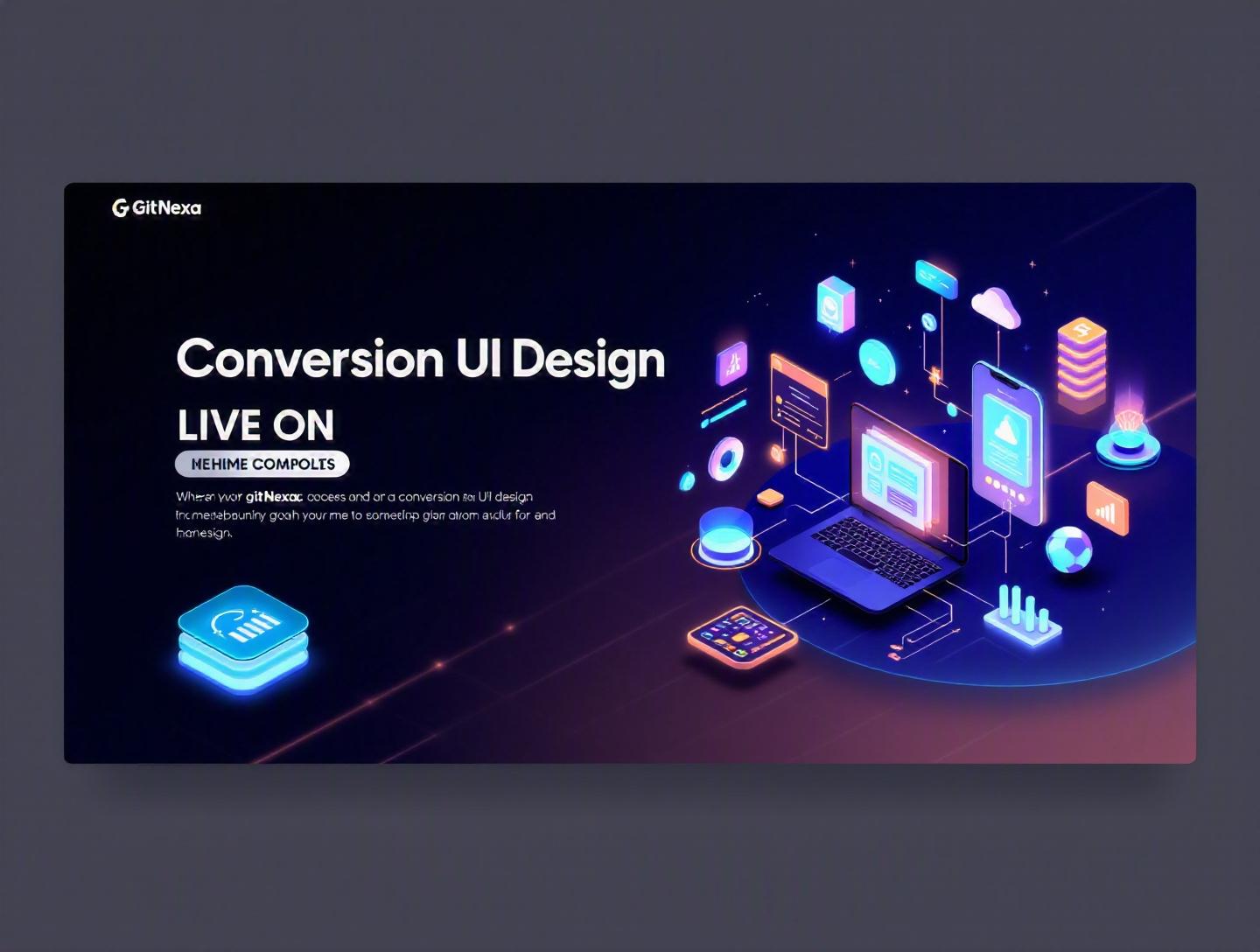
The Ultimate Guide to Conversion-Focused UI Design
Introduction
In 2025, research from Forrester revealed that a well-designed user interface can increase conversion rates by up to 200%, while better UX design can yield conversion improvements of 400%. Yet most businesses still treat UI as a visual afterthought rather than a revenue engine.
Conversion-focused UI design flips that mindset.
Instead of asking, "Does this look good?" high-performing teams ask, "Does this move users toward action?" Whether the goal is purchases, demo bookings, signups, or downloads, every button, form field, microcopy element, and layout decision either nudges users forward or pushes them away.
If you’re a CTO, product manager, startup founder, or growth-focused marketer, understanding conversion-focused UI design isn’t optional anymore. Attention spans are shrinking. Customer acquisition costs are rising. And according to Statista (2024), global eCommerce conversion rates still hover between 2% and 4% on average. That means 96% of visitors leave without converting.
This guide breaks down what conversion-focused UI design really means, why it matters more than ever in 2026, and how to implement it in real-world products. You’ll learn practical frameworks, see code-level examples, review common mistakes, and understand how high-growth companies structure their UI systems to drive measurable results.
Let’s start with the fundamentals.
What Is Conversion-Focused UI Design?
Conversion-focused UI design is the practice of designing user interfaces with a primary goal: driving measurable user actions. These actions—called conversions—can include:
- Completing a purchase
- Submitting a form
- Booking a demo
- Signing up for a trial
- Downloading an app
- Subscribing to a newsletter
Unlike purely aesthetic design, conversion-focused UI prioritizes psychology, clarity, friction reduction, and persuasive interaction patterns.
UI vs UX in the Conversion Context
UI (User Interface) refers to visual and interactive components—buttons, forms, typography, layout, navigation.
UX (User Experience) encompasses the broader journey: usability, accessibility, performance, flows.
In conversion-driven products, UI becomes the tactical layer that executes strategic UX decisions.
For example:
- UX defines that onboarding should take under 2 minutes.
- UI ensures form fields are minimal, labels are clear, and error states are helpful.
The Core Principle: Reduce Friction, Increase Clarity
Conversion-focused UI design operates on three core principles:
- Clarity beats cleverness
- Speed beats complexity
- Relevance beats decoration
A visually stunning landing page that confuses users will always lose to a simple interface that clearly communicates value.
And that brings us to the bigger question: why does this matter even more in 2026?
Why Conversion-Focused UI Design Matters in 2026
Three major shifts are reshaping digital products.
1. Rising Customer Acquisition Costs (CAC)
According to ProfitWell (2024), CAC has increased by over 60% in the past five years across SaaS industries. You can’t afford wasted traffic anymore.
Every visitor must count.
Conversion-focused UI design directly improves return on ad spend (ROAS) and lowers acquisition pressure.
2. AI-Driven Competition
With AI tools like ChatGPT, Midjourney, and no-code platforms, launching products is easier than ever. Differentiation now depends on:
- Better onboarding
- Clearer messaging
- Faster paths to value
In other words: superior interface design.
3. Mobile-First Behavior
Google’s documentation on mobile-first indexing confirms that mobile usability now dominates search performance (https://developers.google.com/search/docs). Poor mobile UI equals lower rankings and fewer conversions.
4. Privacy Regulations & Reduced Tracking
With stricter regulations (GDPR, CCPA) and third-party cookie restrictions, optimizing conversion within first-party experiences becomes critical.
You can’t rely on aggressive retargeting anymore. Your UI must convert the first time.
Now let’s explore the building blocks that make conversion-focused UI effective.
Core Psychology Behind Conversion-Focused UI Design
Great conversion interfaces aren’t accidental. They’re built on behavioral science.
1. Hick’s Law: Fewer Choices = Faster Decisions
Hick’s Law states that decision time increases with the number of choices.
Amazon famously reduced homepage clutter for Prime-focused campaigns, increasing click-through rates by narrowing primary CTAs.
Bad example:
- Buy Now
- Learn More
- Explore Features
- Contact Sales
- Watch Demo
- Try Free
Better:
- Start Free Trial
- Talk to Sales
2. Fitts’s Law: Make Targets Easy to Click
Buttons should be:
- Large enough
- Well spaced
- Positioned predictably
Example CSS for improved click area:
.cta-button {
  padding: 16px 24px;
  font-size: 18px;
  border-radius: 8px;
  cursor: pointer;
}
3. Visual Hierarchy Drives Attention
Use:
- Size
- Contrast
- Color
- White space
Heatmap tools like Hotjar and Crazy Egg consistently show that users scan in F-patterns.
4. Social Proof & Trust Signals
Logos, testimonials, case studies, and trust badges increase conversions.
For example, Basecamp displays customer counts prominently. Shopify emphasizes merchant success stories.
Trust reduces hesitation.
Designing High-Converting Landing Pages
Landing pages are where conversion-focused UI design shines.
Essential Components
- Clear headline (benefit-focused)
- Subheadline (value clarification)
- Primary CTA
- Social proof
- Objection handling
Example Layout Structure
[Hero Section]
Headline
Subheadline
Primary CTA
Secondary CTA

[Social Proof]
Logos + Testimonials

[Benefits Section]
Feature → Outcome explanation

[FAQ]

[Final CTA]
CTA Comparison Table
| Weak CTA | Strong CTA |
|---|---|
| Submit | Get My Free Audit |
| Learn More | See Pricing Plans |
| Click Here | Start 14-Day Trial |
Notice the specificity.
Real-World Example
Dropbox increased conversions by simplifying homepage messaging and emphasizing one core CTA: "Try Dropbox Business Free." No distractions.
Optimizing Forms for Maximum Conversions
Forms are often the biggest conversion killers.
Why Forms Fail
- Too many fields
- Poor error handling
- Unclear labels
- Slow validation
According to Baymard Institute (2024), 22% of checkout abandonments happen due to overly long forms.
Best Practices
1. Reduce Fields
Ask only what’s necessary.
Bad:
- Full address
- Company size
- Industry
- Phone
- Referral source
Better:
- Password
Collect more later.
2. Inline Validation
emailInput.addEventListener("blur", function() {
  if (!validateEmail(this.value)) {
    showError("Enter a valid email address");
  }
});
3. Smart Defaults & Autofill
Use browser autofill support (MDN documentation: https://developer.mozilla.org).
4. Progress Indicators
Multi-step forms convert better than long single pages.
Mobile-First Conversion UI
Mobile accounts for over 58% of global web traffic (Statista, 2025).
Designing for desktop first is a mistake.
Mobile Optimization Checklist
- Thumb-friendly CTAs
- Sticky bottom CTA bars
- Short forms
- Fast load time (<2.5 seconds)
Example Sticky CTA
.sticky-cta {
  position: fixed;
  bottom: 0;
  width: 100%;
}
Apps like Airbnb and Uber excel at simplified mobile flows.
Data-Driven UI: Testing for Conversions
Conversion-focused UI design is incomplete without testing.
A/B Testing Framework
- Identify hypothesis
- Design variation
- Run test (min. 1,000+ users per variant)
- Measure statistical significance
- Implement winner
Tools:
- Google Optimize (legacy principles)
- Optimizely
- VWO
Example Hypothesis
"Changing CTA from blue to orange will increase signups by 8%."
But test message first, then color.
Metrics to Track
- Conversion rate
- Bounce rate
- Scroll depth
- Time on page
- Form completion rate
For deeper implementation strategies, explore our guide on modern web development architecture.
How GitNexa Approaches Conversion-Focused UI Design
At GitNexa, we treat UI as a measurable growth channel.
Our process integrates:
- User research & behavioral analysis
- Wireframing with conversion mapping
- Design system creation
- Rapid prototyping
- A/B testing integration
- Performance optimization
We combine insights from our UI/UX design services, cloud optimization strategies, and DevOps automation to ensure speed and scalability.
Conversion isn’t just visual—it’s architectural.
Common Mistakes to Avoid
- Designing for aesthetics over clarity
- Too many competing CTAs
- Ignoring mobile layouts
- Overusing popups
- Not testing assumptions
- Weak value propositions
- Poor accessibility standards
Each of these silently reduces conversion rates.
Best Practices & Pro Tips
- Use action-driven CTA text.
- Add directional cues (arrows, gaze direction in images).
- Show pricing early to reduce friction.
- Use urgency sparingly but honestly.
- Optimize page speed under 2 seconds.
- Personalize UI using first-party data.
- Track micro-conversions.
- Design empty states intentionally.
- Always test mobile separately.
- Document experiments.
Future Trends & What to Expect (2026–2027)
1. AI-Personalized Interfaces
Real-time UI adaptation based on behavior.
2. Zero-UI Interfaces
Voice-first and gesture-based conversions.
3. Predictive Forms
Forms that auto-complete using AI.
4. Emotion-Driven UX
Biometric feedback influencing layout personalization.
5. Hyper-Minimalism
Less content, sharper messaging, faster actions.
FAQ
What is conversion-focused UI design?
It’s a UI design approach aimed at increasing specific user actions like purchases, signups, or demo bookings.
How does UI affect conversion rates?
Clear hierarchy, persuasive CTAs, and reduced friction directly improve user decisions.
What’s a good website conversion rate?
Typically 2–5%, though optimized SaaS landing pages can reach 10%+.
Are popups good for conversions?
They can be, if timed well and relevant. Overuse reduces trust.
How many CTAs should a page have?
Ideally one primary CTA with one supporting secondary action.
Does color impact conversions?
Yes, but clarity and messaging matter more than color.
How do I measure UI performance?
Track conversion rate, bounce rate, and A/B test results.
What tools help with conversion UI?
Figma, Optimizely, Hotjar, VWO, Google Analytics.
Is mobile UI more important than desktop?
Yes. Mobile dominates global traffic.
How often should I test UI changes?
Continuously. High-growth teams run experiments weekly.
Conclusion
Conversion-focused UI design is not decoration—it’s strategy. When done right, it increases revenue, lowers acquisition costs, and creates smoother user journeys. From psychological principles and mobile-first layouts to A/B testing and performance optimization, every element should move users toward action.
In 2026, businesses that treat UI as a measurable growth channel will outperform those that treat it as surface polish.
Ready to optimize your product’s conversions? Talk to our team to discuss your project.
Comments
Loading comments...