Sub Category
Latest Blogs
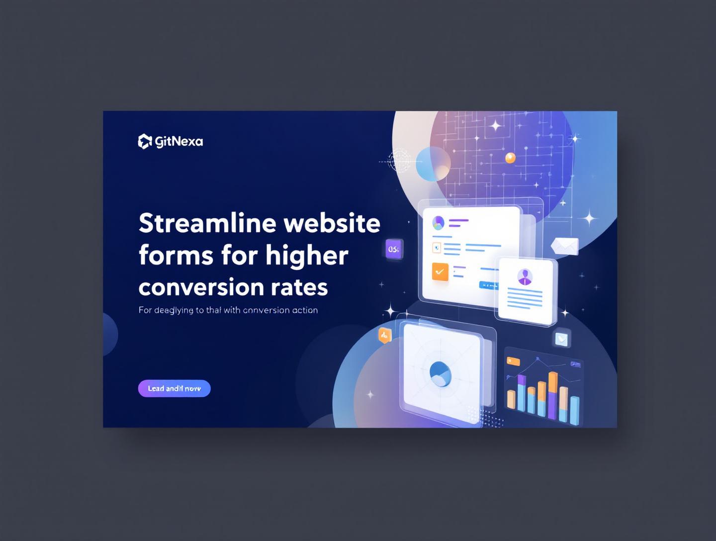
Streamline Website Forms for Higher Conversion Rates
Introduction
Website forms are the silent workhorses of digital conversion. Whether it’s a contact form, lead generation form, newsletter signup, demo request, or checkout flow, forms act as the bridge between user interest and business growth. Yet, despite their importance, forms are also among the top reasons users abandon websites. Data from Baymard Institute shows that nearly 70% of online shoppers abandon forms, often due to complexity, confusion, or lack of trust. This means that even small inefficiencies in your website forms can result in massive revenue and lead losses.
Streamlining website forms for higher conversion rates is not about removing every field or oversimplifying your message. It’s about intentional design, psychological understanding, usability optimization, and technical performance—all working together to reduce friction and improve user confidence. Businesses that take form optimization seriously consistently outperform competitors in lead quality, conversion volume, and user satisfaction.
In this comprehensive guide, you’ll learn how to streamline website forms step by step, backed by real-world examples, data-driven strategies, and actionable best practices. We’ll explore user psychology, UX design, accessibility, form analytics, testing methodologies, and emerging trends. You’ll also see how optimized forms support broader conversion rate optimization efforts such as landing page design, SEO, and marketing automation.
By the end of this article, you’ll know exactly how to turn underperforming forms into high-converting assets that fuel sustainable growth.
What Does It Mean to Streamline Website Forms?
Streamlining website forms means reducing friction while maximizing clarity and value for the user. It involves evaluating every aspect of a form—from field selection and layout to validation, messaging, and backend integration—to ensure the form feels effortless to complete.
Core Principles of Streamlined Forms
A streamlined form follows three foundational principles:
- Clarity: Users instantly understand what the form is for and what happens after submission.
- Simplicity: The form asks for only essential information, minimizing cognitive load.
- Trust: The form reassures users that their data is secure and used responsibly.
Streamlining vs. Oversimplification
Removing too many fields can backfire, especially in B2B or high-ticket conversions. For example, enterprise SaaS companies often need qualifying information to route leads effectively. The goal is not fewer fields at all costs, but smarter fields that align with intent and context.
Business Impact of Streamlined Forms
Streamlined website forms directly influence:
- Lead generation efficiency
- Sales cycle length
- Customer acquisition cost (CAC)
- User experience metrics like bounce rate and time on page
Companies that invest in form optimization often see conversion improvements between 20–120%, depending on baseline performance and traffic quality.
For a broader understanding of digital optimization strategies, explore GitNexa’s guide on conversion-focused web design.
Why Website Forms Fail to Convert
Before fixing forms, it’s essential to understand why they fail. Most low-converting forms suffer from predictable issues rooted in poor UX decisions and misaligned business goals.
Common Reasons Forms Underperform
- Too many mandatory fields
- Lack of visual hierarchy
- Confusing labels or instructions
- Poor mobile optimization
- Slow load times
- No confirmation or feedback
Psychological Friction Points
Users often hesitate because of:
- Fear of spam or misuse of data
- Unclear value exchange ("What do I get?")
- Commitment anxiety (especially with long forms)
According to Google UX research, users decide whether a form is “worth completing” within the first 3–5 seconds of viewing it.
Mobile-Specific Challenges
With over 60% of form submissions now happening on mobile devices, mobile friction is one of the biggest conversion killers. Tiny input fields, non-responsive design, and intrusive pop-ups all contribute to abandonment.
To improve mobile usability, check out GitNexa’s mobile-first UX best practices.
The Psychology Behind High-Converting Forms
Understanding user psychology is the key to streamlining website forms effectively. Conversion optimization is as much about human behavior as it is about design.
Cognitive Load Theory
Every field adds mental effort. When users feel overwhelmed, they abandon the form. Reducing cognitive load through clear labeling, visual grouping, and progressive disclosure dramatically improves completion rates.
The Principle of Reciprocity
Users are more willing to share information when they receive immediate value, such as:
- Free resources
- Instant quotes
- Personalized recommendations
Commitment and Consistency
Multi-step forms leverage psychological commitment. Once users complete step one, they are more likely to finish subsequent steps. This is why many high-performing forms use progress indicators.
Trust Signals and Social Proof
Including trust badges, testimonials, and privacy assurances reduces anxiety and increases perceived safety.
For more insights into trust-focused design, read GitNexa’s article on building website trust signals.
Optimizing Form Field Selection
Every form field should justify its existence. Unnecessary fields are one of the biggest contributors to form abandonment.
Essential vs. Optional Fields
Ask yourself:
- Does this field directly support conversion or sales follow-up?
- Can this information be collected later?
Progressive Profiling
Instead of collecting all data upfront, use progressive profiling to gather additional information over multiple interactions. This approach is especially effective for CRM-integrated forms.
Field Formatting Best Practices
- Use dropdowns only when necessary
- Avoid free-text fields when structured data works
- Enable autofill wherever possible
According to HubSpot, reducing form fields from 11 to 4 can increase conversions by up to 50%, depending on context.
UX and Visual Design for Streamlined Forms
Form design directly impacts usability and perception. Even small visual changes can dramatically affect conversion rates.
Layout and Hierarchy
- Single-column layouts outperform multi-column formats
- Place labels above fields for faster scanning
- Group related fields logically
Button Design
CTA buttons should be:
- Action-oriented ("Get My Quote" instead of "Submit")
- Visually distinct
- Positioned for natural flow
Error Handling
Inline validation with real-time feedback reduces frustration. Avoid generic error messages and clearly explain how to resolve issues.
For design inspiration, explore GitNexa’s UI/UX optimization strategies.
Mobile Optimization and Accessibility
A streamlined form must work seamlessly across devices and for users of all abilities.
Mobile Optimization Essentials
- Large input fields
- Touch-friendly buttons
- Minimal typing requirements
- Support for voice and autofill
Accessibility Standards
Follow WCAG guidelines:
- Proper label associations
- Keyboard navigation support
- Screen reader compatibility
Google emphasizes accessibility as a ranking and UX factor, making inclusive forms both ethical and profitable.
Leveraging Multi-Step and Conditional Forms
Multi-step forms break long processes into manageable chunks, reducing perceived effort.
When to Use Multi-Step Forms
- Lead qualification
- Complex service requests
- Surveys and onboarding
Conditional Logic Benefits
Conditional fields appear only when relevant, keeping the form clean and focused.
Example: Showing company size only if "Business Owner" is selected.
Form Speed, Performance, and Technical Optimization
A slow form is a dead form.
Performance Best Practices
- Minimize JavaScript bloat
- Host forms securely
- Avoid third-party overload
Google research shows that a 1-second delay in page load can reduce conversions by 7%.
Related reading: GitNexa’s performance optimization guide.
Analytics, Testing, and Continuous Improvement
Form optimization is ongoing.
Key Metrics to Track
- Form abandonment rate
- Completion time
- Lead quality
A/B Testing Strategies
Test:
- Field count
- CTA copy
- Layout variations
Data-backed decisions consistently outperform assumptions.
Real-World Use Cases and Case Studies
B2B Lead Generation
A SaaS company reduced its demo request form from 9 to 5 fields and added a progress bar, increasing conversions by 67%.
E-commerce Checkout
An online retailer simplified checkout forms and introduced guest checkout, reducing abandonment by 23%.
Service-Based Businesses
Local service providers using conditional forms saw higher-quality leads with shorter sales cycles.
Best Practices for Streamlining Website Forms
- Ask only for essential information
- Optimize for mobile-first users
- Use trust signals and privacy assurances
- Implement inline validation
- Test continuously
Common Mistakes to Avoid
- Using generic CTA text
- Ignoring mobile users
- Overloading forms with fields
- Not confirming submissions
Frequently Asked Questions
How many fields should a high-converting form have?
There is no universal number, but most high-performing forms have between 3 and 7 fields depending on intent.
Are multi-step forms always better?
They are effective for complex submissions, but simple forms often perform better in a single step.
How do I improve form trust?
Add privacy policies, testimonials, HTTPS security, and clear data usage explanations.
What tools can help streamline forms?
Popular tools include HubSpot, Typeform, Google Forms, and custom-coded solutions.
How often should forms be tested?
Continuous testing is ideal, with formal reviews conducted quarterly.
Do forms affect SEO?
Indirectly, yes. Better UX improves engagement signals that support SEO performance.
Can chatbots replace forms?
Chatbots complement forms but rarely replace them entirely for structured data collection.
What is progressive profiling?
It’s the practice of collecting user data incrementally across multiple interactions.
Conclusion: The Future of High-Converting Website Forms
Streamlining website forms for higher conversion rates is both an art and a science. As user expectations rise and competition intensifies, businesses must treat forms as strategic assets rather than static features. By focusing on usability, psychology, performance, and data-driven optimization, companies can dramatically improve conversions without increasing traffic.
Emerging technologies like AI-powered forms, predictive inputs, and conversational UX will further redefine form experiences. However, the fundamentals—clarity, simplicity, and trust—will remain timeless.
If your forms aren’t converting, they’re costing you growth.
Call to Action
Ready to transform your website forms into conversion engines? Let GitNexa help you design, optimize, and implement high-performing forms tailored to your business goals.
👉 Get started with a free consultation today: https://www.gitnexa.com/free-quote
Comments
Loading comments...