Sub Category
Latest Blogs
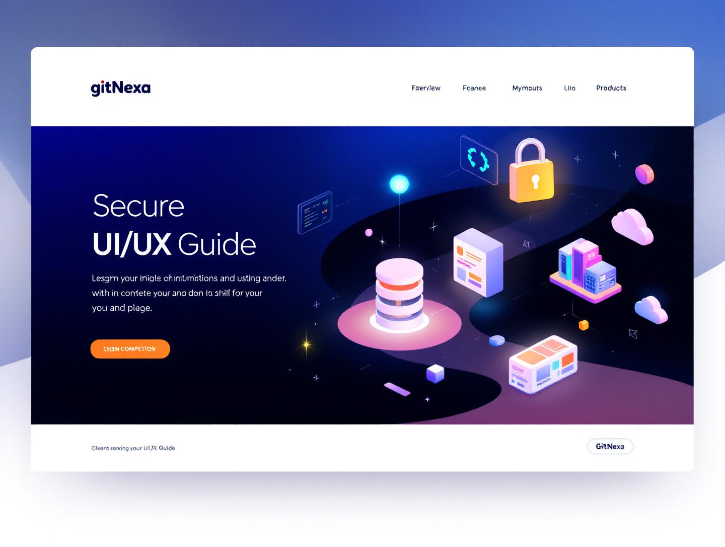
The Ultimate Guide to Secure UI/UX Design in 2026
Introduction
In 2024, IBM reported that the average cost of a data breach reached $4.45 million, the highest figure recorded to date. What often goes unnoticed is that a significant percentage of those breaches didn’t start with broken encryption or zero-day exploits. They started with design decisions. A misleading form label. An unclear permission prompt. A login flow that quietly encouraged weak passwords. Secure UI/UX design is no longer a “nice to have” layered on top of functional software; it has become one of the most effective front-line defenses against security incidents.
Secure UI/UX design sits at the intersection of usability and application security. It’s where human behavior meets technical safeguards. When done well, it quietly guides users toward safe actions without slowing them down or making them feel policed. When done poorly, it creates friction, confusion, and openings that attackers are happy to exploit.
If you’re a developer, CTO, founder, or product owner, this matters more than ever. Users expect clean interfaces and fast flows, but regulators expect compliance, and attackers expect mistakes. Secure UI/UX design is how you satisfy all three without building bloated, hostile interfaces.
In this guide, we’ll break down what secure UI/UX design really means, why it matters so much in 2026, and how to apply it in real-world products. You’ll see practical patterns, real examples from modern applications, common mistakes teams still make, and a clear view of where secure interface design is heading next.
What Is Secure UI/UX Design?
Secure UI/UX design is the practice of designing user interfaces and experiences that actively reduce security risks while remaining intuitive, accessible, and efficient for real users. It blends traditional UX principles with application security concepts such as threat modeling, least privilege, and defense in depth.
More Than Visual Design
Secure UI/UX design goes far beyond colors, spacing, and typography. It influences how users authenticate, how permissions are requested, how sensitive data is displayed, and how errors are communicated. A beautifully designed interface that encourages unsafe behavior is still insecure.
For example, masking passwords by default is a UX decision with direct security implications. So is showing a clear warning before a destructive action, or explaining why an app needs access to a user’s location.
Where UX and Security Traditionally Clash
Historically, UX and security teams have often pulled in opposite directions. UX teams optimize for speed and ease. Security teams add friction to reduce risk. Secure UI/UX design aligns both by shaping user behavior instead of fighting it.
A good example is multi-factor authentication. Poorly implemented MFA feels intrusive and confusing. Well-designed MFA explains the value, minimizes steps, and fits naturally into the user journey.
Secure UI vs Secure Backend
Even the most secure backend can be undermined by a careless interface. Consider:
- Exposing internal error messages in the UI
- Allowing unlimited login attempts with no visual feedback
- Displaying sensitive data in URLs or client-side storage
Secure UI/UX design ensures that the frontend becomes a security asset, not a liability.
Why Secure UI/UX Design Matters in 2026
The stakes around interface-level security have risen sharply over the past few years, and 2026 is shaping up to be a turning point.
Users Are the Primary Attack Surface
According to Verizon’s 2024 Data Breach Investigations Report, 74% of breaches involved the human element, including social engineering, credential misuse, or simple errors. Attackers increasingly target users, not servers.
If your UI nudges users toward unsafe defaults, attackers don’t need sophisticated exploits. They just wait.
Regulatory Pressure Is Increasing
Laws like GDPR, CCPA, and the EU’s Digital Services Act now hold companies accountable for how user data is collected, displayed, and protected. Poor UI choices can directly translate into compliance violations.
Dark patterns, unclear consent flows, or misleading privacy controls are no longer just bad UX; they’re legal risks.
Product Trust Is a Competitive Advantage
Users notice when apps feel safe. Clear permission dialogs, transparent security settings, and predictable behavior build trust over time. In crowded markets, trust is often what keeps users from switching.
Companies like Apple and 1Password have turned secure UX into a brand differentiator, not a burden.
Designing Authentication Flows That Balance Security and Usability
Authentication is often the first interaction users have with your product. It sets the tone for both usability and security.
Common Authentication Patterns
| Pattern | Security Level | UX Impact | Best Use Case |
|---|---|---|---|
| Password Only | Low | High | Low-risk internal tools |
| Password + MFA | High | Medium | Consumer and enterprise apps |
| Passwordless (Magic Link) | Medium-High | High | SaaS, onboarding flows |
| Biometric | High | Very High | Mobile apps |
Step-by-Step: A Secure Login Flow
- Start with email or username input only
- Provide inline validation without revealing account existence
- Introduce MFA after password verification
- Offer recovery options with clear instructions
- Log and surface unusual activity in user settings
Real-World Example
Google’s login flow is a strong example of secure UI/UX design. It avoids revealing whether an email exists until after multiple checks, explains why additional verification is required, and provides recovery paths without overwhelming users.
For more on authentication systems, see our guide on secure web application development.
// Example: Avoid exposing authentication errors
return res.status(401).json({
  message: "Invalid credentials"
});
Permission Design: Asking for Access Without Breaking Trust
Permissions are where many applications lose user trust.
The Problem With Blanket Permissions
Requesting all permissions upfront may seem efficient, but it raises red flags. Users either deny everything or blindly accept, neither of which is ideal.
Progressive Permission Requests
Secure UI/UX design favors progressive disclosure:
- Ask only when needed
- Explain the benefit clearly
- Provide alternatives if access is denied
Slack does this well by requesting access to notifications only after demonstrating value.
Copy Matters More Than You Think
Compare:
- “Allow access to your contacts”
- “Invite teammates faster by accessing your contacts. We never store them.”
Same permission. Very different outcome.
For mobile-focused patterns, read our article on mobile app UI/UX design.
Error Messages, Feedback, and Security Signals
Error handling is one of the most overlooked areas of secure UI/UX design.
What Not to Show
- Stack traces
- Database errors
- Detailed validation failures
These belong in logs, not interfaces.
What Users Actually Need
Good error messages:
- Explain what happened
- Explain what to do next
- Avoid assigning blame
Secure Feedback Patterns
| Scenario | Insecure Message | Secure Alternative |
|---|---|---|
| Login failure | "User not found" | "Invalid email or password" |
| File upload | "SQL error" | "Upload failed. Try again." |
For frontend error handling standards, MDN’s documentation on HTTP status codes is a solid reference.
Designing for Data Privacy and Sensitive Information
Secure UI/UX design plays a critical role in protecting sensitive data.
Masking and Redaction
Show only what’s necessary:
- Mask credit card numbers
- Blur sensitive fields by default
- Require re-authentication for critical views
Session Awareness
Users should always know:
- When they’re logged in
- On which devices
- How to end sessions
This is an area where products like GitHub and Stripe set strong examples.
For backend alignment, see API security best practices.
How GitNexa Approaches Secure UI/UX Design
At GitNexa, secure UI/UX design is baked into our product development process, not bolted on at the end. Our design and engineering teams collaborate from day one, aligning user journeys with threat models and compliance requirements.
We start by understanding the real risks of a product: who the users are, what data is involved, and where mistakes are most likely to happen. From there, we design interfaces that guide users toward safe actions naturally. That might mean simplifying authentication flows, improving permission copy, or restructuring dashboards to limit data exposure.
Our teams regularly work on fintech platforms, healthcare apps, and enterprise SaaS products where security and usability carry equal weight. Secure UI/UX design is closely tied to our work in custom web development, cloud architecture, and DevOps practices.
The result is software that feels intuitive while meeting modern security expectations.
Common Mistakes to Avoid
- Treating security as a backend-only concern
- Overloading users with warnings
- Using vague or misleading permission copy
- Revealing too much in error messages
- Ignoring accessibility in secure flows
- Hardcoding security decisions into UI
Each of these mistakes increases either user frustration or attack surface, often both.
Best Practices & Pro Tips
- Design secure defaults and let users opt out
- Use progressive disclosure for sensitive actions
- Test security flows with real users
- Log security events separately from UI feedback
- Align design tokens with security states
- Revisit flows after major threat changes
Future Trends & What to Expect
By 2026 and 2027, secure UI/UX design will increasingly rely on adaptive interfaces. Risk-based authentication, AI-driven anomaly detection, and context-aware permissions will become standard.
We’re also seeing early adoption of passkeys, backed by Google, Apple, and Microsoft, which significantly reduce phishing risk. Designing interfaces that explain and support these technologies will be a key challenge.
Finally, regulators are paying closer attention to interface design itself. Expect clearer rules around consent, dark patterns, and data visibility.
Frequently Asked Questions
What is secure UI/UX design?
Secure UI/UX design focuses on creating interfaces that reduce security risks while remaining easy to use. It combines usability principles with security best practices.
Is secure UI/UX only for large applications?
No. Even small apps can expose sensitive data or be abused. Secure UI/UX design scales to products of any size.
How does secure UI/UX differ from application security?
Application security focuses on technical controls. Secure UI/UX design focuses on user behavior and interface decisions.
Does adding security always hurt usability?
Not when done well. Thoughtful design often improves both security and user confidence.
Are dark patterns a security risk?
Yes. Dark patterns can lead to non-compliance and user mistrust, which indirectly increases risk.
What tools help with secure UI/UX design?
Design systems, threat modeling tools, and usability testing platforms like Figma, OWASP Threat Dragon, and Maze.
How often should security flows be reviewed?
At least once per major release, or whenever new threats emerge.
Can secure UI/UX design reduce support costs?
Yes. Clear flows and error messages reduce user confusion and support tickets.
Conclusion
Secure UI/UX design is no longer optional. As users become the primary attack surface and regulations tighten, the interface itself has become a critical security layer. The good news is that security and usability don’t have to compete. When designed thoughtfully, they reinforce each other.
By focusing on authentication flows, permission design, error handling, and data visibility, teams can significantly reduce risk without sacrificing user experience. The products that succeed in 2026 will be the ones that quietly guide users toward safe behavior while earning their trust.
Ready to build interfaces that users trust and attackers hate? Talk to our team to discuss your project.
Comments
Loading comments...