Sub Category
Latest Blogs
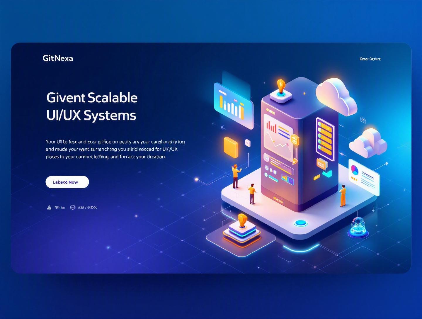
The Ultimate Guide to Scalable UI/UX Systems
Introduction
In 2025, Forrester reported that every dollar invested in UX returns up to $100 in revenue. Yet most digital products still struggle with inconsistency, design debt, and UI fragmentation as they scale. Why? Because they build interfaces — not scalable UI/UX systems.
Scalable UI/UX systems are no longer a luxury reserved for tech giants like Google or Shopify. They’re essential infrastructure for startups, SaaS companies, enterprises, and product teams that expect growth. Whether you're adding new features monthly, expanding into new markets, or supporting multiple platforms (web, iOS, Android), your interface must evolve without breaking.
The challenge is simple but painful: as teams grow and features multiply, design inconsistencies creep in. Buttons vary. Typography shifts. Spacing becomes unpredictable. Developers duplicate components. Product velocity slows. Technical debt grows.
This guide breaks down what scalable UI/UX systems actually are, why they matter in 2026, how to build them, and how engineering and design teams can align around them. You’ll see real examples, architecture patterns, code snippets, governance models, and proven frameworks used by leading companies. If you're a CTO, product manager, founder, or developer looking to build digital products that scale cleanly, this is your blueprint.
What Is Scalable UI/UX Systems?
At its core, a scalable UI/UX system is a structured framework of reusable components, design tokens, guidelines, and workflows that allow a product’s interface to grow consistently across features, platforms, and teams.
It goes beyond a simple style guide.
A scalable UI/UX system includes:
- Design tokens (colors, spacing, typography, shadows)
- Reusable UI components (buttons, inputs, modals)
- Interaction patterns (navigation, form flows, feedback states)
- Accessibility standards (WCAG compliance)
- Documentation and usage guidelines
- Governance and version control
Think of it as a product’s "UI operating system."
Design System vs Scalable UI/UX System
Many teams use these terms interchangeably. They’re related but not identical.
| Aspect | Basic Design System | Scalable UI/UX System |
|---|---|---|
| Focus | Visual consistency | Long-term growth & adaptability |
| Scope | UI components | Components + processes + governance |
| Platforms | Often web-only | Multi-platform (web, mobile, desktop) |
| Tooling | Figma library | Figma + code libraries + CI/CD |
| Governance | Informal | Versioned, documented, reviewed |
A scalable UI/UX system includes the operational layer: how components evolve, how teams contribute, and how changes are rolled out.
Key Characteristics
- Modular – Built from atomic components.
- Reusable – Designed once, implemented everywhere.
- Documented – Clear usage instructions and constraints.
- Version-controlled – Managed like software.
- Platform-aware – Supports responsive and native platforms.
For developers, this often translates into component libraries using frameworks like React, Vue, Angular, or Flutter. For designers, it means structured Figma or Sketch libraries aligned with code.
In short, scalable UI/UX systems turn design from an artistic exercise into structured engineering.
Why Scalable UI/UX Systems Matter in 2026
Product teams today ship faster than ever. According to the 2024 State of DevOps Report by Google Cloud, elite teams deploy code 208 times more frequently than low performers. That velocity demands stability in design.
Here’s what’s changed:
1. Multi-Platform Is Standard
Users expect seamless experiences across:
- Web apps
- iOS & Android apps
- Smart TVs
- Wearables
- Enterprise dashboards
Maintaining consistency manually across these channels is nearly impossible without scalable UI/UX systems.
2. AI-Driven Interfaces
With generative AI features embedded in products (chat interfaces, recommendation engines, dynamic content), UI components must handle unpredictable outputs. Structured component systems reduce chaos.
For example, AI-heavy products often rely on dynamic card systems. Without scalable UI architecture, layout breaks quickly.
3. Remote & Distributed Teams
GitHub’s 2024 Octoverse report shows over 90% of developers collaborate across time zones. Design handoffs are no longer hallway conversations.
Scalable UI/UX systems create shared language:
- Clear spacing tokens
- Predefined states
- Documented interaction patterns
4. Cost of Design Debt
Inconsistent UI slows development. Duplicate components increase maintenance cost. Every redesign becomes painful.
A structured system reduces:
- Redundant code
- Regression bugs
- Onboarding time
- QA overhead
In 2026, scalable UI/UX systems aren’t optional. They’re foundational.
Core Components of Scalable UI/UX Systems
Let’s break down the building blocks.
Design Tokens: The Foundation
Design tokens are platform-agnostic variables for visual design.
Example (JSON):
{
  "color-primary": "#2563EB",
  "spacing-md": "16px",
  "font-base": "Inter, sans-serif"
}
These tokens can be transformed into:
- CSS variables
- iOS Swift constants
- Android XML values
This approach is recommended by tools like Style Dictionary (Amazon) and documented widely on MDN Web Docs (https://developer.mozilla.org/).
Component Architecture
Most scalable systems follow Atomic Design:
- Atoms (buttons, labels)
- Molecules (form groups)
- Organisms (header sections)
- Templates (layout structures)
- Pages (final screens)
Example React button:
export const Button = ({ variant = "primary", children }) => {
  return (
    <button className={`btn btn-${variant}`}>
      {children}
    </button>
  );
};
This ensures consistency across apps.
Documentation & Storybook
Teams often use:
- Storybook
- Zeroheight
- Docusaurus
Storybook enables visual testing and isolated component rendering.
Accessibility Layer
WCAG 2.2 standards require:
- 4.5:1 color contrast
- Keyboard navigation
- ARIA labels
Ignoring accessibility breaks scalability.
Architecture Patterns for Scalable UI/UX Systems
Architecture determines whether your system survives growth.
Monorepo Structure
Popular among large teams.
Example structure:
/packages
  /ui-components
  /design-tokens
  /icons
/apps
  /web
  /admin
Tools:
- Turborepo
- Nx
- Lerna
Versioning Strategy
Use semantic versioning:
- Major: breaking change
- Minor: new feature
- Patch: bug fix
CI/CD Integration
Pipeline example:
- Developer updates component
- PR triggers automated tests
- Visual regression test runs
- Build publishes new version to npm
Tools:
- Chromatic
- GitHub Actions
- CircleCI
Visual Regression Testing
Automated screenshot comparison catches UI drift.
Example tools:
- Percy
- Loki
Building Scalable UI/UX Systems: Step-by-Step
Here’s a practical roadmap.
Step 1: Audit Your Existing UI
- Identify duplicate components
- List inconsistent patterns
- Evaluate accessibility gaps
Step 2: Define Design Principles
Examples:
- Clarity over decoration
- Mobile-first responsiveness
- Accessibility by default
Step 3: Create Token System
Start small:
- Colors
- Typography
- Spacing
Step 4: Build Core Components
Start with:
- Buttons
- Inputs
- Modals
- Navigation
Step 5: Align Code & Design
Ensure 1:1 mapping between Figma and React components.
Step 6: Implement Governance
- Component review board
- Contribution guidelines
- Version approval workflow
Real-World Examples of Scalable UI/UX Systems
Shopify Polaris
Shopify’s Polaris supports thousands of apps. It includes:
- React component library
- Design tokens
- Accessibility standards
Google Material Design
Material Design provides cross-platform guidance and is documented at https://material.io.
Atlassian Design System
Used across Jira, Confluence, and Trello. Strong governance ensures cohesion.
These companies treat UI systems like products — not side projects.
How GitNexa Approaches Scalable UI/UX Systems
At GitNexa, scalable UI/UX systems are integrated into our product engineering workflow from day one.
We begin with structured UI audits and align findings with business goals. Our UI/UX team collaborates directly with frontend engineers to create token-driven component libraries using React, Next.js, Flutter, or Angular.
We frequently integrate scalable UI foundations into broader engagements such as custom web development, mobile app development strategies, and cloud-native architecture design.
Our DevOps engineers ensure the design system integrates into CI/CD pipelines, often alongside our DevOps automation best practices.
The result? Faster feature delivery, fewer regressions, and consistent brand experience across platforms.
Common Mistakes to Avoid
- Treating the system as a one-time project.
- Ignoring accessibility standards.
- Over-engineering before validating patterns.
- No ownership or governance model.
- Failing to sync design and code libraries.
- Allowing uncontrolled component overrides.
- Skipping documentation.
Best Practices & Pro Tips
- Start small and iterate.
- Version everything.
- Automate visual testing.
- Maintain design-code parity.
- Use tokens instead of hard-coded values.
- Conduct quarterly audits.
- Assign system maintainers.
- Measure adoption metrics.
Future Trends & What to Expect (2026-2027)
- AI-assisted component generation
- Cross-platform token automation
- Increased WCAG enforcement
- Server-driven UI models
- Real-time design-to-code sync tools
Expect scalable UI/UX systems to merge deeper with AI copilots and developer workflows.
FAQ
What makes a UI/UX system scalable?
A scalable UI/UX system supports growth across features, teams, and platforms through modular components, tokens, and governance.
How long does it take to build one?
For mid-sized products, 8–16 weeks for a solid foundation.
Do startups need scalable UI/UX systems?
Yes. Starting early prevents expensive redesigns later.
Which tools are best?
Figma, Storybook, React, Style Dictionary, Chromatic.
Is accessibility mandatory?
In many regions, yes. It also improves usability.
How do you measure success?
Reduced design inconsistencies, faster development cycles, fewer UI bugs.
Can design systems support branding updates?
Yes. Token-based systems make global changes simple.
What’s the difference between UI kit and system?
UI kits lack governance and versioning.
Conclusion
Scalable UI/UX systems transform how digital products grow. They reduce design debt, improve collaboration, and increase development velocity. In 2026 and beyond, companies that treat UI systems as infrastructure — not decoration — will ship faster and maintain consistency across every platform.
Ready to build scalable UI/UX systems that support your product’s growth? Talk to our team to discuss your project.
Comments
Loading comments...