Sub Category
Latest Blogs
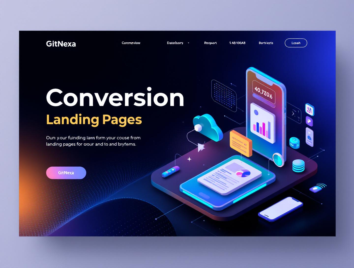
The Ultimate Guide to Conversion-Focused Landing Pages
Introduction
In 2025, the average landing page conversion rate across industries sits at 2.35%, yet the top 10% of landing pages convert at 11% or higher, according to WordStream. That gap isn’t luck. It’s structure, psychology, data, and disciplined optimization.
Conversion-focused landing pages are not just "nice-looking" web pages. They are engineered environments built to turn traffic into measurable action—whether that’s a purchase, demo booking, signup, or download. And in a world where paid acquisition costs continue to rise (Google Ads CPC increased by 15–20% in several competitive niches in 2024), squeezing more value from existing traffic is no longer optional.
If you’re a startup founder burning ad budget, a SaaS CTO optimizing product-led growth, or a marketing leader accountable for CAC and ROI, this guide is for you. We’ll break down what conversion-focused landing pages really are, why they matter in 2026, how to design and build them using modern stacks, and how to test and optimize them at scale.
We’ll cover real-world examples, UX frameworks, technical implementation patterns, CRO workflows, and measurable best practices. By the end, you’ll understand how to architect landing pages that don’t just attract clicks—but convert them.
What Are Conversion-Focused Landing Pages?
Conversion-focused landing pages are standalone web pages built with a single, specific goal: driving one primary action from the visitor.
Unlike homepage experiences—which must serve multiple audiences—these pages eliminate distractions and align messaging, design, and calls-to-action (CTAs) around one outcome.
Core Characteristics
A high-performing landing page typically includes:
- One primary CTA ("Start Free Trial", "Book a Demo", "Get the Guide")
- A compelling headline aligned with traffic source
- Clear value proposition
- Trust signals (testimonials, logos, reviews)
- Objection-handling sections
- Minimal navigation
- Data-driven layout decisions
How They Differ from Regular Web Pages
| Feature | Homepage | Conversion-Focused Landing Page |
|---|---|---|
| Purpose | Inform broadly | Drive one action |
| Navigation | Full navigation menu | Limited or none |
| Messaging | Multi-audience | Single audience |
| CTA | Multiple CTAs | One primary CTA |
| Traffic Source | Organic & direct | Paid ads, email, campaigns |
For example, when Shopify runs paid ads promoting "Start your online store," they don’t send traffic to their homepage. They use targeted landing pages customized to entrepreneurs, dropshippers, or enterprise merchants.
That’s the difference between informing and converting.
Why Conversion-Focused Landing Pages Matter in 2026
Digital competition is sharper than ever. In 2026, three macro trends make conversion-focused landing pages essential.
1. Paid Traffic Costs Are Rising
According to Statista (2024), global digital ad spending exceeded $600 billion. More advertisers means higher CPCs. If your landing page converts at 2% instead of 6%, you’re tripling your customer acquisition cost.
Better landing pages = better economics.
2. Privacy & Attribution Changes
With cookie deprecation and stricter privacy regulations (GDPR, CCPA), attribution is less precise. That makes first-party optimization critical. Instead of relying purely on targeting, companies must improve on-page performance.
3. Shorter Attention Spans
Google research shows users form a first impression of a website in 50 milliseconds. That’s less than the blink of an eye.
Your landing page must:
- Communicate value instantly
- Load under 2.5 seconds (Core Web Vitals)
- Guide the eye with visual hierarchy
If it doesn’t, users bounce.
The Psychology Behind High-Converting Landing Pages
Technology matters. But psychology converts.
The AIDA Framework in Practice
Most effective landing pages follow AIDA:
- Attention – Strong headline
- Interest – Benefits and proof
- Desire – Emotional drivers + outcomes
- Action – Clear CTA
For example:
- Attention: "Cut Your Cloud Costs by 30% in 60 Days"
- Interest: Explain process and case studies
- Desire: Showcase ROI calculator and testimonials
- Action: "Get Your Free Audit"
Cognitive Biases That Increase Conversions
Social Proof
Logos, testimonials, usage stats ("Trusted by 5,000+ companies") reduce perceived risk.
Scarcity
"Only 12 spots left" or limited-time discounts create urgency.
Loss Aversion
People fear losses more than they value gains. Framing matters:
- Weak: "Improve your security"
- Strong: "Stop losing $50,000/year to preventable breaches"
Visual Hierarchy & Eye Tracking
Studies using eye-tracking tools like Hotjar show users scan pages in an F-pattern. Important elements should appear:
- Above the fold
- Left-aligned
- With contrasting colors
Design is persuasion.
Architecture & Tech Stack for Conversion-Focused Landing Pages
Behind every high-converting page is solid engineering.
Performance First
Google’s Core Web Vitals directly impact SEO and conversions. Aim for:
- LCP < 2.5s
- CLS < 0.1
- INP < 200ms
Use:
- Next.js or Remix for SSR
- Image optimization (WebP/AVIF)
- CDN (Cloudflare, Fastly)
Example Next.js structure:
export default function LandingPage() {
  return (
    <main>
      <HeroSection />
      <SocialProof />
      <Benefits />
      <CTASection />
    </main>
  );
}
Headless CMS for Agility
Marketing teams should update content without developer bottlenecks.
Common stack:
- Frontend: Next.js
- CMS: Contentful / Sanity
- Analytics: GA4 + Mixpanel
- A/B Testing: VWO / Optimizely
We often implement this architecture in projects related to custom web application development.
Event Tracking Setup
Track meaningful events:
gtag('event', 'cta_click', {
  event_category: 'landing_page',
  event_label: 'hero_button'
});
Without granular tracking, optimization is guesswork.
Designing for Conversions: UX & UI Best Practices
Design isn’t decoration—it’s direction.
Above-the-Fold Clarity
Your hero section must answer:
- What is this?
- Who is it for?
- Why should I care?
- What do I do next?
Stripe does this well. Their landing pages communicate product value in one line, followed by a clear CTA.
Form Optimization
Form length directly impacts conversions.
| Fields | Avg Conversion Impact |
|---|---|
| 3-4 fields | Highest conversion |
| 5-7 fields | Moderate drop |
| 8+ fields | Significant drop |
Only ask for what you need.
Microcopy Matters
Small text below buttons reduces friction:
- "No credit card required"
- "Takes 30 seconds"
- "Cancel anytime"
These lines increase trust disproportionately.
For deeper UX principles, explore our thoughts on ui-ux-design-best-practices.
A/B Testing & Optimization Framework
Building is step one. Optimization is ongoing.
Step-by-Step CRO Process
- Collect baseline data (2–4 weeks)
- Identify drop-off points
- Form hypothesis
- Design variant
- Run A/B test (statistical significance 95%)
- Implement winner
- Repeat
What to Test First
Prioritize high-impact elements:
- Headline
- CTA color & copy
- Hero image vs. video
- Social proof placement
Sample Hypothesis
"Changing CTA from 'Submit' to 'Get My Free Plan' will increase conversions by 15% because it reinforces value."
Tools:
- Optimizely
- VWO
- Google Optimize alternatives
For scaling experimentation pipelines, DevOps practices discussed in our devops-automation-strategies article are crucial.
How GitNexa Approaches Conversion-Focused Landing Pages
At GitNexa, we treat conversion-focused landing pages as performance products—not static marketing assets.
Our approach combines:
- Data-first discovery workshops
- User journey mapping
- Conversion-centered UX wireframes
- High-performance frontend stacks (Next.js, React)
- Integrated analytics & event tracking
- Ongoing CRO experimentation
We collaborate closely with marketing and product teams to align messaging with real user pain points. Our engineering team ensures pages meet Core Web Vitals benchmarks, integrate cleanly with CRM systems (HubSpot, Salesforce), and support scalable testing frameworks.
Whether part of a larger cloud-native application development initiative or a standalone campaign, our goal is measurable growth—not vanity metrics.
Common Mistakes to Avoid
-
Too Many CTAs Multiple primary actions confuse users and dilute intent.
-
Weak Headlines Generic headlines like "Welcome to Our Platform" don’t convert.
-
Ignoring Mobile Optimization Over 58% of web traffic is mobile (Statista, 2024).
-
Slow Load Times A 1-second delay can reduce conversions by 7%.
-
No Social Proof Lack of trust signals increases hesitation.
-
Designing Without Data Assumptions kill conversion rates.
-
Not Aligning with Ad Copy Message mismatch increases bounce rates.
Best Practices & Pro Tips
- Match headline to ad copy exactly.
- Use contrasting CTA colors.
- Include at least one quantified benefit.
- Add testimonials with photos.
- Use directional cues (arrows, gaze).
- Place CTA every scroll depth.
- Optimize for mobile first.
- Compress images and lazy-load assets.
- Use exit-intent popups sparingly.
- Continuously test, never assume.
Future Trends & What to Expect (2026–2027)
AI-Personalized Landing Pages
Dynamic content based on user behavior and firmographics will become standard.
Voice & Conversational CTAs
Chat-driven landing experiences integrated with AI agents.
Privacy-First Analytics
Server-side tracking and first-party data strategies will dominate.
Interactive & Immersive UX
Micro-interactions and embedded calculators will increase engagement.
Companies integrating AI—similar to strategies discussed in our ai-powered-business-automation post—will gain competitive advantage.
FAQ
What is a conversion-focused landing page?
A standalone web page designed to drive one specific action, such as a signup or purchase.
How many CTAs should a landing page have?
Ideally one primary CTA, repeated throughout the page.
What is a good landing page conversion rate?
Across industries, 2–5% is average; 10%+ is excellent.
How long should a landing page be?
As long as necessary to address objections and persuade—no longer.
Are landing pages good for SEO?
They can rank if optimized, but most are built for paid traffic.
What tools are best for A/B testing?
Optimizely, VWO, and server-side experimentation frameworks.
Should landing pages have navigation menus?
Minimal or none, to reduce distractions.
How fast should a landing page load?
Under 2.5 seconds for optimal performance.
Can AI improve landing page conversions?
Yes, through personalization and predictive optimization.
How often should you test?
Continuously—CRO is an ongoing process.
Conclusion
Conversion-focused landing pages sit at the intersection of psychology, design, and engineering. They reduce acquisition costs, increase ROI, and turn traffic into revenue with measurable precision.
When built intentionally—with strong messaging, clean UX, high-performance architecture, and disciplined testing—they outperform generic web pages every time.
If your paid campaigns aren’t delivering expected returns, the problem might not be traffic. It might be your landing experience.
Ready to build high-converting landing experiences? Talk to our team to discuss your project.
Comments
Loading comments...