Sub Category
Latest Blogs
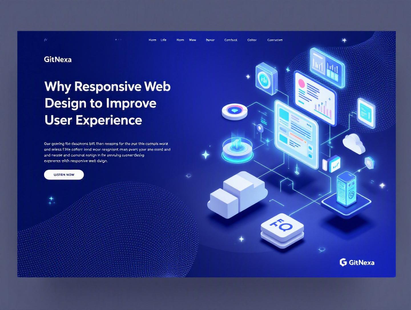
The Ultimate Guide to Responsive Web Design for UX
Introduction
In 2025, mobile devices generated over 58% of global website traffic, according to Statista. Yet, thousands of business websites still struggle with inconsistent layouts, unreadable text, broken navigation, and slow load times on smaller screens. The result? Frustrated users, higher bounce rates, and lost revenue.
This is exactly why responsive web design to improve user experience is no longer optional. It is a foundational requirement. Whether you're running a SaaS platform, an ecommerce store, or a content-heavy enterprise portal, your users expect a consistent experience across smartphones, tablets, laptops, and ultra-wide monitors.
Responsive web design is not just about resizing elements. It directly impacts usability, accessibility, SEO rankings, conversion rates, and even brand perception. Google has used mobile-first indexing since 2019, meaning your mobile experience heavily influences search visibility. If your layout breaks on a 390px-wide screen, your rankings and user trust will follow.
In this comprehensive guide, we will explore what responsive web design really means, why it matters more than ever in 2026, how it improves user experience, and how development teams can implement it effectively. We’ll also cover common mistakes, best practices, future trends, and how GitNexa approaches responsive architecture in real-world projects.
Let’s start with the fundamentals.
What Is Responsive Web Design?
Responsive web design (RWD) is an approach to web development where a single website adapts its layout, content, and functionality to different screen sizes, resolutions, and devices using flexible grids, media queries, and fluid images.
The concept was first popularized by Ethan Marcotte in 2010. Instead of building separate desktop and mobile websites, developers create one flexible system that responds to the user’s environment.
Core Principles of Responsive Web Design
1. Fluid Grid Systems
Rather than fixed pixel widths, responsive layouts use percentages or relative units like em, rem, vw, and vh.
Example:
.container {
  width: 90%;
  max-width: 1200px;
  margin: 0 auto;
}
This ensures the container scales proportionally across screen sizes.
2. Flexible Images and Media
Images should never overflow their parent container.
img {
  max-width: 100%;
  height: auto;
}
Modern formats like WebP and AVIF further improve performance while maintaining quality.
3. CSS Media Queries
Media queries apply styles based on device width, height, orientation, and resolution.
@media (max-width: 768px) {
  .nav-menu {
    display: none;
  }
}
This is how layouts adapt between desktop and mobile views.
Responsive vs Adaptive vs Mobile-First
| Approach | Description | Pros | Cons |
|---|---|---|---|
| Responsive | One flexible layout | Easier maintenance | Requires careful planning |
| Adaptive | Multiple fixed layouts | Device-specific control | More development effort |
| Mobile-First | Design for smallest screen first | Performance-focused | Requires mindset shift |
Most modern teams combine responsive design with a mobile-first strategy for optimal user experience.
For deeper UI strategy insights, you may also explore our guide on ui-ux-design-best-practices.
Why Responsive Web Design Matters in 2026
Responsive web design to improve user experience is more critical in 2026 than ever before.
1. Device Fragmentation Is Increasing
Users access websites on foldable phones, 4K monitors, smart TVs, tablets, and even in-car displays. Screen sizes range from 320px to over 3000px.
Designing for just “mobile and desktop” is outdated.
2. Mobile-First Indexing Is Standard
Google officially switched to mobile-first indexing for all sites in 2021. According to Google Search Central (https://developers.google.com/search/mobile-sites/mobile-first-indexing), the mobile version of your site determines ranking.
A poor mobile layout equals lower visibility.
3. Conversion Rates Depend on UX
A 2023 report by Baymard Institute found that 70% of ecommerce sites have serious mobile usability issues. These issues directly impact checkout abandonment.
Small improvements in responsive design can increase conversions by 10–25%.
4. Performance Expectations Are Higher
Users expect pages to load within 2 seconds. Core Web Vitals — Largest Contentful Paint (LCP), First Input Delay (FID), and Cumulative Layout Shift (CLS) — heavily influence both rankings and user perception.
Responsive architecture improves these metrics when implemented correctly.
5. Accessibility and Compliance
Responsive design supports accessibility standards like WCAG 2.2 by ensuring readable text, scalable interfaces, and usable navigation.
In short, responsive design is not a trend. It is infrastructure.
How Responsive Web Design Improves User Experience
Responsive web design to improve user experience works at multiple levels: usability, accessibility, performance, and emotional satisfaction.
1. Consistent User Journey Across Devices
Imagine a user discovering your SaaS platform on mobile during commute, researching on a tablet at home, and completing signup on a desktop at work.
If layouts differ drastically, friction increases.
Consistency builds trust.
2. Improved Readability and Navigation
Responsive typography ensures text scales appropriately.
body {
  font-size: clamp(1rem, 2vw, 1.25rem);
}
Navigation patterns adapt:
- Desktop: Horizontal mega-menu
- Tablet: Collapsible menu
- Mobile: Hamburger or bottom navigation
3. Better Touch Interaction
Mobile UX requires:
- Minimum 44px touch targets
- Proper spacing
- Gesture support
Ignoring these leads to accidental clicks and frustration.
4. Reduced Bounce Rates
When content fits naturally on screen without zooming or horizontal scrolling, users stay longer.
5. Stronger Brand Perception
A responsive website signals professionalism. An unresponsive one signals neglect.
For businesses modernizing legacy platforms, our article on modern-web-application-development explains architectural upgrades that support responsive design.
Core Techniques Behind Responsive Architecture
Let’s move from theory to implementation.
1. Mobile-First Workflow
Step-by-step approach:
- Design smallest layout (320px–480px)
- Prioritize essential content
- Add enhancements for larger screens
- Optimize assets progressively
This prevents bloated desktop-first builds.
2. CSS Grid and Flexbox
Flexbox example:
.container {
  display: flex;
  flex-wrap: wrap;
  gap: 1rem;
}
CSS Grid example:
.grid {
  display: grid;
  grid-template-columns: repeat(auto-fit, minmax(250px, 1fr));
}
These tools eliminate most layout hacks from the 2010 era.
3. Responsive Images
<picture>
  <source srcset="image-large.webp" media="(min-width: 1024px)">
  <source srcset="image-medium.webp" media="(min-width: 768px)">
  <img src="image-small.webp" alt="Example">
</picture>
4. Performance Optimization
Combine RWD with:
- Lazy loading
- CDN distribution
- Code splitting
- Server-side rendering (Next.js)
For scalable infrastructure strategies, see cloud-native-application-development.
Real-World Examples of Responsive UX Success
Example 1: Shopify
Shopify stores use responsive themes that adapt product grids dynamically. Mobile checkout is streamlined with one-column forms.
Result: Higher mobile conversion rates.
Example 2: Airbnb
Airbnb’s responsive grid reorganizes search results based on viewport width. Filters collapse elegantly on mobile.
Example 3: Slack
Slack’s marketing site shifts from multi-column desktop layout to stacked storytelling sections on mobile.
The takeaway? Responsive UX is strategic, not cosmetic.
How GitNexa Approaches Responsive Web Design
At GitNexa, responsive web design to improve user experience is built into our architecture decisions from day one.
We start with:
- User research and device analytics
- Wireframing across breakpoints
- Component-driven development using React, Vue, or Angular
- Mobile-first CSS strategy
- Performance audits with Lighthouse
Our UI/UX team collaborates closely with frontend engineers to ensure that responsive behavior is not an afterthought.
We also integrate DevOps pipelines for automated testing across devices. Learn more about our approach in devops-automation-strategies.
Common Mistakes to Avoid
- Designing only for popular screen sizes
- Ignoring landscape orientation
- Hiding content instead of restructuring it
- Overusing media queries
- Neglecting performance testing
- Using fixed-width containers
- Forgetting accessibility standards
Each of these can severely degrade user experience.
Best Practices & Pro Tips
- Start mobile-first.
- Use relative units (rem, em, %).
- Test on real devices, not just emulators.
- Optimize images aggressively.
- Keep navigation simple.
- Prioritize Core Web Vitals.
- Use design systems for consistency.
- Conduct usability testing regularly.
Future Trends & What to Expect (2026–2027)
- AI-driven adaptive interfaces
- Container queries becoming mainstream
- Voice and gesture-based interactions
- Foldable device optimization
- Progressive Web Apps dominance
Responsive design will evolve beyond screen size into context-aware experiences.
FAQ
1. What is responsive web design?
Responsive web design is an approach where websites adapt to different screen sizes using flexible layouts and media queries.
2. Why is responsive design important for SEO?
Google uses mobile-first indexing, meaning mobile UX affects rankings directly.
3. How does responsive design improve conversions?
By reducing friction, improving readability, and streamlining navigation across devices.
4. Is responsive design better than a separate mobile site?
Yes. It simplifies maintenance and provides consistent UX.
5. What frameworks support responsive design?
Bootstrap, Tailwind CSS, Foundation, and modern CSS Grid/Flexbox.
6. Does responsive design affect performance?
Yes. When optimized correctly, it improves load speed and Core Web Vitals.
7. What is mobile-first design?
Designing for the smallest screen first, then scaling up.
8. How often should responsive sites be tested?
At every major release and quarterly for performance audits.
Conclusion
Responsive web design to improve user experience is no longer optional. It directly affects usability, conversions, SEO, accessibility, and brand credibility.
Organizations that treat responsiveness as a core architectural principle consistently outperform those that patch it in later.
If your website struggles across devices, now is the time to act.
Ready to build a responsive website that truly delights users? Talk to our team to discuss your project.
Comments
Loading comments...