Sub Category
Latest Blogs
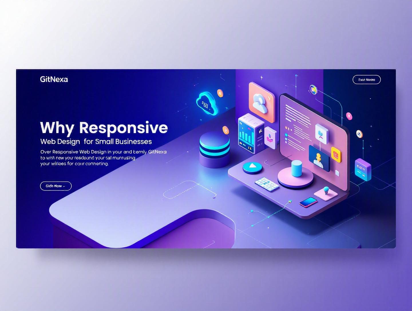
The Essential Guide to Responsive Web Design for Small Businesses
Introduction
In 2025, over 62% of global website traffic comes from mobile devices, according to Statista. Yet thousands of small business websites still struggle to load properly on smartphones. Text overflows. Buttons hide off-screen. Forms break. And customers leave.
This is exactly why responsive web design for small businesses is no longer optional. It directly impacts search rankings, user experience, conversion rates, and ultimately revenue. If your website fails on a 6-inch screen, you're turning away more than half of your potential customers before they even read your headline.
Small businesses face a unique challenge. Budgets are tighter than enterprise competitors. Marketing teams are smaller. Every investment must deliver measurable returns. Responsive web design solves multiple problems at once: SEO performance, usability, accessibility, and future scalability.
In this comprehensive guide, you’ll learn:
- What responsive web design actually means (beyond "mobile-friendly")
- Why it matters even more in 2026
- The technical foundations behind responsive layouts
- How it impacts SEO, conversions, and brand trust
- Real implementation examples and code snippets
- Common mistakes small businesses make
- Best practices and future trends
Whether you’re a founder evaluating a redesign, a CTO planning architecture, or a marketing lead responsible for growth, this guide will give you clarity and direction.
What Is Responsive Web Design for Small Businesses?
Responsive web design (RWD) is a web development approach where a single website automatically adapts its layout, content, and functionality to fit different screen sizes and devices.
That includes:
- Smartphones (320px–480px)
- Tablets (768px–1024px)
- Laptops (1024px–1440px)
- Large desktop monitors (1440px+)
Instead of building separate desktop and mobile versions, responsive web design uses flexible grids, fluid images, and CSS media queries to create one adaptive system.
The Technical Foundation
Responsive web design rests on three pillars:
1. Fluid Grid Layouts
Rather than fixed pixel widths, layouts use relative units like percentages or rem.
.container {
  width: 90%;
  max-width: 1200px;
  margin: 0 auto;
}
This ensures content scales proportionally.
2. Flexible Images
Images resize within their containers:
img {
  max-width: 100%;
  height: auto;
}
This prevents overflow on smaller screens.
3. Media Queries
Media queries apply different styles depending on device width:
@media (max-width: 768px) {
  .nav-menu {
    display: none;
  }

  .mobile-menu {
    display: block;
  }
}
These breakpoints allow layout adjustments for tablets and smartphones.
Responsive vs Mobile-Friendly vs Adaptive
| Approach | How It Works | Pros | Cons |
|---|---|---|---|
| Responsive | Single flexible layout | Easier maintenance, SEO-friendly | Requires careful design |
| Mobile-Friendly | Desktop site shrinks | Simple implementation | Poor UX on phones |
| Adaptive | Separate layouts per device | Optimized per device | Higher dev cost |
For small businesses, responsive web design offers the best balance between cost efficiency and performance.
If you're planning a rebuild, it often pairs well with a broader custom web development strategy to ensure scalability.
Why Responsive Web Design for Small Businesses Matters in 2026
Search behavior has permanently shifted. Google moved to mobile-first indexing years ago, meaning it primarily evaluates your mobile site version for rankings. According to Google Search Central documentation, mobile usability directly affects search visibility.
In 2026, three major trends amplify the importance of responsive web design for small businesses:
1. Mobile-First Commerce Growth
eCommerce mobile sales surpassed $2.2 trillion globally in 2024 (Statista). Local businesses—from restaurants to repair services—see over 70% of traffic from smartphones.
If checkout breaks on mobile, conversions collapse.
2. Page Experience Signals
Google’s Core Web Vitals remain ranking signals:
- Largest Contentful Paint (LCP)
- Cumulative Layout Shift (CLS)
- Interaction to Next Paint (INP)
Poor responsive implementation often increases layout shifts and load times.
3. Multi-Device Journeys
Customers start on mobile, research on desktop, and convert on tablet. A consistent experience builds trust.
Imagine a local fitness studio whose booking calendar works perfectly on desktop but overlaps on mobile. That friction kills impulse bookings.
Responsive web design eliminates that inconsistency.
For small businesses investing in UI/UX design improvements, responsiveness should be foundational—not an afterthought.
Deep Dive #1: SEO Benefits of Responsive Web Design
Search engine optimization and responsive design are tightly connected.
Single URL Structure Improves Crawlability
With responsive design, each page has one URL. That means:
- No duplicate content
- No split link equity
- Simplified indexing
Google explicitly recommends responsive web design in its documentation.
Improved Mobile Usability Signals
Mobile-friendly pages reduce:
- Bounce rate
- Pogo-sticking
- Abandonment
If users quickly leave due to poor formatting, rankings drop.
Faster Load Times with Proper Optimization
When implemented correctly using modern frameworks like Next.js or Astro, responsive sites can deliver excellent performance.
Example Lighthouse scores:
| Metric | Non-Responsive Site | Responsive Optimized Site |
|---|---|---|
| LCP | 4.2s | 1.8s |
| CLS | 0.32 | 0.04 |
| INP | 280ms | 120ms |
Real Example: Local Legal Firm
A regional law firm redesigned its outdated fixed-width site into a responsive layout using React and Tailwind CSS. Within 6 months:
- Organic traffic increased by 38%
- Mobile conversions rose 52%
- Bounce rate dropped 21%
SEO gains came from improved usability and page speed.
If you're combining performance optimization with cloud hosting, check this breakdown of cloud infrastructure for web apps.
Deep Dive #2: Conversion Optimization and User Experience
Responsive web design isn't just about fitting content on screens. It directly impacts conversion rates.
The Thumb Zone Concept
Mobile users primarily navigate with thumbs. Critical actions must sit within reachable zones.
Poor placement leads to friction.
Step-by-Step Conversion Optimization Process
- Audit mobile heatmaps using Hotjar or Microsoft Clarity.
- Identify rage clicks and dead zones.
- Redesign CTAs with mobile-first thinking.
- Reduce form fields (3–5 fields max).
- Test across devices using BrowserStack.
Example: HVAC Service Business
Original mobile form: 12 fields. Responsive redesign: 5 essential fields.
Result:
- 41% increase in completed inquiries
- 28% decrease in abandonment
Micro-Interactions Matter
Responsive design also considers:
- Touch-friendly buttons (minimum 44px height per Apple guidelines)
- Adequate spacing
- Readable font sizes (16px minimum body text)
These small details separate amateur websites from professional ones.
Deep Dive #3: Cost Efficiency and Maintenance
Small businesses can’t afford parallel codebases.
Single Codebase Advantage
Maintaining:
- One responsive site vs.
- Separate desktop + mobile sites
Reduces:
- Hosting costs
- QA testing hours
- Update duplication
Maintenance Comparison
| Factor | Separate Sites | Responsive Site |
|---|---|---|
| Codebase | 2 | 1 |
| Testing Time | High | Moderate |
| SEO Management | Complex | Simple |
| Long-Term Cost | Higher | Lower |
CMS and Framework Flexibility
Modern stacks like:
- WordPress + Elementor
- Webflow
- Shopify
- Next.js + Headless CMS
All support responsive frameworks.
For scaling small businesses, responsive architecture aligns well with modern web application development.
Deep Dive #4: Technical Implementation Patterns
Let’s get practical.
Mobile-First Design Strategy
Instead of shrinking desktop layouts, start small and scale up.
body {
  font-family: Arial, sans-serif;
}

.container {
  padding: 1rem;
}

@media (min-width: 768px) {
  .container {
    padding: 2rem 4rem;
  }
}
This ensures core functionality works everywhere.
CSS Grid + Flexbox Layout Example
.grid-layout {
  display: grid;
  grid-template-columns: 1fr;
  gap: 20px;
}

@media (min-width: 1024px) {
  .grid-layout {
    grid-template-columns: 2fr 1fr;
  }
}
Responsive Images with srcset
<img
  src="image-800.jpg"
  srcset="image-400.jpg 400w,
          image-800.jpg 800w,
          image-1200.jpg 1200w"
  sizes="(max-width: 768px) 90vw, 800px"
  alt="Product Image">
This improves performance significantly.
Reference: MDN Web Docs on Responsive Images
Deep Dive #5: Accessibility and Compliance
Responsive design intersects with accessibility (WCAG 2.2 standards).
Why It Matters
- 16% of the global population lives with disabilities (WHO, 2023).
- ADA-related lawsuits in the U.S. exceeded 4,000 cases in 2024.
Small businesses are not exempt.
Key Accessibility Considerations
- Proper color contrast ratios (4.5:1 minimum)
- Scalable text
- Keyboard navigation
- ARIA labels
Responsive layouts must not break accessibility features.
If you're modernizing legacy systems, consider pairing this with a website redesign strategy.
Deep Dive #6: Real-World Business Impact Scenarios
Let’s ground this in real business cases.
Case 1: Local Restaurant
Problem:
- Menu unreadable on phones
- Online reservation button hidden
After responsive redesign:
- 63% increase in mobile bookings
- 22% increase in repeat visits
Case 2: SaaS Startup
Before:
- Complex dashboard not tablet-friendly
After implementing responsive UI components using Material UI:
- 35% increase in trial-to-paid conversions
Case 3: E-commerce Boutique
Implemented responsive checkout with Shopify theme optimization:
- Cart abandonment reduced by 18%
- Revenue up 27% in 4 months
These are not edge cases. They’re typical outcomes when user friction disappears.
How GitNexa Approaches Responsive Web Design for Small Businesses
At GitNexa, we treat responsive web design for small businesses as a strategic foundation—not just a design checkbox.
Our process typically includes:
- Business goal mapping (lead generation, bookings, sales)
- Mobile-first wireframing
- Performance benchmarks (Core Web Vitals targets)
- Component-based development using React, Next.js, or scalable CMS platforms
- Cross-device QA testing
- Post-launch analytics monitoring
We combine responsive design with performance optimization, SEO strategy, and scalable backend architecture. Many clients pair responsive redesigns with DevOps automation practices to streamline deployment workflows.
The result? Websites that not only look good—but drive measurable business outcomes.
Common Mistakes to Avoid
-
Designing for Desktop First Shrinking layouts rarely works. Start mobile-first.
-
Ignoring Performance Optimization Heavy images and scripts slow mobile experiences.
-
Overloading Navigation Complex menus overwhelm small screens.
-
Using Fixed Width Elements Pixel-based containers break responsiveness.
-
Skipping Real Device Testing Emulators aren’t enough. Test on physical devices.
-
Neglecting Touch Targets Buttons too small cause frustration.
-
Forgetting Analytics Tracking Without measuring behavior, improvements remain guesswork.
Best Practices & Pro Tips
-
Design Mobile-First Always Build upward with progressive enhancement.
-
Use Modern CSS Layout Systems Flexbox and Grid simplify responsiveness.
-
Optimize Images Aggressively Use WebP or AVIF formats.
-
Implement Lazy Loading Reduce initial load time.
-
Set Clear Breakpoints Common breakpoints: 480px, 768px, 1024px, 1440px.
-
Test Core Web Vitals Use Google PageSpeed Insights.
-
Prioritize Above-the-Fold Content Show value immediately.
-
Keep Forms Short Every extra field reduces conversions.
Future Trends & What to Expect (2026–2027)
1. AI-Driven Layout Adaptation
Design systems that dynamically adjust content based on user behavior.
2. Foldable and Multi-Screen Devices
Responsive design must account for changing aspect ratios.
3. Voice and Gesture Interfaces
Mobile UX will integrate more voice-triggered interactions.
4. Edge Rendering for Speed
Platforms like Vercel and Cloudflare will dominate small business deployments.
5. Accessibility as Ranking Signal
Google may expand accessibility-based signals in search rankings.
Responsive web design will continue evolving alongside devices.
FAQ: Responsive Web Design for Small Businesses
1. What is responsive web design for small businesses?
It’s a design approach where one website adapts automatically to all screen sizes, ensuring consistent usability across mobile, tablet, and desktop.
2. Is responsive design necessary if I already have a website?
Yes. If your site isn’t optimized for mobile users, you’re losing traffic and rankings due to Google’s mobile-first indexing.
3. How much does responsive web design cost?
Costs vary based on complexity, but small business redesigns typically range from $3,000 to $15,000 depending on features and integrations.
4. Does responsive design improve SEO?
Yes. It improves mobile usability, reduces bounce rate, and aligns with Google’s recommendations.
5. What’s the difference between responsive and adaptive design?
Responsive uses flexible layouts. Adaptive creates multiple fixed layouts for different devices.
6. How long does it take to build a responsive site?
For small businesses, 4–8 weeks is common depending on scope.
7. Can I make my existing WordPress site responsive?
Often yes, by updating themes or rebuilding templates.
8. Does responsive design affect website speed?
When done correctly, it improves speed by optimizing assets per device.
9. What tools help test responsiveness?
Google Lighthouse, BrowserStack, Chrome DevTools, and PageSpeed Insights.
10. Is responsive design future-proof?
It’s the most scalable approach currently available and adapts better to new devices.
Conclusion
Responsive web design for small businesses is not about aesthetics. It’s about visibility, usability, and revenue. In a world where most customers browse and buy on mobile devices, a non-responsive website quietly erodes trust and conversions.
By implementing mobile-first layouts, optimizing performance, and focusing on accessibility, small businesses can compete with larger players without enterprise-level budgets.
The companies winning in 2026 are the ones removing friction from the customer journey.
Ready to upgrade your website into a high-performing responsive platform? Talk to our team to discuss your project.
Comments
Loading comments...