Sub Category
Latest Blogs
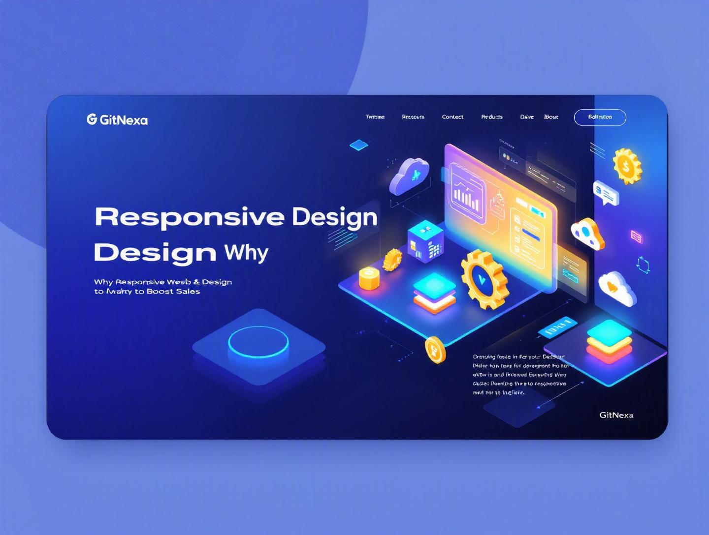
The Ultimate Guide to Responsive Web Design to Boost Sales
Introduction
In 2025, mobile devices generated over 60% of global website traffic, according to Statista. Yet thousands of businesses still lose customers every day because their websites don’t adapt properly to different screen sizes. Buttons are hard to tap. Checkout forms break. Product images overflow. And frustrated users leave — often for a competitor.
This is exactly where responsive web design to boost sales becomes more than a design trend. It becomes a revenue strategy.
When your website automatically adapts to smartphones, tablets, laptops, and ultra-wide monitors, you remove friction from the buying journey. Fewer obstacles mean more engagement. More engagement means higher conversion rates. And higher conversions mean more revenue.
In this comprehensive guide, we’ll unpack what responsive web design really means, why it matters more than ever in 2026, and how it directly impacts sales performance. You’ll see real-world examples, implementation techniques, common mistakes, best practices, and emerging trends. Whether you're a CTO evaluating a redesign, a startup founder optimizing conversion rates, or a developer architecting a scalable frontend, this guide will give you practical insights you can act on.
Let’s start with the fundamentals.
What Is Responsive Web Design?
Responsive web design (RWD) is a development approach that ensures a website automatically adapts its layout, content, and functionality to different screen sizes and devices using flexible grids, fluid images, and CSS media queries.
Instead of building separate versions for desktop and mobile, you create a single codebase that responds dynamically to the user’s viewport.
The Core Principles of Responsive Web Design
Responsive web design rests on three technical pillars:
1. Fluid Grid Layouts
Instead of fixed pixel widths, responsive layouts use relative units like percentages, em, rem, vw, and vh.
Example:
.container {
  width: 90%;
  max-width: 1200px;
  margin: 0 auto;
}
This allows content to scale proportionally across devices.
2. Flexible Images and Media
Images resize within their containers to prevent overflow.
img {
  max-width: 100%;
  height: auto;
}
Modern responsive images also use srcset and sizes for performance optimization, as documented by MDN: https://developer.mozilla.org/en-US/docs/Learn/HTML/Multimedia_and_embedding/Responsive_images
3. CSS Media Queries
Media queries apply different styles based on screen width, orientation, or resolution.
@media (max-width: 768px) {
  .nav-menu {
    display: none;
  }
}
This enables mobile-first or desktop-first design strategies.
Responsive vs Adaptive vs Mobile-First
| Approach | Description | Pros | Cons |
|---|---|---|---|
| Responsive | One flexible layout that adapts | Single codebase, SEO-friendly | Requires thoughtful planning |
| Adaptive | Multiple fixed layouts | Device-specific control | Maintenance complexity |
| Mobile-First | Design starts for small screens | Performance-focused | Requires disciplined UX planning |
Most high-growth companies today combine responsive and mobile-first methodologies for optimal scalability.
Why Responsive Web Design Matters in 2026
The digital landscape has shifted dramatically in the past five years.
Mobile Commerce Is Dominating
According to Insider Intelligence (2025), mobile commerce accounts for over 44% of total U.S. eCommerce sales — surpassing $710 billion. If your mobile experience underperforms, you’re losing revenue at scale.
Google Prioritizes Mobile-First Indexing
Google fully switched to mobile-first indexing in 2023. That means your mobile site determines your search rankings. Learn more directly from Google: https://developers.google.com/search/docs/crawling-indexing/mobile/mobile-sites-mobile-first-indexing
Poor mobile usability hurts:
- SEO performance
- Page experience signals
- Core Web Vitals
- Organic visibility
Consumer Expectations Have Changed
Users expect:
- Fast load times (< 2.5s LCP)
- Thumb-friendly navigation
- Instant checkout
- Seamless cross-device transitions
If your site feels outdated, trust erodes instantly.
Device Fragmentation Is Increasing
It’s no longer just phones and laptops. Consider:
- Foldable devices
- 4K monitors
- Smart TVs
- Tablets with external keyboards
Responsive design ensures long-term compatibility without rebuilding from scratch.
How Responsive Web Design Directly Boosts Sales
Let’s connect design decisions to revenue impact.
1. Reduces Bounce Rate
A poorly optimized mobile site increases bounce rates dramatically. Google reports that when page load time increases from 1 second to 5 seconds, bounce probability increases by 90%.
Responsive design improves:
- Layout stability
- Performance optimization
- Visual consistency
Lower bounce rates mean more users reach product pages and checkout flows.
2. Improves Conversion Rates
When buttons are easy to tap and forms auto-adjust for mobile keyboards, users complete purchases more often.
Example:
An online fashion retailer redesigned its checkout using responsive best practices:
- Larger tap targets (48px minimum)
- One-column layout on mobile
- Auto-fill enabled
Result: 18% increase in mobile conversions within three months.
3. Enhances Trust and Brand Perception
Design inconsistency damages credibility. Responsive consistency builds confidence. And confidence drives purchases.
4. Supports Cross-Device Buying Journeys
A customer may:
- Discover via Instagram (mobile)
- Compare products on tablet
- Complete purchase on desktop
A responsive site ensures continuity across all touchpoints.
Technical Architecture for High-Performance Responsive Design
Design alone isn’t enough. Architecture matters.
Frontend Framework Choices
Popular frameworks include:
- React + Next.js
- Vue + Nuxt
- Angular
- SvelteKit
Next.js, for example, supports image optimization and server-side rendering, which improves Core Web Vitals.
Example: Mobile-First Grid with Tailwind CSS
<div class="grid grid-cols-1 md:grid-cols-3 gap-6">
  <div class="p-4">Product 1</div>
  <div class="p-4">Product 2</div>
  <div class="p-4">Product 3</div>
</div>
This ensures:
- 1 column on mobile
- 3 columns on medium screens and above
Performance Optimization Techniques
- Lazy loading images
- Code splitting
- CDN integration
- HTTP/2 or HTTP/3
- Image compression (WebP, AVIF)
Workflow Diagram
Design → Mobile Wireframes → Component System → Development → Performance Audit → Cross-Device Testing → Launch → Analytics Monitoring
Tools commonly used:
- Lighthouse
- GTmetrix
- BrowserStack
- Figma
Real-World Case Studies: Responsive Design That Increased Revenue
Case Study 1: eCommerce Brand Scaling Globally
A Shopify Plus store targeting EU and US markets faced high mobile abandonment (72%).
Problems:
- Sticky banners covering CTAs
- Desktop-sized images on mobile
- 7-field checkout form
Actions taken:
- Implemented mobile-first redesign
- Reduced checkout fields to 3
- Introduced responsive image delivery
- Improved LCP from 4.2s to 2.1s
Results:
- 22% increase in mobile revenue
- 15% higher average order value
- 30% lower bounce rate
Case Study 2: B2B SaaS Company
A SaaS platform offering DevOps automation tools (similar to topics we cover in our DevOps automation strategies guide) redesigned their marketing site.
After responsive optimization:
- Demo bookings increased 27%
- Mobile traffic engagement doubled
- Organic rankings improved within 60 days
Case Study 3: Healthcare Portal
A healthcare booking platform rebuilt its UI with accessibility-first responsive design. Larger tap areas and structured forms improved patient bookings by 19%.
Responsive Design vs Separate Mobile Sites: Which Wins?
Some companies still run m.example.com versions. Let’s compare.
| Criteria | Responsive | Separate Mobile Site |
|---|---|---|
| SEO | Strong | Risk of duplicate content |
| Maintenance | Single codebase | Dual maintenance |
| Cost | Lower long-term | Higher ongoing |
| Analytics | Unified data | Split tracking |
| Scalability | Easier | Complex |
For most businesses, responsive design offers better ROI.
How GitNexa Approaches Responsive Web Design to Boost Sales
At GitNexa, we treat responsive web design as a revenue optimization initiative — not just a UI upgrade.
Our process blends UI/UX research, frontend engineering, performance optimization, and CRO testing.
We start with device analytics to identify where conversions drop. Then we create mobile-first wireframes in Figma, followed by scalable component libraries using React, Vue, or Next.js.
Our teams integrate:
- Core Web Vitals optimization
- Accessibility standards (WCAG 2.1)
- Conversion-focused UI patterns
We also connect responsive builds with broader digital strategies like custom web development services, UI/UX design systems, and cloud deployment architecture.
The goal is simple: measurable sales growth.
Common Mistakes to Avoid
-
Designing Desktop First Without Mobile Testing Many teams shrink desktop layouts instead of designing for mobile constraints first.
-
Ignoring Performance Metrics Responsive doesn’t mean fast. Monitor LCP, CLS, and FID.
-
Using Oversized Images Always compress and serve device-appropriate resolutions.
-
Small Tap Targets Buttons smaller than 48x48px hurt usability.
-
Hiding Important Content on Mobile Don’t remove essential information for small screens.
-
Not Testing Across Devices Emulators aren’t enough. Use real-device testing tools.
-
Overcomplicating Navigation Keep mobile menus intuitive and shallow.
Best Practices & Pro Tips
- Start with Mobile Wireframes
- Use Design Systems for Consistency
- Optimize Fonts for Readability (16px base minimum)
- Implement Sticky CTAs on Mobile
- Reduce Form Fields to Increase Conversions
- Monitor Analytics Weekly Post-Launch
- Use Progressive Enhancement Principles
- Implement A/B Testing for Layout Variations
- Use CSS Grid and Flexbox Instead of Float Layouts
- Align Responsive Strategy With Business KPIs
For performance insights, review our guide on web performance optimization techniques.
Future Trends & What to Expect (2026–2027)
Responsive design continues to evolve.
1. AI-Driven Layout Personalization
Websites will dynamically rearrange layouts based on user behavior patterns.
2. Foldable and Multi-Screen Optimization
Developers must account for viewport changes mid-session.
3. Voice and Gesture Integration
Responsive interfaces will adapt to voice-first interactions.
4. Edge Rendering and Faster Delivery
Edge functions reduce latency for global users.
5. Deeper CRO Integration
Responsive layouts will sync with AI-driven analytics dashboards.
We’re already seeing convergence between responsive web design and AI-powered personalization strategies.
FAQ: Responsive Web Design to Boost Sales
1. Does responsive web design really increase sales?
Yes. By improving usability, reducing bounce rates, and optimizing mobile experiences, responsive design directly improves conversion rates.
2. Is responsive design better than a mobile app?
For most businesses, yes. It’s more cost-effective and accessible across devices without requiring downloads.
3. How much does a responsive redesign cost?
Costs vary depending on complexity, features, and integrations. Custom builds range from $5,000 to $50,000+.
4. Does responsive design affect SEO?
Absolutely. Google prioritizes mobile-first indexing, so responsive sites perform better in search rankings.
5. How long does it take to implement?
Typical projects take 4–12 weeks depending on scope.
6. What frameworks are best for responsive web design?
React, Next.js, Vue, Angular, and Tailwind CSS are widely used.
7. Can responsive design improve page speed?
Yes, when paired with image optimization, lazy loading, and proper caching.
8. Is responsive design required for eCommerce?
Practically, yes. Mobile commerce dominates online sales.
9. What is the difference between responsive and adaptive design?
Responsive uses fluid layouts; adaptive uses fixed layouts per device.
10. How do I measure success after redesign?
Track bounce rate, conversion rate, average session duration, and revenue per visitor.
Conclusion
Responsive web design to boost sales is not optional anymore. It’s a foundational requirement for modern digital businesses. With mobile traffic surpassing desktop, search engines prioritizing mobile-first indexing, and customers expecting fast, intuitive experiences, companies that ignore responsive optimization lose revenue daily.
When implemented correctly — with performance, usability, and conversion strategy aligned — responsive web design becomes a powerful growth engine.
If your website isn’t delivering consistent experiences across devices, now is the time to act.
Ready to optimize your website for higher conversions and revenue? Talk to our team to discuss your project.
Comments
Loading comments...