Sub Category
Latest Blogs
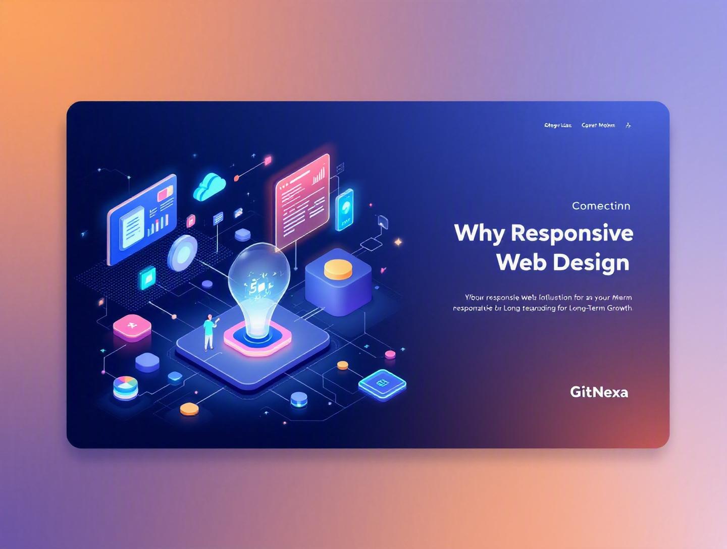
The Ultimate Guide to Responsive Web Design for Long-Term Growth
Introduction
In 2025, mobile devices generated over 58% of global website traffic, according to Statista. That number has held steady above 55% for the past three years—and in some industries like eCommerce and media, it crosses 70%. Yet thousands of businesses still treat responsive web design as a cosmetic upgrade rather than a growth strategy.
Here’s the hard truth: if your website doesn’t adapt flawlessly across devices, you’re losing traffic, conversions, and search visibility every single day.
Responsive web design is no longer a “nice-to-have.” It’s a foundational requirement for sustainable digital growth. Google’s mobile-first indexing, Core Web Vitals, rising user expectations, and the explosion of screen sizes—from foldables to ultrawide monitors—have reshaped how modern websites must perform.
In this comprehensive guide, we’ll break down what responsive web design really means, why it matters more than ever in 2026, and how it directly impacts revenue, SEO, user experience, and long-term scalability. You’ll see real-world examples, technical approaches, architectural patterns, and common pitfalls we’ve observed while building high-performance platforms at GitNexa.
If you’re a CTO planning a redesign, a founder scaling a SaaS product, or a marketing leader trying to improve conversion rates, this guide will help you connect responsive design decisions to measurable business outcomes.
What Is Responsive Web Design?
Responsive web design (RWD) is a development approach that ensures a website’s layout, content, and functionality automatically adapt to different screen sizes, orientations, and devices using fluid grids, flexible images, and CSS media queries.
Instead of building separate desktop and mobile versions (m.example.com), responsive design uses a single codebase that dynamically adjusts presentation based on the viewport.
Core Principles of Responsive Web Design
1. Fluid Grid Systems
Traditional web layouts used fixed pixel widths. Responsive layouts rely on percentages or relative units like rem, em, vw, and vh.
Example:
.container {
  width: 90%;
  max-width: 1200px;
  margin: 0 auto;
}
This ensures the container scales proportionally rather than breaking on smaller screens.
2. Flexible Images and Media
Images should scale within their parent container:
img {
  max-width: 100%;
  height: auto;
}
This prevents overflow and layout shifts—critical for improving Core Web Vitals.
3. CSS Media Queries
Media queries allow developers to apply styles conditionally:
@media (max-width: 768px) {
  .nav-menu {
    display: none;
  }
}
Modern frameworks like Tailwind CSS, Bootstrap 5, and Chakra UI abstract this logic into utility-based classes.
Responsive vs Adaptive vs Mobile-First
| Approach | Description | Pros | Cons |
|---|---|---|---|
| Responsive | Fluid layouts adjust continuously | Single codebase | Complex CSS logic |
| Adaptive | Predefined layouts for fixed breakpoints | Performance control | Multiple templates |
| Mobile-First | Design starts from smallest screen | Performance-focused | Requires disciplined planning |
Most modern teams combine responsive and mobile-first methodologies.
Why Responsive Web Design Matters in 2026
The landscape has shifted dramatically over the past five years.
1. Google’s Mobile-First Indexing
Google officially moved to mobile-first indexing for all websites in 2023. That means Google primarily evaluates the mobile version of your site for ranking and indexing. If your mobile UX is broken, your SEO suffers.
2. Core Web Vitals Impact Rankings
Largest Contentful Paint (LCP), Cumulative Layout Shift (CLS), and Interaction to Next Paint (INP) are now ranking signals. Poor responsive behavior often causes layout shifts and slow rendering.
3. Device Fragmentation Is Growing
It’s not just phones and desktops anymore:
- Foldable devices (Samsung Galaxy Fold)
- Tablets with desktop-class browsers (iPad Pro)
- 4K and ultrawide monitors
- Smart TVs and kiosks
Responsive web design ensures your UI gracefully adapts to unpredictable viewports.
4. Conversion Rates Depend on Mobile UX
According to Google research, 53% of mobile users abandon sites that take longer than 3 seconds to load. Performance and responsiveness are directly tied to revenue.
For eCommerce platforms we’ve optimized at GitNexa, improving mobile responsiveness and load time increased conversion rates by 18–32% within three months.
Responsive Web Design and Business Growth
Responsive web design directly influences revenue, brand perception, and operational efficiency.
Higher Conversion Rates
When buttons are thumb-friendly, forms auto-adjust, and checkout flows remain intuitive, users complete actions faster.
Consider Shopify. Their responsive checkout flow ensures consistent UX across devices. The result? Merchants benefit from mobile-optimized sales without separate development costs.
Lower Maintenance Costs
Maintaining separate mobile and desktop sites doubles testing and QA overhead. A unified responsive architecture reduces:
- Code duplication
- Bug tracking complexity
- Deployment cycles
This aligns with scalable DevOps practices like CI/CD pipelines. Learn more in our guide on DevOps best practices for scalable applications.
Improved SEO Performance
Responsive sites avoid duplicate content issues common in m-dot domains. Google recommends responsive design as its preferred configuration.
Stronger Brand Credibility
Users subconsciously associate broken layouts with outdated companies. Clean, responsive interfaces signal trust and technical maturity.
Technical Architecture Behind Responsive Systems
Let’s move from strategy to engineering.
Step 1: Adopt a Mobile-First CSS Strategy
Start with base styles for small screens, then scale up:
body {
  font-size: 16px;
}

@media (min-width: 1024px) {
  body {
    font-size: 18px;
  }
}
Step 2: Use Modern Layout Systems
CSS Grid
.grid {
  display: grid;
  grid-template-columns: repeat(auto-fit, minmax(250px, 1fr));
  gap: 20px;
}
Flexbox
Perfect for navigation bars and dynamic alignment.
Step 3: Component-Driven Development
With React, Vue, or Next.js, create responsive components rather than responsive pages.
Example architecture:
UI Components
  ├── ResponsiveCard
  ├── AdaptiveNavbar
  └── FluidGrid
This approach scales well in SaaS platforms and aligns with modern web application development.
Step 4: Performance Optimization
Responsive design fails if performance lags. Key techniques:
- Lazy loading images
- Using
srcsetfor responsive images - Code splitting in React
- CDN caching
Responsive Web Design and SEO Synergy
SEO and responsive design are tightly connected.
Crawl Efficiency
Single URLs simplify indexing.
Reduced Bounce Rate
Better UX lowers pogo-sticking behavior.
Structured Data Consistency
Ensure schema markup remains identical across breakpoints.
We often combine responsive redesigns with technical SEO audits to maximize ranking improvements.
Responsive UX Design Principles
Thumb-Friendly Navigation
Apple’s Human Interface Guidelines recommend a minimum 44px touch target.
Progressive Disclosure
Hide non-essential elements on smaller screens.
Accessibility
Responsive design must meet WCAG 2.2 standards:
- Sufficient contrast ratios
- Keyboard navigation
- Screen reader compatibility
Reference: https://www.w3.org/WAI/standards-guidelines/wcag/
How GitNexa Approaches Responsive Web Design
At GitNexa, responsive web design is integrated into our full-stack development lifecycle—not treated as a front-end afterthought.
We begin with device analytics to identify real user screen distributions. Then we create mobile-first wireframes, followed by scalable design systems using tools like Figma and Storybook.
Our engineering team implements responsive architectures using Next.js, Tailwind CSS, and performance optimization strategies aligned with cloud-native deployment models.
Before launch, we run cross-device testing across 20+ real devices and emulators. The goal is simple: deliver fast, consistent, conversion-focused digital experiences.
Common Mistakes to Avoid
-
Designing Desktop First and Shrinking Later
Leads to cluttered mobile experiences. -
Ignoring Performance on Mobile
Heavy desktop assets slow down phones. -
Too Many Breakpoints
Over-engineering creates maintenance chaos. -
Neglecting Real Device Testing
Emulators don’t reveal all interaction issues. -
Hiding Content Instead of Prioritizing It
Google may not value hidden content equally. -
Inconsistent Navigation Patterns
Users expect predictable UX. -
Overusing Popups on Mobile
Google penalizes intrusive interstitials.
Best Practices & Pro Tips
-
Start with Content Hierarchy
Design around user intent. -
Use a Design System
Maintain consistency across breakpoints. -
Optimize Images with WebP or AVIF
Reduce file size by up to 30%. -
Implement Fluid Typography
Useclamp()for scalable text. -
Monitor Core Web Vitals Continuously
Use Google Search Console and Lighthouse. -
Test Edge Cases
Foldables and landscape tablets. -
Combine RWD with Progressive Web App Features
Offline caching improves retention.
Future Trends & What to Expect (2026–2027)
AI-Assisted Layout Adaptation
AI-driven personalization engines will adjust layout structures based on user behavior.
Container Queries
Now widely supported, container queries allow components to adapt based on parent size—not just viewport.
Edge Rendering
Platforms like Vercel and Cloudflare Workers enable dynamic content delivery at the edge.
Voice and Multimodal Interfaces
Responsive design will extend beyond screens to voice-first interactions.
FAQ
What is responsive web design in simple terms?
It’s a way of building websites so they automatically adjust to different screen sizes using flexible layouts and media queries.
Is responsive design better than a separate mobile site?
Yes. It reduces maintenance, improves SEO, and provides consistent user experience.
Does responsive design affect SEO rankings?
Absolutely. Google prioritizes mobile-first indexing and Core Web Vitals.
How many breakpoints should a responsive site have?
Typically 3–5 major breakpoints depending on audience device data.
What frameworks support responsive web design?
Bootstrap, Tailwind CSS, Foundation, and Material UI are popular choices.
Is responsive design enough for performance?
No. You must also optimize assets, caching, and server response times.
How long does a responsive redesign take?
For mid-sized business sites, 6–12 weeks depending on complexity.
Can legacy websites be made responsive?
Yes, but sometimes a rebuild is more cost-effective.
Does responsive design increase development cost?
Initially slightly, but it reduces long-term maintenance expenses.
What’s the difference between responsive and fluid design?
Fluid design scales continuously; responsive design uses breakpoints.
Conclusion
Responsive web design is not just about fitting content onto smaller screens. It’s about building a scalable digital foundation that supports SEO, improves conversions, reduces operational costs, and prepares your business for emerging devices.
Companies that treat responsiveness as a strategic investment consistently outperform competitors who rely on outdated layouts. As device diversity increases and user expectations rise, the gap will only widen.
If long-term growth is your goal, responsive web design must sit at the center of your technology strategy.
Ready to future-proof your digital platform? Talk to our team to discuss your project.
Comments
Loading comments...