Sub Category
Latest Blogs
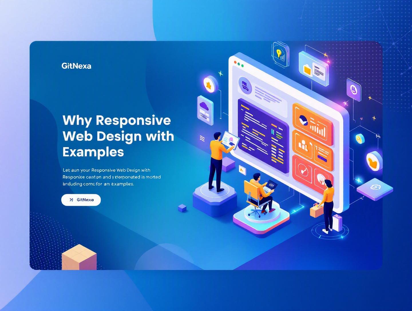
The Essential Guide to Responsive Web Design with Examples
Introduction
In 2025, mobile devices accounted for over 58% of global website traffic, according to Statista. On some consumer-facing platforms—eCommerce, food delivery, travel—that number regularly crosses 70%. Yet many businesses still treat mobile design as an afterthought. They design for a 1440px desktop screen first and then “fix” things for smaller devices later.
That approach no longer works.
Responsive web design isn’t just a design preference—it’s a business requirement. If your website breaks on a mid-range Android device, loads slowly on 4G, or hides critical CTAs below awkward breakpoints, you lose leads. Period.
Responsive web design ensures that your website adapts fluidly across devices—desktops, laptops, tablets, foldables, and smartphones—without compromising usability or performance. It uses flexible grids, media queries, responsive images, and modern CSS techniques to create consistent experiences regardless of screen size.
In this comprehensive guide, we’ll break down what responsive web design really means, why it matters in 2026, and how companies implement it effectively. You’ll see real-world examples, code snippets, architecture decisions, common mistakes, and future trends shaping the next generation of adaptive interfaces.
If you’re a CTO, startup founder, product manager, or developer looking to build scalable, future-ready digital products—this is your roadmap.
What Is Responsive Web Design?
Responsive web design (RWD) is an approach to web development where a single website dynamically adapts its layout, content, and functionality to different screen sizes and device capabilities.
Instead of building separate desktop and mobile websites (like m.example.com), responsive design uses:
- Flexible grid systems
- Fluid images and media
- CSS media queries
- Viewport-based sizing units
- Modern layout techniques like Flexbox and CSS Grid
The term was popularized by Ethan Marcotte in 2010. Since then, it has become the standard approach recommended by Google in its mobile-first indexing guidelines: https://developers.google.com/search/docs/crawling-indexing/mobile/mobile-sites-mobile-first-indexing.
Core Components of Responsive Web Design
1. Fluid Grid Layouts
Instead of fixed pixel widths, layouts use percentages or relative units.
.container {
  width: 90%;
  max-width: 1200px;
  margin: 0 auto;
}
2. Flexible Images
Images scale relative to their parent container.
img {
  max-width: 100%;
  height: auto;
}
3. Media Queries
Media queries apply styles based on screen characteristics.
@media (max-width: 768px) {
  .nav {
    flex-direction: column;
  }
}
Responsive vs Adaptive vs Mobile-First
| Approach | How It Works | Pros | Cons |
|---|---|---|---|
| Responsive | Fluid layouts adapt continuously | Single codebase, SEO-friendly | Can be complex to optimize |
| Adaptive | Predefined layouts for fixed breakpoints | Highly tailored experiences | More maintenance |
| Mobile-First | Design starts from smallest screen | Performance-focused | Requires disciplined planning |
In practice, modern teams combine responsive web design with a mobile-first strategy.
Why Responsive Web Design Matters in 2026
Responsive web design affects more than aesthetics. It directly influences search rankings, user engagement, accessibility, and conversion rates.
1. Google’s Mobile-First Indexing
Since 2021, Google predominantly uses the mobile version of content for indexing and ranking. If your mobile layout hides content, breaks structured data, or loads slowly, your SEO suffers.
2. Device Fragmentation Is Increasing
We’re no longer designing for:
- Desktop (1920x1080)
- Mobile (375x812)
Now we have:
- Foldable phones
- Ultra-wide monitors
- Tablets in split-screen mode
- Smart TVs
- In-car dashboards
Responsive design is the only scalable way to handle this variability.
3. Conversion Rates Depend on UX
According to a 2024 report by Baymard Institute, 68% of users abandon forms that are difficult to use on mobile. Poor button spacing, zoom requirements, and layout shifts kill conversions.
4. Cost Efficiency
Maintaining two separate websites (desktop + mobile) doubles development overhead. A single responsive codebase reduces:
- QA complexity
- DevOps maintenance
- Feature rollout friction
At GitNexa, we’ve seen companies cut frontend maintenance effort by 30–40% after consolidating into a properly architected responsive system.
Deep Dive #1: Responsive Layout Architecture in Modern Frameworks
Let’s move from theory to implementation.
Using CSS Grid and Flexbox Together
Modern responsive web design relies heavily on CSS Grid for macro layouts and Flexbox for micro alignment.
Example dashboard layout:
.dashboard {
  display: grid;
  grid-template-columns: 250px 1fr;
  min-height: 100vh;
}

@media (max-width: 992px) {
  .dashboard {
    grid-template-columns: 1fr;
  }
}
Sidebar collapses automatically below 992px.
Example: SaaS Admin Panel
For a SaaS analytics platform:
- Desktop: Sidebar + content + filters
- Tablet: Collapsible sidebar
- Mobile: Bottom navigation
Architecture decisions:
- Use React or Next.js for component modularity.
- Apply Tailwind CSS or CSS Modules for scoped styling.
- Define breakpoint tokens in a design system.
const breakpoints = {
  sm: "640px",
  md: "768px",
  lg: "1024px",
  xl: "1280px"
}
This avoids “random” breakpoints that cause layout inconsistencies.
For a deeper look at scalable frontends, see our guide on modern web application development.
Deep Dive #2: Responsive Images and Performance Optimization
Images account for nearly 50% of average web page weight (HTTP Archive, 2025).
Responsive web design without image optimization is incomplete.
Using srcset and sizes
<img
  src="image-800.jpg"
  srcset="image-400.jpg 400w,
          image-800.jpg 800w,
          image-1200.jpg 1200w"
  sizes="(max-width: 600px) 400px,
         (max-width: 1200px) 800px,
         1200px"
  alt="Product preview" />
Browser chooses optimal size based on viewport.
Modern Image Formats
- WebP (smaller than JPEG/PNG)
- AVIF (up to 30% smaller than WebP)
Lazy Loading
<img src="product.jpg" loading="lazy" alt="Product" />
Real-World Example: eCommerce Store
One fashion retailer reduced page load time from 4.2s to 2.1s after:
- Implementing responsive image sets
- Converting assets to WebP
- Enabling CDN compression
The result? 18% increase in mobile conversion rate.
We often combine these strategies with performance audits similar to those discussed in our cloud optimization strategies.
Deep Dive #3: Mobile-First Design Workflow
Responsive web design works best when mobile is prioritized first.
Step-by-Step Mobile-First Process
- Design smallest layout (320px–375px).
- Focus on core content.
- Add progressive enhancements for larger screens.
- Test with real devices.
- Optimize touch interactions.
Example: Booking Platform
Mobile-first wireframe includes:
- Search
- Date picker
- CTA button
Desktop adds:
- Side filters
- Comparison widgets
- Multi-column layout
This approach reduces feature clutter and improves clarity.
Our UI/UX design best practices article explores this methodology in detail.
Deep Dive #4: Responsive Navigation Patterns
Navigation can make or break usability.
Common Patterns
| Pattern | Best For | Pros | Cons |
|---|---|---|---|
| Hamburger Menu | Content-heavy sites | Saves space | Hidden discoverability |
| Bottom Navigation | Mobile apps | Thumb-friendly | Limited items |
| Mega Menu | eCommerce | Scalable | Complex on mobile |
Example: Shopify
Shopify uses:
- Mega menu on desktop
- Collapsible accordion on mobile
Accessibility Considerations
- Minimum 44px touch targets
- ARIA labels
- Keyboard navigation
MDN provides detailed accessibility patterns: https://developer.mozilla.org/en-US/docs/Web/Accessibility.
Deep Dive #5: Testing and Quality Assurance for Responsive Web Design
Responsive design without testing is guesswork.
Testing Checklist
- Cross-browser testing (Chrome, Safari, Firefox)
- Device testing (iOS, Android)
- Orientation testing
- Lighthouse audits
- Accessibility validation
Tools:
- BrowserStack
- Chrome DevTools Device Mode
- Lighthouse
- Playwright for automated testing
Example Playwright test:
test('mobile layout loads correctly', async ({ page }) => {
  await page.setViewportSize({ width: 375, height: 812 });
  await page.goto('https://example.com');
  await expect(page.locator('.mobile-nav')).toBeVisible();
});
For DevOps automation strategies, explore our article on CI/CD pipeline best practices.
How GitNexa Approaches Responsive Web Design
At GitNexa, responsive web design is built into our engineering workflow—not treated as a final QA step.
Our process includes:
- Design system creation with breakpoint tokens
- Mobile-first component development
- Performance budgets (under 2.5s LCP target)
- Automated visual regression testing
- Accessibility compliance (WCAG 2.1)
We combine frontend frameworks like React, Vue, or Next.js with scalable backend architectures described in our custom software development services.
The goal isn’t just responsiveness—it’s measurable business outcomes: improved conversion rates, lower bounce rates, and higher engagement.
Common Mistakes to Avoid
- Designing desktop first and shrinking later
- Using too many breakpoints
- Ignoring performance optimization
- Hiding important content on mobile
- Not testing on real devices
- Overusing JavaScript for layout
- Ignoring accessibility standards
Each of these can silently reduce usability and SEO performance.
Best Practices & Pro Tips
- Use relative units (rem, %, vw) instead of px.
- Define 4–5 consistent breakpoints.
- Optimize images with srcset.
- Implement lazy loading.
- Prioritize above-the-fold content.
- Use CSS Grid for layout, Flexbox for alignment.
- Test with Lighthouse regularly.
- Set performance budgets.
- Follow WCAG guidelines.
- Use a design system.
Future Trends & What to Expect (2026–2027)
1. Container Queries
CSS Container Queries allow components to adapt based on parent size instead of viewport.
2. Foldable Device Optimization
Designing for dynamic hinge-based layouts.
3. AI-Assisted Layout Adaptation
Tools that auto-generate layout adjustments.
4. Performance-Driven Ranking Signals
Core Web Vitals will continue influencing SEO.
FAQ
What is responsive web design in simple terms?
It’s a way of building websites that automatically adjust to different screen sizes and devices.
Why is responsive web design important for SEO?
Google uses mobile-first indexing, so mobile-friendly layouts rank better.
What’s the difference between responsive and adaptive design?
Responsive uses fluid layouts; adaptive uses fixed layouts for specific breakpoints.
How many breakpoints should a website have?
Typically 4–5 standard breakpoints.
Does responsive design improve conversion rates?
Yes. Better usability reduces friction and increases engagement.
What frameworks support responsive web design?
Bootstrap, Tailwind CSS, Foundation, and modern CSS Grid/Flexbox.
Is responsive web design expensive?
It reduces long-term costs by maintaining a single codebase.
Can old websites be converted into responsive ones?
Yes, through redesign or frontend refactoring.
Conclusion
Responsive web design is no longer optional. It directly impacts search rankings, user experience, and revenue. By combining flexible layouts, performance optimization, accessibility standards, and thorough testing, businesses can build websites that work everywhere.
The companies that win online aren’t the ones with the flashiest designs—they’re the ones that deliver fast, consistent experiences across every device.
Ready to build a high-performing responsive website? Talk to our team to discuss your project.
Comments
Loading comments...