Sub Category
Latest Blogs
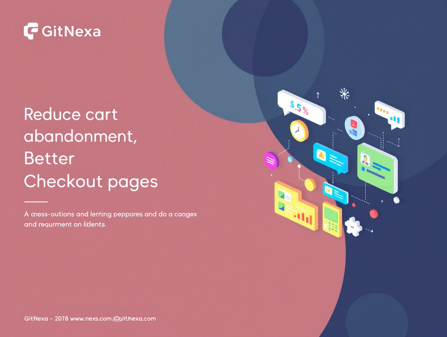
Reduce Cart Abandonment With Better Checkout Pages
Introduction
Cart abandonment is one of the most persistent and expensive challenges in eCommerce. A shopper browses your site, adds products to their cart, reaches the checkout—and then disappears. According to the Baymard Institute, the average cart abandonment rate across industries hovers around 69–70%, meaning that nearly seven out of ten potential purchases never convert. For growing online businesses, this isn’t just a metric problem; it’s lost revenue, wasted marketing spend, and frustrated customers.
The good news is that cart abandonment is not an unsolvable mystery. In fact, most abandoned carts share common causes: poorly designed checkout pages, unnecessary friction, lack of trust, hidden costs, or confusing user flows. When you improve your checkout experience intentionally, you don’t just recover lost sales—you build confidence, loyalty, and long-term brand value.
In this comprehensive guide, you’ll learn how to reduce cart abandonment with better checkout pages, using proven design principles, behavioral psychology, and real-world examples. We’ll explore why users abandon carts, how checkout UX directly impacts conversions, and what best practices successful brands use to turn hesitant shoppers into happy customers. Whether you’re running a small Shopify store or managing an enterprise-level eCommerce platform, this guide will give you actionable insights you can implement immediately.
By the end of this article, you’ll understand how to:
- Identify the hidden friction points in your checkout flow
- Design faster, simpler, and more trustworthy checkout pages
- Optimize for mobile users and global audiences
- Use data, testing, and personalization to continuously reduce abandonment
Let’s dive in.
Understanding Cart Abandonment and Its Business Impact
Cart abandonment occurs when a shopper adds one or more items to their online shopping cart but leaves the website before completing the purchase. While abandonment rates vary by industry, device, and region, the financial impact is universal.
Why Cart Abandonment Happens
Multiple studies, including research from Baymard Institute and Google Consumer Insights, reveal consistent reasons for abandonment:
- Unexpected extra costs (shipping, taxes, fees)
- Mandatory account creation
- Long or complicated checkout processes
- Lack of trust in payment security
- Slow page load times
- Poor mobile experience
Each of these issues is directly related to how your checkout page is designed and optimized.
The True Cost of Abandoned Carts
Cart abandonment doesn’t just mean one lost sale. It often means:
- Higher customer acquisition costs (CAC)
- Lower return on ad spend (ROAS)
- Reduced lifetime customer value (LTV)
- Skewed analytics and forecasting
For example, if your store generates $50,000 per month in completed checkouts with a 70% abandonment rate, improving conversions by just 5–10% can add tens of thousands of dollars annually—without increasing ad spend.
Checkout Pages as Conversion Gatekeepers
Your checkout page is the final and most critical step in the buyer’s journey. Everything before it—SEO, content, ads, product pages—loses value if checkout fails. That’s why checkout optimization consistently delivers one of the highest ROIs in eCommerce.
To understand how checkout fits into the wider conversion funnel, you may also find value in GitNexa’s guide on conversion rate optimization strategies.
The Psychology Behind Checkout Behavior
Understanding user psychology is essential to reducing cart abandonment. Checkout decisions are driven as much by emotion and perception as by logic and price.
Cognitive Load and Decision Fatigue
Every extra field, step, or choice adds cognitive load. By the time users reach checkout, they’ve already made multiple decisions. Complex checkout forms increase decision fatigue, making abandonment more likely.
Trust and Risk Perception
At checkout, users are asked to share sensitive information such as credit card details and addresses. If your page looks outdated, cluttered, or inconsistent with the rest of your site, users may perceive higher risk—even if your platform is secure.
Loss Aversion and Price Transparency
Shoppers strongly react to unexpected costs. A sudden shipping fee activates loss aversion, making users feel they’re losing value. Transparent pricing throughout the checkout journey reduces this effect.
Urgency vs. Pressure
Subtle urgency (low stock indicators, delivery deadlines) can increase conversions, but aggressive pressure tactics often backfire. The best checkout pages reassure rather than intimidate.
For a deeper look at user behavior and UX principles, explore how UX design improves customer retention.
Essential Elements of High-Converting Checkout Pages
A high-performing checkout page balances speed, clarity, and reassurance. While design trends evolve, the fundamentals remain consistent.
Clear Progress Indicators
Users want to know how close they are to completion. A simple progress bar (e.g., Shipping → Payment → Review) reduces anxiety and improves completion rates.
Guest Checkout Options
Forcing account creation is one of the top abandonment triggers. Always allow guest checkout, and offer account creation after the purchase is complete.
Minimal Form Fields
Only ask for information that is absolutely necessary. Autofill, address lookup, and smart defaults can significantly reduce friction.
Prominent Security Signals
- HTTPS and SSL indicators
- Payment provider logos (Visa, PayPal, Stripe)
- Trust badges and security seals
These visual cues reassure users at the moment they need it most.
Clear Order Summary
Users should be able to easily review items, quantities, prices, shipping, and taxes without leaving the checkout.
These elements align closely with broader eCommerce UI/UX best practices.
Simplifying the Checkout Flow for Speed and Clarity
Complex checkout flows kill conversions. Simplification is often the fastest way to reduce cart abandonment.
One-Page vs. Multi-Step Checkout
There is no universal winner, but clarity matters more than format. One-page checkouts reduce clicks, while multi-step checkouts can feel easier if well-structured.
When One-Page Works Best
- Low product complexity
- Returning customers
- Mobile-heavy audiences
When Multi-Step Works Better
- Complex shipping options
- B2B or high-ticket purchases
- International shipping scenarios
Removing Distractions
Checkout pages should eliminate:
- Main navigation menus
- Promotional popups
- Irrelevant links
The goal is focus—one page, one action.
Autofill and Smart Defaults
Using browser autofill, saved addresses, and location-based defaults can reduce form completion time by up to 30%.
Mobile Checkout Optimization: A Non-Negotiable
Mobile commerce now accounts for more than half of eCommerce traffic, yet mobile checkout abandonment rates are consistently higher.
Common Mobile Checkout Issues
- Small buttons or text
- Excessive typing
- Slow load times
- Non-responsive layouts
Best Practices for Mobile Checkout
- Use large, tappable buttons
- Enable numeric keyboards for phone and card fields
- Minimize scrolling
- Optimize images and scripts for speed
Google emphasizes mobile-first indexing, making mobile checkout optimization crucial for both UX and SEO. You can explore more in mobile-first web design guide.
Building Trust and Credibility at Checkout
Trust is the currency of online transactions. Without it, even the best pricing won’t convert.
Consistent Branding
Checkout pages should visually match the rest of your site. Sudden design changes can signal third-party risk.
Social Proof and Reviews
Subtle reminders such as “Trusted by 10,000+ customers” or short testimonials can reinforce confidence.
Clear Return and Refund Policies
Link to your return policy near the payment button. Knowing there’s a safety net reduces hesitation.
Payment Transparency
Clearly explain when cards are charged, how subscriptions work, or what happens after payment.
For more on building digital trust, see how brand credibility affects online conversions.
Payment Options That Reduce Friction
Payment flexibility has a direct impact on cart completion.
Offer Multiple Payment Methods
- Credit and debit cards
- Digital wallets (Apple Pay, Google Pay)
- Buy Now, Pay Later (BNPL) options
According to research by Stripe, adding digital wallets can increase checkout conversions by double digits.
Localized Payment Methods
For international customers, offering region-specific payment options significantly reduces abandonment.
Save Payment Information Securely
Returning customers appreciate faster checkout experiences. Clearly communicate how payment data is stored securely.
Using Data and Analytics to Identify Checkout Drop-Offs
Optimization starts with insight.
Key Metrics to Track
- Checkout abandonment rate
- Field-level drop-off
- Time to complete checkout
Tools for Checkout Analysis
- Google Analytics funnels
- Heatmaps and session recordings
- A/B testing platforms
Google’s own documentation on Analytics for eCommerce provides authoritative guidance on tracking checkout behavior.
Continuous Improvement Through Testing
Small changes—button labels, form layouts, microcopy—can produce measurable improvements when tested correctly.
Real-World Examples of Checkout Optimization Success
Case Study: Mid-Sized Fashion Retailer
After simplifying their checkout from five pages to two and adding guest checkout, this retailer reduced abandonment by 18% in three months.
Case Study: SaaS eCommerce Platform
By adding trust badges, clearer error messages, and BNPL options, a SaaS brand increased checkout conversions by 12% without changing pricing.
These examples highlight that checkout improvements don’t require radical redesigns—just thoughtful, user-focused decisions.
Best Practices to Reduce Cart Abandonment
- Always offer guest checkout
- Be transparent about all costs upfront
- Reduce form fields to the minimum
- Optimize checkout speed
- Display clear trust signals
- Design mobile-first checkout flows
- Offer flexible payment options
- Continuously test and iterate
Common Checkout Mistakes to Avoid
- Forcing account creation
- Hiding shipping costs until the final step
- Poor error handling and validation
- Ignoring mobile users
- Overloading checkout pages with content
Avoiding these mistakes alone can dramatically improve conversions.
Frequently Asked Questions (FAQs)
What is a good cart abandonment rate?
Rates vary by industry, but anything below 60% is considered strong performance.
How can I reduce cart abandonment quickly?
Start by enabling guest checkout, improving page speed, and clearly displaying all costs early.
Does one-page checkout always work better?
Not always. The best format depends on product complexity and user expectations.
How important is mobile optimization?
Extremely. Mobile users abandon carts more frequently due to poor UX.
Do trust badges really help?
Yes, especially for new or lesser-known brands.
Should I remove navigation from checkout?
In most cases, yes. Fewer distractions increase focus.
How often should I test checkout changes?
Continuously. Even small improvements can yield significant gains over time.
Can personalization reduce abandonment?
Yes. Autofill, saved preferences, and localized content all improve completion rates.
What role does page speed play in checkout?
A major one. Even a one-second delay can reduce conversions.
Conclusion: The Future of Checkout Optimization
Reducing cart abandonment isn’t about chasing trends—it’s about respecting your customer’s time, trust, and expectations. Checkout pages are where intent meets execution. When that execution fails, revenue leaks quietly but consistently.
As eCommerce continues to evolve, checkout experiences will become even more personalized, faster, and frictionless. Brands that invest now in better checkout design, data-driven optimization, and user-centric thinking will outpace competitors who treat checkout as an afterthought.
Every improvement you make compounds over time. Fewer abandoned carts mean higher profitability, happier customers, and more sustainable growth.
Ready to Optimize Your Checkout?
If you’re serious about reducing cart abandonment and increasing conversions, GitNexa can help. Our experts specialize in UX, CRO, and performance-driven eCommerce solutions.
👉 Request a free quote today and start turning abandoned carts into completed orders.
Comments
Loading comments...