Sub Category
Latest Blogs
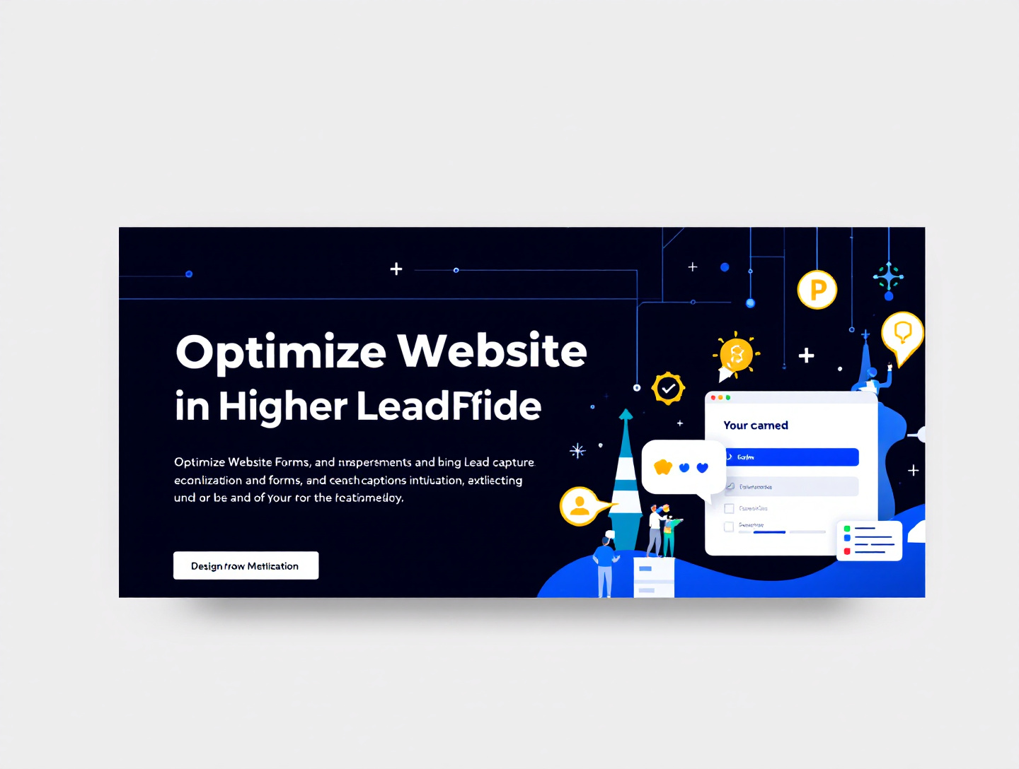
Optimize Website Forms for Higher Lead Capture & Conversions | GitNexa
Introduction
Website forms are the silent salespeople of your digital presence. They don’t sleep, they don’t take breaks, and when optimized correctly, they can outperform entire sales teams by capturing highly qualified leads at scale. Yet for many businesses, website forms remain one of the most under-optimized assets. Poorly designed forms, unnecessary fields, unclear messaging, and weak trust signals quietly drain conversion potential every single day.
If you have steady website traffic but low lead volume, chances are your forms are the bottleneck. According to Google’s UX research, users abandon forms primarily due to complexity, lack of transparency, and perceived risk. Even a single extra field can reduce conversion rates by up to 11%. In competitive industries, that difference translates directly into lost revenue.
This in-depth guide is written for marketers, founders, UX designers, and growth teams who want to optimize website forms for higher lead capture without gimmicks or guesswork. You’ll learn the psychology behind form behavior, UX best practices, real-world optimization examples, advanced CRO tactics, and how to continuously improve form performance using data.
By the end of this guide, you will understand:
- Why most website forms fail to convert
- How to design frictionless, high-converting forms
- Which form elements impact lead quality vs volume
- How to test, measure, and scale form optimizations
- Practical frameworks used by high-growth companies
This is not a surface-level checklist. It’s a complete, experience-driven blueprint built on proven conversion science.
Understanding the Role of Website Forms in Lead Generation
Website forms sit at the intersection of traffic, intent, and opportunity. They are the primary mechanism businesses use to convert anonymous visitors into identifiable leads. Yet many teams treat forms as a technical necessity instead of a strategic asset.
Why Website Forms Matter More Than Ever
Modern buyers are self-directed. According to Google, over 70% of B2B buyers complete more than half of their research before speaking to sales. Forms are often the first and only gate between anonymous research and active engagement.
When optimized properly, forms:
- Capture intent-rich leads
- Segment prospects automatically
- Trigger personalized follow-ups
- Feed CRM and marketing automation systems
When ignored, they:
- Increase bounce rates
- Lower campaign ROI
- Frustrate users
- Damage brand trust
Forms as Conversion Levers, Not Data Dumps
One of the biggest mindset shifts in form optimization is understanding that forms are conversion experiences, not data collection tools. Every field you add is a decision point. Every label affects clarity. Every error message shapes perception.
At GitNexa, form optimization projects consistently improve conversion rates by 20–60% without increasing traffic. These gains come not from redesigns alone, but from aligning forms with user intent.
For a broader perspective on conversion-focused design, explore our guide on conversion rate optimization strategies.
The Psychology Behind High-Converting Website Forms
Understanding human behavior is the foundation of form optimization. People do not abandon forms randomly—they abandon them for emotional and cognitive reasons.
Cognitive Load and Decision Fatigue
Every form field requires mental effort. The more effort required, the higher the dropout rate. Cognitive load theory explains why users prefer simplicity, clarity, and speed.
Reducing cognitive load involves:
- Limiting required fields
- Using clear, familiar language
- Grouping related fields logically
- Providing inline validation
Perceived Risk and Trust Signals
When users submit a form, they are giving away personal information. Without reassurance, uncertainty creeps in.
Effective trust signals include:
- Privacy assurance statements
- Security badges (used sparingly)
- Testimonials near the form
- Clear explanation of “what happens next”
According to Nielsen Norman Group, transparency significantly improves form completion rates by reducing anxiety.
Motivation vs Friction Balance
Conversion happens when motivation outweighs friction. High-intent offers (like demos or audits) can support longer forms, while low-commitment offers (like newsletters) must minimize friction.
Understanding this balance is essential when deciding how many fields to include and which questions to ask.
Choosing the Right Form Type for Higher Lead Capture
Not all forms serve the same purpose. Matching form type to user intent is a critical optimization lever.
Contact Forms
Best for:
- General inquiries
- Support requests
- Low-friction touchpoints
Optimization tips:
- Keep fields to 3–5 max
- Include a strong CTA
- Avoid unnecessary dropdowns
Lead Magnet Forms
Used for:
- Ebooks
- Whitepapers
- Checklists
These forms can request slightly more information, especially if the content provides high perceived value.
Demo and Quote Request Forms
High-intent forms require balance. While sales teams want data, users want speed.
A common GitNexa strategy is progressive profiling—collecting essential data first and gathering additional details later.
Learn more about lead qualification in our article on B2B lead generation best practices.
Form Field Optimization: Asking Less Without Losing Value
Field Quantity vs Lead Quality
There’s a persistent myth that more fields equal better leads. In reality, excessive fields reduce volume without guaranteeing quality.
Case Study: A SaaS company reduced its demo form from 11 fields to 6. Conversion rates increased by 47%, while sales-qualified lead quality remained unchanged.
Which Fields Actually Matter
High-impact fields typically include:
- Name
- Company
- Primary goal or challenge
Low-impact, high-friction fields:
- Budget (early-stage)
- Phone number (unless required)
- Address
Optional Fields and Smart Defaults
Mark non-essential fields as optional. Use smart defaults to reduce typing effort, especially for dropdowns.
Designing Form Layouts That Drive Completion
Single-Column vs Multi-Column Forms
Single-column layouts outperform multi-column forms in most scenarios. They create a clear vertical flow and reduce visual complexity.
Visual Hierarchy and Spacing
Whitespace improves readability. Labels should be clearly associated with fields, and error messages should appear inline.
Mobile-First Form Design
Over 60% of form submissions now happen on mobile. Optimize for thumb reach, large tap targets, and minimal typing.
For more mobile UX insights, read our article on mobile-first website design.
Writing Button Copy and Microcopy That Converts
CTA Button Language
Replace generic CTAs like “Submit” with action-oriented language:
- “Get My Free Quote”
- “Schedule My Demo”
- “Download the Guide”
Microcopy That Reduces Anxiety
Examples:
- “We’ll never share your email”
- “Takes less than 30 seconds”
These small additions significantly improve completion rates.
Using Progressive Profiling and Multi-Step Forms
Why Multi-Step Forms Work
Breaking longer forms into steps reduces perceived effort. Users are more likely to complete a process that feels manageable.
Progressive Profiling in Practice
Use cookies or CRM data to avoid asking repeat visitors the same questions. This improves UX and data quality.
Trust Signals and Compliance in Website Forms
Privacy, Security, and Compliance
Clearly state how data will be used. For GDPR and CCPA compliance, include consent checkboxes where required.
Authoritative reference:
- Google’s UX guidelines on form design emphasize transparency and user control.
Social Proof Near Forms
Adding short testimonials or trust logos near forms can increase conversions by up to 15%.
A/B Testing Website Forms for Continuous Improvement
What to Test
High-impact elements:
- Number of fields
- CTA copy
- Form placement
- Trust signals
Testing Methodology
Test one variable at a time. Use statistically significant sample sizes before drawing conclusions.
For analytics setup, explore our guide on Google Analytics conversion tracking.
Best Practices to Optimize Website Forms for Higher Lead Capture
- Limit fields to essentials only
- Match form length to offer value
- Use clear, benefit-driven CTAs
- Optimize for mobile first
- Add trust signals without clutter
- Use inline validation and clear error messaging
- Test continuously and iterate
Common Website Form Optimization Mistakes to Avoid
- Asking for too much information too early
- Using vague CTA buttons
- Ignoring mobile usability
- Hiding privacy information
- Not tracking form performance
Real-World Use Cases and Examples
B2B SaaS Lead Generation
A CRM provider simplified its demo request form and added a progress bar. Result: 34% increase in completed demos within 60 days.
E-commerce Lead Capture
An eCommerce brand added exit-intent forms with minimal fields and saw a 22% boost in email signups.
Professional Services
A consulting firm reworded its form CTA from “Submit” to “Request My Strategy Call,” increasing conversions by 29%.
Frequently Asked Questions (FAQs)
How many fields should an optimized website form have?
Typically 3–5 fields for low-commitment offers and 5–8 for high-intent forms. Always test before expanding.
Do multi-step forms always convert better?
Not always. They work best for longer forms where perceived effort is high.
Should phone numbers be required?
Only if absolutely necessary. Optional phone fields often perform better.
How do I improve mobile form conversions?
Use larger input fields, minimal typing, and mobile-friendly keyboards.
What tools are best for form optimization?
Popular tools include Google Optimize, Hotjar, HubSpot, and Typeform.
How often should forms be tested?
Quarterly testing is a good baseline, with more frequent tests for high-traffic pages.
Can form design impact lead quality?
Yes. Clear intent-based questions improve qualification without adding friction.
Where should forms be placed on a page?
Above the fold for high-intent pages, and after value explanation for others.
Are short forms always better?
Shorter forms improve volume, but alignment with intent matters more than length alone.
Conclusion: The Future of Website Form Optimization
Optimizing website forms for higher lead capture is no longer optional—it’s a competitive advantage. As users become more selective and privacy-conscious, businesses must design forms that respect time, reduce friction, and clearly communicate value.
The future of form optimization lies in personalization, AI-driven insights, and continuous experimentation. Companies that treat forms as dynamic experiences—not static elements—will win more leads without increasing ad spend.
If you want expert guidance tailored to your business, GitNexa specializes in conversion-driven design and lead generation systems.
Ready to Increase Your Lead Capture Rates?
If your website traffic isn’t turning into leads, your forms may be the missing link. Let GitNexa analyze, redesign, and optimize your forms for maximum performance.
👉 Get your free optimization quote today: https://www.gitnexa.com/free-quote
Comments
Loading comments...