Sub Category
Latest Blogs
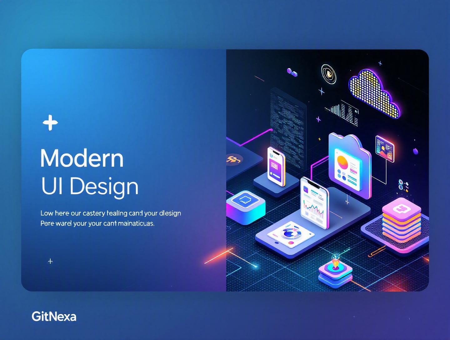
The Ultimate Guide to Modern UI Design Principles
Introduction
In 2025, Google research revealed that users form an opinion about a website in just 50 milliseconds. That’s faster than a blink. If your interface feels cluttered, confusing, or outdated, users won’t stick around long enough to read your headline—let alone convert. This is where modern UI design principles separate successful digital products from the rest.
Modern UI design principles are not just about aesthetics. They influence conversion rates, user retention, accessibility, and even development velocity. A well-designed interface can increase conversion rates by up to 200% according to Forrester (2024), while a poor user experience can drive away 88% of online consumers.
Yet many teams still treat UI as a “final layer” applied after development. The result? Inconsistent components, accessibility issues, bloated interfaces, and frustrated users.
In this comprehensive guide, we’ll break down the core principles of modern UI design, explain why they matter in 2026, and show how to apply them in real-world web and mobile projects. You’ll see practical examples, implementation workflows, comparison tables, and actionable steps that product teams can apply immediately.
Whether you’re a CTO evaluating a redesign, a startup founder building an MVP, or a product designer refining a design system, this guide will help you build interfaces that are intuitive, scalable, and future-ready.
What Is Modern UI Design?
Modern UI design refers to the strategic creation of user interfaces that are intuitive, accessible, aesthetically refined, and optimized for performance across devices. It blends visual design, interaction design, accessibility standards, and frontend engineering best practices.
At its core, modern UI design focuses on:
- Clarity over decoration
- Consistency through design systems
- Accessibility by default
- Responsive and adaptive layouts
- Performance-first thinking
- Data-informed iteration
Unlike early web design (heavy gradients, skeuomorphic textures, cluttered layouts), modern UI prioritizes minimalism, usability, and systemized components.
Key Characteristics of Modern UI
- Minimalist visual language – Generous whitespace, limited color palettes, clear typography.
- Component-driven architecture – Reusable UI components built with frameworks like React, Vue, or Angular.
- Design systems – Centralized tokens, patterns, and documentation.
- Accessibility compliance – WCAG 2.2 standards.
- Motion with purpose – Subtle transitions that enhance understanding.
For deeper technical references, Google’s Material Design (https://m3.material.io/) and Apple’s Human Interface Guidelines provide foundational frameworks.
Why Modern UI Design Principles Matter in 2026
UI expectations have evolved dramatically over the past five years.
1. Multi-Device Ecosystems Are the Norm
Users now interact across phones, tablets, foldables, desktops, smart TVs, and wearables. Statista reported in 2025 that over 62% of global web traffic comes from mobile devices. Responsive design is no longer optional.
2. Accessibility Is a Legal and Business Imperative
The Web Content Accessibility Guidelines (WCAG 2.2) are becoming legally enforceable in more regions. Accessible interfaces expand your audience and reduce legal risk.
3. Design Systems Improve Velocity
Companies like Airbnb and Shopify use design systems to accelerate feature releases. A centralized UI library reduces duplicated effort and improves consistency.
4. AI-Driven Interfaces Require Clarity
As AI-powered features become common (chatbots, recommendations, personalization), clarity in UI becomes critical. If users don’t understand system feedback, trust erodes quickly.
For businesses investing in custom web application development, modern UI design directly affects adoption and ROI.
Core Principle #1: Clarity and Visual Hierarchy
Clarity is the foundation of modern UI design principles. If users can’t understand your interface in seconds, you’ve lost them.
Understanding Visual Hierarchy
Visual hierarchy organizes elements so users instinctively know where to look first.
Key Tools for Hierarchy
- Size (larger = more important)
- Color contrast
- Spacing
- Typography weight
- Positioning
Example: SaaS Dashboard
Imagine a project management dashboard:
- Primary CTA: "Create Project" (large, bold, high-contrast)
- Metrics: Mid-sized cards
- Secondary links: Muted color
Without hierarchy, everything competes for attention.
Code Example: Establishing Hierarchy with CSS
:root {
  --primary-color: #2563eb;
  --text-dark: #111827;
  --text-muted: #6b7280;
}

h1 {
  font-size: 2rem;
  font-weight: 700;
  color: var(--text-dark);
}

.button-primary {
  background: var(--primary-color);
  color: white;
  padding: 12px 20px;
  border-radius: 8px;
}
Practical Steps to Improve Hierarchy
- Define one primary action per screen.
- Limit font sizes to 4–5 scale levels.
- Use contrast ratios of at least 4.5:1.
- Apply consistent spacing using 8px grids.
Core Principle #2: Consistency Through Design Systems
Modern UI design scales through systems, not isolated screens.
What Is a Design System?
A design system includes:
- Design tokens (colors, spacing, typography)
- UI components
- Documentation
- Usage guidelines
Component-Based Architecture
Example in React:
function Button({ variant = "primary", children }) {
  return (
    <button className={`btn btn-${variant}`}>
      {children}
    </button>
  );
}
This ensures consistent styling across features.
Design System vs No System
| Without System | With Design System |
|---|---|
| Inconsistent buttons | Standardized components |
| Repeated CSS | Reusable tokens |
| Slower releases | Faster iteration |
| Higher QA effort | Predictable UI patterns |
Teams investing in UI/UX design services often reduce development rework by 30–40%.
Core Principle #3: Accessibility by Default
Accessibility isn’t a feature. It’s a requirement.
WCAG 2.2 Essentials
- Minimum 4.5:1 contrast ratio
- Keyboard navigation
- Screen reader compatibility
- Focus indicators
Reference: https://www.w3.org/WAI/standards-guidelines/wcag/
Example: Accessible Button
<button aria-label="Submit form" class="button-primary">
  Submit
</button>
Accessibility Checklist
- Test with keyboard only.
- Use semantic HTML.
- Provide alt text.
- Avoid color-only indicators.
Accessible interfaces improve usability for everyone—not just users with disabilities.
Core Principle #4: Responsive and Adaptive Design
Responsive design ensures layouts adapt to various screen sizes.
Mobile-First Approach
Start with mobile constraints, then scale up.
.container {
  padding: 16px;
}

@media (min-width: 768px) {
  .container {
    padding: 32px;
  }
}
Breakpoint Strategy
| Device | Breakpoint |
|---|---|
| Mobile | 0–767px |
| Tablet | 768–1023px |
| Desktop | 1024px+ |
Real-World Example
E-commerce brands optimizing mobile checkout see conversion lifts of 15–25%.
For scalable infrastructure behind responsive apps, see our guide on cloud-native application architecture.
Core Principle #5: Performance-First UI
Users expect fast interfaces. Google’s Core Web Vitals directly impact SEO rankings.
Key Metrics
- LCP (Largest Contentful Paint)
- CLS (Cumulative Layout Shift)
- INP (Interaction to Next Paint)
Optimization Techniques
- Lazy load images
- Use WebP format
- Minify CSS/JS
- Implement code splitting
Example in React:
const Dashboard = React.lazy(() => import('./Dashboard'));
Performance-driven UI aligns closely with frontend performance optimization strategies.
Core Principle #6: Meaningful Motion and Microinteractions
Subtle animation enhances clarity.
When to Use Motion
- Indicate loading
- Confirm actions
- Guide navigation
Example: CSS Transition
.button-primary {
  transition: background 0.3s ease;
}

.button-primary:hover {
  background: #1e40af;
}
Avoid decorative animations that slow down performance.
How GitNexa Approaches Modern UI Design Principles
At GitNexa, modern UI design principles guide every project—from startup MVPs to enterprise platforms.
Our process typically includes:
- Discovery workshops
- User journey mapping
- Design system creation
- Component-driven frontend development
- Accessibility audits
- Performance testing
We align UI strategy with backend scalability, DevOps workflows, and cloud architecture. Our teams integrate closely with development pipelines, ensuring design decisions translate smoothly into production-ready code.
Whether it’s a SaaS dashboard, fintech app, or enterprise portal, we build interfaces that are intuitive, performant, and scalable.
Common Mistakes to Avoid
- Designing without user research.
- Ignoring accessibility compliance.
- Overloading screens with features.
- Inconsistent spacing and typography.
- Skipping performance optimization.
- Designing without developer collaboration.
- Failing to document components.
Best Practices & Pro Tips
- Use an 8-point spacing system.
- Limit primary colors to 2–3.
- Create reusable component libraries.
- Run usability tests before launch.
- Monitor Core Web Vitals.
- Implement dark mode support.
- Document design tokens.
- Align UI with brand voice.
Future Trends & What to Expect (2026–2027)
- AI-assisted design systems.
- Voice-integrated UI patterns.
- AR/VR interface standards.
- Hyper-personalized dashboards.
- Zero-UI ambient interactions.
- Increased regulation on accessibility.
Modern UI will become more context-aware and adaptive, blending AI with human-centered design.
FAQ
1. What are modern UI design principles?
They are foundational guidelines that prioritize clarity, consistency, accessibility, responsiveness, and performance in interface design.
2. Why is modern UI important for startups?
It improves conversion rates, reduces churn, and builds credibility from day one.
3. How do design systems improve development speed?
They standardize components, reduce redundancy, and streamline collaboration.
4. What tools are used in modern UI design?
Figma, Adobe XD, React, Vue, Tailwind CSS, Storybook.
5. How does accessibility impact business?
It expands your audience and reduces legal risk.
6. What is mobile-first design?
Designing for small screens first, then scaling up.
7. How do you measure UI performance?
Using Core Web Vitals and real-user monitoring tools.
8. What is the difference between UI and UX?
UI focuses on visual and interactive elements; UX covers the overall user journey.
9. Are animations necessary in modern UI?
Yes, when used to enhance clarity—not decoration.
10. How often should UI be updated?
Continuously, based on analytics and user feedback.
Conclusion
Modern UI design principles are no longer optional—they are essential for building scalable, accessible, and high-performing digital products. From visual hierarchy and consistency to accessibility and performance optimization, each principle contributes to user trust and business growth.
Teams that treat UI as a strategic asset—not just visual polish—consistently outperform competitors in engagement and retention.
Ready to build a future-ready interface? Talk to our team to discuss your project.
Comments
Loading comments...