Sub Category
Latest Blogs
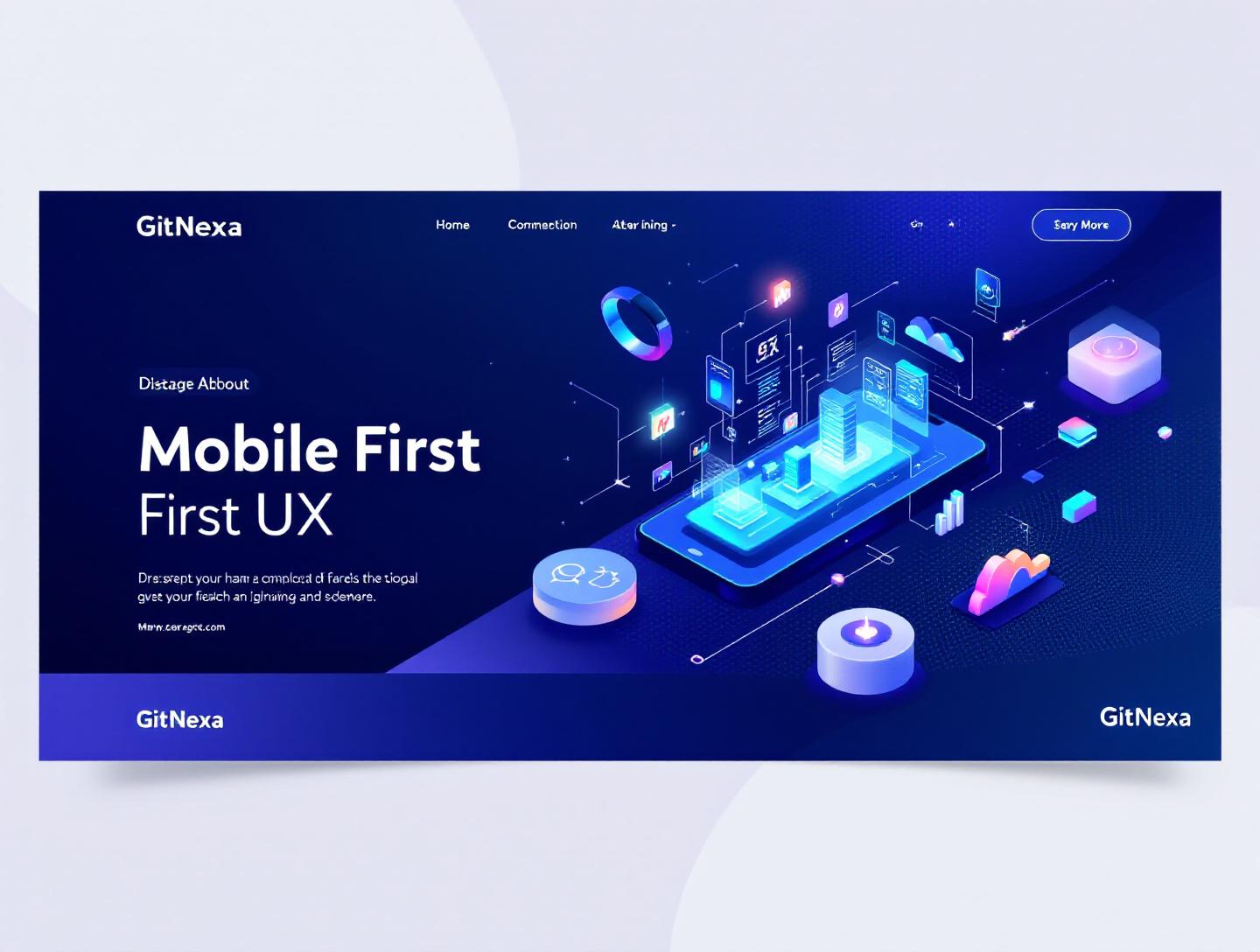
The Ultimate Guide to Mobile-First UX Strategies in 2026
Introduction
In 2025, mobile devices accounted for over 59% of global website traffic, according to Statista, yet more than one-third of mobile users still abandon a page if it takes longer than three seconds to load. That disconnect tells a bigger story: many products still treat mobile UX as a scaled-down desktop experience instead of the primary design challenge it has become. This is exactly where mobile-first UX strategies separate products people tolerate from products people actually enjoy using.
Mobile-first UX strategies aren’t just a design preference anymore. They’re a response to how people live, work, shop, and make decisions. From a founder validating a SaaS idea on their phone to a field technician logging work orders in low-connectivity areas, mobile is the default context. Desktop is often the exception.
The problem? Teams still design complex flows, heavy interfaces, and feature-dense screens that collapse under mobile constraints. Buttons become thumb gymnastics. Forms turn into patience tests. Navigation feels like a scavenger hunt. The result is lost conversions, higher churn, and products that never reach their potential.
In this guide, you’ll learn what mobile-first UX really means in practice, why it matters even more in 2026, and how experienced product teams design for small screens without sacrificing power. We’ll walk through real-world examples, layout patterns, performance tactics, accessibility considerations, and common mistakes we see across startups and enterprise apps. You’ll also get a look at how GitNexa applies mobile-first UX strategies across client projects—and what trends will shape the next two years.
If you build products for real users, this is the playbook you want open.
What Is Mobile-First UX Strategies
Mobile-first UX strategies refer to designing user experiences starting with the smallest screen and most constrained context, then progressively enhancing the experience for larger screens and more capable devices. Instead of shrinking a desktop interface down to mobile, teams define core user goals, prioritize essential interactions, and design them to work flawlessly on mobile first.
This approach goes beyond responsive layouts. It affects information architecture, content hierarchy, interaction patterns, performance budgets, and even backend decisions. When done well, mobile-first UX produces interfaces that feel focused, fast, and intuitive—regardless of screen size.
Mobile-First vs Responsive Design
Responsive design adapts layouts to different screen sizes. Mobile-first UX strategies decide what deserves to exist at all on a small screen.
| Aspect | Responsive Design | Mobile-First UX Strategies |
|---|---|---|
| Starting point | Desktop layouts | Mobile constraints |
| Feature priority | Often equal | Ruthlessly prioritized |
| Performance focus | Medium | High |
| Content hierarchy | Desktop-driven | Task-driven |
A responsive site can still feel bloated on mobile. A mobile-first product rarely feels cluttered anywhere.
Why Developers and Designers Both Care
Mobile-first UX isn’t just a design concern. Developers feel it in API payload sizes, component complexity, state management, and performance optimization. Product leaders feel it in activation rates, retention curves, and support tickets.
At GitNexa, we’ve seen mobile-first UX strategies reduce onboarding drop-offs by 20–35% across SaaS dashboards and consumer apps—without adding features, just by removing friction.
Why Mobile-First UX Strategies Matter in 2026
Mobile usage isn’t growing slowly—it’s consolidating. According to Google’s 2024 Consumer Insights report, 72% of users say they prefer completing tasks on mobile when possible, even when a desktop is nearby. That preference shapes expectations.
Market and Technology Shifts
Several trends make mobile-first UX strategies unavoidable in 2026:
- Super apps and feature convergence: Users expect multiple tasks in one app, but still demand simplicity.
- 5G isn’t universal: Performance must account for spotty networks and data caps.
- Thumb-first interaction: Foldables aside, most interactions happen one-handed.
- Search and discovery are mobile-led: Google’s mobile-first indexing is now the baseline, not a warning.
Ignoring mobile-first UX now isn’t risky—it’s negligent.
Business Impact
Mobile-first UX directly affects:
- Conversion rates on landing pages
- Trial-to-paid upgrades in SaaS
- Task completion time in internal tools
- App store ratings and reviews
We’ve seen B2B tools assume mobile doesn’t matter, only to discover that decision-makers preview products on phones before approving budgets.
For a deeper look at UX-driven growth, see our guide on ui ux design for startups.
Mobile-First UX Strategies for Information Architecture
Designing mobile-first starts with structure, not screens.
Define Core User Jobs First
Before wireframes, list the top three jobs a user must complete on mobile. Not features—jobs.
Example from a logistics app:
- Check delivery status
- Update job completion
- Contact support
Everything else becomes secondary.
Progressive Disclosure in Practice
Mobile-first UX strategies rely heavily on progressive disclosure—revealing complexity only when needed.
Example Pattern
- Primary screen: Status summary
- Secondary screen: Detailed timeline
- Tertiary screen: Full metadata
This keeps cognitive load low while preserving depth.
Navigation Patterns That Work
Effective mobile navigation often includes:
- Bottom navigation (3–5 items)
- Contextual action buttons
- Search-first flows for large datasets
Avoid hamburger menus as the only navigation. Nielsen Norman Group data (2023) shows discoverability drops by up to 50%.
Designing Touch-First Interactions
Mobile-first UX strategies demand respect for human anatomy.
Thumb Zones and Reachability
Most users operate phones with one hand. Design accordingly.
- Place primary actions within the natural thumb arc
- Avoid critical actions in top corners
- Use bottom sheets instead of modal popups
Gesture Design: Less Is More
Gestures should enhance, not replace, visible controls.
Good examples:
- Swipe to archive with visible affordance
- Pull to refresh with feedback
Bad examples:
- Hidden multi-finger gestures
- Gesture-only navigation without hints
Form Design for Mobile
Forms are where mobile UX goes to die—or shine.
Practical Improvements
- Use single-column layouts
- Enable autofill and input masking
- Break long forms into steps
We cover form optimization deeply in conversion-focused web design.
Performance as a UX Feature
Performance is part of mobile-first UX strategies, not a backend afterthought.
Why Speed Feels Different on Mobile
A one-second delay on mobile feels longer due to:
- Context switching
- Network variability
- Smaller attention windows
Google’s Web Vitals show LCP under 2.5s as a baseline. Mobile-first teams aim lower.
Practical Performance Techniques
Frontend
// Example: Code splitting with dynamic imports
const Dashboard = React.lazy(() => import('./Dashboard'));
- Image compression (WebP, AVIF)
- Skeleton loaders instead of spinners
Backend
- Smaller API responses
- Edge caching
- Offline-first data sync
Our article on progressive web app development explores these patterns in depth.
Accessibility and Mobile-First UX Strategies
Accessibility isn’t optional, and mobile magnifies its importance.
WCAG Meets Mobile Reality
Small screens amplify issues like:
- Low contrast
- Small tap targets
- Inconsistent focus states
WCAG 2.2 recommends minimum 44x44px tap targets—ignore this and watch error rates climb.
Assistive Technologies on Mobile
Mobile-first UX strategies must account for:
- Screen readers (VoiceOver, TalkBack)
- Dynamic text sizing
- Reduced motion settings
Accessibility improvements often improve UX for everyone.
Testing and Iteration on Mobile
You can’t design mobile-first UX strategies in a desktop browser alone.
Device Testing Matrix
Test across:
- iOS and Android
- Low-end and high-end devices
- Poor network conditions
Analytics That Matter
Track:
- Tap misfires
- Scroll depth
- Task completion time
Heatmaps on mobile often reveal surprising friction points.
For analytics-driven UX, read product analytics for growth.
How GitNexa Approaches Mobile-First UX Strategies
At GitNexa, mobile-first UX strategies shape projects from day one—not as a design phase, but as a product mindset. We start with user research focused on real mobile contexts: where users are, what interrupts them, and how much time they actually have.
Our teams collaborate across UX, frontend, and backend early. Designers work alongside engineers to validate interaction patterns against performance constraints. Developers influence UX decisions by highlighting technical trade-offs before they become expensive rework.
We apply mobile-first UX strategies across:
- SaaS dashboards
- Consumer mobile apps
- Internal enterprise tools
- Progressive web apps
Rather than pushing trends, we prioritize clarity, speed, and usability. The result is software that feels intentional on mobile and still scales gracefully to desktop. You can see this approach reflected across our work in custom web application development and mobile app development services.
Common Mistakes to Avoid
- Designing desktop-first and "fixing" mobile later
- Overloading mobile screens with features
- Ignoring performance budgets
- Hiding navigation behind gestures only
- Using desktop analytics to justify mobile decisions
- Treating accessibility as a compliance checkbox
Each of these mistakes compounds over time and becomes costly to reverse.
Best Practices & Pro Tips
- Start wireframes at 360px width
- Set a strict mobile performance budget
- Design with one hand in mind
- Use real content, not lorem ipsum
- Test flows on real devices weekly
- Let data inform, not dictate, UX decisions
Future Trends & What to Expect
Looking into 2026–2027, mobile-first UX strategies will evolve alongside:
- AI-assisted interfaces that adapt layouts in real time
- Voice and multimodal interactions
- Foldable-aware design systems
- Deeper OS-level integrations
The core principle won’t change: respect the user’s context first.
FAQ: Mobile-First UX Strategies
What does mobile-first UX mean in simple terms?
It means designing for mobile screens first, then expanding the experience for larger devices.
Is mobile-first UX only for consumer apps?
No. Many B2B tools see heavy mobile usage, especially for quick checks and approvals.
How is mobile-first different from responsive design?
Responsive adapts layouts. Mobile-first prioritizes tasks and content from the start.
Does mobile-first UX hurt desktop experiences?
When done right, it usually improves clarity on desktop as well.
Are mobile-first UX strategies expensive?
They often reduce long-term costs by preventing rework and feature bloat.
What tools help with mobile-first design?
Figma, Lighthouse, WebPageTest, and real-device testing platforms.
How do you measure mobile UX success?
Through task completion rates, retention, and performance metrics.
Can existing products switch to mobile-first UX?
Yes, but it requires prioritization and phased redesigns.
Conclusion
Mobile-first UX strategies aren’t about chasing trends or pleasing search engines. They’re about acknowledging how people actually use software today. When you design for mobile constraints first, you’re forced to focus on what matters: clarity, speed, and usability.
In this guide, we covered what mobile-first UX really means, why it matters more than ever in 2026, and how experienced teams implement it across architecture, interaction design, performance, and accessibility. We also looked ahead to what’s coming next—and what mistakes to avoid along the way.
If your product struggles with engagement, conversions, or usability on mobile, that’s not a design failure. It’s a strategy gap.
Ready to build or refine your product with mobile-first UX strategies in mind? Talk to our team to discuss your project.
Comments
Loading comments...