Sub Category
Latest Blogs
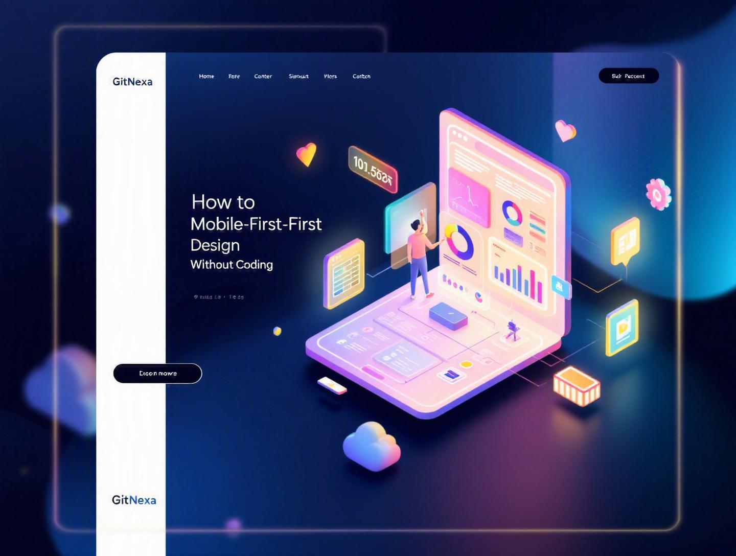
The Ultimate Guide to Mobile-First Design Without Coding
Introduction
In 2025, over 63% of global web traffic comes from mobile devices, according to Statista. Yet thousands of websites and web apps are still designed on large desktop screens first—and then awkwardly squeezed onto phones. The result? Slow load times, cramped interfaces, frustrated users, and lost revenue.
Mobile-first design without coding flips that script. Instead of starting with a 1440px desktop canvas, you begin with the smallest screen and build up. And here’s the surprising part: you don’t need to write a single line of HTML, CSS, or JavaScript to do it well.
Thanks to powerful no-code and low-code tools like Webflow, Figma, Framer, Wix Studio, Bubble, and Glide, founders, marketers, product managers, and even non-technical teams can create responsive, performance-focused digital experiences. The challenge isn’t access to tools. It’s knowing how to think mobile-first—structuring content, prioritizing user flows, and designing layouts that scale elegantly.
In this guide, you’ll learn exactly how to approach mobile-first design without coding. We’ll cover principles, step-by-step workflows, real-world examples, tool comparisons, common mistakes, and future trends. Whether you’re launching a startup MVP, redesigning a corporate website, or validating a SaaS idea, this guide will give you a practical roadmap.
Let’s start with the basics.
What Is Mobile-First Design Without Coding?
Mobile-first design without coding is the process of designing and building digital products—websites, web apps, landing pages, or SaaS platforms—starting with mobile screen constraints using no-code or visual development tools.
Traditionally, designers created desktop layouts first and then used CSS media queries to adjust for smaller screens:
@media (max-width: 768px) {
  .container {
    flex-direction: column;
  }
}
Mobile-first reverses that logic:
/* Base styles for mobile */
.container {
  display: flex;
  flex-direction: column;
}

/* Enhance for larger screens */
@media (min-width: 768px) {
  .container {
    flex-direction: row;
  }
}
When you design without coding, tools handle these breakpoints visually. Instead of writing media queries, you:
- Start with the smallest breakpoint (320px–390px).
- Design layout, typography, spacing, and navigation for touch.
- Expand the design progressively for tablet and desktop.
Key Principles of Mobile-First Design
- Content prioritization: Only essential elements appear first.
- Progressive enhancement: Add complexity for larger screens.
- Touch-first interactions: Buttons sized 44px+ (Apple HIG recommendation).
- Performance-first mindset: Optimize images and reduce scripts.
- Accessibility from the start: Contrast ratios, readable font sizes.
Without coding, the difference lies in how you configure layouts visually. Tools like Webflow generate clean HTML/CSS under the hood. Figma helps define responsive constraints. Framer allows interactive responsive components without manual CSS.
Mobile-first design is not about shrinking. It’s about clarity.
Why Mobile-First Design Without Coding Matters in 2026
The digital landscape in 2026 looks different from five years ago.
1. Google’s Mobile-First Indexing
Google officially switched to mobile-first indexing for all websites. That means Google primarily uses the mobile version of content for ranking and indexing. If your mobile experience is weak, your SEO suffers.
See Google’s documentation here: https://developers.google.com/search/docs/crawling-indexing/mobile/mobile-first-indexing
2. Rising Mobile Commerce
According to eMarketer (2025), mobile commerce accounts for over 72% of total eCommerce sales globally. If your checkout flow breaks on mobile, you’re losing revenue.
3. Faster Product Validation Cycles
Startups now validate MVPs in weeks, not months. No-code platforms reduce development time by 40–60% in early-stage projects. Combined with mobile-first thinking, teams can launch testable prototypes quickly.
4. Cost Efficiency for Businesses
Hiring a development team for a basic marketing website can cost $8,000–$25,000. A well-structured no-code approach significantly reduces initial investment while maintaining scalability.
For companies exploring broader digital transformation, mobile-first design pairs well with strategies like custom web application development and UI/UX design best practices.
5. Performance Expectations Are Higher
Google’s Core Web Vitals—LCP, CLS, INP—directly impact rankings and user experience. On mobile networks, performance issues are amplified.
Mobile-first design forces discipline. It trims excess.
Now let’s move into practical implementation.
Step-by-Step Process for Mobile-First Design Without Coding
This is the core workflow we recommend for founders and product teams.
Step 1: Define Primary User Goal
Before opening Figma or Webflow, answer one question:
What is the single most important action on mobile?
Examples:
- SaaS: Start free trial
- E-commerce: Complete checkout
- Local service: Book appointment
- B2B: Request demo
Clarity here prevents clutter later.
Step 2: Create a Mobile Wireframe First
Use Figma, Adobe XD, or Penpot.
Design at:
- 375px width (iPhone baseline)
- 8px spacing system
- 16px base font size minimum
Structure:
- Header
- Hero
- Primary CTA
- Supporting proof
- Secondary CTA
Keep everything vertically stacked.
Step 3: Prioritize Content Hierarchy
Ask yourself:
- Does this section drive conversions?
- Is it necessary on first scroll?
- Can it move to desktop-only enhancement?
Mobile-first design is about subtraction.
Step 4: Build in a No-Code Tool
Here’s a quick comparison:
| Tool | Best For | Learning Curve | Hosting Included |
|---|---|---|---|
| Webflow | Marketing sites, CMS | Medium | Yes |
| Framer | Interactive landing pages | Low-Medium | Yes |
| Bubble | SaaS apps | High | Yes |
| Glide | Data-driven apps | Low | Yes |
| Wix Studio | Business websites | Low | Yes |
Set your base breakpoint first (mobile). Only after completion should you expand to tablet and desktop.
Step 5: Test on Real Devices
Use:
- Chrome DevTools device simulation
- BrowserStack
- Real phones (Android + iOS)
Check:
- Tap targets
- Form usability
- Scroll smoothness
- Load speed
Then iterate.
Designing Layout Systems Without Writing Code
Responsive behavior doesn’t require CSS knowledge—but understanding layout logic helps.
Flexbox and Grid (Conceptually)
Most no-code tools visually represent Flexbox and CSS Grid.
Flexbox mental model:
- Direction (row/column)
- Alignment (start, center, space-between)
- Wrapping
Grid mental model:
- Rows and columns
- Gap spacing
- Auto-fit behavior
Even if you don’t code, knowing these concepts improves design decisions. MDN explains Flexbox fundamentals clearly: https://developer.mozilla.org/en-US/docs/Web/CSS/CSS_flexible_box_layout
Vertical-First Thinking
On mobile:
- Everything stacks
- Avoid multi-column layouts
- Keep sections concise
Then enhance:
- 2-column layout on tablet
- 3–4 columns on desktop
Component-Based Design
Create reusable components:
- Buttons
- Cards
- Navbars
- Feature blocks
In Webflow or Framer, use symbols/components so updates reflect globally.
This approach mirrors modern development frameworks like React or Vue—even if you never touch code.
For deeper architecture alignment, see our guide on modern frontend development frameworks.
Real-World Examples of Mobile-First Without Coding
Let’s look at practical scenarios.
Example 1: SaaS Landing Page (Framer)
A B2B SaaS startup building a CRM tool needed a launch page quickly.
Process:
- Designed mobile hero first.
- Single CTA: "Start Free Trial".
- Reduced navigation to hamburger.
- Used 3 feature cards stacked vertically.
- Expanded to 3-column layout on desktop.
Result:
- 28% higher mobile conversion rate compared to previous desktop-first version.
Example 2: E-commerce MVP (Shopify + Custom Sections)
Even Shopify supports mobile-first customization.
Strategy:
- Large product images
- Sticky "Add to Cart"
- Simplified checkout
Outcome:
- Reduced cart abandonment by 17%.
Example 3: Service-Based Business (Webflow)
A law firm redesigned their site focusing on:
- Call button above the fold
- Simplified menu
- FAQ accordion
Organic traffic improved due to better Core Web Vitals.
These improvements align with broader optimization efforts like technical SEO for web applications.
Performance Optimization in No-Code Mobile-First Projects
Mobile users abandon pages that load longer than 3 seconds (Google research).
Key Areas to Optimize
1. Image Compression
Use:
- WebP format
- TinyPNG
- Built-in optimization tools
2. Font Limitation
Use max:
- 2 font families
- 4 weights
3. Reduce Animations
Heavy Lottie files can slow mobile performance.
4. Lazy Loading
Most platforms enable automatic lazy loading.
Performance Checklist
- LCP under 2.5 seconds
- CLS under 0.1
- INP under 200ms
Test via:
- Google PageSpeed Insights
- Lighthouse
For infrastructure-heavy platforms, consider scalable backend architecture as explained in our cloud-native application guide.
How GitNexa Approaches Mobile-First Design Without Coding
At GitNexa, we treat mobile-first design without coding as a strategic starting point—not a limitation.
For early-stage startups, we often begin with rapid no-code prototyping using Webflow or Bubble to validate assumptions. This reduces time-to-market while ensuring the product is aligned with real user behavior.
Once validated, we transition seamlessly into scalable development stacks—React, Next.js, Node.js, or cloud-native architectures—when needed. Our UI/UX team designs mobile-first systems in Figma before any build phase begins.
We’ve seen companies cut launch timelines by 35% using this hybrid approach: prototype fast, validate on mobile, scale with engineering.
If you’re exploring product validation or redesign, our experience across mobile app development and enterprise web solutions ensures your foundation is solid.
Common Mistakes to Avoid
- Designing desktop first and "shrinking" later.
- Overloading mobile navigation with 10+ menu items.
- Using tiny tap targets (<40px).
- Ignoring performance testing.
- Adding too many animations.
- Forgetting accessibility (contrast, font size).
- Skipping real device testing.
Each mistake increases friction—and friction kills conversions.
Best Practices & Pro Tips
- Start with grayscale wireframes before adding visuals.
- Use a consistent spacing system (8px or 4px grid).
- Keep primary CTA visible above the fold.
- Limit text blocks to 3–4 lines per paragraph.
- Use sticky CTAs for conversion pages.
- Test with 5 real users before launch.
- Track behavior using Hotjar or Microsoft Clarity.
- Optimize images before upload.
- Design for thumb zones.
- Document your design system.
Future Trends & What to Expect (2026–2027)
AI-Assisted Layout Generation
Tools like Framer AI and Wix AI already generate responsive layouts instantly. Expect smarter personalization.
Voice and Gesture Interfaces
Mobile-first will expand beyond touch.
Progressive Web Apps (PWAs)
PWAs combine web and native capabilities.
Performance as Ranking Signal Expansion
Google will likely tighten Core Web Vitals thresholds.
No-Code + Dev Collaboration
Hybrid workflows will dominate: no-code for speed, custom development for scale.
FAQ: Mobile-First Design Without Coding
What is mobile-first design without coding?
It’s designing websites or apps starting with mobile layouts using visual tools instead of writing code.
Do I need technical knowledge?
Basic understanding of layout concepts helps, but coding isn’t required.
Is no-code scalable?
For MVPs and marketing sites, yes. Complex platforms may require custom development later.
Which tool is best for beginners?
Wix Studio and Framer are beginner-friendly.
Can mobile-first improve SEO?
Yes. Google uses mobile-first indexing for rankings.
How long does it take to build a mobile-first site?
A landing page can take 1–3 weeks depending on complexity.
Is mobile-first only for websites?
No. It applies to web apps and SaaS platforms.
What screen size should I design for first?
Start around 375px width.
How do I test responsiveness?
Use device simulators and real devices.
Can I migrate from no-code to custom development later?
Yes. Many startups begin with no-code and scale into full-stack solutions.
Conclusion
Mobile-first design without coding isn’t a shortcut. It’s a discipline. By starting with constraints, you clarify your message, improve performance, and create user-focused experiences that convert.
With the right tools, structured workflow, and strategic thinking, you can design powerful mobile-first experiences—without writing code.
Ready to build your mobile-first product? Talk to our team to discuss your project.
Comments
Loading comments...