Sub Category
Latest Blogs
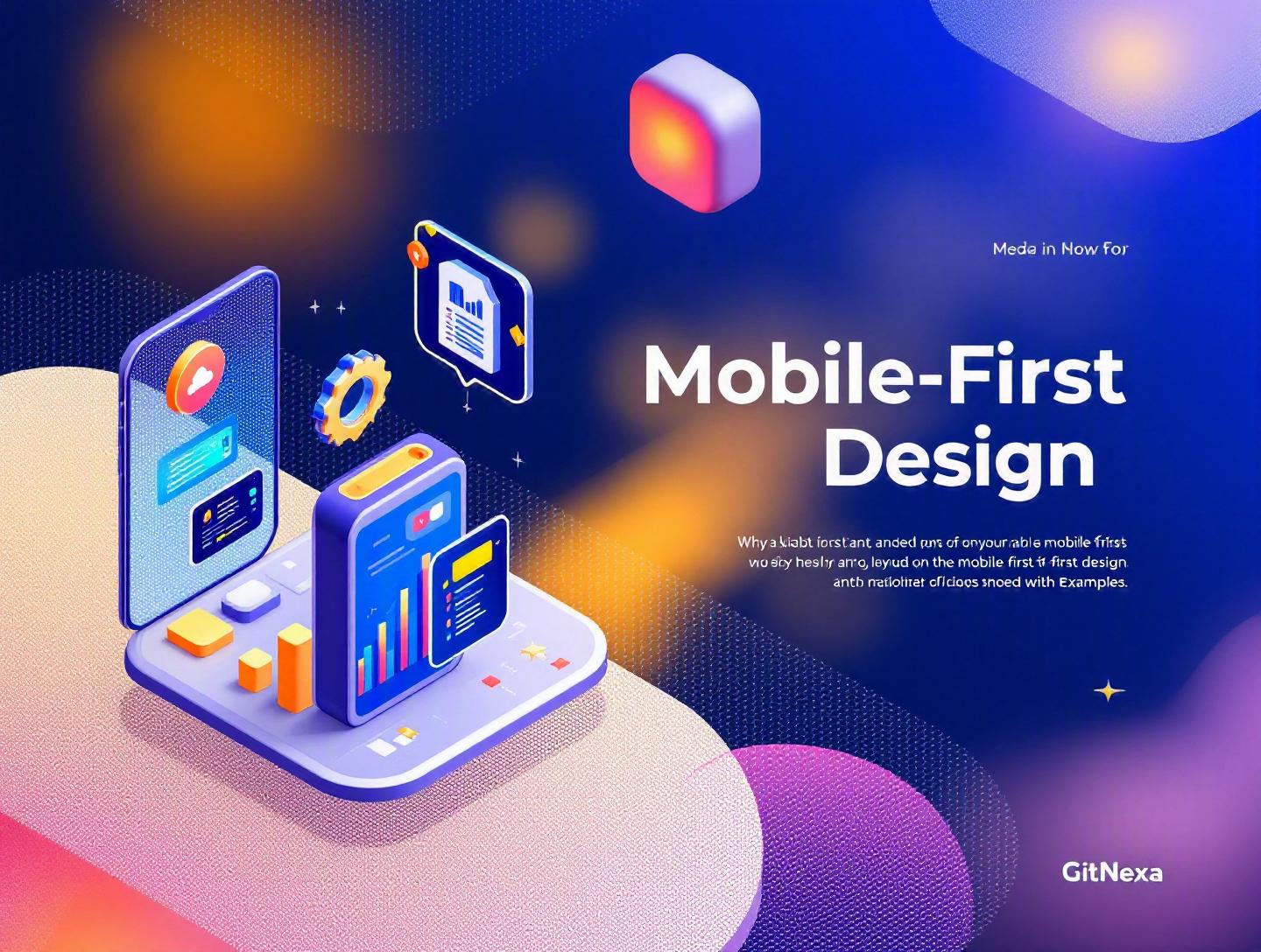
The Ultimate Guide to Mobile-First Design with Examples
Introduction
In 2025, mobile devices accounted for over 59% of global website traffic, according to Statista. In some industries—like eCommerce and social media—that number crosses 70%. Yet many companies still design for desktop first and then "shrink" their interfaces for smaller screens. That approach no longer works.
Mobile-first design is not just a UI trend. It is a product strategy that starts with the smallest screen and builds upward. When done right, it forces clarity, performance discipline, and user-centric thinking. When ignored, it leads to bloated interfaces, slow load times, and frustrated users.
In this comprehensive guide, we will break down what mobile-first design really means, why it matters in 2026, real-world examples from companies that got it right, implementation techniques with code snippets, architectural considerations, common mistakes, and what the future holds. If you are a developer, CTO, product owner, or startup founder, this guide will help you make smarter design and development decisions.
What Is Mobile-First Design?
Mobile-first design is a product design and development approach where you start designing for the smallest screen (typically smartphones) before progressively enhancing the experience for tablets and desktops.
Coined by Luke Wroblewski in 2009, the concept challenged traditional desktop-first workflows. Instead of removing features for mobile, you prioritize core functionality from the start.
Core Principles of Mobile-First Design
1. Content Prioritization
You identify the most important user actions and content. Everything else becomes secondary.
2. Progressive Enhancement
You begin with a minimal, functional baseline and add enhancements for larger screens.
Example CSS structure:
/* Base styles for mobile */
body {
  font-family: system-ui, sans-serif;
  margin: 0;
}

.container {
  padding: 16px;
}

/* Enhancements for larger screens */
@media (min-width: 768px) {
  .container {
    max-width: 720px;
    margin: 0 auto;
  }
}
3. Performance-First Thinking
Mobile networks are often slower. A mobile-first strategy naturally aligns with performance optimization techniques like lazy loading, code splitting, and image compression.
Google’s Core Web Vitals framework (see https://web.dev/vitals/) directly ties performance to search rankings. Mobile-first design supports better LCP, CLS, and INP metrics.
Why Mobile-First Design Matters in 2026
Google has fully adopted mobile-first indexing. That means Google predominantly uses the mobile version of content for indexing and ranking. If your mobile experience is weak, your SEO performance suffers.
Market Shifts
- 5G expansion has increased mobile engagement time by 20% year-over-year (GSMA, 2025).
- Mobile commerce is projected to reach $4.5 trillion globally by 2026.
- Over 60% of B2B buyers research vendors on mobile before switching to desktop.
User Behavior Has Changed
Users expect:
- Instant load times
- Thumb-friendly navigation
- Minimal typing
- Clear CTAs
A cluttered desktop-style interface scaled down to mobile simply cannot deliver that.
Real-World Examples of Mobile-First Design
1. Airbnb
Airbnb redesigned its search experience with mobile as the primary touchpoint. Key changes included:
- Sticky bottom navigation
- Large tap targets
- Minimalist filters
- Card-based layout
Result: Increased booking conversions on mobile devices and improved engagement time.
2. Spotify
Spotify’s mobile UI emphasizes:
- Large album art
- Clear playback controls
- Bottom navigation bar
Desktop versions expand functionality without overwhelming users. The mobile core remains intact.
3. Shopify Stores
Many high-performing Shopify themes are mobile-first. They:
- Prioritize product images
- Use collapsible menus
- Simplify checkout forms
Comparison:
| Approach | Desktop-First | Mobile-First |
|---|---|---|
| Content Strategy | Feature-heavy | Essential-first |
| Performance | Often heavy | Optimized |
| SEO | Risky with mobile indexing | Aligned with Google |
| UX | Shrunk desktop UI | Native mobile thinking |
How to Implement Mobile-First Design
Step 1: Define Core User Actions
Ask: What is the ONE primary action?
- Buy a product
- Book a call
- Submit a form
Everything else supports that action.
Step 2: Design Low-Fidelity Mobile Wireframes
Use tools like:
- Figma
- Adobe XD
- Sketch
Start with a 375px width artboard.
Step 3: Build with Progressive Enhancement
Structure your HTML semantically:
<main>
  <section class="hero">
    <h1>Product Name</h1>
    <button>Get Started</button>
  </section>
</main>
Add enhancements only after mobile layout is stable.
Step 4: Optimize Performance
Techniques:
- Image compression (WebP/AVIF)
- Lazy loading (
loading="lazy") - Code splitting with Next.js or Vite
- CDN usage
Learn more about performance optimization in our guide on modern web development best practices.
Mobile-First Architecture Considerations
Mobile-first is not only visual—it impacts backend and DevOps decisions.
API-Driven Architecture
Mobile interfaces benefit from headless architectures:
- Frontend: React, Vue, or Flutter
- Backend: Node.js, Django, or Spring Boot
- API: REST or GraphQL
GraphQL example:
query GetProduct {
  product(id: "123") {
    name
    price
    image
  }
}
This ensures mobile apps fetch only required data.
For scalable deployments, explore cloud-native application development.
How GitNexa Approaches Mobile-First Design
At GitNexa, mobile-first design is embedded in our UI/UX and development workflow. Every project begins with user journey mapping for mobile personas. We design wireframes at 375px before expanding to tablet and desktop breakpoints.
Our frontend teams use React, Next.js, and Tailwind CSS for responsive performance-focused builds. Backend systems are API-first to support both web and mobile apps. We also integrate DevOps pipelines to ensure Lighthouse performance scores above 90 before launch.
You can explore related insights in our article on UI/UX design strategies for startups and DevOps best practices.
Common Mistakes to Avoid
- Designing desktop mockups first.
- Hiding content instead of prioritizing it.
- Ignoring touch target size (minimum 48px recommended by Google).
- Overloading mobile with popups.
- Not testing on real devices.
- Ignoring performance budgets.
- Using heavy animations that hurt battery life.
Best Practices & Pro Tips
- Start with content hierarchy.
- Use a single-column layout for clarity.
- Keep navigation within thumb reach.
- Minimize form fields.
- Use system fonts for faster rendering.
- Test with Lighthouse and PageSpeed Insights.
- Implement accessibility standards (WCAG 2.2).
For accessibility insights, refer to MDN documentation: https://developer.mozilla.org/.
Future Trends & What to Expect (2026-2027)
- AI-personalized mobile interfaces.
- Voice-first micro interactions.
- Foldable device design standards.
- Progressive Web Apps (PWAs) replacing lightweight native apps.
- Edge computing for faster mobile APIs.
Mobile-first will evolve into mobile-primary ecosystems where desktop becomes secondary in many industries.
FAQ: Mobile-First Design
1. What is the difference between responsive and mobile-first design?
Responsive design adapts layouts to different screens. Mobile-first is a strategy where you design for mobile first and enhance for larger screens.
2. Does mobile-first improve SEO?
Yes. Google uses mobile-first indexing, meaning rankings depend heavily on your mobile version.
3. Is mobile-first suitable for B2B platforms?
Absolutely. Over half of B2B research starts on mobile devices.
4. What frameworks support mobile-first design?
Tailwind CSS, Bootstrap 5, and Material UI all encourage mobile-first breakpoints.
5. How do I test mobile performance?
Use Lighthouse, PageSpeed Insights, and real device testing.
6. What screen width should I design for first?
Start with 375px width for modern smartphones.
7. Is mobile-first more expensive?
Not necessarily. It often reduces rework and improves performance efficiency.
8. Can mobile-first work with legacy systems?
Yes, especially with API-first refactoring strategies.
Conclusion
Mobile-first design is no longer optional. It influences SEO rankings, conversion rates, performance metrics, and long-term product scalability. By starting with the smallest screen, you force clarity, prioritize what truly matters, and build better digital products.
Whether you are building an eCommerce store, SaaS platform, or enterprise dashboard, mobile-first design ensures your product meets modern user expectations.
Ready to build a high-performing mobile-first product? Talk to our team to discuss your project.
Comments
Loading comments...