Sub Category
Latest Blogs
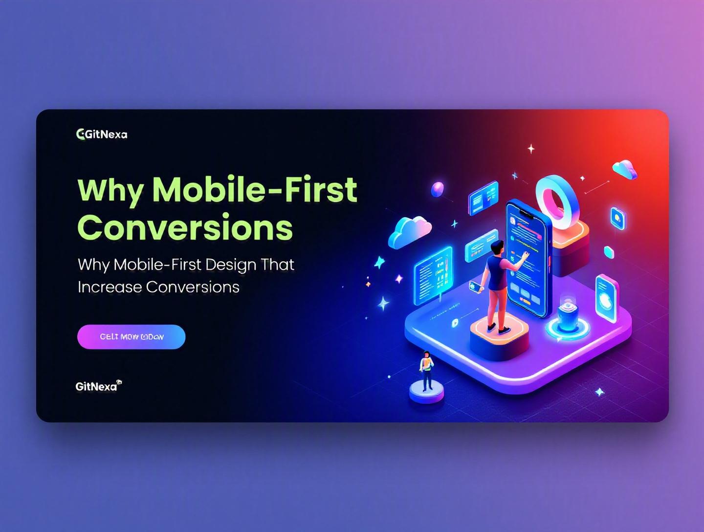
The Ultimate Guide to Mobile-First Design That Increase Conversions
Introduction
In 2025, mobile devices generated over 58% of global website traffic, according to Statista. In some industries—food delivery, ride-sharing, social commerce—that number exceeds 75%. Yet most websites are still designed desktop-first and then "shrunk" to fit smaller screens. The result? Slower load times, cluttered layouts, frustrating checkout flows, and abandoned carts.
Mobile-first design that increase conversions is no longer a design preference. It’s a business strategy. When your primary users browse, compare, and buy on smartphones, every tap, scroll, and form field becomes a conversion trigger—or a conversion killer.
The challenge is simple: attention spans are shorter, screens are smaller, and expectations are higher. Users expect instant loading, thumb-friendly navigation, biometric authentication, and frictionless payments. If they don’t get it, they leave.
In this guide, we’ll unpack what mobile-first design really means, why it matters even more in 2026, and how it directly impacts conversion rate optimization (CRO). You’ll see real examples, technical implementation patterns, UI/UX frameworks, performance benchmarks, and actionable steps. We’ll also cover common mistakes, future trends, and how GitNexa approaches mobile-first product development.
If you’re a founder, CTO, product manager, or growth leader, this isn’t just about design. It’s about revenue.
What Is Mobile-First Design That Increase Conversions?
Mobile-first design is a product strategy where teams design for the smallest screen first—typically smartphones—and progressively enhance the experience for larger screens like tablets and desktops.
Instead of starting with a wide desktop layout and removing elements, you start with constraints:
- Limited screen real estate
- Touch-based interactions
- Variable network conditions
- Single-column layouts
- Performance-critical rendering
Then you build upward.
The Core Principles
1. Progressive Enhancement
You design the core experience for mobile and add enhancements for larger screens.
/* Base styles (mobile-first) */
.container {
  padding: 16px;
}

/* Tablet and above */
@media (min-width: 768px) {
  .container {
    padding: 32px;
  }
}

/* Desktop */
@media (min-width: 1200px) {
  .container {
    max-width: 1140px;
    margin: 0 auto;
  }
}
This ensures performance and clarity on mobile before layering complexity.
2. Content Prioritization
Mobile-first forces ruthless prioritization. What does the user actually need to see first?
For an eCommerce product page:
- Product image
- Price
- Key benefit
- CTA (Buy Now / Add to Cart)
- Reviews
Not: sidebar banners, multi-column comparison tables, or promotional clutter.
3. Touch-Centric Interaction
Buttons must be at least 44x44px (Apple Human Interface Guidelines). Thumb zones matter. Navigation must account for one-handed usage.
How It Directly Impacts Conversions
Mobile-first design that increase conversions works because it:
- Reduces friction
- Speeds up load time
- Improves clarity
- Simplifies decision-making
- Aligns with real user behavior
It aligns UX with CRO. That’s where the real power lies.
Why Mobile-First Design That Increase Conversions Matters in 2026
Let’s look at where we are right now.
- Google uses mobile-first indexing by default (since 2019) — meaning your mobile version determines SEO rankings.
- According to Google, a 1-second delay in mobile load time can reduce conversions by up to 20%.
- Gartner predicted that by 2025, 70% of customer interactions would involve mobile devices.
And now in 2026, we’re seeing three major shifts.
1. Mobile Commerce (mCommerce) Is Dominant
eMarketer reported that mobile commerce accounted for over 43% of total US eCommerce sales in 2024. That number continues to climb globally.
If your checkout isn’t optimized for Apple Pay, Google Pay, autofill, and biometric authentication, you’re bleeding revenue.
2. 5G Raised Expectations
Faster networks didn’t reduce the need for performance optimization. They increased expectations. Users now expect instant rendering.
Core Web Vitals—LCP, CLS, INP—directly affect rankings and user trust. You can review Google’s guidelines here: https://web.dev/vitals/
3. AI-Driven Personalization Happens on Mobile
Recommendation engines, dynamic pricing, and real-time notifications are consumed primarily on smartphones.
Mobile-first design that increase conversions isn’t optional in 2026. It’s table stakes.
The Psychology Behind Mobile-First Conversions
Design isn’t just layout. It’s behavioral science.
Smaller Screens, Faster Decisions
On mobile, cognitive load increases quickly. There’s less visual space to process information. That means:
- Fewer options → higher clarity
- Clear CTA → faster action
- Short forms → lower abandonment
Amazon’s mobile app is a masterclass here. The “Buy Now” button is persistent. Minimal distractions. Reviews are scrollable, not overwhelming.
Thumb Zones & Fitts’s Law
Fitts’s Law states that the time to acquire a target is a function of distance and size.
Implication: Critical CTAs must sit within the natural thumb zone.
[ Top of screen ]  -> Hard to reach
[ Middle zone ]    -> Comfortable
[ Bottom zone ]    -> Easiest
That’s why many high-converting apps place primary CTAs near the bottom.
Micro-Interactions Increase Trust
Small animations—button feedback, loading indicators, validation messages—reduce uncertainty.
Example:
- Immediate form validation
- Visual confirmation on payment
- Subtle haptic feedback
Trust drives conversions.
Performance Optimization: The Conversion Multiplier
Speed is revenue.
Real Numbers
- Pinterest reduced perceived wait time by 40% and increased sign-ups by 15%.
- AliExpress improved load time by 36% and saw a 10.5% increase in orders.
Mobile-First Performance Checklist
1. Optimize Images
Use WebP or AVIF formats.
<picture>
  <source srcset="image.avif" type="image/avif">
  <source srcset="image.webp" type="image/webp">
  <img src="image.jpg" alt="Product image">
</picture>
2. Lazy Loading
<img src="product.jpg" loading="lazy" alt="Product">
3. Minimize JavaScript
Heavy bundles slow Time to Interactive (TTI). Consider:
- Code splitting
- Tree shaking
- Dynamic imports
4. Use a CDN
Cloudflare, AWS CloudFront, or Fastly reduce latency.
For deeper cloud optimization strategies, see our guide on cloud architecture best practices.
Performance vs Conversion Table
| Load Time | Bounce Rate | Conversion Impact |
|---|---|---|
| 1 second | Low | High |
| 3 seconds | +32% | Significant drop |
| 5 seconds | +90% | Severe loss |
(Source: Google research)
Mobile-first design that increase conversions always starts with performance.
Designing High-Converting Mobile User Flows
A beautiful UI means nothing if the flow is broken.
Step-by-Step Mobile Conversion Flow
Let’s take an eCommerce checkout.
Step 1: Simplify Product Discovery
- Smart search with autocomplete
- AI recommendations
- Filters optimized for mobile
If you’re building AI-driven product systems, explore our insights on AI in eCommerce platforms.
Step 2: Frictionless Add-to-Cart
- Sticky CTA
- Clear price display
- Visible shipping estimate
Step 3: Guest Checkout Option
Forced account creation kills conversions.
Step 4: Autofill & Digital Wallets
Use:
- Apple Pay
- Google Pay
- Stripe Payment Element
Stripe documentation: https://stripe.com/docs
Step 5: Minimal Form Fields
Ask only what’s essential.
| Field | Required? |
|---|---|
| Name | Yes |
| Yes | |
| Phone | Optional |
| Company | No (B2C) |
One-Page vs Multi-Step Checkout
| Approach | Pros | Cons |
|---|---|---|
| One-page | Faster perception | Can feel long |
| Multi-step | Clear progress | Extra taps |
In mobile-first design that increase conversions, multi-step with progress indicators often wins.
Responsive vs Mobile-First: Critical Differences
Many teams confuse the two.
Responsive Design
Start desktop → adapt downward.
Mobile-First Design
Start mobile → enhance upward.
| Factor | Responsive | Mobile-First |
|---|---|---|
| Performance | Often heavy | Optimized early |
| Content priority | Desktop-driven | User-driven |
| Conversion focus | Secondary | Primary |
If you’re modernizing legacy systems, our article on modern web application development explains migration strategies.
Mobile-first design that increase conversions forces discipline. Responsive alone doesn’t guarantee it.
How GitNexa Approaches Mobile-First Design That Increase Conversions
At GitNexa, we treat mobile-first design as a product growth discipline, not just a UI decision.
Our approach includes:
- Mobile behavior analytics (Hotjar, GA4, Mixpanel)
- CRO audits focused on mobile funnels
- Performance benchmarking against Core Web Vitals
- Thumb-zone wireframing in Figma
- Frontend frameworks like Next.js, React Native, or Flutter for optimized delivery
- DevOps pipelines for continuous performance monitoring
Our UI/UX specialists work closely with backend and DevOps engineers to ensure performance aligns with conversion goals. If you’re exploring UX improvements, read our breakdown of UI/UX design process for startups.
We don’t just make screens responsive. We engineer measurable conversion lifts.
Common Mistakes to Avoid
-
Designing Desktop First and “Fixing” Mobile Later
This leads to bloated layouts and hidden CTAs. -
Ignoring Page Speed
Heavy animations and large images kill mobile conversions. -
Overloading Navigation
Too many menu options overwhelm users. -
Tiny Tap Targets
Frustrating UX leads to drop-offs. -
Long Forms Without Autofill
Every extra field reduces completion rates. -
Not Testing on Real Devices
Emulators don’t replicate real-world performance. -
Ignoring Accessibility
WCAG compliance improves usability for everyone.
Best Practices & Pro Tips
- Design in grayscale first to prioritize hierarchy.
- Place primary CTAs in the lower-middle thumb zone.
- Use sticky navigation strategically.
- Keep hero sections under 600px height on mobile.
- Compress images below 200KB when possible.
- Implement skeleton screens instead of spinners.
- Use A/B testing tools like VWO or Optimizely.
- Monitor mobile funnels weekly.
- Implement server-side rendering (SSR) for SEO.
- Continuously test Core Web Vitals.
For performance automation strategies, see DevOps for scalable web apps.
Future Trends & What to Expect (2026–2027)
1. AI-Generated Adaptive Interfaces
Layouts that adjust dynamically based on user behavior.
2. Voice + Touch Hybrid UX
Mobile interfaces integrating conversational UI.
3. Biometric-First Authentication
Face ID and fingerprint as default checkout verification.
4. Progressive Web Apps (PWAs)
PWAs continue bridging web and native experiences. MDN documentation: https://developer.mozilla.org/en-US/docs/Web/Progressive_web_apps
5. Zero-UI Micro-Transactions
One-tap checkout embedded in messaging platforms.
Mobile-first design that increase conversions will become increasingly predictive and personalized.
FAQ: Mobile-First Design That Increase Conversions
1. What is mobile-first design in simple terms?
It means designing for smartphones first, then adapting the design for larger screens.
2. Does mobile-first improve SEO?
Yes. Google uses mobile-first indexing, meaning rankings depend on mobile performance.
3. Is responsive design enough?
Not always. Responsive adapts layouts, but mobile-first prioritizes performance and conversion strategy.
4. How does page speed affect mobile conversions?
Even a one-second delay can significantly reduce conversions and increase bounce rate.
5. What tools help test mobile UX?
Google Lighthouse, PageSpeed Insights, Hotjar, and BrowserStack.
6. Should I build a native app instead?
It depends on user frequency and engagement. PWAs often work well for startups.
7. What is the ideal mobile load time?
Under 2 seconds for optimal conversion performance.
8. How many form fields are ideal on mobile?
As few as possible—ideally under five for lead generation.
9. How do I measure mobile conversion rate?
Use GA4 or Mixpanel to segment by device category.
10. Can mobile-first work for B2B companies?
Absolutely. Many B2B buyers research solutions on mobile before converting on desktop.
Conclusion
Mobile traffic dominates. User patience is shrinking. Competition is relentless. Mobile-first design that increase conversions isn’t a trend—it’s the foundation of modern digital growth.
When you prioritize performance, simplify user flows, design for thumbs, and reduce friction, conversions follow. It requires cross-functional thinking: UX, frontend engineering, backend performance, DevOps, analytics.
The companies winning in 2026 aren’t just responsive. They’re intentional about mobile-first experiences that drive measurable revenue.
Ready to optimize your mobile-first experience and increase conversions? Talk to our team to discuss your project.
Comments
Loading comments...